1. Introduction
Building asset management is often a complex issue. Indeed, large property managers frequently need buildings that are spread over a large area with heterogeneous construction and spatial characteristics, as much as variable usage patterns. The access to updated and consistent information on the buildings and their surrounding is key to provide correct knowledge of the real estate assets and their management.
Moreover, the information exchange should take place between different actors and different domains, enabling multi-scale data transfer [
1].
In addressing these challenges, digitalization and new technologies have become central in the Architecture, Engineering, Construction, and Operation (AECO) industry [
1]. Notably, technologies such as Information Technologies play a crucial role in the evolving field of real estate management [
2]. However, challenges can be addressed in their usage, relating to the integration of diversified data from different sources and their processing into information that can be viewed and sometimes understood intuitively by users [
3].
Specifically, in the asset management domain, the quantity and the heterogeneity of the type and quality of data involved [
4,
5] require a structured collection and process of data related to the territory and the asset’s buildings.
These imply the need to define a framework that is capable of aggregating such information through a defined standard, which is able to be supportive of management operations, but also analytical with respect to possible improvement strategies to be implemented.
From this assumption, the work presented proposes an Asset Management System (AMS) for the University of Turin (UniTO), focusing on Geographic Information System (GIS) and Business Intelligence (BI) Technologies’ exploitation, developed to renovate building assets.
The Geographic Information System (GIS) can assist in geographical and non-spatial data integration, allowing dataset visualization in a spatial context, and becoming a highly supportive system in different fields such as asset management, development, and security [
6].
Moreover, Business Intelligence (BI) tools provide a great contribution, as they are exploitable for facilitating data storage, integration, and governance [
7,
8]. Thanks to such technologies, it is possible to simplify the loading, accessibility, and analysis of a large amount of data [
9,
10], enabling the integration of datasets from different sources as well as their updating.
The asset management system creation deals with the challenges exposed by the literature, related, for example, to data integration and management, multi-scale approaches, and easy knowledge transfer [
1,
3,
5]. Indeed, the system, which is easily replicable, can be visualized and queried through a web-based application (AMS-App), ensuring information transfer to different stakeholders (administrations, staff members, students, professors, citizens, etc.).
The UniTO’s asset was identified as a significant case study in the Italian scenario, as it includes vast and heterogeneous real estate assets, scattered throughout the city, bringing significant issues related to space management and the users’ well-being. Due to the numerous activities and movements involving users within such widespread buildings, the primary outcome of the research lies in providing data accessibility to its different users through the creation of an AMS-App, available with different levels of information detail. One of the main goals of this AMS consists of supporting the optimization of spaces, resources, and decision-making processes.
After investigating the research background and presenting the case study, the article illustrates the methodology exploited to develop the AMS-App, pointing to its evolution over time. Although the system integrates asset spatial information and a BIM-based building model, the presented work focuses on GIS and BI tools’ exploitation in selected management themes at the territorial level.
Then, it presents the final App in the results, illustrating the application of the developed workflow and providing some use cases. Finally, first results, limitations, and further developments are discussed, highlighting potential and challenges.
1.1. Background
Recently, in the field of asset management, the potential provided by the integration of different systems and technologies has been highlighted. Among these, the literature has often examined how integrating the Geographic Information System (GIS) and Building Information Modeling (BIM) brings significant benefits in gaining knowledge about real estate consistency at different scales [
1,
5].
The increasing interest arises from the potential to create a multi-scalable database, exploitable during the Operations & Maintenance Phase (O&M), which proved to be one of the most expensive phases of the asset lifecycle [
5]. Even though both the BIM and GIS aim to manage information, they diverge significantly in many aspects, such as in scopes, storage methodologies, and the use of different exchanged data [
11]. Thus, it is essential to evaluate how integrate them in a way that best suits the project.
The ability of BIM to construct digital building models that incorporate information from various project stages produces valuable data for operations and maintenance throughout the lifecycle of the building [
12]. In fact, BIM can be particularly effective in contexts related to buildings’ maintenance and renovation, energy, emergency, and security management, as well as to the buildings’ spaces and asset management [
13]. Concurrently, the use of GIS has become essential in efficiently managing and optimizing building assets, offering an advanced approach to spatial data analysis and decision-making at the territorial scale [
6].
Location is a necessary parameter for optimal asset management, as it involves the identification of the element and its contextualization in the geographic pattern [
4], as asset management fits into systemic decision-making concerning the acquisition, financing, management, planning, and maintenance of assets through time [
14]. Thanks to its ability to manage spatial data on a large scale, it is particularly suitable for supporting university asset management [
5].
The use of platforms integrating the computing capabilities of GIS at the scale of a large territorial context with more precise ones of its buildings provided through BIM is gaining attention in different fields [
11]. According to Zhu, the interest in integrating BIM and GIS has increased consistently in recent decades, highlighting the importance of information integration at different scales. The concept of “BIM-GIS Integration” encompasses many issues in different fields and applications due to the differences between the two technologies in terms of modeling and representation, georeferencing, and data management [
4,
15]. The capability to hold together the information at different scales requires the integration of systems with different focuses, involving data combination problems introduced by the use of different data schemas. According to the literature, three different patterns are available to integrate those system’s data schemes: from BIM to GIS, from GIS to BIM and from both data schemes to a third system. Despite BIM to GIS being the mainstream solution, it involves a number of issues [
16] that have led to the investigation of the third solution through the use of Business Intelligence (BI) tools.
The integration of BI and GIS tools can be a solution in the case of asset management where the elements are located in the territory and spatial data become valuable [
3].
The introduction of BI tools aims to support the organization in making better decisions, undertaking more informed activities and implementing more efficient business processes. Indeed, Business Intelligence tools can simplify the data analysis and understanding to support different stakeholders in decision-making processes [
3].
BI tools enable the collection of updated data in easy-to-understand formats, in addition to integrating them in several ways, including data warehousing, integration, governance, and inconsistencies adjustment, as illustrated below:
Data warehousing: a method for gathering, storing, and managing massive amounts of data in a single area. As a result, BI tools may access the data and provide analyses swiftly [
9].
Data integration: the process of merging data from various sources into a single, comprehensive view. It is crucial for BI tools as it enables the access and evaluation of data from different sources, including transactional systems and external data feeds.
Inconsistency adjustment: relates to the identification and fixing of flaws and inconsistencies in data, known as data cleansing. A key feature of BI tools, faulty or inconsistent data can result in incorrect insights and bring deficiencies in decision-making.
Data governance: the entire administration of data throughout an organization. It ensures data correctness, pertinence, and accordance with applicable regulations. Data governance is crucial for BI tools, ensuring data reliability and high quality [
10].
The use of information interfaces allows for more effective data sharing [
17], collaborative and sustainable planning [
18,
19], and city management, also supporting information mining and decision-making [
20]. Specifically, geospatial dashboards can find applications in business, health, social, and environmental domains, as well as in urban planning, management, governing, and development [
20].
The visualization of interactive maps integrated with data analysis tools can be found in the literature under the name geo-visualization [
17]. Jing [
20] integrates the business intelligence domain into the geo-visualization concept, defining a geospatial dashboard “as a web-based interactive interface that is supported by a platform combining mapping, spatial analysis, and visualization with proven business intelligence tools”.
Dashboards must be intuitive to be used by different audiences. Therefore, special attention should be placed on the interface design, so that information is perceived effectively [
20].
The connection of BIM and GIS to BI tools has been demonstrated to provide a valuable basis for decision-making in any organization [
21], as information based on both the actual state and simulation scenarios can be exposed in a 2D and 3D virtual environment [
18].
The management of spaces concerning their use and the people flows linked to the users’ needs and behaviors can significantly affect management costs. Knowledge of users’ habits, for example, can determine choices regarding the management of cleaning services or heating and cooling systems, with a high impact on consumption and costs [
22,
23].
As previously mentioned, in the context of universities’ asset management, the use and management of spaces is inserted within a vast territory.
Thus, in managing space occupation it is crucial to consider distances reasonable for users when they are required to move from one space to another during the working day. In this way, the necessary university services should be ensured within a given radius for each location. The university asset, indeed, being located within the urban context, must relate to the city system in terms of management but also with respect to the proximity between locations and services. The topic of urban proximity related to citizen well-being is becoming increasingly popular. Indeed, the concept of the 15 min city, first introduced by Carlos Moreno in 2016 [
24,
25], has increased in value after the COVID-19 emergency. During this period, in fact, citizens preferred moving on foot, avoiding public transportation.
In a 15 min city, inhabitants can access their essentials in no more than 15 min [
25,
26]. Thus, the management of the University’s assets should involve borrowing this concept, with the aim of improving the users’ quality of life, encouraging people to walk instead of driving, with benefits for health and the environment [
27].
1.2. The University of Turin
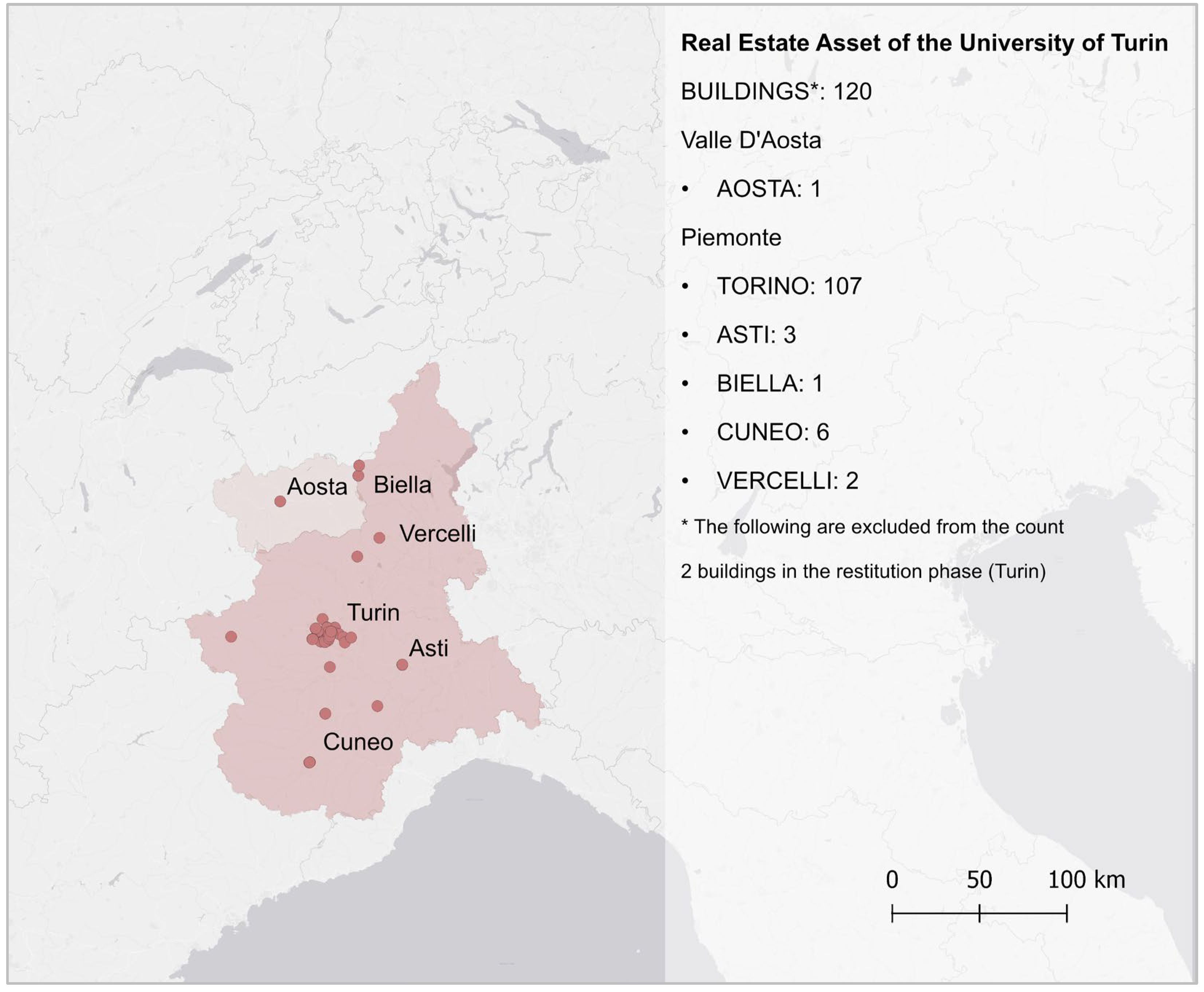
The case study adopted in the present research is optimal for the experimentation and combination of various Information Technologies (IT), with high potential for asset management. The University of Turin (UniTO) is the fourth Italian mega-university according to number of enrolments (around 81,000 in the 2022–2023 academic year), and its assets do not include a single campus or a series of smaller campuses. Indeed, except for a few isolated cases, most of its buildings are strongly diffused and integrated into the urban contexts of the city of Turin. UniTO’s real estate encompasses 120 buildings spread over two regions, six provinces, and nineteen municipalities (
Figure 1).
Hence, UniTO represents a campus spread widely across the urban and suburban structures of the city, providing a highly interesting case study due to its complexity and extensiveness. The UniTO’s assets are comparable to a small city with a significant catchment area and related management complexity, accentuated by the numerous activities open to both university users and citizens (e.g., theatres, museums, events, etc.). Additional factors accentuate its complexity, such as the numerous historical buildings, various types of properties, and different management methods depending on the school or department involved, leading to information fragmentation. The management of such an asset, aiming at optimizing the use of its resources, spaces, and services, and ensuring a great user experience, should consider the university’s internal users and external users (i.e., citizens) with related activities in the urban context.
Despite its size and management complexity, the University of Turin has not provided a structured AMS until recently, so decision-makers struggle to be aware of the actual consistency and uses of the asset, with extra costs and a waste of resources. Currently, it is quite hard to provide available, updated, and correlated data of different types (e.g., the size of spaces, their planned and actual allocation, and related equipment), for timely and effective decision making. Furthermore, it is difficult to gather and update existing data as they are scattered in various siloed databases, managed by the different administrative departments through a still strongly document-based approach. Thus, with the last university strategic plan, a requirement to have a digitized, structured, and data-driven AMS, accessible at different levels of detail, from the territorial scale to the individual space and with related equipment arose.
2. Materials and Methods
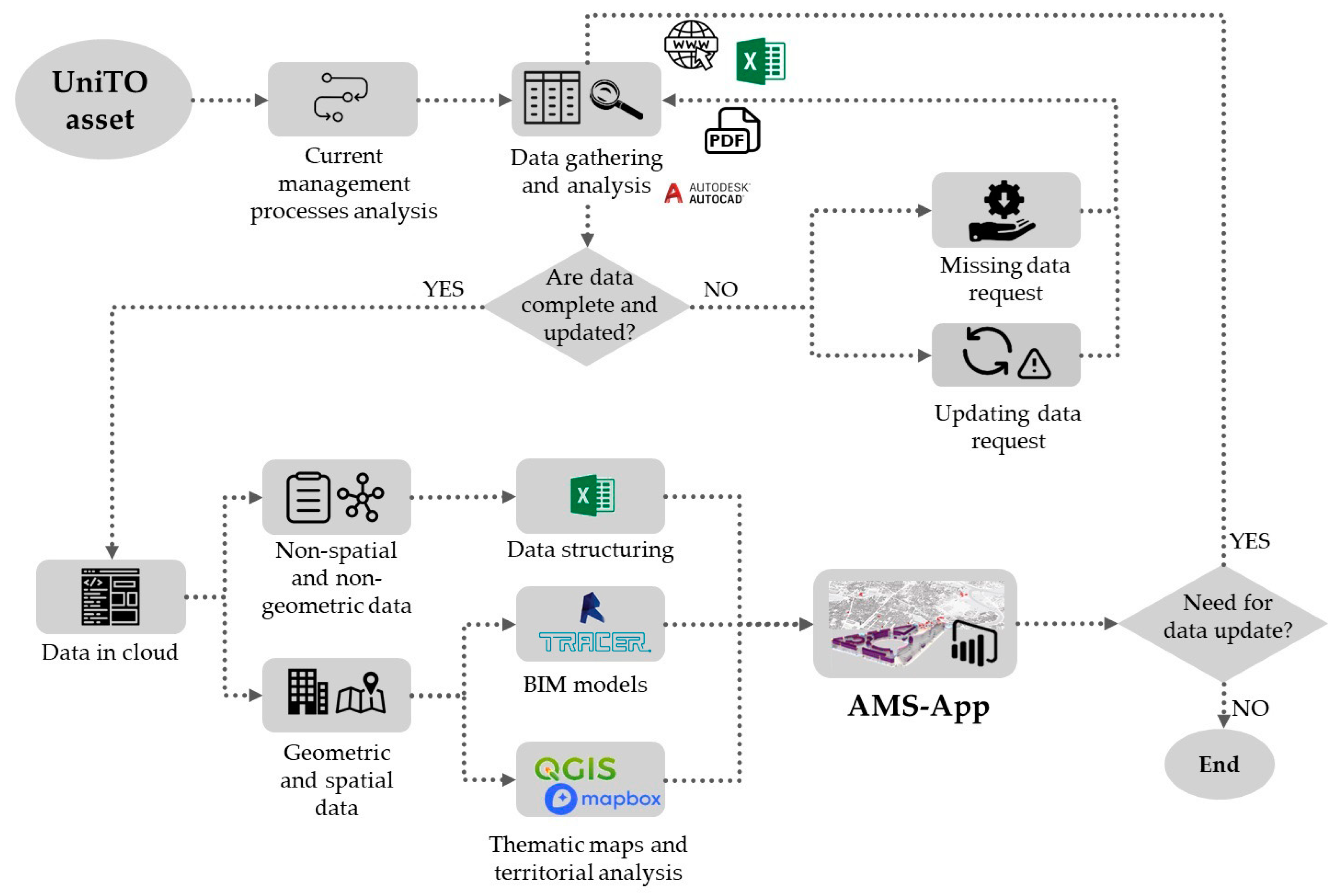
The presented work is part of the UniTO asset digitalization project [
28], whose methodology (
Figure 2) can be summarized in the following steps:
Data collection and storage: Data are collected from different sources and verified. The more complete a dataset is, the more support it can offer in decision making. In any case, an imperative piece of information for each dataset collected is the encoded name of the asset element the values refer to. For example, the dataset “Classroom,” which contains within it the list of classrooms throughout the university, must also contain, for each value, the alphanumeric code of the room and not just the name. Therefore, if something is missing or un-updated, further implementations to the university offices are required.
Data categorization: Data are grouped according to the nature of their contents (datasheets, geometrical information, spatial information, etc.) and structured or used to populate and create the components of the system. Data are also divided according to whether their contents present static (can rarely change) or dynamic (can frequently change) data, and if they refer to the entire asset or a single building.
System elements creation: The outputs resulting from this phase are datasets, BIM models (exploited in Autodesk Revit 2023 Software), and GIS-based maps (created with QGIS 3.28.7). Additional applications used were Proving Ground Tracer for exporting BIM models, the pgRouting layer for QGIS routes analysis, and Mapbox for map visualization. At this stage, static information datasets (e.g., ID, name, encoding, address, net area, etc.) will have already been integrated into the BIM models and the GIS-based maps to associate defined information with the geometries. Moreover, GIS-based maps are created, integrating shape files based on the collected data and open map services, and also exploiting spatial analysis.
System elements’ integration and BI report creation: This phase involves the integration of the previously created elements into the Business Intelligence tools, which allows their relation thanks to the semantic association of the encoded values. This enables dynamic data to be integrated into the digital models, such as occupancy, space availability, real time data, etc. Eventually, the union of datasets, maps, and BIM models will produce a dashboard which, combined with other dashboards on the same topic, can generate a thematic report.
AMS-App construction and publication: The reports, published online and related to each other according to a well-defined architecture, constitute the final App.
AMS-App update: As the different elements of the system are related but independent of each other, it is possible to update only the interested part. This means that targeted action can be taken and that once the individual element edit has been finished, it is also automatically updated on PowerBI reports.
Figure 2.
Methodology workflow for the AMS-App creation.
Figure 2.
Methodology workflow for the AMS-App creation.
As evidenced by
Figure 2, which summarizes the methodology adopted, technologies, systems, and data are thus perfectly integrated into a structured information flow.
The following paragraphs aim to enrich the description of the replicable methodology developed, also illustrating the tools and the data exploited to create the AMS-App and its structure.
Then, the description will focus on the themes individuated so far, requiring Geographic Information System support for data analysis, visualization, and integration in PowerBI, the Business Intelligence software adopted.
2.1. The Evolution of the Asset Management System for the University of Turin
In the context of the digital transition for Public Administration, the University of Turin represents a pioneering case, especially in Italy. Indeed, UniTO embarked on a path to build a platform to collect information regarding heritage buildings in a digital format before 2018. The platform, called OpenSIPI and handled by the Building Directorate, allows the visualization of buildings on the territory thanks to base maps. At the lower scale of the building it allows the visualization of interactive floor plans with data regarding the spaces (
Table 1). Despite the presence of the platform and some input data, the tool has not proven to be useful for maintenance operations or making informed decisions as it lacks data regarding the O&M phase (e.g., occupancy, mechanical systems, timetables, and furniture). In addition, the platform is not designed with integration and data sharing in mind, as it was not linked to data from other departments or directorates in the University. Thus, information was digitized but management processes had not been changed with the aim of integrating and eliminating the so-called information silos. On the other hand, the fragmentation of information makes it difficult to obtain a clear and accurate picture of the size of the University of Turin’s real estate holdings.
To solve this problem, a research project [
16,
29] was initiated in 2021 to create an integrated Asset Management System Application (AMS-App) that would make it possible to visualize and connect data of different types and extractions, thus transforming them into information regarding performances or the use of resources.
However, the first AMS-App created needed improvements in system component relation and data integration, and also presented deficiencies related to the user experience. For this reason, between 2022 and 2023, a first attempt at system optimization was carried out [
30].
Although the changes resulted in significant improvements in data and platform management, user tests revealed some limitations. Specifically, users were unable to change predefined views, the link to the information dashboards was difficult to find amongst other tabular information, and it redirected the user to another web page. This made it difficult for users unfamiliar with the platform to find the link.
To address these issues, in 2023 a new methodology was developed [
28] in which data and system components could interact with each other and be visualized effectively. This paper aligns with the latter methodology.
2.2. The Asset Management System for the University of Turin: New Platform Structure
The objective of the development of a new platform structure was to define a new methodology that could systematically solve all the problems that emerged while increasing the quality of the user experience. As explained in [
28], the changes initially focused on better data management by reorganizing and rationalizing the datasets. Additionally, the plugin that enabled the visualization of plans within the information dashboards was replaced. The Tracer plugin was chosen to enable the direct input of plans from the BIM model, streamlining the workflow and introducing 3D visualization within the business intelligence software.
The most significant methodological change was the adoption of PowerBI as a single base and container for the development of the AMS-App. Due to the reorganization, the GIS software (QGIS 3.28.7) was no longer a container but rather a part of the platform, serving as a foundation for geolocation and data analysis. The data were then conveyed and visualized on the PowerBI platform.
In order to achieve a transition to open software, QGIS was introduced as a tool for spatial information management. This is especially relevant for the work discussed in the present paper; as better explained in
Section 2.3, using QGIS allows for the creation of new maps and information layers.
At its current state of development, the application utilizes the potential of both Building Information Modeling (BIM) and the Geographic Information System (GIS) and integrates data of several formats and from multiple sources. The data are the basis for all information that can be visualized using Business Intelligence (BI)-based systems and include geographic data, geometric and functional data, and information related to the quality and comfort of indoor environments (
Table 2).
One of the first stages of development involved data collection, and for this purpose fact datasheets were prepared and sent to the technical areas, requesting their completion. In cases where compilation was not possible, manual compilation by the authors was required, particularly for geometric data derived from drawings or models and for geographic data from map services.
At a later stage, encoding was defined for each city, building, and space belonging to the University’s real estate assets. This made it possible to link the different data through the semantic association of the encoded names.
Another goal following the data collection was to visualize the building stock in the context of a three-dimensional map. In this regard, QGIS 3.28.7 software was used for the creation of Shapefiles, while Mapbox was used for the development and visualization of 3D maps. Again, the encoding system was crucial as it allowed the association of data in the GIS. A three-dimensional map was developed to obtain a better sense of the urban space, consistency, and distribution of buildings geolocated and associated with their encoded names. QGIS and Mapbox integration enabled the generation of custom web maps based on the shapefiles, shareable via URL, and carrying selected information. Shapefiles were created on QGIS, integrating data collected from the UniTO’s sources and the maps available on OpenStreetMap and the Piedmont Regional Geoportal, and exploiting their Web Map Service (WMS) and Web Feature Service (WFS). Once ended, shapefiles have been uploaded on Mapbox, for the graphic edit and online publication. In this way, maps can be easily integrated into Microsoft PowerBI, the Business Intelligence software selected.
For building visualization, the BIM model is linked to data regarding the building’s standard use and characteristics. During parameter creation, a parameter comparator makes it possible to identify the shared parameter between floors and mass rooms, avoiding repetition that can result in association errors or lower the quality of the final model. In the future, every university building will have its own set of data for better management; these Revit parameters and associated values are derived from the same set of data stored in a cloud repository. During this phase, the association of more dynamic data, such as real-time collected data, was avoided. The model could thus serve as the foundation for a variety of analyses about space occupancy or the management of teaching and working spaces, in addition to environmental quality. Lighter models with smaller file sizes and more fluidity were made possible by this improvement.
Finally, Proving Ground Tracer was used to export the BIM model to make integration between BIM and Microsoft Power BI easier. This software facilitates the export of both 2D and 3D geometries along with associated data, all of which are kept in a SQL database that the software creates, and after this process, the model is prepared for import and display in Microsoft Power BI. The software’s ability to analyze and visualize data is impressive, and it allows various stakeholders to share information through analytical dashboards that include data, BIM models, and GIS maps. Despite Mapbox tools allowing the visualization of the georeferenced BIM model, in the proposed methodology the BIM model remains separated from GIS maps, per the established analysis needs. The two objects are separately integrated into Power BI, allowing more efficient management and updating of the different elements. Power BI, thanks to its functionality of report generation, enables the creation of the primary AMS-App used for data analysis and visualization by the different stakeholders.
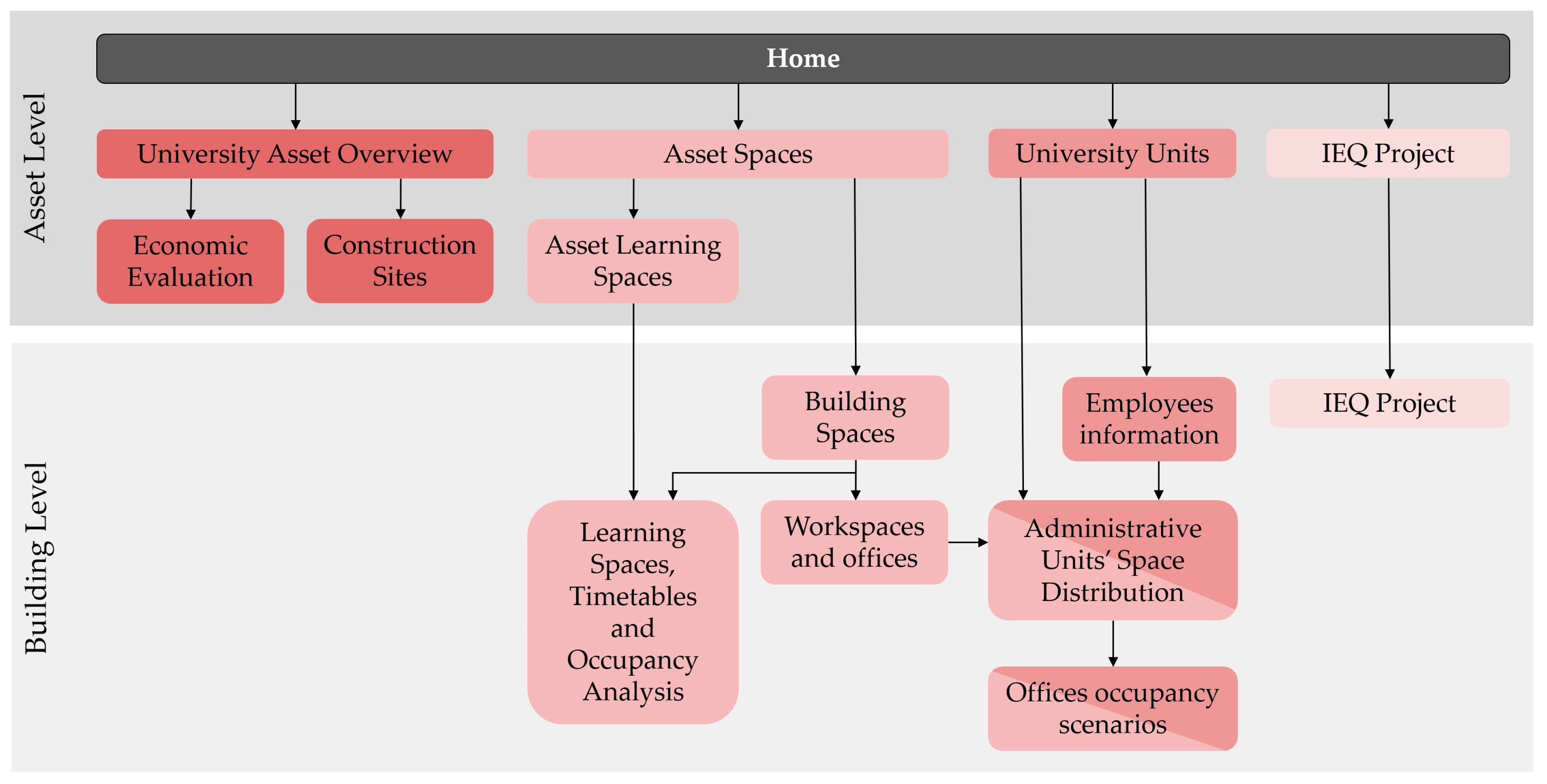
The results of the methodology explained are from the AMS-App development. Its structure (
Figure 3) is composed of several thematic reports, each including one or more dashboards. The dashboards that are generated can be integrated with GIS and BIM, and they are directly linked to datasets that are kept in a cloud repository. These connections allow previously excluded data, like dynamic data related to real-time environmental quality measurement, course schedules, occupancy rates, etc., to be associated with resources based on the relationship of encoded names. As aforementioned, the platform is set up so that the reports are gathered by themes, which are further divided according to the information level they reach (Asset Geographic Level, Building Level), although each report is independent and connected to the others based on a predetermined structure (
Figure 3). Switching to the reports is possible thanks to a link button, and its selection opens the chosen report to the user. This independence also enables better management of the system and different levels of user accessibility to information.
According to the AMS-App structure, its informative level division, and the objective of highlighting the results achieved with GIS and BI tools’ integration, the following methodology section focuses on the maps’ creation and BI contextualization. The paragraphs are divided by selected themes concerning the difficulties encountered in managing such an asset and its resources.
Moreover, due to the replicability of the system, in the following parts of the methodology and consequently the results, the following reports are presented as applicative examples:
University Asset Overview: Presents an overview of the asset consistency and building identification. The report is composed of three different dashboards (Spatial Overview, Spatiotemporal Overview, Distance Overview).
University Units: The report contains only one dashboard that localized the University units in the asset, also showing the spaces assigned to them. Only administrative staff have access to this report.
Asset Spaces: This report, composed of the homonymous dashboard, gives information concerning spaces uses and net areas, divided by buildings.
Asset Learning Spaces: This report is reachable by the Asset Spaces Report and contains two dashboards. The Learning Spaces Analysis dashboard gives an overview of the buildings that contain educational spaces and their peculiarities, while the Learning Spaces Facilities dashboard allows classroom equipment analysis.
Building Spaces: Even this report is related to the Asset Spaces Report, as it presents detailed data concerning spaces in a selected building. It also provides a 3D view of the building and indicates information like the spaces’ positions in the buildings, the spaces’ names, the equipment, the occupancy indices, etc.
Except for the University Units one, the listed reports have been designed to be usable by the entire university population upon authentication. The University Units report, on the other hand, is dedicated to administrative staff.
The report excluded from the list above, but viewable in
Figure 3, presents the same or similar maps and models but data based on different topics. Even in this case, some of them allow visualization only to specific users like directorate (Economic Evaluation, Construction Sites, Employees Information) or administration and management offices (Workspaces and Offices, Administrative Unit’s Space Distribution).
2.3. Thematic Map Generation
Among the several themes analyzed in a geographical-territorial context, the identification of the components of the asset is an essential step for creating an AMS. Although mapping the building stock may seem trivial, it is central to relating the urban context with spaces, and also to identifying the resources and organizational structures of the university located in the territory. Moreover, as asset consistency can change over time, depending on the needs, GIS enables the tracking of such changes, creating diversified maps. GIS spatial querying also enables distance analysis and pedestrian routes calculation, in terms of both length and time, combining the assets’ information with the built environment and the road graphs of the cities.
The integration of GIS and BI tools creates relationships between spatial and static data with more dynamic ones, providing, for example, dynamic reports on economic states, construction sites and maintenance operations, spaces’ features, uses, and occupations.
In the next sections, images and tables are provided as examples for each theme covered. Specifically, these can report information about UniTO’s buildings in the Piero della Francesca Center or Palazzo Nuovo depending on the subject matter, enabling a better understanding of the examples. The Palazzo Nuovo is exploited for examples of the Distance Analysis and Pedestrian Routes Calculation (
Section 2.3.2. Theme 2), while the Piero della Francesca Center is examined for the other themes. The Palazzo Nuovo and Piero della Francesca Center were chosen as a case study because, together with Campus Luigi Einaudi, they host about 40,000 users, almost 50% of the university population. Indeed, in the Palazzo Nuovo is located the School of Human Science (Department of Historical Studies, Department of Humanities, Department of Philosophy and Education Sciences) and the Piero della Francesca Center hosts the Computer Science Department.
2.3.1. Theme 1: University Assets’ Consistency Identification
The first theme concerns the identification of the university building stock and the buildings’ administration group localization. As the methodology flow suggests (
Figure 2), the process starts with the data requirement and collection from the university’s official website and resources, and administrative offices. Then, data are checked and organized in a predefined structure, maintaining, as much as possible, the spreadsheet forms of the source. The dataset fields are reported in the following tables. To analyze the consistency of the real estate asset and its evolution over time, the consistency dataset was collected for the years 2020, 2021, and 2022, and it contained the list of university buildings and their characteristics (
Table 3).
There is a second dataset (
Table 4) which refers only to 2022, and it contains information about the buildings’ administration groups (Polo), allowing their localization in the urban context. As suggested by the name, the buildings’ administration groups divided the administration of the building of the asset by geographical area. One or more buildings’ administration groups can be part of the same School. For example, “Medicine: Orbassano-Candiolo” and “Medicine: Torino” are located in different municipalities but are both part of the School of Medicine.
The following step concerns map creation in the QGIS. First, the informative maps of the city of Turin were identified on the geoportal of the city and in the Piedmont region.
These sources provide maps and databases via download services, Web Map Services (WMS), and Web Features Services (WFS). Information extracted from these maps, such as the geometry of the buildings and their heights, have been crossed with parts of the dataset for the construction of the thematic shapefiles, useful for the realization of the queryable maps.
In particular, at this stage, the following shapefiles were created:
Cities Basemap (Basemap);
2020 UniTO building stock (2020_UniTO);
2021 UniTO building stock (2021_UniTO);
2022 UniTO building stock (2022_UniTO);
2022 UniTO building stock Units (2022_UniTO_Poli).
Once the shapefiles were created, latitude and longitude were extracted. The calculation of coordinates was carried out by the QGIS fields calculator, pointing to the center of the polygon. This extraction allows the placement of the names of the buildings’ labels in the thematic dashboards. As already described in the general methodology, the shapefiles are then imported into Mapbox, where the final map is created and published. Finally, the map is imported into PowerBi, where the geometries and coordinates are associated with the rest of the datasets through the defined real estate encoding system, enabling further analysis through the visual objects of the BI software.
2.3.2. Theme 2: Distance Analysis and Pedestrian Routes Calculation
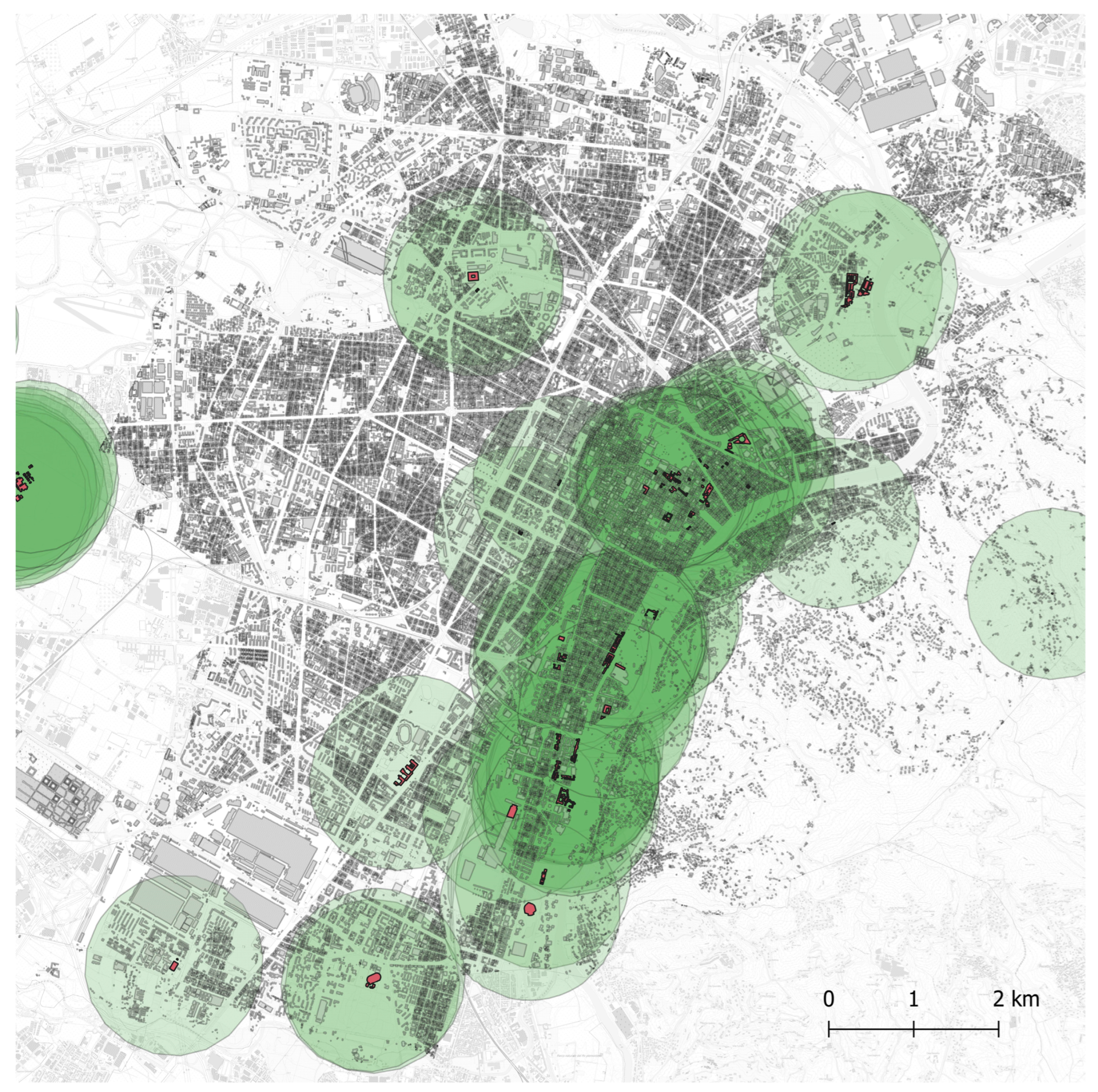
With the aim of investigating the distance and proximity context, QGIS and its packages were exploited for buildings’ distance analysis and pedestrian routes’ calculation.
The road graph of the Open Street Map cartography was exploited as an additional information level. For better visualization, the road graph shapefile has visibility settings limiting its display in scales greater than 1:25,000.
As indicated by the literature, the average person’s walking speed is between 4 and 5 km/h [
31,
32,
33]. This fact implies that in 15 min it is possible to reach a distance of 1 km or a little more (1.2 km), in conditions with straight paths and no obstacles.
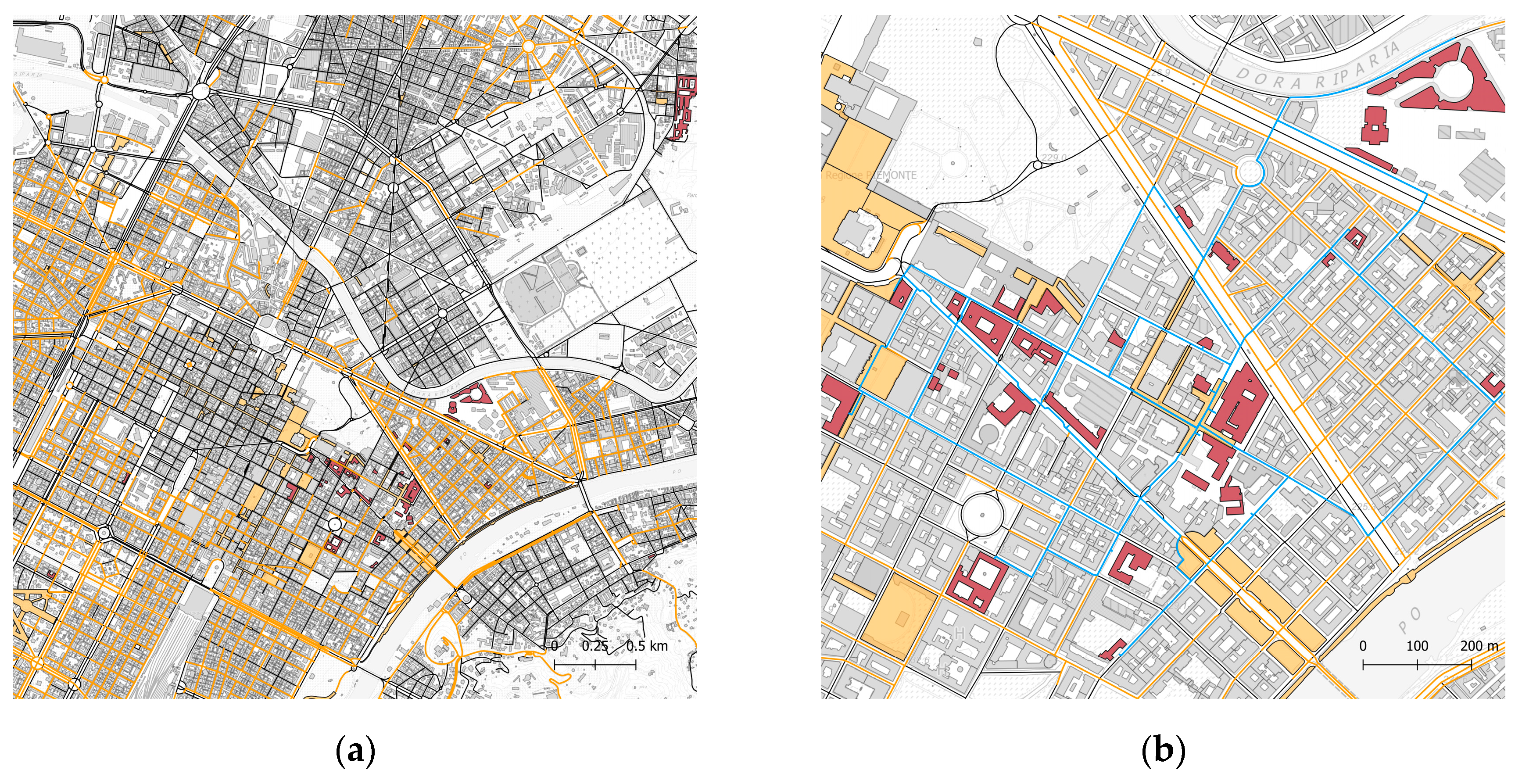
Aiming to receive initial feedback about the distances between the different buildings, buffer zones have been created around each building, within a radius of 1 km (
Figure 4).
The distance was chosen as the maximum to allow no more than 15 min of pedestrian routes between the buildings. In this way, keeping an average speed set at 5 km/h, the result obtained will absorb potential user delays due to slowdowns from obstacles and unexpected events on the route. The choice of the 15 min limit was outlined with the 15 min city concept, and transposed onto the university asset. Subsequently, pedestrian routes were calculated within buffer zones, using the road graph as a base map (
Figure 5). For this purpose, QGIS provides open-source plug-ins, like the pgRouting Layer. However, the road graph presented some deficiencies that sometimes disabled the plugin exploitation, so some routes were traced and/or integrated manually, based on user experiences. The GIS-based analysis provides the shapefiles of the different routes based on lines.
Once the routes had been defined, they were collected in a single shapefile with the following attributes: the route name, the departure and arrival points, the route length in meters, and the travel time in hours. In this phase, missing data were integrated.
Considering the results presented by Caselli [
17], a pedestrian speed of 5 km/h was identified as the most correct both for the plug-in processing, and manual calculation.
Secondly, more operations were carried out to convert travel time in min and group data by travel time classification (less than 5 min, between 5 and 10 min, between 10 and 15 min, over 15 min). Then, to facilitate data analysis once reported in the dashboards, the general routes shapefile was divided into 4, according to the travel time classification group, and the shapefiles attributes table was exported in tabular format (
Table 5).
In the end, the dashboard was created, exploiting both shapefiles and datasets, related, as always, by buildings’ encoded names.
2.3.3. Theme 3: Asset’s Spaces and Administrative Units
This theme is the perfect representation of the main methodology as it does not require the creation of new a map. In fact, shapefiles are related to a larger amount of data, allowing a more detailed identification of the building spaces and administrative units while maintaining the asset view.
The workflow followed the main path, integrating spatial information levels such as building identification and tabular datasets.
According to the thematic areas, datasets reported information about spaces’ peculiarities (
Table 6) and organizational units’ allocation (
Table 7).
The general spaces datasets also reported links, allowing the opening of single building reports with deeper information about spaces and their occupancy. Once the map and the datasets had been integrated into Power BI, the link field was enabled as a URL field aiming at activating external links.
The information from these tables was collected by counting operations on another dataset that presented single building characteristics. (
Table 8). This dataset was also exploited for the single building reports, as previously mentioned and linked in the “Asset Spaces” dashboard.
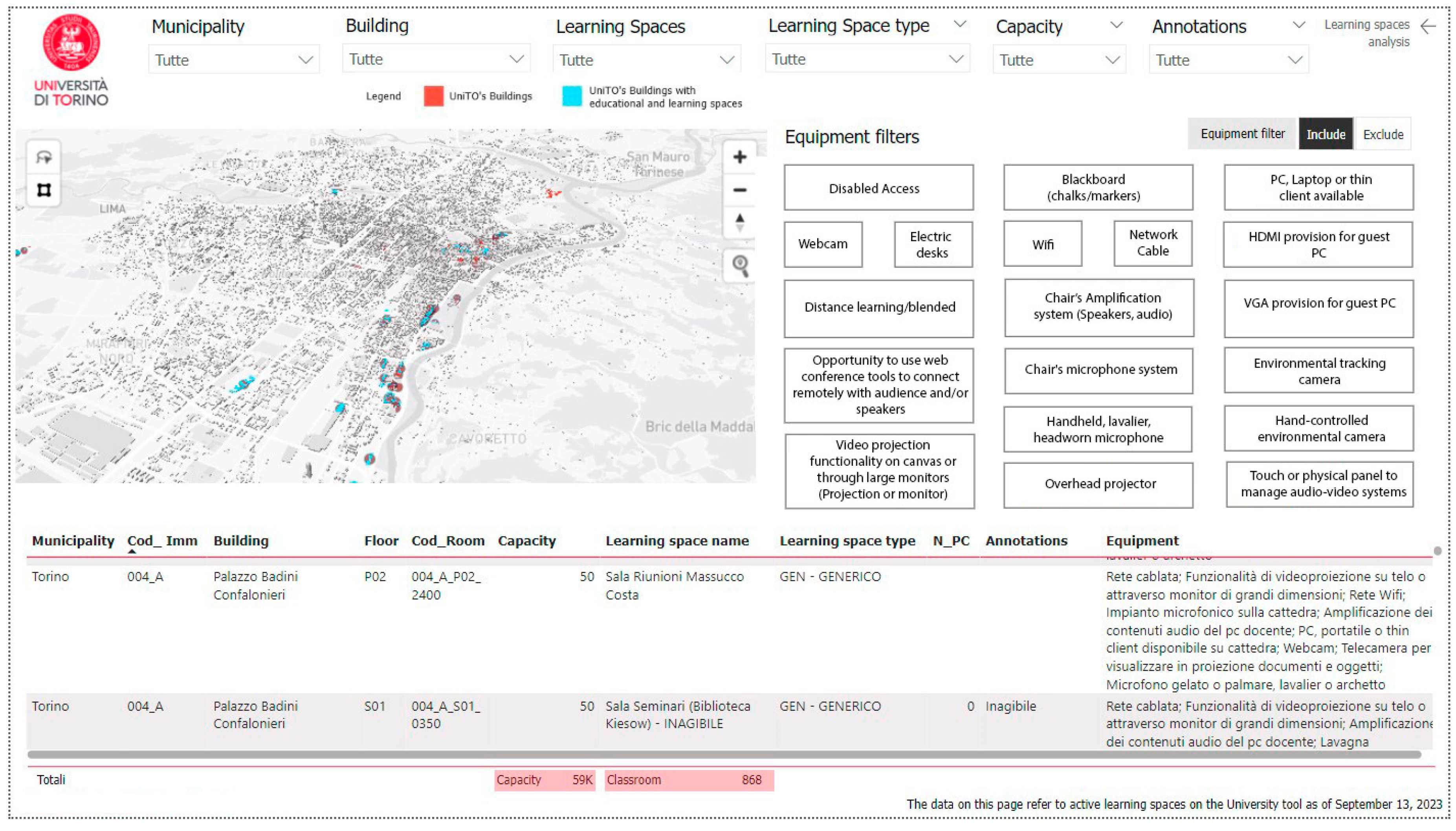
2.3.4. Theme 4: Asset’s Learning Spaces
This theme focuses on the learning spaces of the asset, producing a comprehensive overview of classrooms, study rooms, lecture halls, etc., and their peculiarities. The dashboard realization followed the main methodology added a new information layer, which identified the university buildings with a didactic function.
Even in this case, the resulting map was then related to the learning spaces datasets through buildings’ encoded names. The dataset covered information about dimensions, use, accessibility, and facilities (
Table 9). As in “Theme 3”, URL fields linked each table’s rows to a single building dashboard that displayed, for example, the classrooms’ schedules and the daily occupancy rate.
3. Results
As the main result, the AMS-App provides a series of connected reports that contain one or more interactive dashboards. The stakeholders involved in the decision-making process of asset management can exploit the system created to manage resources such as buildings, services, and people, gaining information and knowledge through a user-friendly interface. Easy data analysis can improve the comprehension of the asset and support effective policy evaluation of management choices, easily taking into account factors such as asset consistency, buildings’ distances, and spaces and resource allocation. Moreover, results can come from the perspective of the information exchanges, leading to the formalization of datasets and a well-defined structure for the visualization and interrogation of information.
3.1. Theme 1: University Assets’ Consistency Identification
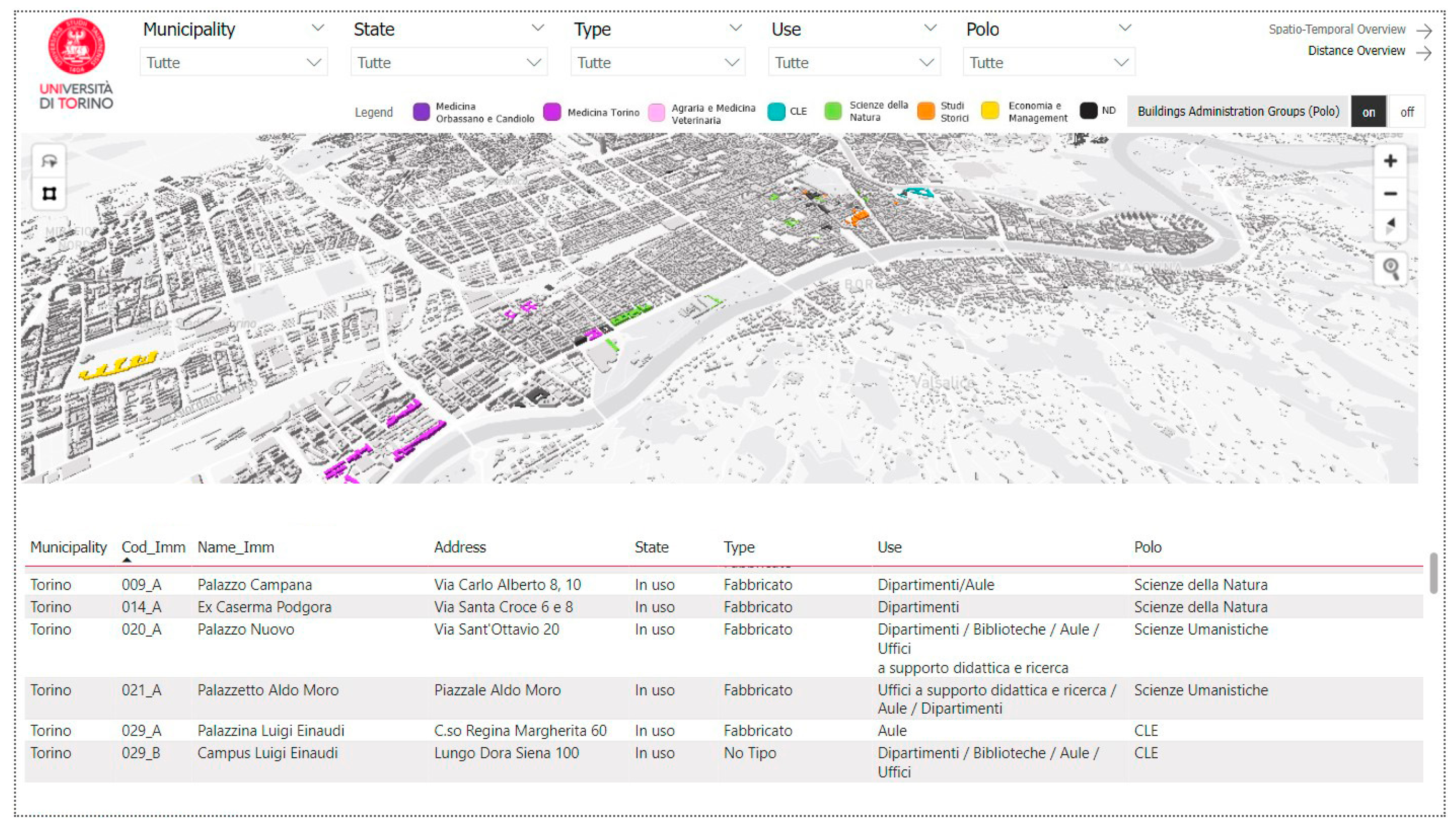
The material produced for the asset consistency identification finds its visualization in the Power BI report “University’s Asset Overview”, and particularly in the dashboards “Spatial Overview” and “Spatiotemporal Overview”.
The “Spatial Overview” (
Figure 6) aims to generate a general outlook of the asset, identifying the main elements, such as buildings and fields, and buildings’ unit administration.
As mentioned, the University of Turin’s real estate assets are very extensive and heterogeneous. Thanks to the integration of datasets and their analysis through business intelligence visual objects, it is possible to quantify these data. By selecting the properties within the map, or through the visual objects, more information can be shown, such as their address, their state of use, the consistency type, and the general function. The dashboard enables filtering according to specific information, such as building state or main use. Moreover, a switch button allows map buildings to change in color, activating or deactivating, for the categorization of the building administration units. In this regard, the map allows the observation of the allocation of the units. From the perspective of asset management, this tool can be very useful in carrying out evaluations on the distribution of buildings and departments throughout the territory, validating the placement policy, or supporting change proposals.
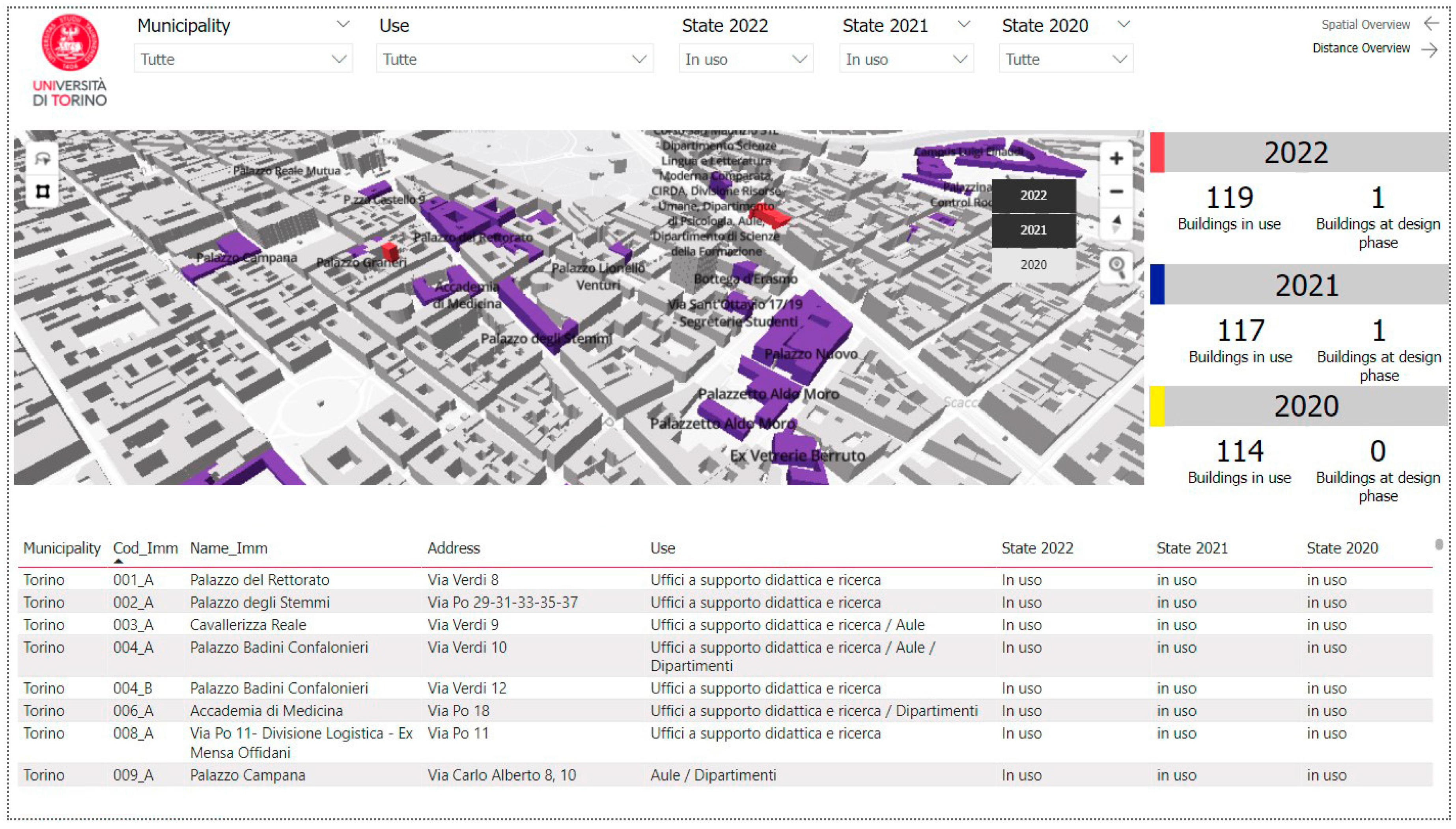
The “Spatiotemporal Overview” dashboard (
Figure 7) extends the real estate asset identification in a temporal dimension, combining information from different years.
In 2022, real estate asset consistency, including of both buildings and lands, increased by more than 4% compared to 2022. Indeed, according to datasets, 114 items were counted in 2020, while in 2022 this figure was 120 (119 without considering buildings in the design phase). However, the increase in the number alone does not show the user how the asset buildings’ stock has changed over time, or identify differences between buildings acquired and disposed. Thus, the data can have a better interpretation if related to the map, showing at a glance the changes in the asset over time.
The spatiotemporal variations of the different elements can be identified through the map, and the related information can be accessible with the support of datasets.
Thus, when the system has been integrated, this allows us to know, for example, that between 2020 and 2021, four buildings related to classrooms, offices for Education and Research, and Departments were implemented in the asset, while one residential apartment was excluded from it. The following year, buildings with residential and educational functions were excluded, while those added involved a wide range of functions, balancing the teaching space losses with new acquisitions.
This type of information, compared with data related to the university population, can support statistical analysis. Considering past experiences and the prediction of the number of future users, the dashboard can assist in the decision process regarding the acquisition or exclusion of properties, optimizing management and maintenance costs.
3.2. Theme 2: Distance Analysis and Pedestrian Routes Calculation
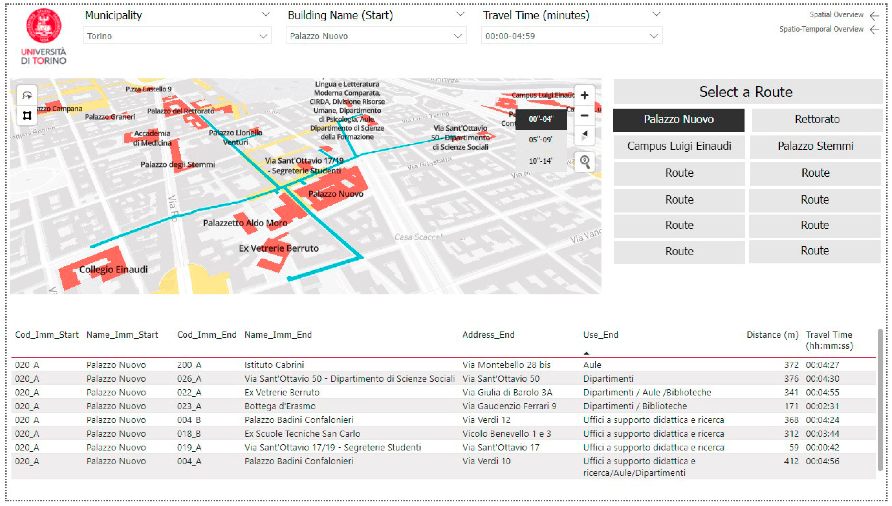
The mapping of pedestrian paths is also exploited in the “University’s Asset Overview” report, in particular in the dashboard “Distance Overview”. This enables a great number of users to exploit such a tool for querying paths at a general level. The dashboard offers the visualization of the routes that connect the different buildings, filterable by distance range (0–5 min, 5–10 min, +15 min), as well as the relations between the building administration units and the departments.
At the management level, this tool type finds multiple applications, ranging from the programming of the localization resources in the long term to unexpected situations or emergencies.
Figure 8 shows how to use the dashboard to generate analyses. The query, set through filters, shows which buildings are reachable from Palazzo Nuovo in different time ranges. Palazzo Nuovo is an emblematic example of the application of this system for several reasons. As aforementioned, it has a very high attendance by both students and staff. Secondly, the complete accessibility to the building can be and was compromised by various factors, including social ones such as events or demonstrations, and by being in the center of the city of Turin. Thirdly, the building has been undergoing heavy renovation in recent years, changing the usability of the spaces in a very short period. The dashboard results are therefore relevant in planning the allocations, whether these are adopted for a long period or a few hours.
3.3. Theme 3: Asset’s Spaces and Administrative Units
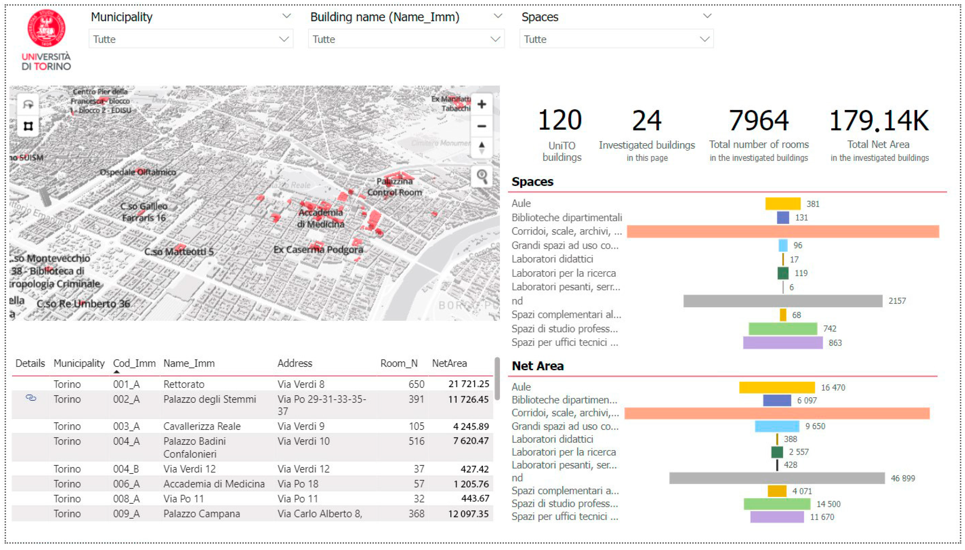
Information levels and datasets related to spaces and organizational structures are applied in the single-dashboard’s reports “Asset spaces” and “University units”. These reports relate to each other, allowing data independence. Nonetheless, the information deriving from different reports can be related, offering efficient support in asset knowledge. For example, integrating information from the “Distance Overview” dashboard and “Asset spaces” reports allows the identification of buildings with libraries reachable in less than 5 min. The single-dashboard report “Asset spaces” reveals information about the uses of the spaces, counting the number of rooms for uses’ typology and areas (
Figure 9).
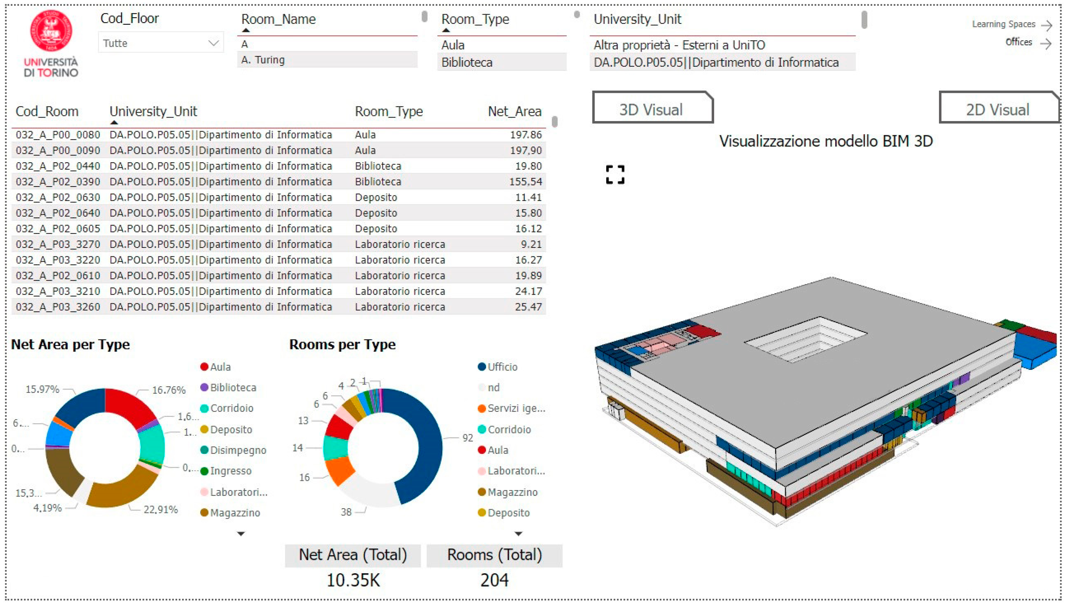
Within a building selection, the number represents the count of the entire analyzed building (to date, 24). The building can be selected by pointing to the map or through the filter box. The latter can also be used to select the building name, the type of use, and the municipality settlement. Moreover, an additional feature is represented by the presence of the URL field. This allows each BIM model to be linked to a new dashboard in which the information is further detailed and the spaces can be identified through a 3D information model (
Figure 10).
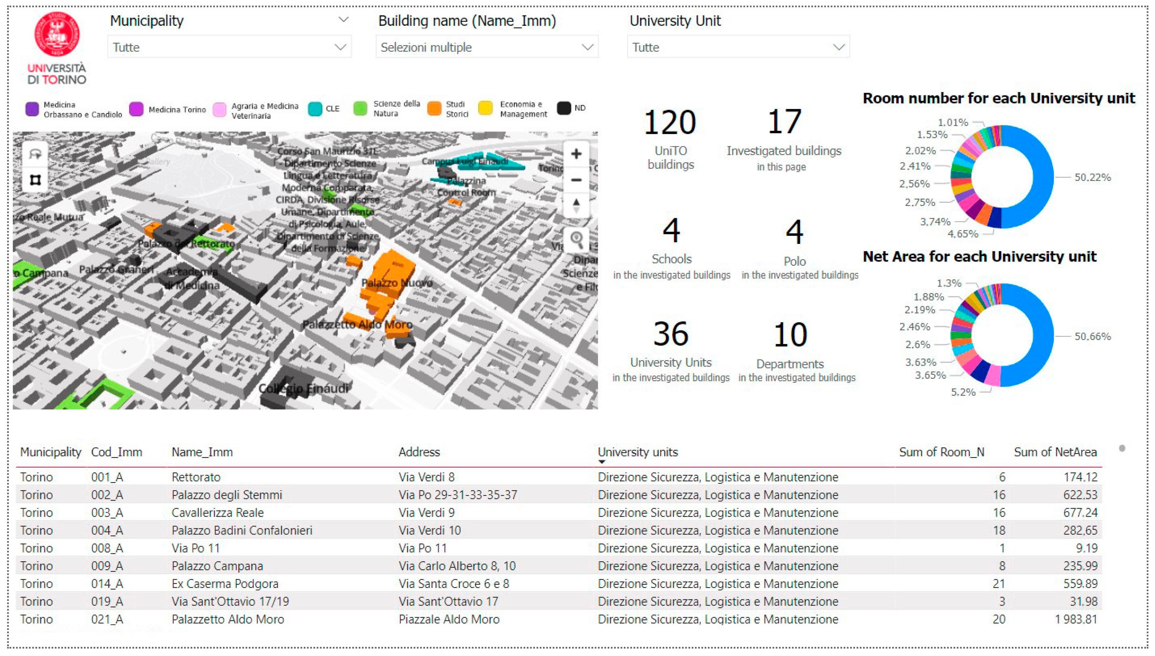
The analysis exploited with the “Distance Overview “dashboard can also be integrated with the “University units” one, which allows users to check how many rooms are available for the assigned department. This type of information association could highlight, for example, which buildings can be reached in 5–10 min but that also have the greatest number of spaces associated with a specific department.
The dashboard “University units” (
Figure 11), contained in the same named report, provides instead information about the organizational structures that occupy the different spaces of the asset buildings.
It differs from the “Distance Overview” dashboard for the higher information level. The dashboard “University units” exceeds the management of the asset by the administrative building units and the departmental assignment, but nevertheless defines for each organizational structure of each analyzed building so far the number and the area of assigned spaces. Despite the level of detail, it allows an overview at the asset level, as data interaction for different buildings is possible.
3.4. Theme 4: Asset’s Learning Spaces
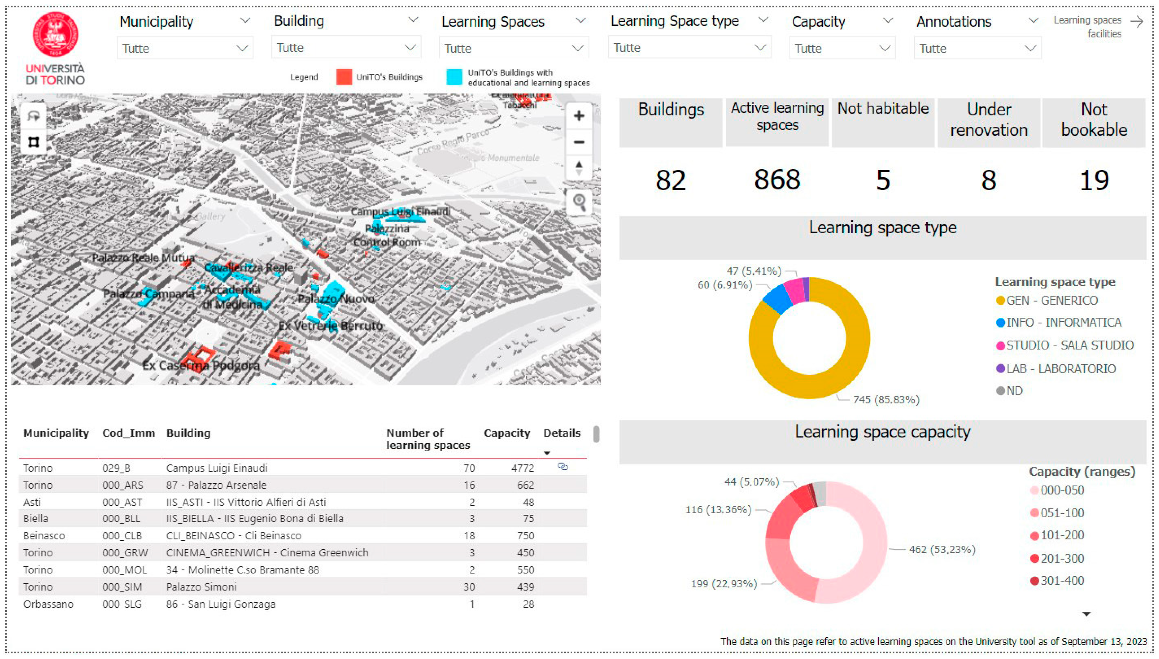
The latest results concern the theme of “Asset learning spaces”, demonstrated by the homonym report. The main purpose of this report is to provide asset managers for educational services with a comprehensive view of the learning spaces at a territorial level, but also detailed information such as capacity and type of space.
Thus, the report is composed of two dashboards. The first, “Learning Spaces Analysis” (
Figure 12), provides an initial analysis of the types of classrooms (generic classroom, computer laboratory, study room, laboratory) and their capacity divided into groups. It also identifies how many of these spaces can be used in the different buildings, informing the user in the case of un-usability or temporary inaccessibility.
As in the “Asset Spaces” dashboard, the “Learning Spaces Analysis” main table provides a URL field. The link, which needs to be included in the dataset, opens a new dashboard, providing lecture schedules and classroom occupation rates.
The second dashboard, “Learning Spaces Facilities” (
Figure 13), brings deeper information than the previous one, allowing the view of all the individual spaces at the asset level. While in the “Learning Spaces Analysis” dashboard, educational spaces were grouped by building, in the “Learning Spaces Facilities”, they were not. Rather, this provides information about the equipment available in each space, allowing filtered selection to include or exclude different categories from the analysis.
Even in this case, all of this information, combined with the “Distance Overview” dashboard, can support classroom scheduling. Indeed, sometimes, students cannot attend some courses because they are located too far apart and they cannot reach them in time. Although it may seem trivial, this can create issues with students’ learning quality. The ability to consider travel times between locations can optimize the distribution of courses across multiple buildings, and their use. Additionally, this enables verification that the lecturers can reach the different classes on time. The same principles can be applied to administrative and general staff.
All these tools bring significant support in learning space management, enabling the knowledge of spaces’ peculiarities, availability, localization, and proximity, and consequently improving users’ experience and satisfaction.
4. Discussion
As stated, UniTO’s AMS-App enables the integration, interpretation, and availability of different data to different stakeholders, providing benefits in decision-making processes such as improved efficiency, awareness, and effectiveness. Such benefits are central for managing large and widespread university campuses, comparable to small cities with a large urban area, and various building types and resources. Their buildings and services, with related information, should be simultaneously accessible to stakeholders involved in the decision-making process, university users, and citizens at different levels of detail. GIS allows the management and analysis of data and models in the context of a global spatial reference system [
34]. Data storage can rely on traditional solutions such as relational databases or more advanced ones such as cloud databases. Data visualization and processing can be handled, instead, through Business Intelligence (BI) software (Microsoft PowerBI), allowing the management of large amounts of data and the creation of graphical interfaces for easy reference by all stakeholders [
35].
Although data are integrated with the information level, they remain external to the map, allowing a continuous information update without the need for changes in the GIS attributes tables. With this aim, the QGIS was exploited for map creation, data analysis, and initial querying, gaining more effective analysis once integrated into PowerBI. As demonstrated by the results, the two contributions are fundamental for realizing the AMS-app. GIS provides geographic information, allows the development of spatial analysis, and provides graphic support, while Power BI empowers the enrichment of data-improving analysis.
The adopted methodology is based on a common replicable workflow, while still allowing analysis customization. To summarize what has been detailed in the previous paragraphs, the methodological flow begins with the collection of data, which are processed and sorted according to the object (general asset or single building) and the topic of information.
Data are further divided into static data, which tend to remain unchanged over time, and dynamic data, which need to be updated frequently. This facilitates the updating process and is central to deciding which data should be imported into the digital graphic models such as GIS maps and BIM models (static data), and which should remain external (dynamic data) but related to the models through the encoding of the elements. Data are then exploited to produce analysis, easily interpretable through geometries, tables, and graphs, all collected within thematic Power BI reports. The reports’ independence allows better management and user accessibility control. Finally, the final platform includes all the reports, related to each other according to the
Figure 3 structure.
The dashboards can be queried both from the map and from the visual objects, and the filters allow for targeting the information displayed.
Power BI dashboards are user-friendly and their integration with BIM models and GIS maps allows a perception at a glance of the asset consistency, and in addition permits useful information to be analyzed for the decision-making process in different management processes in different and digitally supported management methods. Indeed, the results showed how an Asset Management System that integrates these components can be easy to use but has great potential to support informed and effective decision-making processes.
With the previous document-based system, all the information that has been inserted into the dashboards can be consulted but is stored in silos which are not supported by user-friendly graphics, and therefore they have little use for many decision-making processes. The proposed system enables more efficient information consultation and information traceability, providing great added value for the university’s departments and users who need to consult many of them simultaneously and make consistent decisions.
The identification of the UniTO asset and its localization can be visualized through the related thematic dashboards. The “Spatial Overview” dashboard gives a comprehensive overview of the university real estate, providing information such as the address, the state of use, the buildings’ administration groups, and their main use. Some of this information is transposed through a temporal dimension with the “Spatiotemporal Overview” dashboard. Then, the “Distance Overview” dashboard provides information about building distance, in terms of length and time. This, combined with information about space geometries, equipment, use, and occupancy, can be particularly useful in user allocation, both in long-term planning and in an emergency context. Such advantages are evident through the “Asset spaces” dashboard, enabling the visualization of space peculiarities and uses, and in the “University units” dashboard, showing the university’s organizational unit allocation and space assignment. This approach is also reflected in the “Asset’s Learning Spaces”, supporting Educational Direction, students, and teaching staff. The first can be supported in space management, classroom and lecture schedules, and occupancy analysis, while the other two can easily display the classroom localization and equipment, finding the lecture timetable, also, through a URL link.
Despite the recent abundance of tools and digital technologies, they are still underexploited in asset management, especially for university campuses. Digitalization has not always translated into an effective benefit for campus users or for supporting decision-making processes about management and maintenance procedures. Public administrations are usually not ready to accept and introduce new technologies and practices, and modify management systems accordingly [
36]. In other words, digitization and not digitalization are often implemented, which means translating documents into machine-readable formats and introducing digital tools without reviewing the management processes with crucial benefits accordingly.
Limitations and Future Development
To facilitate the embracing of the digital transition, the university administration devised a solution without a significant impact on data producers’ workflows and which can overcome some of the issues found in the literature, concerning the exploitation of BIM and GIS data. The added value of the research arises from the fact that such issues were addressed by proposing a replicable methodology and showing results applied to a concrete case study. The research addressed certain issues that have been highlighted in the literature [
1,
5,
20]:
Interoperability;
Real-time data integration;
Multi-scale information exchange;
Information exchange between different stakeholders and on different topics.
Concerning the first one, the issue of data interoperability was bypassed, at least with respect to the purpose of the research and the AMS-app developed. Integrations such as BIM-GIS and GIS-BIM usually required defined protocols for elements’ translation. The system proposed for UniTO, as it is based on PowerBI, can easily integrate the output of the other elements of the system.
Moreover, PowerBI is currently the only non-replaceable authoring software in the system. Tracer, the tool which allows BIM models to be imported into PowerBI, can handle both authoring and open formats (.ifc), so it does not force the use of Autodesk Revit. Tracer itself could be eliminated, giving up the 3D visualization of models. GIS maps can be developed, either using the open-source tool QGIS in conjunction with Mapbox, as described, or through other authoring software like Esri ArcGIS. Even in this case, if 3D visualization is not required, Mapbox can also be excluded from the process. All data are correlated through semantic relationships and refer to a single database.
With respect to multi-scale information exchange, the proposed system solves this by changing visualization via semantic association. Moreover, data from a single repository can still be related and some are used for visualization at both spatial and building levels, while others are used only in one of the two cases.
Another solved issue concerns the information exchange between different stakeholders dealing with different topics. The proposed methodology allows easy replication for various thematic areas and types of organizations, regardless of the formats or applications used to manage the data. Moreover, information dashboards do not require specific skills to read them, and are thus becoming accessible to a wide range of stakeholders.
An issue that has been partially addressed and needs to be deepened in future developments, especially concerning the development of Digital Twins or the implementation of proactive management, deals with real-time data visualization. PowerBI allows the connection to databases of a different nature, and even with data in the cloud, how to visualize these data in maps and BIM models should be investigated so that they can always be updated to the latest survey. One hypothesis could be the creation of a data repository from which data can be automatically extracted through predefined queries, and in this way they could be filtered according to the purpose of extraction and with an established periodic pace. Therefore, they can directly feed maps and models, as well as dashboards, displaying them and keeping them updated and readily available, avoiding the current step of downloading, processing, and uploading them into the developed system.
Finally, another topic to be investigated further concerns the creation and updating of the system. The former is the most complex, and indeed expertise is needed for the creation and updating of maps and BIM models, but once the relevant dashboard has been set up, the updating of the related data takes place automatically with the updating of the dataset (except in rare cases requiring the modification of models and maps). Thus, software interfaces could be developed, giving technical users access to the data according to the management purpose for which they need to process them and they can update them directly without any special skills or knowledge of the AMS-app architecture. This avoids the risk that the staff could modify data outside their competence with possible errors, and ensures timely and user-friendly data updateability.
Indeed, Power BI allows the collection, relation, and manipulation of a large amount of heterogeneous data which are different in topics, sources, and structures. The adopted methodology and the AMS-App is in accordance with the source administration processes, as the datasets, once transmitted, can be manipulated and analyzed through the reports. Moreover, once the links between the reports and the dataset have been defined, the procedure should not be repeated for data updating, due to the software recognition of the data source file. Moving from the precedent assumptions, future developments will include the drafting of guidelines and protocols for allowing the definition of a more structured information exchange and sharing by the administration offices.
This will help also to deal with the creation part of the system aforementioned, making the process more easily replicable. Furthermore, information management issues such as loss, redundancy or a lack of information will be reduced, ensuring information completeness and updateability.
In order to feed the system with up-to-date and quality data, further future developments could be pursued. For example, the calculation of distances and routes is currently based on average data regarding the speed of users and does not consider additional indicators of walkability that can affect the timing of the route journey. These indices refer, for example, to intersections, road quality, accessibility, etc. [
33], and the user ages [
31,
32] and eventual impairments. In the future, surveys could be considered and conducted to find out what the users’ preferences are with respect to the chosen routes, integrating them into the calculation and making it more realistic. Furthermore, more detailed cases could be developed according to different types of analysis to be conducted, e.g., considering elderly or disabled users or even other means of transport.
Among new technologies, the research on data use, connection, and availability will be pursued, with particular concern for real-time data integration and visualization. The system can be used for the creation of scenarios and predictive analyses, the integration of IoT devices, and the development of Digital Twin for strategic buildings and objectives. Furthermore, other themes strongly related to AM and very impactful on the exploitation and management costs and methods of large, diffused university assets will be investigated, such as sustainability and energy efficiency, building safety, and crowd simulation. The main aim consists of providing optimal resource use and improved sustainability and user experience, with enhanced wellbeing and safety of both internal users and citizens and management processes.
5. Conclusions
In conclusion, this paper demonstrates how the Asset Management System (AMS) developed for the University of Turin has great potential in providing complete and updated information able to support decision-making process.
It illustrated the methodology followed for the creation of an AMS Application capable of integrating BIM models, as well as focusing on the use of Geographic Information System and Business Intelligence technologies. The University of Turin represents an exemplary case study as its size and configuration is comparable to that of a small city. Indeed, it includes 120 building spread over a vast territory and more than 85,000 users. Furthermore, except for a few isolated cases, its assets consist of buildings highly integrated into the urban context of Turin, rather than a single campus or a series of smaller, limited campuses.
The management of such large and widespread campuses has been demonstrated to be a complex issue, dealing with different activities, users, and heterogeneous buildings strongly connected to the urban context. Although the university has shown a willingness to push the digital transition, with even an initial attempt to create a platform integrating spatial maps, the management processes are still strongly based on the disconnected management of datasets. This leads to management issues related to the lack of integrated and comprehensive information for effective decisions. In order to support the decision-making processes dealing with resource management and policy evaluation, a tool that can collect heterogeneous information provided highly valuable results. This paper illustrated how, thanks to the AMS-app, information can be available through thematic reports aimed to solve management issues. Each report is related to the others and can include one or more dashboards resulting from the integration of maps, data, and visual objects that facilitate data analyses and visualization. The results propose examples of dashboard visualization and analyses, exploiting the themes developed so far and dealing with asset identification, even in a spatiotemporal context, the distance of the buildings, and spaces and users’ localization.
The tangible potential for the Asset Management of large real estate is discussed, as well as the new challenges to be faced for further developments.


 ,
, 


