

The covers of magazines are often dismissed as inconsequential wrapping paper, soon torn and tattered as they protect the more important contents within. Most libraries, indeed, discard them when they send the magazines to the bindery, and many reprint editions of historical materials fail to include them. The vivid effect of the object's transitory encounters with glancers and readers is thus lost in this transformation from the ephemeral into the permanent, as the conventions of preservation necessitate the conversion of magazines deemed worthwhile into hardbound books or microfilm.Footnote 1 This chapter, by surveying covers of women's magazines of the early Republican period, seeks to draw attention to the significance of these publications as material objects, and particularly to explore the visual images with which editors and publishers conveyed their ideas to their readers. Funü zazhi – The Ladies’ Journal, as the longest running of these magazines (1915–1931) presents a good case for examination of the intersection between the concerns of magazine publishers and larger trends in society of the day (Figure 1.1).Footnote 2 These intersections become most apparent when we do an integrated reading of the covers of various magazines, a situated reading of the covers in the context of the shifting Chinese art world, and most importantly in the analysis that follows, a horizontal reading of The Ladies’ Journal covers against its content.
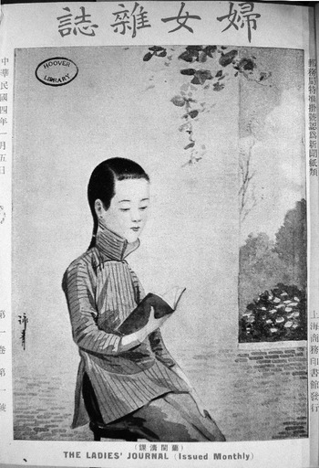
Fig. 1.1 Cover of The Ladies’ Journal, 1:1 (1915): painting by Xu Yongqing
The Object
The Ladies’ Journal, published by the Commercial Press, was one of nineteen new journals created by the press shortly before and after the 1911 Republican revolution to satisfy and profit from public demand for reading matter on modern subjects. From about the turn of the twentieth century, the expanding use of modern printing technology and Western paper by Chinese publishers introduced new formats and sizes, yielding tactile and visual changes that presented editors with unprecedented potential, as well as challenges. Most notably, with the birth of magazines on the Western model and their stiff paper covers came the opportunity, and the competitive necessity, for cover images and text that would most effectively communicate with the magazine's anticipated readership. Over its seventeen-year history, the editors and artists of The Ladies’ Journal evolved a range of conceptual and practical responses to the challenges presented by the new cover format and new technological possibilities.
Until the twentieth century, Chinese books were generally printed on soft Chinese paper from large wooden blocks, with the individual pages folded at the outer edge. Each fascicle of the book was tightly bound with thread and usually protected by a plain paper or cloth cover. On the exterior, there was little to distinguish one volume from another, other than the vertical paper label on which the title might appear, usually in hand-brushed calligraphy.Footnote 3 Volumes in a set of books were usually protected on four of their six faces with stiff wrappers constructed from hand-made paperboard that was lined with good paper and faced on the outside with blue cotton. The sets were distinguished only by a paper label and the bone, ivory, or jade fasteners used to close the wrapping case and were shelved horizontally so that one would see the exposed white ends of the pages rather than the binding or the cover.
Some of the earliest modern periodicals produced in China, such as the Dianshizhai Pictorial (1884–1898), which was photolithographically printed on soft Chinese paper, were distributed with pages unbound and folded in a colored paper wrapper that was printed with the periodical's title, price, and issue number and a brief advertisement of its contents (Figure 1.2). Periodicals of the next generation, in contrast, began to present readers with an aesthetic founded on international models, but modified to the extent deemed necessary by its editors. Women's World began by closely following Japanese periodical design of the day, with an attractive but simple two-color design printed in red and gold on a white background (Figure 1.3). Curved lines and two small clusters of flowers frame the large characters of the magazine title, hand-brushed from right to left in a legible but relaxed kaishu (standard script). This cover, its imagery similar to that of Art Nouveau commercial art in the United States, Europe, and Japan, is elegant, refined, and stylish. The influence of a European enthusiasm for Japonisme in the formation of Art Nouveau makes this style modern in a way that is simultaneously international and Asian. Although the text of the magazine's title, Women's World, states its intention, it does not, in its inaugural issue, yet speak to gender in visual terms.
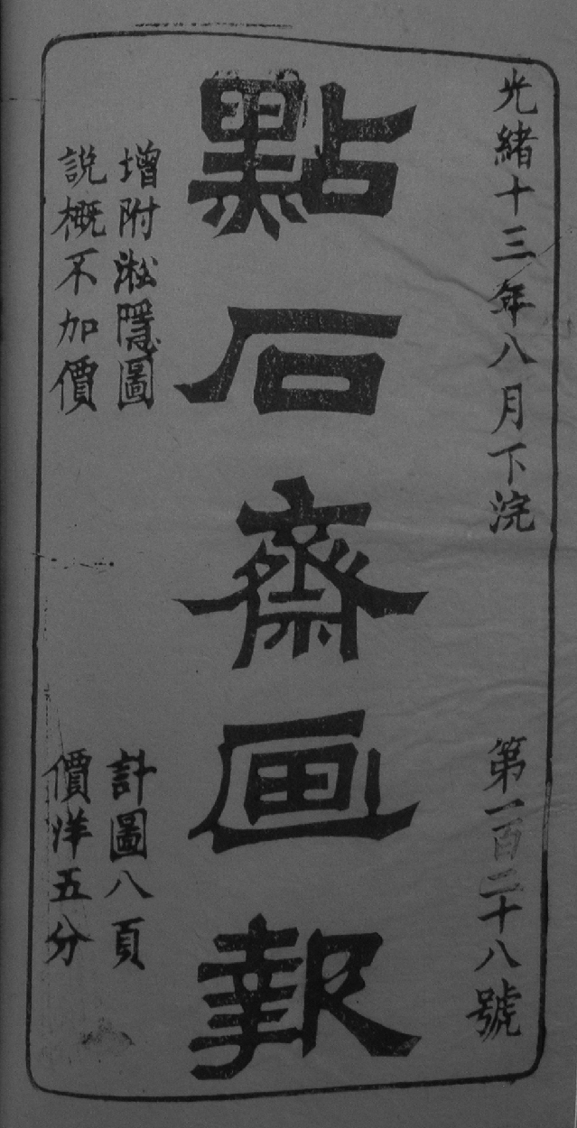
Fig. 1.2 Cover of Dianshizhai Pictorial, 128 (1887.8.xia)
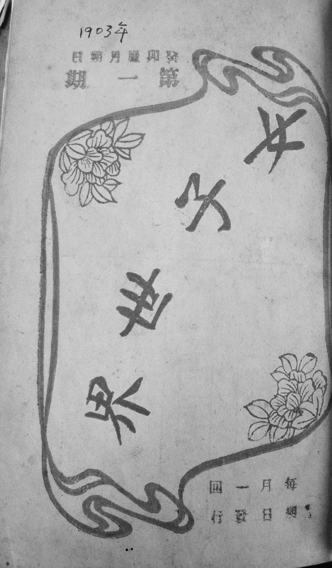
Fig. 1.3 Cover of Women's World, 1 (Jan. 1904)
The Women's Eastern Times broke new ground in the conceptual richness and visual coherence of its full-color cover designs.Footnote 4 With its first issue, published just before the Republican revolution, the editors established a standard for the magazine's subsequent imagery and design. Commercial artist Xu Yongqing (1880–1953), who was trained in the Jesuit painting atelier associated with the orphanage at Xujiahui, depicted two girls looking happily at the cover of the inaugural issue of The Women's Eastern Times (Figure 1.4). A full-page color reproduction of a watercolor painting, it carries a strong sense of narrative – as though caught in a spontaneous moment, one girl has tucked a small Western-style book under her arm and is avidly listening to her friend, who holds the magazine with two hands to better display and inspect its cover. That cover, of course, is the same one, depicting the same two girls looking at it. If carried to its logical conclusion, the image would repeat infinitely, like a hall of mirrors. The difference between this fictional self-portrait of the magazine and that implied optical reality is that here the present and the future coexist in the same space. Moreover, as spectators, our viewpoint is identical to that of the cover girls who are looking at the magazine, suggesting that we are they, or vice versa.

In simplest terms, this striking conceit simultaneously signifies both the potential readership of the magazine, literate young women, and its subject matter. Indeed, as a marketing statement, Xu Yongqing's cover image conveys to potential buyers and subscribers how completely The Women's Eastern Times aims to serve its readers, with this visual trick totally eradicating the distinction between contents and audience, the magazine world and that of reality.
A systematic cover program reinforced this visual definition of the magazine – that it was both for and about young women. Each issue of the journal bears a different image, but the entire run, at least through 1916, shares a consistent theme – images of young Chinese women enjoying their daily lives – and a consistent Western style of illustration.Footnote 5 These are young women who do not always stay at home, and the covers demonstrate in pictorial terms the many possibilities, from reading to aviation, that might occupy the minds and lives of readers at the dawn of China's new era. The cover of issue four continues the publisher's clever self-promotion, with an image of a girl relaxing in a garden chair reading a newspaper, probably intended to be the magazine's sibling, the daily Shibao – The Eastern Times. Continuing to emphasize the desire of modern girls to read modern periodicals, the visually reduplicative cover of issue 13 (1914) takes as its subject a well-dressed young woman gazing intently through a shop window at two rows of magazines on display (Figure 1.5). Readers will immediately recognize that the objects of her interest, depicted with legible cover images, are prior issues of The Women's Eastern Times. The successful establishment of the visual identity of the brand is proclaimed in this painted image. Those who conceived and approved these covers, whether the publisher, his editors, or an art editor such as Xu Yongqing, clearly emphasized the communicative potential of the visual on their covers.
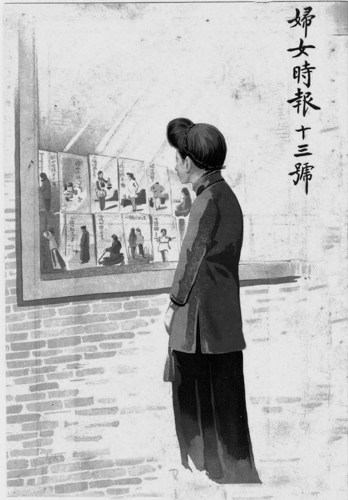
Fig. 1.5 Cover of The Women's Eastern Times, 13 (April 1, 1914): painting by Xu Yongqing
These were not the only Shanghai publishers of the day to headline their editorial agenda with cover design. A more flamboyant effort that survived for fourteen months and seventeen issues was Zhenxiang huabao (True record), founded by artists and revolutionary activists Gao Jianfu and Gao Qifeng early in 1912.Footnote 6 Lavishly printed on high-quality paper, its complex covers, printed in rich colors and even gold, survive as extravagant celebrations of the victory of the revolutionary movement (Figure 1.6). Printed by the Shangwen printing house, the covers created a grand impression that emphasized the seriousness of the publishers’ political and artistic agenda. This idealistically conceived periodical took its cultural mission as primary and financial concerns as secondary. Faced with loss of their subsidy from the Nationalist Party after Yuan Shikai began centralizing his power, however, its editors were forced to close it after the March 1913, issue, when funding collapsed.
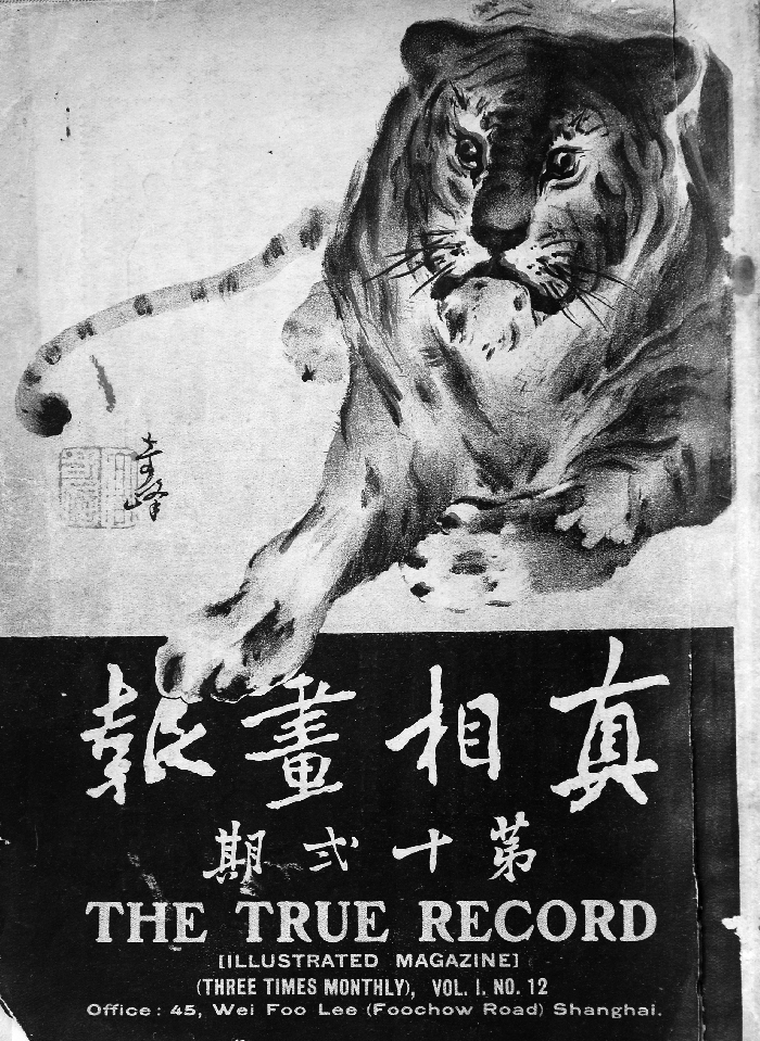
Fig. 1.6 Cover of The True Record, 12 (1912): painting by Gao Qifeng
The Company
In contrast to this important but short-lived publication effort, The Ladies’ Journal survived for a decade and a half (1915–1931). The history of its parent, the Commercial Press, from 1897 to 1948, spans the birth and development of graphic design in China, and the evolving appearance of its publications testifies to the growing importance of a professional practice that operated at the intersection of art, commerce, and persuasion. Over the decade of its Sino-Japanese partnership, 1904 to 1913, the press experimented with letterpress and advanced photographic printing, and it subsequently expanded its repertory to include color lithography, copper engraving, collotype printing, and three-color copper engraving.Footnote 7 Technicians from Japan and the United States were engaged to develop the capacity for sophisticated use of color with newly purchased equipment. By the time The Ladies’ Journal was established in 1915, the press had a decade of experience with the highly successful Dongfang zazhi – The Eastern Miscellany, established 1904, and Jiaoyu zazhi– The Chinese Educational Review, established 1909.Footnote 8 In 1909, Commercial Press even produced its own kaishu type fonts. Its magazines, printed with moveable type on Western paper in the modern magazine format, had stapled bindings and stiff paper covers.
The First Designer
In 1913, after the appearance of Xu Yongqing's striking covers for The Women's Eastern Times, the Commercial Press engaged him to head its illustration department (tuhuabu).Footnote 9 Xu had co-authored a middle school drawing textbook for the firm as early as 1902.Footnote 10 At this chronological junction, however, it may have been more important that he had developed the appealing visual image that gave the cover of The Women's Eastern Times its look. When the new magazine The Ladies’ Journal appeared on the stands, it announced its intention to compete with The Women's Eastern Times in unmistakable terms: its cover images in the first year were a series of twelve images by the same experienced illustrator, Xu Yongqing, which featured young women engaged in various activities of daily life.
Although the Chinese title of The Ladies’ Journal was placed in the margin above the illustration rather than superimposed on the image, as in the earlier journal, the hand of the artist was unmistakable and the compositional concept identical. Perhaps the only thing that differentiated the young women on the first twelve covers of The Ladies’ Journal from their sisters on the first twenty issues of The Women's Eastern Times was the somewhat less adventurous nature of their activities.
Readers of The Women's Eastern Times had encountered many cover images of women who were outside the home, and engaged in specifically modern activities – walking to school, playing tennis, walking dogs, photographing, fishing with rod and reel, posting a letter, donning white gloves, and watching an airplane. The covers of this magazine thus generally describe a world of modern women who were literate, creative, independent, athletic, and mainly urban. The texts on the interior pages are further supplemented by an assortment of images to inspire the imagination – princesses, concubines, female artists, and woman aviators.
Over the course of the first twelve issues of The Ladies’ Journal, Xu Yongqing presented a spectrum of more ordinary women and differentiated the look of The Ladies’ Journal from that of The Women's Eastern Times by his concentration on images of women at home. The first issue announces itself and its potential readers with a girl reading in an urban garden, the red brick wall behind her suggesting that the setting is a modern city and her calm concentration testifying to her enjoyment of the solitary pleasure offered by the book in her hand (cf. Figure 1.1). Although to our eyes today her clothing looks “traditional,” in the context of her time, and in contrast to many of the cover illustrations to subsequent issues, her garments are particularly colorful and stylish – the green fabric of her skirt is echoed in the artfully exposed inner face of her tunic's high collar, displaying it as a carefully designed matched set. On all twelve covers of volume one, the same masthead, Funü zazhi, proceeds in large standard script calligraphy from right to left across the top margin of the page. The date, volume, and issue number are arrayed vertically in the left margin and the government registration and publisher's name appear at right. Below the illustration is printed in four small characters a poetic Chinese title for the cover image. In a small font, the alternate title The Ladies’ Journal is printed in English below the illustration title.
The young woman on the cover of issue two, even more colorfully garbed, is painting, her tools at her side and her watercolor paper tacked to her tilted drafting board (Figure 1.7). She works in a Western-style interior, with an electric light overhead and an ornate clock on the wall. Equally significantly, she is painting in the Western manner, and tacked on the wall to her right appears a completed watercolor landscape painting. Beside her on the table is a square, indicating her familiarity with geometry, a subject introduced in the previous issue and considered the most important scientific foundation of Western perspective. A pamphlet at the edge of her table suggests the benefits of using instructional manuals of the kind that Commercial Press offered on the market and that the cover artist had himself authored. Artist-designer Xu Yongqing has simultaneously brought to the attention of readers a number of his editors’ stated goals: to promote women's art – a topic discussed at length in Doris Sung's chapter in this volume – to emphasize useful scientific principles, to facilitate understanding of Western culture, and to demonstrate the varied occupations of women. “Art,” the editors declared in issue one, “is our national essence, but women's art, particularly that of modern times, rarely reaches readers. If the magazine can collect examples of their artistic achievements it will be a grand event for women.” Moreover, the editors noted that they had added an additional column on art to their original plan of twelve thematic sections, and particularly sought submissions of painting, calligraphy, embroidery, epigraphy, and music.Footnote 11
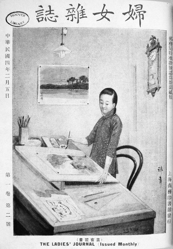
Fig. 1.7 Cover of The Ladies’ Journal, 1:2 (1915): painting by Xu Yongqing
Bridging the gap from ideas with the authority of antiquity to those that might herald modernity was still an awkward process for the editorial team in the second decade of the twentieth century. Moreover, the definition of the newly translated term for art, meishu, remained in flux.Footnote 12 Perhaps acknowledging that Europe prized artistic activities that had never achieved significant status in China, the art (meishu) section aimed to expand the boundaries of Chinese critical theory beyond the high arts of ink painting and calligraphy. In issue one, editor Chunnong (Wang Yunzhang) stated that his project was inspired by shortcomings in the two earlier histories of women's artistic accomplishments, Yutai shushi (Calligraphy from the jade terrace) by Li E (1692–1752) and Yutai huashi (Painting from the jade terrace) by Tang Shuyu, which were limited to women's painting and calligraphy.Footnote 13 He thus combed the art (yishu) section of the Siku Quanshu (The complete library in four sections) for additional examples. The result, organized biographically into the same categories as its source, still included many women famous as calligraphers and painters, but also three Qing dynasty artists in other fields – Gao Mei, a composer for the qin (a seven-stringed zither), Han Yuesu, a seal-carver, and Gu Erniang, an ink-stone carver – along with three more ancient women, Gongsun Daniang, a Tang dynasty sword-dancer, Huang Daopo, a Yuan dynasty weaver, and Lu Meiniang, a Tang dynasty embroiderer. Issue two summarized biographical entries for eleven painters and calligraphers, along with one composer, one seal carver, and one embroiderer. The articles may have served their purpose of informing young women of these earlier histories and of the names and notable reputations of a few of their predecessors, but they did not succeed in expanding upon the Jade Terrace histories in any significant way and were dropped in later issues. The question of women's artistic production remained important to the editorial agenda, however, and pages with black-and-white or color reproductions of paintings by female artists were bound into each issue, along with photographs of girl's school principals and other notable figures in the world of literate women. These pages were printed on more expensive coated paper for better results than could be obtained on the rougher paper used for the text.
In issue three, the art section was given over to a three-part series on embroidery, and Xu Yongqing's cover again highlights the contents of the journal by depicting a young woman earnestly bending over her needlework (Figure 1.8). The setting is the interior of a traditional house, its floor paved with rectangular grey tiles, the embroiderer's work mounted on a simple frame and illuminated by diagonal rays of natural light that filter into her high-ceilinged room. We move outside on the April cover, where pink blossoms in the distance evoke springtime and, to continue the theme of silk working, a young countrywoman picks mulberry leaves to feed silk worms. Expanding the female occupations rendered on previous The Ladies’ Journal covers, Xu Yongqing depicts a pair of girls picking tea leaves on the cover of issue five, suggesting their contributions to the gustatory pleasures of the urban population (Figure 1.9). Injecting the most prosaic housework with a touch of romance in issue six, a girl washing clothes on the bank of a stream is depicted gazing poetically at the flight of distant geese. We return to the domestic interior in issue seven to find a girl spinning thread in an expansive home with grey tile floors of traditional architecture (Figure 1.10a). The settings in the cover illustrations for issues eight through eleven may be metropolitan, but are sufficiently generalized to be typical of the aspirations of a wide range of potential readers. Ensuring that cuisine is not neglected, issue eight's cover girl slices vegetables in a comfortable but simply furnished Chinese kitchen, with a steaming wok behind her (Figure 1.10b). The cover images return to a thoroughly Western interior and a new Western occupation with issue nine, on the cover of which appears a nurse, garbed in crisp white uniform, preparing medicine (Figure 1.10c). Like all the interiors depicted on these covers, the setting is clean and hygienic. The matron on the cover of issue ten sits in a tidy room with dark woodwork, a hardwood floor, and a stone outdoor patio, presumably an elegant urban residence (Figure 1.10d). The labor of the cover girls on the last three issues of the year returns to textile production. The one on issue eleven stitches fabric, her basket and scissors at her side. Finally, on the cover of issue twelve, a pretty girl wearing the blue tunic and black skirt typical of Xu Yongqing's traditionally attired women turns towards us from her seat at a large loom (Figure 1.11). The oil lamp behind her contrasts with the electric light illustrated on the cover of issue two. Six of the images are rendered in modern metropolitan settings: the other six women are placed in more traditional Chinese rooms that could be almost anywhere in the Yangzi River valley area – in Shanghai's old city, in Suzhou, or in any one of the prosperous smaller cities of the region.
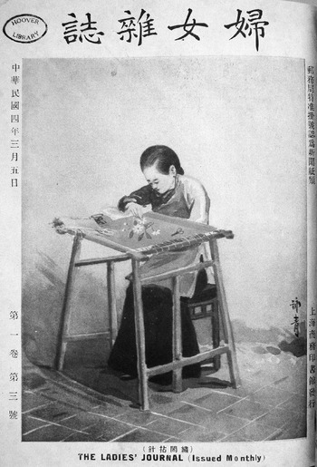
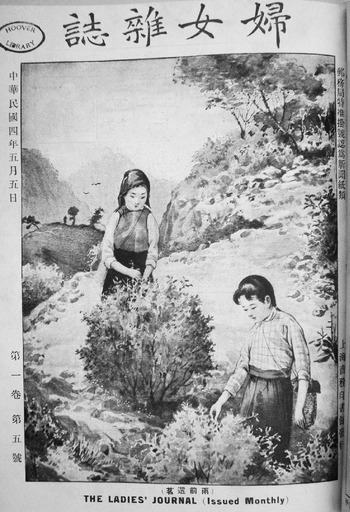
Fig. 1.9 Cover of The Ladies’ Journal, 1:5 (1915): painting by Xu Yongqing
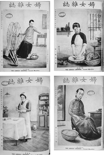
Fig. 1.10 Covers of The Ladies’ Journal, 1:7–10 (1915): paintings by Xu Yongqing
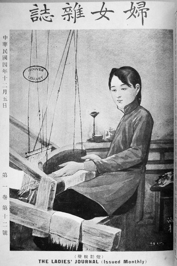
Fig. 1.11 Cover of The Ladies’ Journal, 1:12 (1915): painting by Xu Yongqing
Although published in Shanghai, and painted by an artist who had grown up in the rural suburbs of the city, the generalized images on the covers of this first volume are not primarily urban and seem targeted to the wider geographic reach of the Commercial Press's network of thirty-six branch booksellers in cities, large and small, throughout China. Indeed, Xu Yongqing's illustrations echo the editorial postscript to the first issue. Perhaps most important, their variety and careful balance of setting and occupation suggest the national scope of the publication's aim: “Our country is very large, and the situation in every different region is different. We will be grateful to writers who can carefully explain the customs and professions of your areas.”Footnote 14
Equally important, Xu Yongqing's covers are directly related to topics specifically mentioned by the editors in the respective issues of the journal – hygiene, home management, handicrafts, and cuisine – and they echo the mutually reinforcing relationship between the magazine's contents and the advertisements for Commercial Press publications on its pages. Reading horizontally, we realize that in the first issue the ads introduce texts specifically for girls on Chinese literature, moral cultivation, and choral music, as well as a range of general textbooks – elementary arithmetic, Chinese, and ethics, and secondary science, geography, history, mathematics, and Chinese – along with edifying works on hygiene and poetry, an English–Chinese dictionary, travel guides for China, Shanghai, and West Lake, diaries, household budgets, handicraft and sewing manuals, letter-writing manuals, reproductions of Tang, Song, Yuan, and Ming calligraphers’ writings, maps of the European war, and art products – art and photography albums, art reproductions, and postcards.
The first year's covers for The Ladies’ Journal thus established an identity for the magazine, displaying the range of modern and traditional women who would form its subject matter. Whether all of them, the pickers of tea and mulberry leaves, the embroiderer, the spinner, and the weaver, were likely to read this magazine is less certain, but the images created by Xu Yongqing and the magazine's claims that art is the national essence both aimed to elevate the status of women's work in the eyes of male and female readers alike.
A distinctive, and sometimes even disorienting, new cover look was introduced for every one of the first five years of the magazine, and each, in its own way, contributed to the editorial agenda. In the second year, 1916, the focus of the color images changes from women as subject matter to art made by women. Each of the covers features a rectangular full-color reproduction of a Chinese painting framed by a complex botanical arabesque. Like that of the first year, the design is essentially Western, but it now assumes a hybrid form. The Chinese masthead appears in the decorative clerical script popular among enthusiasts of epigraphy in Shanghai, balanced below by its large English title set in a curvilinear Art Nouveau font to match the background ornament (Figure 1.12).
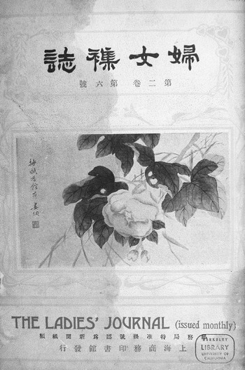
Fig. 1.12 Cover of The Ladies’ Journal, 2:6 (1916): painting by Lou Tong
The artist of the bird-and-flower paintings on the cover of issues seven and eight (Figure 1.13) was Jin Zhang (Jin Taotao; 1884–1939), the British-educated daughter of a prominent Zhejiang family (also discussed in Sung's chapter). She had studied in Shanghai, England, and France by this time, but was talented in Chinese painting, thus exemplifying a certain ideal of the well-educated cosmopolitan Chinese woman. Her older brother, the legal expert Jin Cheng (1878–1926), a former Qing official who continued to serve in the new Republic, recruited her to teach in the vigorous traditionalist painting group he led in early Republican period Beijing. She would go on to exhibit her paintings in major national and international exhibitions of the 1920s and 1930s and was best known for her paintings of fish. Flower paintings such as this were well regarded as well.Footnote 15
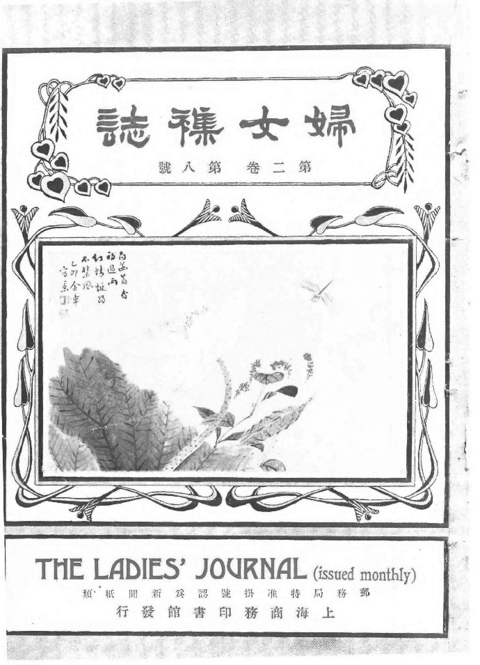
Fig. 1.13 Cover of The Ladies’ Journal, 2:8 (1916): painting by Jin Zhang
Oddly, although the artists of the painting reproductions that appear in the magazine are usually listed in the captions and the table of contents, those who painted the cover images are rarely identified, and, as is more common, the art editor in charge is never mentioned. The artist of the central cover image for the first half of 1916, six different bird-and-flower album leaves, may be read from signatures and seals as the still unidentified, but possibly female, Lou Tong (sobriquet Hongye ciren, Poet of Red Leaves). Xu's and Jin's paintings also bear legible signatures, but most cover paintings and designs are anonymous. Nevertheless, by virtue of the signed paintings on some covers, the theme of women artists is conspicuous, and a Western Art Nouveau design is established as the magazine's new look. This pattern survives into 1917, when black-and-white reproductions of Chinese narrative paintings become the ornamental centerpiece of the fussy floral design (Figure 1.14).
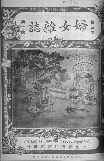
Fig. 1.14 Cover of The Ladies’ Journal, 3:10 (1917)
In the issues of 1918 and 1919, however, there is a conceptual shift in a more Asian aesthetic direction. The featured artist in volume four, 1918, was the famous woman painter Wu Shujuan (1853–1930) (Figure 1.15). Primarily a painter of landscapes, a traditionally masculine genre, she was paired by admirers with the renowned male painter Wu Changshi (1844–1927) as “the two Wu.”Footnote 16 Her reputation was furthered by the selection of her work for exhibition in an international exposition held in Rome in 1910. These twelve covers thus demonstrate the accomplishments of a Chinese woman artist notable on the international stage.Footnote 17
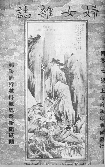
Fig. 1.15 Cover of The Ladies’ Journal, 4:7 (1918): painting by Wu Shujuan
Thematically, therefore, the covers take Wu Shujuan as a model to demonstrate the potential of women creative artists, but simultaneously put forth a larger argument about the position of Chinese culture in the international milieu. Moreover, from an artistic perspective, they mark a shift in approach that parallels larger trends in the Shanghai art world of the day. Unlike the paintings on the covers of volumes two and three, which were subordinated to a dominating Western-style commercial design, the Wu Shujuan covers foreground her work, monumental Chinese landscape paintings, as high art. The cover has now banished the previous Art Nouveau ornaments, replacing them with a plain background design that, in totality, suggests the effect of a Chinese painting. Around the black and white vertical landscape image is printed a simple border of textile patterns in a single subtle hue of green, yellow, or grey, as though to form the silken borders of a traditionally mounted painting. The Chinese masthead is in a plain, handwritten standard kaishu script, and the English title has retreated to a small strip below the painting.
This emphasis on fine arts over commercial art on these covers shows changes occurring in the Chinese art world making their way into the pages of the journal. The Shanghai Art Academy, which opened in 1913, was founded as a school of Western painting, but in practice, this meant commercial art – the skills in drawing, watercolor, and oil painting that would enable artists to work as illustrators and designers in the new Shanghai publishing industry and theatre world. From 1915, its faculty included Xu Yongqing and Shen Bochen. However, with the increasingly widespread acceptance of Cai Yuanpei's theories of aesthetic education, which were published in 1917, as well as the return from study in Japan of several men who taught at the academy, the modernizers in the Shanghai art world quickly realized that this school for commercial art did not fulfill the more elevating role of an academy of fine arts.Footnote 18 From 1918, Shanghai Art Academy, which began to supply the publishing industry with talent, also took the lead in promoting new style art education. It was soon followed by establishment of the Beijing Art Academy and the implementation of co-education in both schools in 1919.
In accordance with these developments, the journal's focus on fine art covers in 1918 would continue in the 1919 issues, which reproduce figure paintings by the famous nineteenth-century Shanghai-school painter of elegant women Hu Xigui (1839–1883). The two volumes of The Ladies’ Journal, which reproduce high-quality Chinese paintings rather than commercial art on their covers, are thus in harmony with both the overall aims of the magazine and broader trends in art circles of the day.
Perhaps considering that bird-and-flower paintings were common subjects for female painters, the art department turned back to this theme as the central cover image of the 1920 issues, publishing paintings dated 1801 by Zhou Li (Figure 1.16). By 1920 the interior pages were more fully decorated with line drawings, and almost every section or article was supplied with an ornamental header. Even the photographs of paintings on the covers are now ornamented with a pale figural border, somewhat incongruously depicting little boys holding sets of string-bound books overhead as they dance on fluttering ribbons. The covers of volumes four through six (1918–1920) span the three major genres of Chinese classical painting, namely landscape, figures, and birds-and-flowers. In May of 1919, Luo Jialun published a scathing critique of the Commercial Press magazines, including The Ladies’ Journal, which led the press to reconsider its editorial strategy.Footnote 19 During this period, 1919–1920, Wang Yunzhang implemented a shift from classical Chinese to the newly fashionable baihua (colloquial) language, and, to satisfy demand for new content, staff writer Shen Yanbing (best known under his pen name Mao Dun) was asked to contribute articles on women's issues.Footnote 20 Wang Yunzhang's last two years as editor of the journal, however, show no dramatic break with the magazine's previous graphic design.
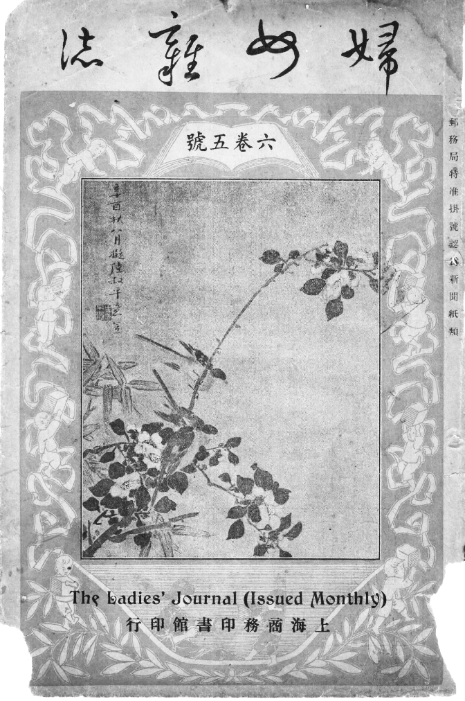
Fig. 1.16 Cover of The Ladies’ Journal, 6:5 (1920): painting by Zhou Li, dated 1801
The Radical Era
In contrast, the term of new editors Zhang Xichen and Zhou Jianren in 1921 was launched by a strikingly ornamental cover, a single image used for an entire year (Figure 1.17). The magazine's designers turned away from the focus on the high art of Chinese painting that had dominated recent volumes and returned to an image made as a commercial ornamentation. The elegant drawing, a peacock framed by the moon, is decorative and cosmopolitan, suggesting an exoticism in which East Asian and Western viewers might equally partake. Most conspicuously, it is not identifiably Chinese. The most radical change in the magazine's look, however, occurred in the following year, 1922, with more experimental and less consistent visual ideas at work and a conspicuously greater emphasis on text than image. The table of contents began to appear on the cover for the first time, even replacing the cover image. Issue four of volume eight announced a special issue on divorce with a plain but bright red-and-white checked cover on which no other image was attempted (Figure 1.18).

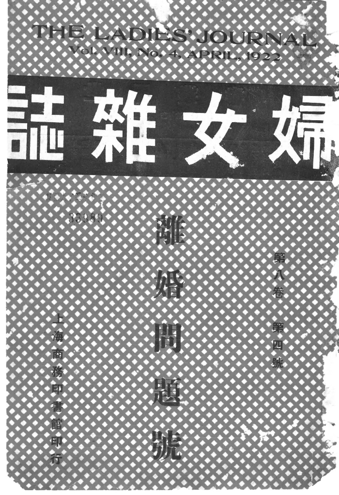
Fig. 1.18 Cover of The Ladies’ Journal, 8:4 (1922): special issue on divorce
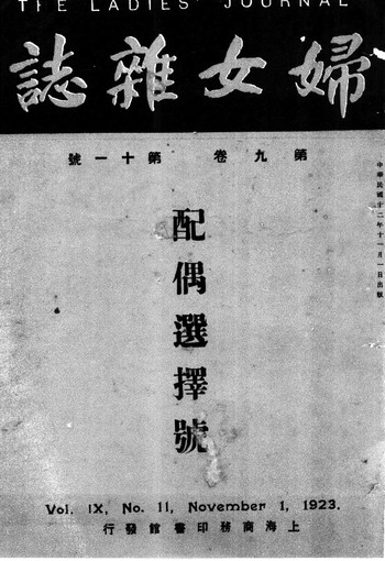
Reading horizontally, one sees that these changes on the cover are congruous with changes inside the journal: Under Zhang Xichen, the magazine shifted to more controversial aspects of feminism, including women's sexual emancipation, while deemphasizing the practical aspects of family life, child-rearing, and housekeeping that were found in earlier issues.Footnote 21 This stance, developed in the context of New Culture theoretical and social ferment and in response to attacks on the magazine for conservatism, is not directly reflected by images on the magazine's covers. What may be notable is what is not on the covers. First, the revival of Chinese paintings as cover motifs between 1916 and 1920 completely ceases. For 1923, editors Zhang and Zhou settled on a stark unfigured cover. As though needing nothing to attract readers beyond its sophisticated contents, the cover eschewed visual complexity and had no decoration other than plain color and straightforwardly laid out words. An editorial innovation of this period was the frequent publication of thematic special issues. Number eleven of 1923, for example, announced the title of one such number – Choosing a Spouse, in black type against a bright blue background (Figure 1.19). It is not currently known who designed such covers, but they are broadly in keeping with the simplified functional designs promoted by the Bauhaus and other European proponents of modern design in the same period.
The last two years of Zhang and Zhou's editorship were devoted to pushing the boundaries of conventional thinking even farther, but the pair chose not to carry forward a similar revolution in cover design. All twelve issues of 1924 (volume 10) were decorated with comfortable images of paired birds on a flowering branch signed by the male artist Li Licheng (1881–1942) (Figure 1.20). Li, a contemporary painter from Shaoxing, was a maternal cousin of the magazine's editor Zhou Jianren and his more famous brothers Lu Xun (Zhou Shuren) and Zhou Zuoren.
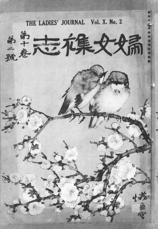
Fig. 1.20 Cover of The Ladies’ Journal, 10:2 (1924): painting by Li Lichen
The year 1925 opened with the special issue that would eventually cost Zhang Xichen his editorship – The New Sexual Morality. The covers of some of the 1925 issues were strikingly new – bold and lyrical versions of Art Deco botanical motifs possibly stimulated by art world excitement about the International Exhibition of Decorative Art soon to open in Paris (Figure 1.21).Footnote 22 This Asian version of Art Deco was most brilliantly displayed in the designs of Sugiura Hisui (1876–1965), the lead designer for the Mitsukoshi department store and a pioneer of Japanese graphic design. Work such as his seems to have inspired a number of Japan-oriented Shanghai designers, including Feng Zikai (1898–1975). This striking and innovative cover style suggested similarly forward-looking contents.
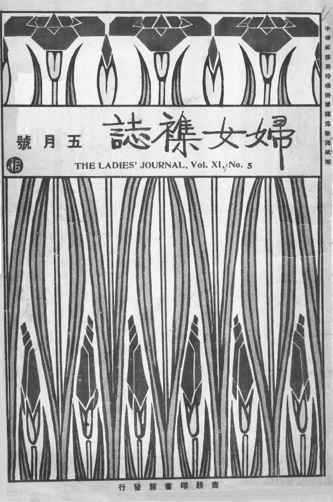
Fig. 1.21 Cover of The Ladies’ Journal, 11:5 (1925): design by “Xiang”
The magazine covers chosen during the term of Zhang Xichen and Zhou Jianren are as simple as the ideological issues raised in the magazine's text are profound. In contrast, the interior pages followed a course of increasing visual complexity. The upper margin of the table of contents typically published lyrical landscape drawings, and almost every section and in some cases every article was decorated by an ornamental line drawing, usually in an Art Nouveau style. The most elaborate chapter headings drew attention to articles by Zhang Xichen himself: “What Is the New Sexual Morality?”Footnote 23 in the special issue of the same title (Figure 1.22) and “The Female Student's World View,” in the special issue on woman students.Footnote 24 Special issues routinely had additional title pages, which were often ornately decorated. They were not particularly avant-garde by international standards, some reminiscent of Aubrey Beardsley, but they remained entirely “Western” in look.
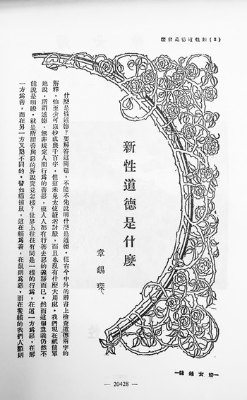
Fig. 1.22 “What Is the New Sexual Morality?” The Ladies’ Journal, 11:1 (1925)
Modern graphic and book design began to separate themselves somewhat from illustration and advertising in the mid- and late 1920s. With the appearance of Art Deco, and later Bauhaus- and Constructivist-inspired designs, the second half of the 1920s was the period when a fully cosmopolitan modernist look began to appear regularly in Shanghai publications.Footnote 25 Zhou Jianren's brother, Lu Xun (1881–1936), was one of the earliest editors to concern himself seriously with cover design.Footnote 26 He had insisted on providing his own cover designs for some of his early book publications, including his 1909 Stories from Foreign Lands and his 1923 translation Peach-Colored Cloud, and soon after began commissioning young artists to design covers for some of his books and magazines. One of his favorite designers was Tao Yuanqing (1893–1929), whose work was simple and direct, sometimes with a slight Japanese flavor, and who avoided the fussy Victorian styles that characterized early-twentieth-century Chinese magazines, including The Ladies’ Journal issues of the 1910s. The 1925 covers of The Ladies’ Journal are similarly in the new, more direct and simple cosmopolitan style (see Figure 1.23).

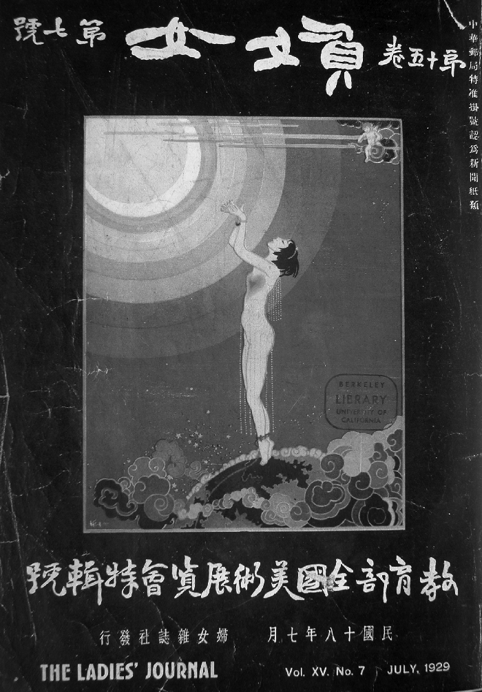
By end of the 1920s, when the journal was edited by Du Jiutian, The Ladies’ Journal began to solicit individual covers from commercial artists of the day. The seventh issue of 1929 (vol. 15) devoted an entire issue to the First Ministry of Education National Fine Arts Exhibition, with a particular focus on female artists whose work was selected for the show. Extensively illustrated, and filled with biographies of women who exhibited in the Shanghai exhibition, this special issue made a greater contribution to recording and publicizing the careers of female artists than any other in its seventeen-year history. The striking cover was adorned with an Art Deco image in which a female nude towers over the earthly globe on which she stands, gracefully raising her arms toward a celestial orb (Figure 1.24). Not designed specifically for the magazine, this was one of five “designs” by the male artist Jiang Zhaohe that had hung in the applied arts section of the national exhibition. Critic Li Yuyi singled it out for particular praise as representing women's spiritual liberation, calling attention to the bonds that tie her ankles to the earth, the shackles of family and society that the young woman must resist. She extends her bound hands toward the auspicious light of the moon, toward the goddess of beauty in her lunar palace, yearning for freedom.Footnote 27 While the eye-catching quality of the image and the critic's enthusiastic explication may bring attention to this ambitious special issue, the artist's addition of a cupid in the upper right is a diversion from the issue's main theme, the seriousness and success of women artists of the day. The remaining covers of 1929, possibly selected, like this, from pre-existing designs rather than commissioned for the journal, are varied in style and theme in an almost random way.
The Final Phase: A New Cosmopolitanism
The strategy Commercial Press used at the end of 1929 to reestablish a more coherent visual identity was similar to that employed in its inaugural issues – it simply borrowed talent from its competitors. The covers of the 1930 issues all feature the same bold and attractive Art Deco design (Figure 1.25). Beginning in that year, and continuing through the first half of 1931, drawings and decorations on the interior pages of The Ladies’ Journal bear signatures such as Baceo, Bacceo, and J Pacco (see Figure 1.26). All were part of the artist Qian Juntao's (1906–1998) playful transformations of his artistic and editorial identity. The Chinese characters of the artist's studio name, on which these signatures are based, look as though they should be Japanese (白川尾 Mandarin: Baichuanwei). In these versions, however, he has romanized his pseudonym in an Esperanto version of its pronunciation in his native Zhejiang dialect.Footnote 28 The result now looks European, not Japanese. On other occasions, particularly in his work for his primary employer, Kaiming Book Company, he published under female pseudonyms – a common practice, as Grace Fong explains in her chapter, in early-twentieth-century poetry as well.
Fig. 1.25 Cover of The Ladies’ Journal, 16:11 (1930): design by Qian Juntao
Fig. 1.26 Table of contents for The Ladies’ Journal, 17:1 (1931): ornaments by Baceo (Qian Juntao)
When Qian Juntao announced his public launch into the field of graphic design in 1928, he began a long career that would mark him as one of the most consistently accomplished of the Japan-oriented modernist designers in Shanghai, and one of the first to openly and consistently claim design as his primary profession.Footnote 29 Following the pattern commonly seen among Chinese professional painters, he asked his teacher,Feng Zikai, to draw up a price list for his designs. In this public recommendation, Feng praised his student highly for his gifts as a graphic designer and pointed out the significance of book design in influencing the mood of readers – “it may symbolize the contents, and it can prepare people's mood and attitude for the reading before they even open the book. Like the overture of an opera, it can stimulate the feelings of the viewers, and get them in tune with the drama…” The price list was published in Dushu zazhi (Readers’ magazine) in 1932, as well as in Xin nüxing (New woman) and as a flyer.Footnote 30 Qian Juntao worked freelance for a number of Commercial Press publications, including Xiaoshuo yuebao (Short story magazine), Eastern Miscellany, The Educational Review, and Xuesheng zazhi (Student magazine), throughout this period, although he later listed his editorship at the Kaiming Book Company as his primary job.
He brought a very modern sensibility to his work, both in design and lettering, and his covers therefore speak of a cultural world that is fully up to date, flowing forward in the same aesthetic stream that carried the artists of the West and Japan. This is evident in his introduction of modernist lettering and abstraction to the masthead of The Ladies’ Journal (see Figure 1.25). Qian provided most of the cover designs and ornamentation for the interior features for The Ladies’ Journal throughout the magazine's final two years.Footnote 31
Qian Juntao's designs for the journal were generally more lyrical than was his abstract design for Student Magazine (Figure 1.27) (and more often signed with a Chinese seal, Juntao, than with Esperanto). He often used floral motifs, which were closely related to Japanese design and were a hallmark of his style in the 1920s. The 1930s would bring a more global look to Qian's work, as it did to Chinese publishing as a whole. Designs inspired by Egyptian archaeology brought a more exotic form of Art Deco imagery into his covers for the first three issues of The Ladies’ Journal in 1931.
Fig. 1.27 Cover of Student Magazine, 18:1 (1929): design by Qian Juntao
While Qian Juntao stopped work for The Ladies’ Journal after its chief editor, Ye Shengtao, departed in the spring of 1931, the magazine continued to run equally striking cover designs by Qian's younger colleague, Zhang Lingtao, and other designers in the second half of 1931. In the magazine's last years, with these innovative modern designers, The Ladies’ Journal reassumed the cosmopolitan look with which it had begun. International standards had changed dramatically since 1915, however, with the widespread adoption of modernist forms in commercial design, and the decision makers at Commercial Press chose The Ladies’ Journal's designers from those who worked in this new international style.
When a brief war with Japan broke out in Shanghai on January 28, 1932, one of the first casualties of the battle was the headquarters of the Commercial Press, located adjacent to the Japanese district of Shanghai. In addition to raining bombs on the printing factory, arsonists burned to the ground the building in which the magazine offices were located. This could not have come at a worse time, after the great stock market crash of 1929 had plunged much of the world, and thus some potential advertisers, into financial crisis. Publication of Eastern Miscellany was soon resumed despite the great practical difficulties faced by the press, but The Ladies’ Journal, having recently lost much of its staff, was never revived as an independent publication. The last issue of 1931, its cover an abstracted image of a fair-haired girl and a dove, was its final appearance.
The Commercial Press, which survived for more than half a century, was more notable for its economic success than for innovations in aesthetic language or high production values. Yet the seventeen-year run of The Ladies’ Journal spans a crucial formative period of China's magazine industry, one in which the various goals of edification and entertainment, modernization and profit, were pursued against the unpredictable background of contemporary political and economic events. The look of the magazine, as defined by its cover, was crucial to its identity. The lyrical images of gentle, industrious women that greeted readers in 1915 spoke to a new regard for women as cultural consumers and as a focus of educational, economic, and social concern. While women as participants in constructing a new society are demonstrated by some covers in the magazine's first half decade, their real or imagined tastes for floral and figural fine arts imagery become dominant in its first transitional phase as the press implemented a radical linguistic shift from classical Chinese to the modern written language in 1919 and 1920. This break with the past was marked in 1922 by covers of the new The Ladies’ Journal that consistently rejected traditional Chinese imagery.Footnote 32 By the end of the 1920s, as pictorial magazines such as Young Companion (Liangyou huabao) and tabloids like Pictorial Shanghai emerged as potential competition for the attention of Shanghai readers, Commercial Press reaffirmed the importance of the visual by seeking eye-catching imagery. Covers for 1928 and 1929 span rather backward-looking figural images in watercolor, conservative Japanese-style floral imagery, epigraphic-style calligraphy, Art Deco designs and lettering, and finally even photography.Footnote 33 This diversity may be construed positively as trying to offer something for every class of reader, or negatively as lacking necessary coherence. In terms of the editorial message, the increasing exposure for work by women artists was also part of a message the magazine as a whole was trying to convey. In its last phase, under the editorship of Ye Shengtao (who had signed the price list for his designer friend Qian Juntao in 1932), the magazine sought clarity of cover design, with a consistent focus on Art Deco images that speak to a gentle cosmopolitan stylishness.
By its very final months, which corresponded to the dawn of Shanghai's great era of 1930s graphic design, the publisher consistently ran striking modern cover designs on The Ladies’ Journal. The September 1931 issue presents a young woman, her fashionably cropped hair blown in the wind, who bends her torso expressively as she turns to gaze through a window (Figure 1.28). But the vivid black and white pattern of her short dress extends over her whole form, including her head, converting the woman into a patterned silhouette. Over her head, as she looks out the window, grows a tree. Is she indoors or out? Is it night or day? The modish pattern of her garb and the elegance of the tall, European-style window beside which she stands are the utmost in high style, a quality that the surrealistic puzzle of the image and the modernist masthead only emphasize. This pictorial ambiguity, with a woman standing intensely alert, lost in thoughts we cannot read, suggests a more complicated agency for this female subject than the more straightforward pictures of her sisters who read, painted, sewed, or cooked on the covers of The Ladies’ Journal a decade and a half before. Indeed, while obviously not the intent, this uncertain image might even be read as foretelling the end of The Ladies’ Journal. While it was certainly the destruction of the Commercial Press facilities in 1932 that precipitated the magazine's demise, the publishing boom of the 1930s, with the appearance of so many more beautifully designed and printed modern magazines, as well as the increasingly numerous and diverse possibilities for culture, profession, and life-style that this decade of prosperity brought to Shanghai, may have made it impossible for a magazine like The Ladies’ Journal to continue to try to speak to or for “all Chinese women,” as it had attempted for seventeen years.
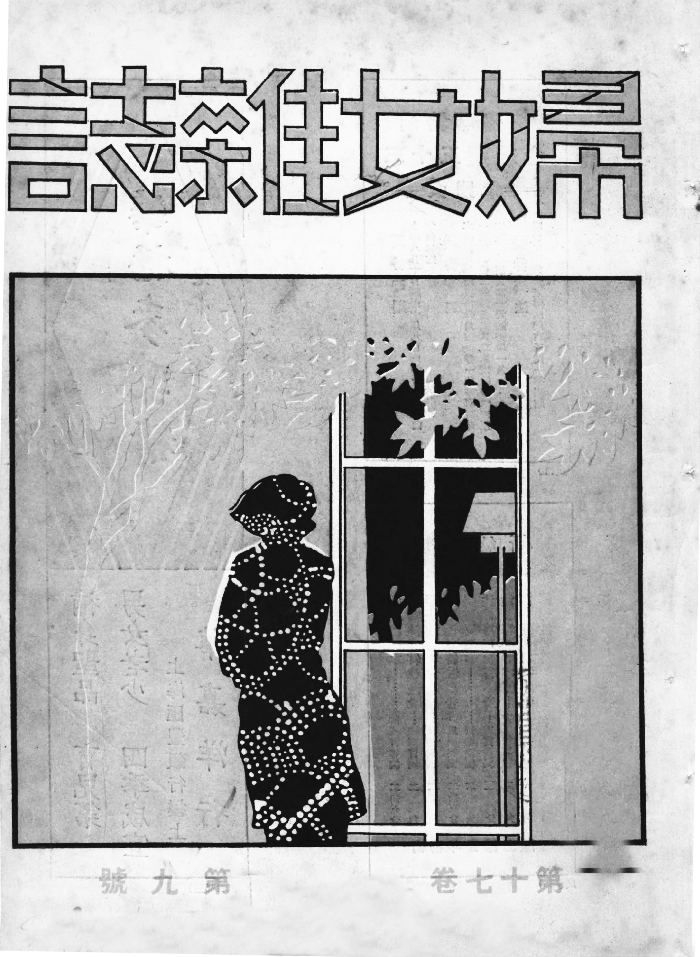
Fig. 1.28 Cover of The Ladies’ Journal, 17:9 (1931)
Just as the concerns of its potential audience and the editorial agendas of the press and its editors evolved over the seventeen-year run of the magazine, so did its visual identity. Though it was assumed to target an audience of women, many of its readers were, in actuality, like the majority of its editors and authors, men for whom the situation of women in modern China was of personal, social, or intellectual concern. Its artists and editors triangulated the diverse desires of its publishers and its public against their own ideals and practical compromises. The evolving and often contradictory standards that it set for itself represent major trends in the Chinese publishing world and in the rapidly evolving culture of which it was a part.
Reading horizontally, we realize that the cover images developed at the Commercial Press for The Ladies’ Journal usually pushed forward its editorial agendas. No doubt they were also affected by certain practical limitations, ranging from personnel to budget to schedule, and, as we have seen, reading situatedly, by the relationships between managers, editors, and artists; nevertheless, the conspicuous changes over the years give visual form to transformations in the rapidly modernizing domestic and international environment in which the magazine was published. However one may wish to evaluate the changing editorial approaches that might appear on its interior pages, whether to consider the journal's approach more or less progressive in the context of its time, the cacophonous nature of the early twentieth century debates about women,Footnote 34 along with the social transformations then under way, are well reflected in its cover design. From its coherent initial imagery in 1915 to the visual diversity of its final year, 1931, The Ladies’ Journal offered its readership a convincing demonstration of the centrality of the Chinese woman in a modernizing and internationally oriented urban world.


