Metaphor Representation and Analysis of Non-Spatial Data in Map-Like Visualizations


1
School of Resource and Environment Sciences, Wuhan University, 129 LuoYu Road, Wuhan 430072, China
2
College of Geomatics, Shandong University of Science and Technology, 579 QianWanGang Road, Qingdao 266590, China
*
Author to whom correspondence should be addressed.
ISPRS Int. J. Geo-Inf. 2018, 7(6), 225; https://doi.org/10.3390/ijgi7060225
Submission received: 25 April 2018
/
Revised: 27 May 2018
/
Accepted: 13 June 2018
/
Published: 19 June 2018
Abstract
:Metaphors are rhetorical devices in linguistics that facilitate the understanding of an unfamiliar concept based on a familiar concept. Map representations are usually referred to as the second language of geo-science studies, and the metaphor method could be applied to maps to visualize non-spatial data via spatial element symbols. This study performs a cross-domain application of the map representation method through a map-like visualization. The procedure first designs the map layout with the aid of the Gosper curve. Under the guidance of the Gosper curve, the leaf data items without spatial attributes are arranged on the space plane. Through the bottom-up regional integration, one can complete the construction of the map framework. Then, the cartographic method is used to complete map-like renderings that reflect different data features through diverse visualizations. The map representation advantages, such as overview sensing and multi-scale representation, are also reflected in the map-like visualization and used to identify the characteristics of non-spatial data. Additionally, the electronic map provides a series of interactive convenience features for map observation and analysis. Using the help of map-like visualizations, one can perform a series of analyses of non-spatial data in a new form. To verify the proposed method, the authors conducted map-making experiments and data analyses using real data.
1. Introduction
The physical space filled with geographic elements and phenomena is essential and familiar in human life, providing people with the basic context, and human beings interact with it in various forms. People use map tools to describe the spatial distribution and spatial characteristics of objects. However, in the information age, people’s living space has expanded from the traditional physical space to the combination of physical space and virtual space, and the proportion of virtual space is increasing [1]. Textual expressions, with the emergence of a large amount of pure semantic data, often represent a difficult medium for meeting the needs of data exploration in today’s data-rich society. Many researchers have considered using maps to describe virtual space and express abstract non-spatial data, which belongs to the field of spatialization [2].
Spatialization is a method of visualizing data that uses a spatial metaphor to map the high dimension data of the information space to a lower dimension space that is easier to understand [3]. This method not only has the advantage of providing visual overview but also can use the audience’s spatial imaging abilities. The use of spatial objects provides tangible support for the expression. Map representations, which are frequently referred to as the second language of geo-science studies, can apply the metaphor method to visualize non-spatial data via spatial element symbols. Spatial metaphors represent an important rhetorical construct in language representation. Living in physical space, people establish a strong sense of the spatial dimension. Through building connections between an abstracted concept and a real spatial object, one can share similar conceptual meanings based on the spatial direction, distance, height, and so forth. [4]. People often use spatial objects as a metaphor for abstract concepts, such as the expression “Life is like a river”. Compared with abstract concepts, the spatial objects lead to a more direct sensory experience and thus are more likely to be perceived. Map-like visualizations represent a common form of expression in spatialization that uses map forms to express non-spatial data and can exploit the convenience of maps in cognition [5]. A map that follows certain mapping rules can be used to correctly reflect data and the data structures using symbolic language, from the aspect of information expression. Regarding the aspect of information receival, people are trained to read maps in the early learning period [6], and all types of map products may be encountered throughout daily life. Based on the cognitive convenience established by a continuous interaction with a map, the information expression of a map can be easily accepted. Map-like visualization not only provides a new perspective for observing and analyzing data but also can greatly broaden the application range of maps by effectively transferring the methods and techniques of cartography.
As a cognitive tool, map visualization integrates data management, visual expression and analysis, and results presentation [7], and it deeply affects people’s thinking, decision-making, and behaviour. Maps, such as topographic maps that express topography and navigation maps used for location and path finding, are rich in forms of expression. Diverse forms of expression can be used to display data in many ways and reflect different data features. However, the expression form of the current map-like visualization is still limited and few works can reflect multiple data characters in different map forms. This affects the flexibility of the map-like visualization. Additionally, due to the lack of in-depth integration with map features and technologies, the current map-like visualization is often used as a tool for data presentation to analyze some shallow rules. How to design map-like visualization and make it undertake tasks that are difficult to do in a conventional manner is a problem that needs to be considered and solved. Since we use map metaphors, we should not only express the data in the form of a map but also use existing map methods to fully discover the application potential of a map [5]. Based on the mental map produced by map reading, a comparative analysis of the main features between many images can be conveniently performed. The multi-scale feature of a map meets the needs for data observation and analysis from different scales [8]. Furthermore, combined with a computer science electronic map, this method is more convenient for multi-scale operations. The electronic map provides a human–machine interaction and a good user experience for map browsing and analysis.
Based on the use of map-like visualizations for data expression, this study aims to try a variety of expression forms in map-like visualization to reflect different data characteristics, and to perform tasks that are difficult to carry out in a conventional manner through the combination of map features and techniques with data. The introduction of the Gosper curve helps arrange the location of non-spatial data in the plane space. In this process, the corresponding map regions of all data items are obtained by merging regions bottom-up. It completes the layout of data and provides a basic map framework. Using geographic language, different data features are reflected by the diversification of geographical features, and the comparative analysis of data is conducted. Additionally, combined with the multi-scale feature and interactive convenience of an electronic map, the authors analyze data from multiple scales in the form of map browsing. The remainder of this paper is organized as follows. Section 2 reviews the theoretical and practical work related to the map-like visualization. Section 3 introduces the method design of this study. Section 4 discusses the experimental part using real data to verify the proposed theoretical method. Finally, in Section 5, the conclusions of this study are provided.
2. Related Research
A metaphor is a rhetorical device used in linguistics, and studies have shown that a metaphor is associated with human thinking and acts on human cognitive processes [4]. People often use familiar concepts to understand unfamiliar items, and this is the most basic application of a metaphor. People stay in the physical space and interact with it all the time and the map is a common tool for people to acquire spatial knowledge. However, both the understanding of space and the mastery of maps are continuous learning processes. Piaget [9] has done meticulous research on human spatial cognition and put forward the developmental stage theory to describe the stages in a child’s development of spatial skills. The process of human growth is also a process of constant understanding and familiarity with space. Regarding maps, by designing the amount, shape, size, and color of map symbols, and using map generalization to reduce the geometric complexity of elements one could increase the cognitive convenience in the process of map reading. Due to the limitation of human visual perception, the minimum size, minimum width, and minimum interval of symbols all need to be considered and designed in the course of cognitive design [10]. The audience’s individual factors cannot be ignored, at the same time. There are tactile maps specially designed for people with visual impairments [11] for example. How to fully consider the problems of geometric visual complexity and perceptive graphical restrictions to design a map that is more consistent with their cognition for different audience groups has always been a continuous exploration problem. Through reasonable map design, people can build up cognitive familiarity in the continuous interaction with maps. Based on the familiarity of human beings to space and maps, the map metaphor method uses familiar map language to describe data features and explore data through map browsing.
In the research of the basic theories, Skupin and Buttenfield [3] provided the definition of spatialization in the information space. Fabrikant and Skupin [12] proposed the framework of spatialization from the perspective of geographic visualization and outlined a summary of the process. The researchers studied the distance similarity metaphor in various types of spatializations (point-display spatializations, network display spatializations, region-display spatializations, and so forth) to analyze the influence of different types of distance on similarity judgement [13,14,15]. Based on the influence of distance in similarity judgement, the first law of cognitive geography was proposed, and it states that closer things are considered more similar [13]. This law is reminiscent of the first law of geography [16] in the inverse, because similarity determines distance in spatializations rather than the reverse [17]. Under the effective consideration of the first law of cognitive geography, the location of each abstract object can be determined through similarities or correlations among data. This dimensionality reduction process converts abstract data in the multidimensional attribute space into a two-dimensional plane space and realizes the simple generalization of semantic data through spatial elements. Skupin compared the map projection to the dimension reduction operation and performed a comparative analysis of several commonly used methods of dimension reduction [5].
Researchers have also accumulated rich results in the practice of map-like visualization. Skupin [18] tried to express abstract multidimensional data in the form of a map and used the Self Organizing Map (SOM) method to cluster semantic data. Cao et al. [19] also aimed at expressing multidimensional data and visualized the multi-label data on a triangle map. Wattenberg [20] used the space-filling curve for map region division, and Auber et al. [21] also proposed a method of polygon map building using another space-filling curve called the Gosper curve. These methods based on a space-filling curve can construct map-like visualizations achieving seamless regional splicing. Biuk-Aghai et al. [22] created a preliminary map layout by using a force-directed algorithm with the aid of category similarity values and then applied liquid modelling to create the final layout. Yang and Biuk-Aghai [23] chose a random filling method to implement the map region construction. The graphic parameters, such as the aspect ratio, were considered and controlled in these processes. For relational data, many studies have expressed such data in the form of a map [24,25]. Fried and Kobourov [26] also introduced the heatmap to the study of relational data to extract the characteristic data. Social media data has been a very hot research focus in recent years [27], and related studies analyzed this typical relational data in the form of map-like visualization [28,29]. Cao et al. [30] also applied the contour map to the study on social media data. Knowledge and technologies should be applied to the design of spatialization to improve its application value [12] for the practitioners of maps. The current achievements provide an effective technical support framework for the research of non-spatial data. Combined with the related technologies and methods in cartography, map-like visualization can not only express data but also perform data structure and data feature analyses and mining.
3. Methods
Data expression and analysis are two important functions of a map. The basic purpose of data expression is to promote data understanding and data mining analyses. This study designs the map framework to highlight the data structure, which references the Gosper map generation principle, and combined with cartography technology, the expression and analysis of hierarchical data are realized. The hierarchical data contain including relationships that are often hidden in the data organization. These data have many features, such as an object that can only be directly contained by another object but can directly contain multiple objects. This study uses file directory data as an example. Figure 1 shows the three folders of ArcGIS Desktop 10.1, MyEclipse 2017, and Visual Studio 2015 which are selected as data sources. The authors use the nested relationship between map regions to reflect hierarchy and use other map features to display hierarchical data characteristics.
3.1. Map Frame Construction
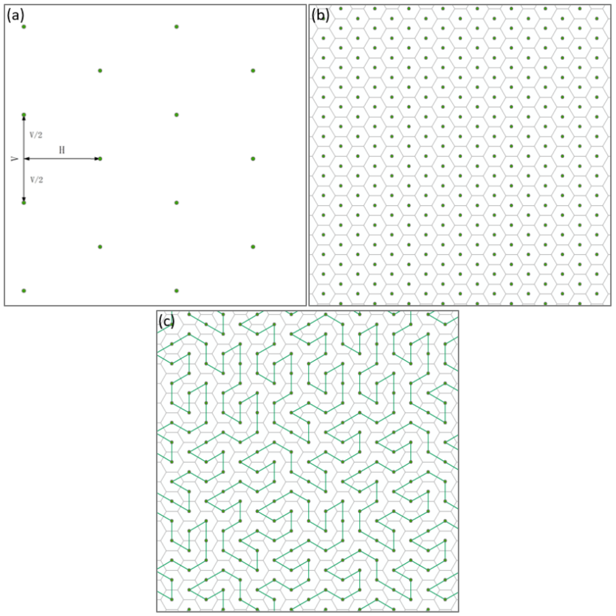
This study is slightly different from that of Auber et al. [21] in constructing the Gosper map. First, the discrete points are generated according to certain horizontal and longitudinal intervals. As Figure 2a shows, for discrete points, the horizontal interval is H, the vertical interval is V, and the points between adjacent columns differ by V/2 in the vertical direction. The relationship between H and V is expressed in Equation (1). The Thiessen polygons are constructed based on these discrete points shown in Figure 2b. These polygons are all hexagons. Then, the appropriate hexagonal center point is selected as the starting point and the Gosper fractal curve is constructed on the hexagonal base map, with V as the step length. Following the above steps, the resulting Gosper curve’s nodes are coincident with the center points of the hexagons, thus, establishing the correspondence between the Gosper curve and the base map shown in Figure 2c.
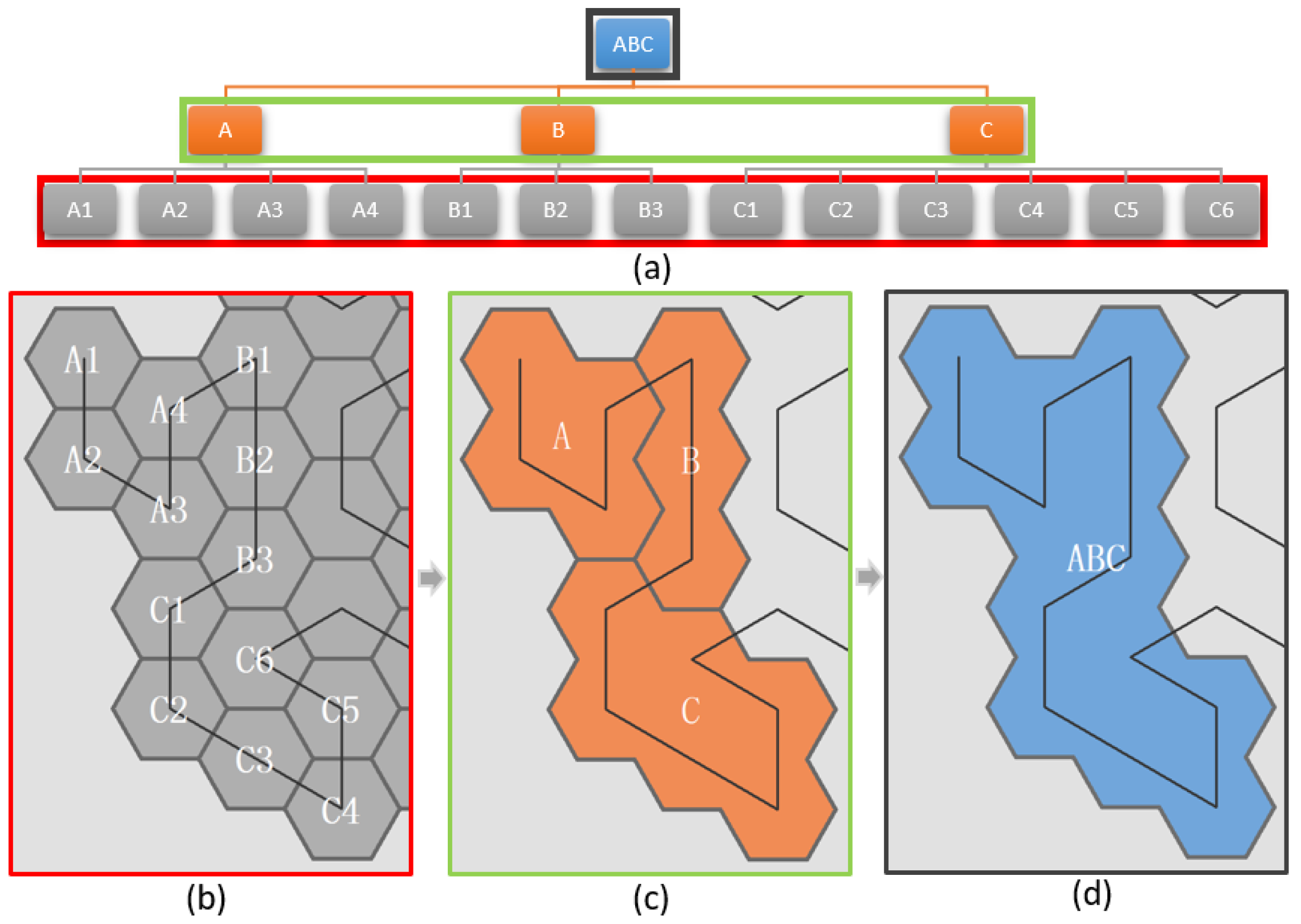
The process of building a map framework is shown in Figure 3. The leaf nodes of a multilevel tree are extracted by the depth-first traversal. Under the guidance of the Gosper curve, these nodes are arranged on certain hexagons. According to the inclusion relationship of the nodes, a parent node region can be obtained from the fusion of the node regions in the lower layer. This process is repeated in a bottom-up manner to generate a collection of polygons that corresponds to the hierarchical relationship of the data.
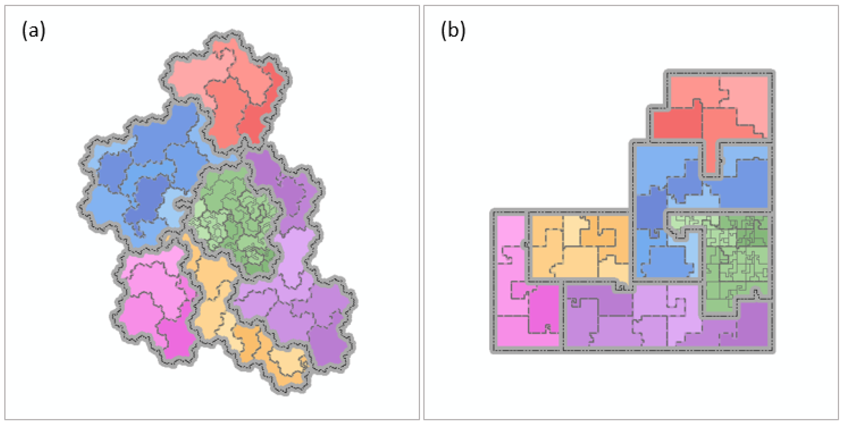
The Gosper map uses the hexagon as the basic unit for constructing the map, which has the advantages of seamless splicing and representational accuracy [31]. Compared with the point connection commonly used in the triangular mosaic and the regular mosaic, the adjacent regions in the hexagon mosaic are connected with the shared edge, which makes them more isotropic [32] and can increase the continuity of the contiguous region and avoids the discontinuous phenomena caused by point connection. Additionally, human beings are particularly sensitive to vertical and horizontal lines [33]. The hexagonal grid structure can avoid the orthogonal lines formed in the regular grid, thus, avoiding a loss of attention [34,35]. Under the guidance of the Gosper curve, a strict mapping between the data and map is established. The adjacent relation of nodes in the hierarchical data can be considered, and the hierarchical inclusion relation can also be embodied intuitively through region nesting. Moreover, the irregular shape of the boundary and region in a Gosper map also increases its map similarity. The shape plays an important role in discovering characteristics [36], and it will affect people’s discrimination of items [37]. The authors construct a Gosper map in Figure 4a and a Hilbert map (constructed on a square base map under the guidance of the Hilbert curve) in Figure 4b using the same data. The irregular region shape in Figure 4a effectively avoids the straight line boundaries in Figure 4b due to hard cutting.
3.2. Virtual Terrain Expression
Abstract high-dimensional spaces are unfamiliar to humans, which increases the difficulty of expressing, perceiving, and identifying their structures and patterns [38]. When faced with abstract concepts, people often choose the familiar spatial metaphor to explain and understand them [4]. Whether in the process of human evolution or experience in personal life, the terrain or the natural scene is universal, and humans are constantly trained to understand the terrain structure effectively [39,40]. The use of terrain to express the characteristics of abstract data aims to exploit the human sense of space and familiarity with spatial objects. The abstract data are described in the form of geographic language to make them concrete. Transforming semantic data into natural objects allows visual exploration to be performed rather than abstract thinking, thus, providing a familiar method of interacting with data [38]. The macro overview of the terrain could promote the identification of subject areas and significant entities [41], and such objects are easy to remember and helps the user to build a mental map, which facilitates comparative analyses between different scenes [38,42].
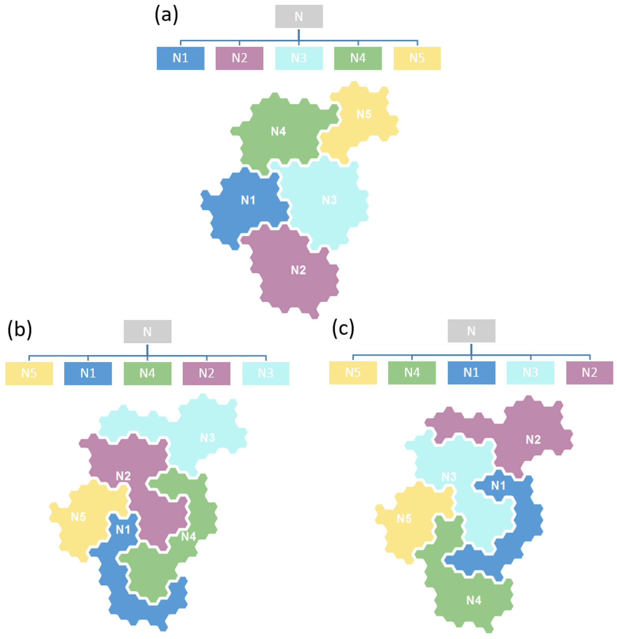
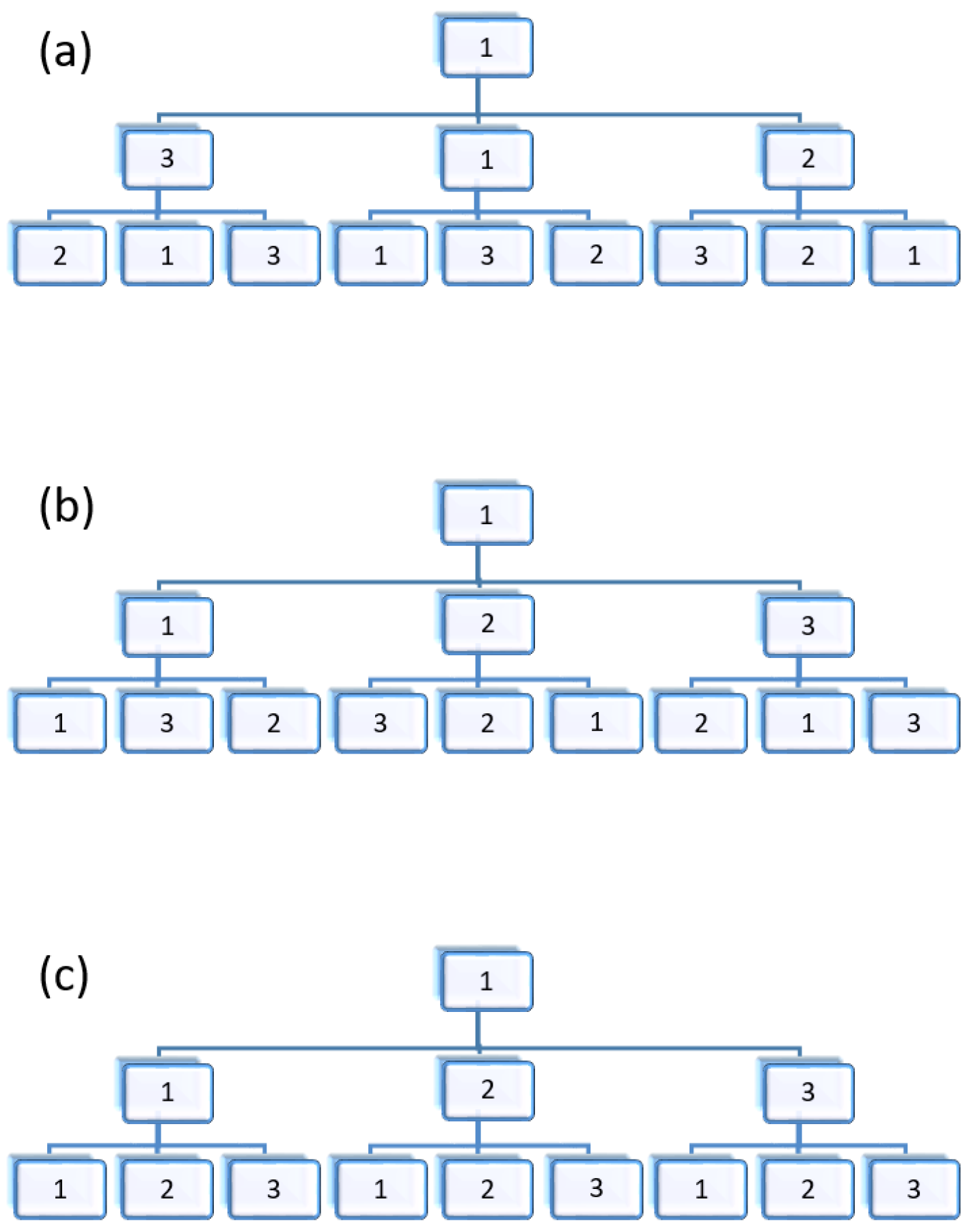
The design process of a virtual terrain includes spatial layout and rendering. The spatial layout is mainly used to solve the randomness in map design to promote the feature representation. The node order of most hierarchical data has no specific meaning and is generally arranged randomly. As shown in Figure 5, the randomness of the Gosper map layout is caused by the uncertain node order of hierarchical data. However, the spatial locations of items often imply their relationship. Such a random layout cannot pass useful information to the audience through location design and, thus, is not conducive to the expression and identification of data features. Additionally, a fixed layout also helps create a stable mental map. The map layout needs to be designed in this case.
According to the first law of geography, objects with close spatial positions often have similar properties. Data in this study with similar characteristics were gathered by a location clustering design. However, the hierarchical structure also need to be considered when implementing spatial clustering in a Gosper map. The Gosper map realizes the placement of leaf nodes by linear guidance, and two-dimensional Euclidean distance provides a good consideration of the linear distance [43]. That is, the linear sequence distance of the leaf nodes can be reflected by the Euclidean distance in the plane: when the two leaf nodes are adjacent to the Gosper curve, their corresponding map regions are also adjacent on the two-dimensional plane; and if their linear order is closer, then their location on the map plane will not be far away. Since the parent node region is fused by their sub-node regions, the adjacency and distance relation of nodes in eah layer will be well considered in the two-dimensional plane. Using this characteristic, the clustering relationship of the multi-tree nodes can be transferred to the regions on the plane. Therefore, the clustering process can be performed in a multi-tree of hierarchical data. As shown in Figure 6, for the disordered multi-tree of a hierarchical data, the upper nodes were sorted first according to the target attribute value and then the sorting process was completed from top to bottom. Finally, the sorted multi-tree was converted into a Gosper map to achieve the spatial clustering expression in space. Thus, the hierarchical relationship between the data were not destroyed in the clustering process.
A series of attributes were stored in each object region in the resulting Gosper map. Such a map belongs to the vector data type, which have strong object characteristics and are suitable for object-oriented queries and analysis. However, the field characteristics of this data type are weak and the performance for a natural landform or a continuous distribution phenomenon is poor. Subsequent processing of map rendering extracted all the central points of the leaf node regions as key points. Combined with the target attribute, a spatial interpolation was conducted between the key points, and the original discrete vector model was converted into a continuous grid model. The grid value was regarded as the elevation value, and the shadow layer is built to enhance the visual effect. According to the type of the virtual terrain, the appropriate colour is chosen to render and complete the construction of the virtual terrain. The above operation realizes the spatially continuous expression of attributes without changing the positions of the elements. Through a clustering operation in the spatial layout, feature elements were aggregated in space, and the rendering operation used visual variables that highlighted these features. The three-dimensional terrain model was built based on the virtual elevation value to show data in a more stereoscopic way.
3.3. Multi-Scale Analysis of a Map
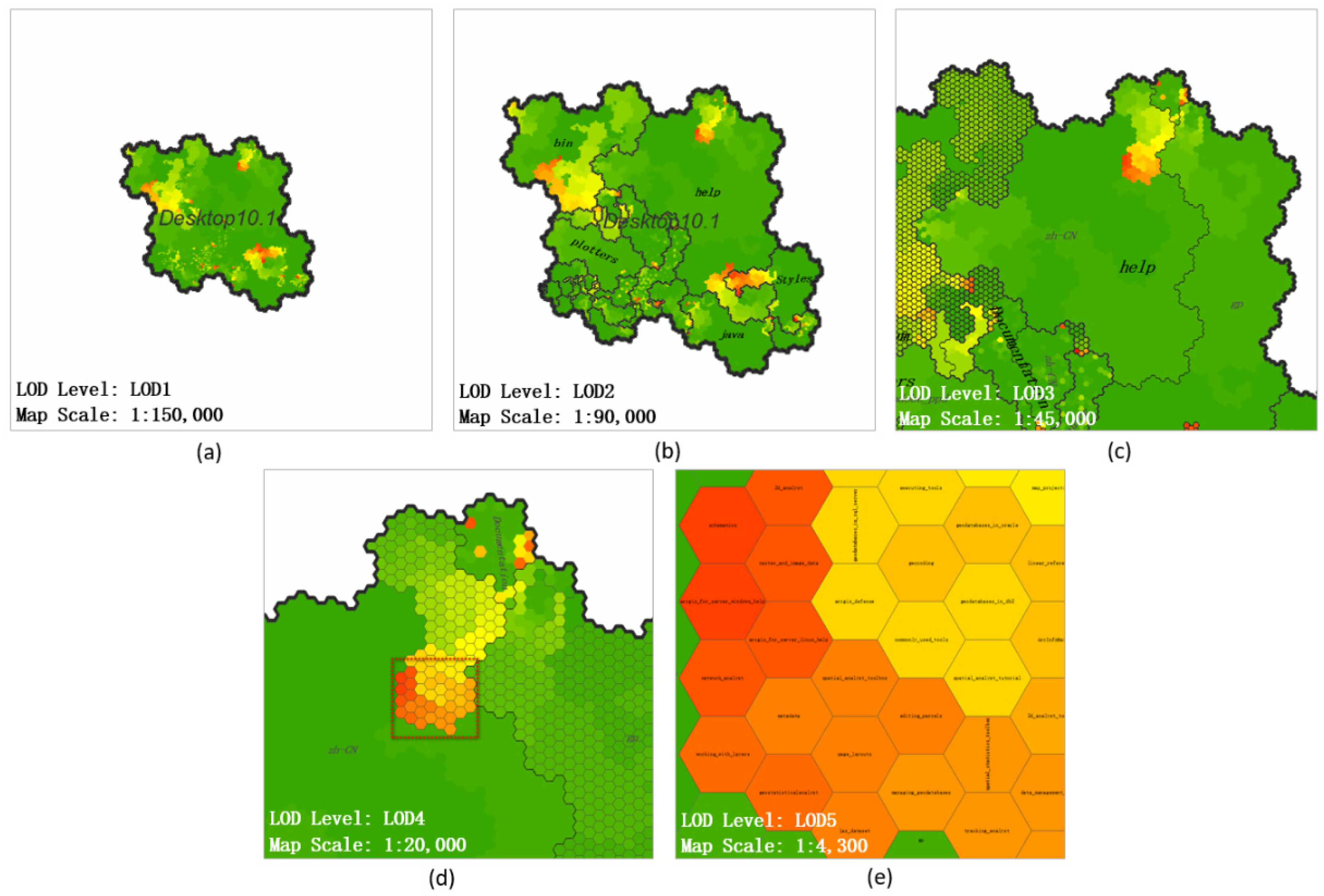
Scale is an important factor both in semantics and space. Regarding a map, a multi-scale expression is an important advantage, and researchers have focused on such expressions [44]. Great importance has also been attached to the scale in the early introduction of the spatialization [3]. Fabrikant studied the metaphorical function of the scale and indicated that people could link the changes in spatial resolution to the changes in the hierarchy [45]. Level of Detail (LOD) technology can be regarded as a multi-granularity slice set in terms of multi-scale technology. Through different scale controls, different slices can be visualized. Hierarchical data analysis requires a macro overview to grasp the overall characteristics and the trend distribution of the data, and it also needs to focus on the microcosmic details of interest areas. To meet the above requirements, the LOD technology was introduced into the analysis of a Gosper map. The linkage relations among the map scales, LOD levels, and multilevel map scenes were established to realize the dynamic multi-scale expression of a Gosper map. Based on different analysis needs, the map scenes that show different levels of semantic information were used to perform an analysis and mine the data at different scales.
The procedure included separating the map regions according to their level of hierarchy and assigning them the level. Regarding the region corresponding to the upstream node of the hierarchical tree, a smaller level was set. As the level deepened, the sub-node area that showed the details was given a higher level. The region set at the same level constituted a map slice of the corresponding level. Map scenes were made up of map slices at different levels. The relationship among the map scales, LOD levels, and map scenes is shown in Figure 7. The increment of the LOD level corresponded to a more elaborate subdivision, and the detail information was further displayed in the map scene. Under a certain map scale, the increased detail occasionally caused an excessive symbol density on the map, which affected the observation and needed to be adjusted by a scale transformation. The general relationship between the scale range and the LOD levels was as follows: small map scales corresponded to lower LOD levels, and large map scales corresponded to higher LOD levels.
Via establishing a scale detector, the change of map scale was detected and the display and blanking of corresponding map slices was controlled to construct different map scenes. The map scale was changed through a map interactive operation to dynamically drive the map scene transformation: when the map scale increased from small to large, the map slices with higher levels were superimposed to construct a higher precision map scene. Conversely, when the scale decreased, the high-level slices were hidden, and only the corresponding low-level map slices were displayed, which constructed a lower precision map scene. Using such a map for analysis can well meet Ben Shneiderman’s well-known Visual Information-Seeking Mantra (overview first, zoom and filter, then details-on-demand) [46]. A map has a wide field of vision when at a smaller scale. Accordingly, a low precision map scene is more general, which is suitable for macroscopic analysis, but lacks detail. Such a map can be used to grasp the general trend of the data and choose the area of interest. As the analysis increases in depth, people need the map scene with a higher precision to show more details about the area of interest. Then, one should switch the map to a larger scale to drive the transformation of map scenes and display the details accurately. Compared with the last map scene, the current map’s range shrinks, although the expressed information has greater detail and is suitable for micro-research on individuals.
Based on the interactive convenience of an electronic map, a series of exploration works can be performed in a multi-scale map expression. Through dynamic changes in the map scale, switching to different levels of map slices to observe the hierarchy of data can be accomplished, for example. Additionally, people can find the area of interest through the map overview and achieve a multilevel location of the area of interest. During these processes, a map provides a rich context that is useful for the comparison of object structure characteristics and attribute content. This comparison could be conducted between maps constructed by different data sources or between different regions of the same map.
4. Experiment and Discussion
The file directory data are typical hierarchical data whose hierarchical relationship is embodied by the nesting of the folders. During daily interactions with file data, the focus is often on a single file, and intuitively understanding the overall information of other context files is difficult. When faced with a folder, people cannot obtain the information of each sub-file contained in the folder and thus cannot effectively analyze the files.
Regarding the three file data in the experiment, based on the map construction method described above, the map frames were generated. First, file data were organized into a hierarchical multi-tree whose nodes corresponded to folders or files. Then, the nodes were sorted according to the size of the node object (corresponding to the size of a folder or file) from top to bottom. Finally, the hierarchical tree was converted into a polygon map frame (Figure 8) through the method introduced in this article. Through these operations, the hidden hierarchy in the file data was reflected as nested inclusion relations among polygons. As shown in Figure 8, because the area of each map building unit was the equivalent and the slice of each map was generated at the same scale, the number of files contained in the folders were learned from the area of the territory: Visual Studio 2015 had the largest number of files, followed by MyEclipse 2017 and ArcGIS Desktop 10.1. However, these polygons were simple graphs that were not trimmed. Subsequent series of map decoration and rendering work will be carried out based on them.
4.1. Diversified Expressions of Maps
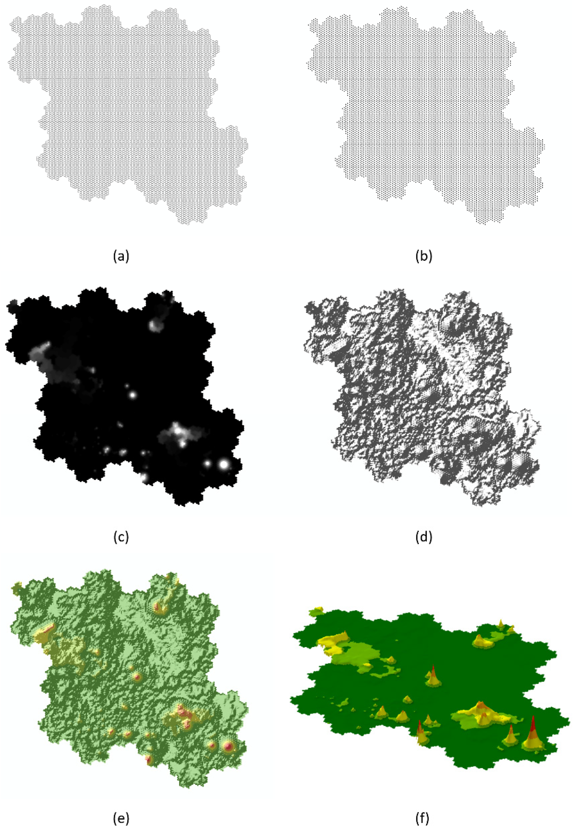
Combined with the map framework and file attributes, the virtual terrain could be build. Figure 9a shows the bottom hexagons corresponded to file objects that were associated with basic file attributes such as size, depth, and so forth, were singled out. The authors extracted the geometric center points of bottom hexagons, which are shown in Figure 9b. The file size was selected to interpolate the discrete points to form a continuous grid field model in Figure 9c. Figure 9d shows the mountain shadow result generated by the grid data to enhance the stereoscopic effect of the expression. Figure 9e displays color rendering conducted in the form of a geomorphic map, in which a large file area is red high terrain while a small file area uses a flat terrain of green. The making and rendering of a two-dimensional virtual terrains are completed above. Compared with the simple grid data in Figure 9c, shadow superposition and color rendering can better highlight the high value region in Figure 9e. Finally, the result of the grid field model was stretched in three dimensions, in which the size of the file was mapped to the elevation of the terrain (Figure 9f).
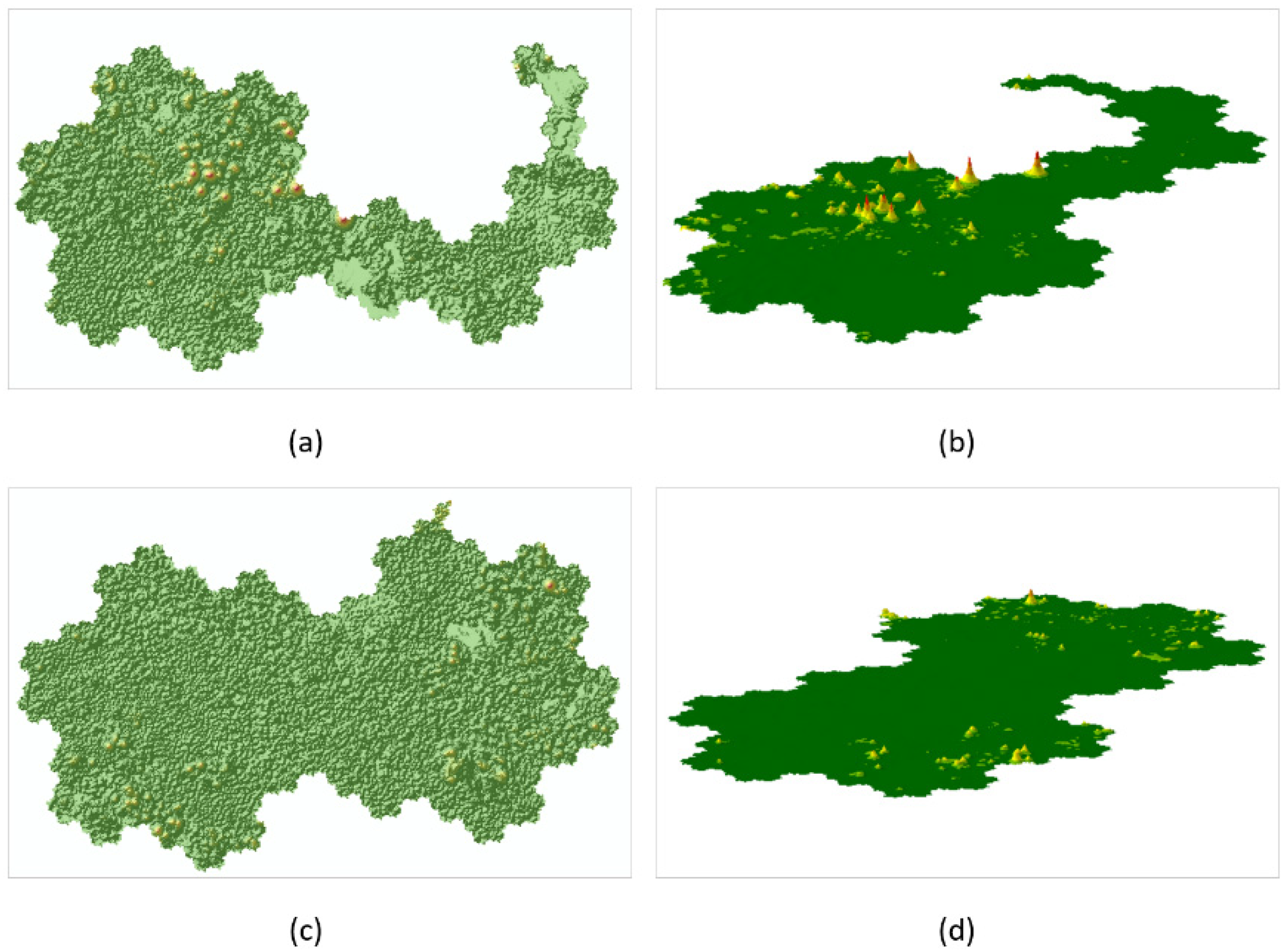
Concurrently, the authors constructed a virtual terrain using the unsorted hierarchical tree following these mapping steps, which can be seen in Figure 10. That is, this data was not processed by clustering. Compared with the virtual terrain produced without the cluster process shown in Figure 10, the data that was clustered by hierarchical tree sorting significantly reduced the discrete small humps in the red boxes. To further quantitatively explore the aggregation of the clustered data, the authors calculated the spatial autocorrelation coefficient of the data. The calculation was carried out by ArcGIS software and the hexagon base map layer Figure 9a was used as the input data. The “Inverse Distance” was chosen as the conceptualization of spatial relationships parameter and the distance method was “Euclidean Distance”. The distance threshold was 100.01 m, which was slightly larger than the center distance of two adjacent hexagonal units (100 m). Figure 11 shows the graphical calculation results: the p value indicates that the data are not random and the high z-score shows the high aggregation of data. The results significantly reject the null hypothesis and show that the data present clustering characteristics and are positively correlated with the spatial mode.
The above construction process of the virtual terrain was performed for all three folders. Three pieces of data results were placed in a unified expression space to facilitate the horizontal contrast between data. The same attribute values were expressed as the same height and color, for example. Figure 12 shows the result of the virtual terrain expression for the other two data sources. This approach represented the abstract value by tangible height. Its purpose was to enable audiences to analyze the data through visual observation rather than abstract thinking like numerical comparison. Using hierarchy tree sorting, the objects with similar attributes were more aggregated in space. This highlighted the characteristics of the data and made it easy to be found.
The virtual landscape indicates the map overview analysis perspective so that the audience can explore the data characteristics from a global perspective. Simultaneously, it could also provide for convenient feature contrast among different data sources. When observing the virtual landscape map (Figure 9e,f and Figure 12, respectively) the authors found that the large file areas in each folder were effectively highlighted via the geometry and color rendering. Due to the clustering process, the large file distribution presented good clustering. The clusters of peaks better highlighted the features, thereby facilitating feature discovery and comparisons. A lack of high topography means that the proportion of large files is generally small in a virtual landscape map. Particularly, in the maps of Visual Studio 2015 (Figure 12c,d), the high terrain area showed a sporadic distribution. However, as shown in Figure 9, ArcGIS Desktop 10.1 had many high terrain regions. A horizontal comparison of these maps showed that ArcGIS Desktop 10.1 and MyEclipse 2017 had significantly more large files than did Visual Studio 2015. Due to the small size of the territory (the number of files was small), the distribution density of large files in ArcGIS Desktop 10.1 was generally higher.
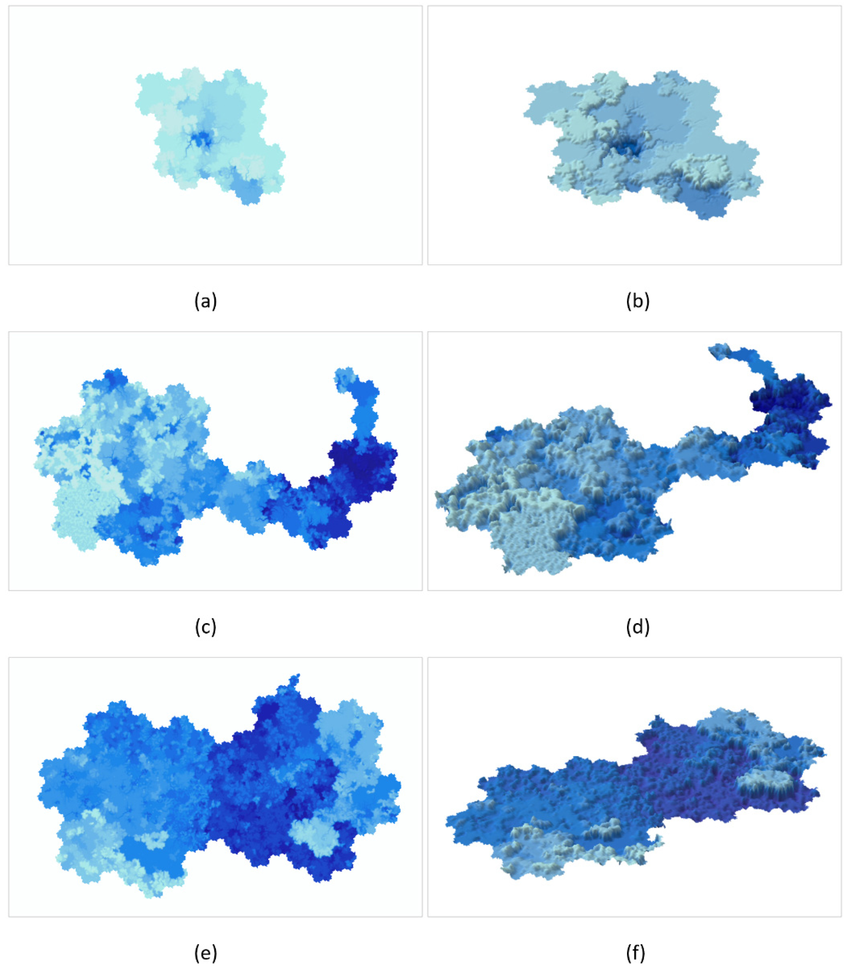
The depth of the file in the file tree can be simply understood as the number of clicks required to reach the target file from the outermost folder. Using an operating system, the depth of the file is not explicitly described, and it is usually calculated in the file tree window or through the information in the address bar. When the folder contains a large number of subfolders or many levels, the depth distribution of its sub-files is difficult to observe. Figure 13 shows the two-dimensional and three-dimensional virtual water depth maps that were generated based on the depth attribute of the file. The mapping process was similar to the above virtual topographic map. These virtual maps used the depth of water as a metaphor for the depth of the document. By using the ocean map style for reference, the low terrain in dark blue corresponded to the deep files, whereas the white high terrain showed that the corresponding files were small in depth. The virtual water depth map provided an image and macro-perspective for the observation and analysis of folder depth characteristics. Similar to the virtual terrain, these maps integrated the information hidden in the files and visualized these data in the form of a virtual landscape, thus, they can be used to compare various data sources.
Demonstrated in Figure 13a,b, ArcGIS Desktop 10.1 presented a large white shallow water area and only had deeper blue regions in the central part. Additionally, its depth distribution was relatively uniform and many large areas of the same height could be found. The above phenomenon indicated that it had a relatively shallow file depth in general and the depth distribution of files was even. The other two folders generally had a larger depth and uneven depth distribution. The MyEclipse 2017 map had the deepest regions. The water depth difference reflected by the color and topographic structure showed that ArcGIS Desktop 10.1 had a smaller depth range in its internal files than did the other two documents. Adding the boundaries of the folders, a more detailed analysis was performed for the distribution of the attributes within each folder.
4.2. Multi-Scale Map Analysis
Above all, the hexagonal regions that represented all the file objects were rendered. The color code of green, yellow, and red denoted the change of the file size from small to large. Figure 14a corresponded to data that were not clustered. Many disordered speckled spots were shown in the red boxes. The irregularity of the color distribution in general increased the difficulty of discerning the distribution and change of object size. Conversely, Figure 14b depicted the image after cluster processing, and the uniform color distribution reduced the confusion of the layout and enabled clear observations of the size distribution. A strong clustering feature was shown from the color. Since the hierarchical structure was considered in the clustering process, multiple clusters were observed. Accordingly, it was easy to observe the distribution of the large file communities and analyze these files.
Using the multi-scale expression of a map, feature data could be located and analyzed from different levels. Taking the search of large file communities in ArcGIS Desktop 10.1 as an example, the authors used an interactive approach to analyze the large file communities and locate them at each level.
The map boundaries were extracted at different levels as map slices. Table 1 demonstrates that the corresponding relationship between the key map scales and the newly emerging map slices was established. Subsequently, different blanking and display rules were set for map slices based on a user’s map interaction behaviours, such as zoom in and zoom out. When the user zoomed in on the map, if the current scale was greater than or equal to the map scale of a certain LOD level, the corresponding newly emerging map slice was superimposed to construct a new map scene. Accordingly, if the zooming out operation caused the current scale to be less than a certain map scale of a LOD level, the corresponding map slice was eliminated. Using the user’s map operation, the dynamic change of map scenes led the user to browse different data levels.
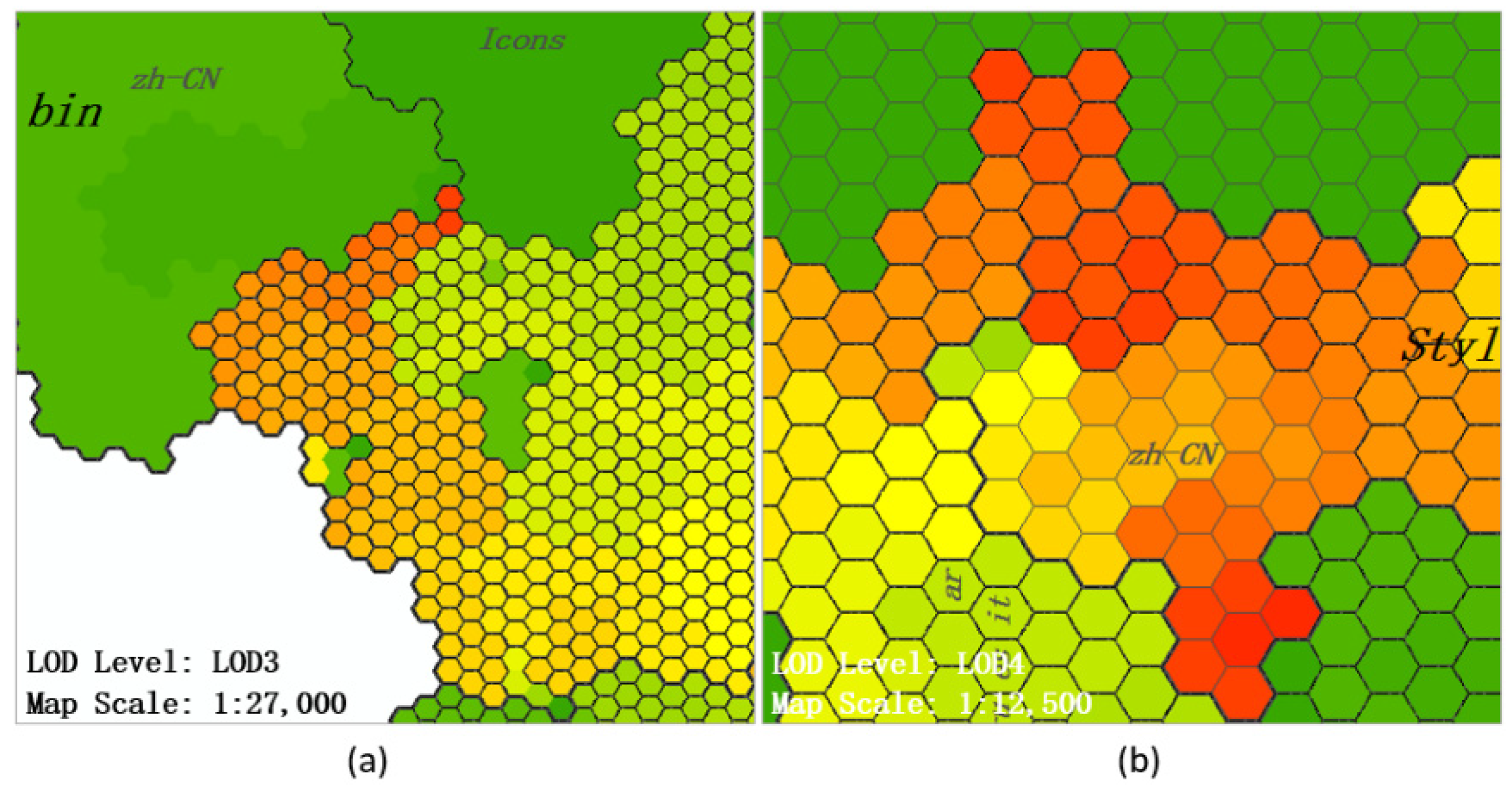
Through an overall observation of the map in Figure 15a, the authors determined the distribution of large files in ArcGIS Desktop 10.1. Three distinct large file communities were observed, and a few large files were scattered in the central and the lower part. When zooming in on the map to enter a larger scale, the new boundaries were superimposed onto the map and divided the map to include more details (Figure 15b). It could be observed that the area of the regions is uneven, which conformed to the Pareto principle: a few regions occupy most of the area on the map. As an example, the “help” and “bin” regions accounted for more than half of the area on the map, which meant that most of the files in ArcGIS Desktop 10.1 were included in these two folders. The three large file communities were divided into three folders: “help”, “bin”, and “Styles”. The area of the large file community at the top of the “help” folder was identified as the target area and the hierarchical location analysis was continued. Moving the focus of the map and switching to a large-scale map perspective, Figure 15c indicated the previously locked target area was located in the newly emerging region “zh-CN”. Regarding “zh-CN”, most of its sub-regions appeared in green tones, indicating that their file size was small, and the regions representing large files were clustered at the top. A similar map operation could be chosen, and the top region could be amplified. Figure 15d shows that when targeting a deeper folder, a more detailed boundary was displayed. The large file community in that observation had reached the bottom of the branch and became a series of hexagonal units representing the files. However, other regions were still not completely divided. To explore the details of the files in the large file community, the red box area was constantly amplified until the map scene became Figure 15e. During the process of the above analysis, the authors found that the levels of the files in this large file community were relatively shallow (all at the fourth level, while the whole folder has 12 levels). The situation was similar to that of the remaining two large file communities. Figure 16 shows that the files in the other two large file communities also had relatively shallow levels (level 3 or level 4). This multilevel search and location pattern was not limited to be used for the discovery of large files. When using other attributes, such as file depth, to render the map, the above model could also be used to analyze other file features.
The analysis of the key operations in the above task showed that the process of constantly opening the target folder on a map was accomplished by constantly amplifying the target area. The above operations in the operating system were performed as follows (consider the Windows operating system as an example): double click the folder to be analyzed to open it and determine the next object to open in the subfolders. When the number of subfolders was too large, the current screen space would not fit. The user could browse by dragging the scroll bar up and down, which was similar to dragging a map to change the focus area. Double click on the selected subfolder and repeat the process. One could also use the file tree window on the left side in file form to complete the process: double click on the folder node that needed to be analyzed, and the included subfolder nodes appeared below it. When there were too many subfolder nodes, the user also needed to drag the scroll bar to determine the next open folder node. The subfolder in the form could be opened using a single click on folder node, and the above process can be repeated.
A comparison of the behaviours of searching and opening folders in a map and file system showed that the difference in operation complexity mainly occurred at the stage of determining the next target in the subfolders. The two approaches present nearly equivalent operational complexity if the criteria, such as the file name or even random selection, to determine the target object were relatively simple. However, when the size of the folder and other attributes were considered for the selection process, the operation in the file system was much more complicated, and a series of complex attribute query operations were required. For example, first right-click on the folder and click on the property item in the drop-down menu to find its properties through the pop-up dialog. The above actions could be repeated for each folder, and the data had to be remembered or recorded. This process represented tedious work when the number of folders was large. The map displayed the attributes in a visual manner that provided the context for the search process. Therefore, users could choose the target by visual judgement rather than manual inquiry, which reduced the operational complexity of the whole process.
A map-like visualization in the analysis of abstract non-spatial data provided vivid and concrete features. The map-like visualization process helped users to make an intuitive comparison and analysis of the data. Additionally, with the help of the map’s multi-scale characteristics, data could be displayed in different levels and described with different details. Users could grasp the data structure and analyze data at different levels. The exploration of data through map browsing might be able to effectively reduce the complexity of operations, and certain tasks that were difficult to accomplish in the operating system could be performed, such as the above task of large file discovery and location at each level, because an overview could not be provided of the size and distribution of all the files in an operating system. Just like the above advantages of using map overview and interaction, spatialization and spatialization solutions provided a new perspective for the discovery and analysis of problems. Concurrently, the authors were delighted to find that the combination of spatial and non-spatial things not only existed in the theoretical thinking, but also played an important role in many software applications. Researchers visualize and analyze data through the combination of professional spatial information processing software and business intelligence software [47], for example. Through this type of combination, the Geospatial Business Intelligence (Geo-BI) [48] can integrate multi-source information and provide solutions for policy decisions. The application of map dashboards provides an effective tool for these studies to display and analyze multiple data [47,48,49]. Although some of the data processed by the above software and applications are not typical geospatial data, they are associated with geographic space, which belong to geospatially referenced data such as consensus data [2]. This is different from the current study because the authors here aimed at the non-spatial data that were not referenced to geographic space such as the above file data. However, all of these examples have the aid of spatialization and use various ways to realize spatial expressions of data to display and analyze them.
5. Conclusions
Through the experiment, this paper verified the feasibility of expressing the file data without geographical location through the map-like visualization. Under the guidance of the Gosper curve, the spatial layout of abstract data was completed, which provided the foundation for spatial display and analysis. Due to the sorting work in the hierarchy tree, the objects in the space presented a good aggregation which made the data feature more significant. It is precisely due to the two-dimensional Euclidean distance in the Gosper map providing a good consideration of the sequence distance of nodes in hierarchical data, that the authors could achieve the aggregation of spatial objects without destroying the hierarchy in a simple way by hierarchical tree sorting. Using the help of the rich representation and analysis methods of maps, the map-like visualization could also identify characteristics that conventional methods have difficulty determining. That means the map-like visualization provided a new but also useful perspective for the expression and analysis of non-spatial data. Through this design, it not only satisfied the discovery and contrast of macro rules, but also supported multi-scale data analysis which made it better than the same type of research. It can be used not only for file data analysis but also for the expression and analysis of other large non-spatial hierarchical data such as biological classification data, large organization management data, and more. On the other hand, map-like visualizations extended the application of maps and cartography and, thus, could be used for spatial data as well as non-spatial data. Classical cartography theories and methods could play a role in the analysis of semantic data and new insights are possible. However, compared with the rich technologies available in the map field, this article focused on only a few of them. Additionally, as a relatively new visualization form, map-like visualization inevitably had a series of problems in visual expression, perception, cognition, and more. This is the motivation to continue to study this area and it requires the authors to do more in-depth research to constantly improve it. The authors, in future, will further study the application potential of map-like visualization methods and apply more map techniques to explore the hidden features of non-spatial data. Relevant cognitive experiments will also be carried out to help design map-like visualization more scientifically.
Author Contributions
Conceptualization, R.X.; Formal analysis, R.X.; Funding acquisition, T.A. and B.A.; Investigation, R.X.; Methodology, R.X.; Supervision, T.A.; Writing—original draft, R.X.; Writing—review & editing, T.A. and B.A.
Funding
This research was supported by the National Key Research and Development Program of China (Grant No.2017YFB0503500), and the National Natural Science Foundation of China (Grant No.41531180 and No.41401529) and A Project of Shandong Province Higher Educational Science and Technology Program (Grant No.J15LH01).
Acknowledgments
We appreciate the reviewers for their valuable suggestions and questions.
Conflicts of Interest
The authors declare no conflict of interest.
References
- Dodge, M.; Kitchin, R. Atlas of Cyberspace; Addison-Wesley: Boston, MA, USA, 2001. [Google Scholar]
- Skupin, A.; Fabrikant, S.I. Spatialization. In The Handbook of Geographical Information Science; Wilson, J.P., Fotheringham, A.S., Eds.; Blackwell Publishing: Malden, MA, USA, 2008; pp. 61–79. [Google Scholar]
- Skupin, A.; Buttenfield, B.P. Spatial metaphors for visualizing information spaces. In Proceedings of the ACSM/ASPRS Annual Convention and Exhibition, Seattle, WA, USA, 7–10 April 1997; pp. 116–125. [Google Scholar]
- Lakoff, G.; Johnson, M. Metaphors We Live by; University of Chicago Press: Chicago, IL, USA, 2008. [Google Scholar]
- Skupin, A. From metaphor to method: Cartographic perspectives on information visualization. In Proceedings of the IEEE Symposium on Information Visualization, Salt Lake City, UT, USA, 9–10 October 2000; pp. 91–97. [Google Scholar]
- Blades, M.; Blaut, J.M.; Darvizeh, Z.; Elguea, S.; Sowden, S.; Soni, D.; Spencer, C.; Stea, D.; Surajpaul, R.; Uttal, D. A cross-cultural study of young children’s mapping abilities. Trans. Inst. Br. Geogr. 1998, 23, 269–277. [Google Scholar] [CrossRef]
- Kraak, M.-J.; Ormeling, F.J. Cartography: Visualization of Spatial Data; Routledge: Abingdon, UK, 2013. [Google Scholar]
- Ai, T.; Ke, S.; Yang, M.; Li, J. Envelope generation and simplification of polylines using Delaunay triangulation. Int. J. Geogr. Inf. Sci. 2017, 31, 297–319. [Google Scholar] [CrossRef]
- Piaget, J.; Inhelder, B. The Child’s Conception of Space. Am. J. Sociol. 1956, 5, 490. [Google Scholar]
- Spiess, E.; Baumgartner, U.; Arn, S.; Vez, C. Topographic Maps—Map Graphics and Generalisation; Swiss Society of Cartography: Wabern, Switzerland, 2002. [Google Scholar]
- Brock, A.M.; Truillet, P.; Oriola, B.; Picard, D.; Jouffrais, C. Interactivity Improves Usability of Geographic Maps for Visually Impaired People. Hum. Comput. Interact. 2015, 30, 156–194. [Google Scholar] [CrossRef] [Green Version]
- Fabrikant, S.I.; Skupin, A. Cognitively plausible information visualization. In Exploring Geovisualization; Dykes, J., MacEachren, A.M., Kraak, M.-J., Eds.; Elsevier: New York, NY, USA, 2005; pp. 667–690. [Google Scholar]
- Montello, D.R.; Fabrikant, S.I.; Ruocco, M.; Middleton, R.S. Testing the first law of cognitive geography on point-display spatializations. In Proceedings of the International Conference on Spatial Information Theory, Kartause Ittingen, Switzerland, 24–28 September 2003; Kuhn, W., Worboys, M., Timpf, S., Eds.; 2003; Volume 2825, pp. 316–331. [Google Scholar]
- Fabrikant, S.I.; Montello, D.R.; Ruocco, M.; Middleton, R.S. The distance–similarity metaphor in network-display spatializations. Cartogr. Geogr. Inf. Sci. 2004, 31, 237–252. [Google Scholar] [CrossRef]
- Fabrikant, S.I.; Montello, D.R.; Mark, D.M. The distance-similarity metaphor in region-display spatializations. IEEE Comput. Graph. Appl. 2006, 26, 34–44. [Google Scholar] [CrossRef] [PubMed]
- Tobler, W.R. Computer Movie Simulating Urban Growth In Detroit Region. Econ. Geogr. 1970, 46, 234–240. [Google Scholar] [CrossRef]
- Fabrikant, S.I.; Montello, D.R. The effect of instructions on distance and similarity judgements in information spatializations. Int. J. Geogr. Inf. Sci. 2008, 22, 463–478. [Google Scholar] [CrossRef]
- Skupin, A. A cartographic approach to visualizing conference abstracts. IEEE Comput. Graph. Appl. 2002, 22, 50–58. [Google Scholar] [CrossRef]
- Cao, N.; Lin, Y.-R.; Gotz, D. UnTangle Map: Visual Analysis of Probabilistic Multi-Label Data. IEEE Trans. Vis. Comput. Graph. 2016, 22, 1149–1163. [Google Scholar] [CrossRef] [PubMed]
- Wattenberg, M. A note on space-filling visualizations and space-filling curves. In Proceedings of the IEEE Symposium on Information Visualization, Minneapolis, MN, USA, 23–25 October 2005; pp. 181–186. [Google Scholar]
- Auber, D.; Huet, C.; Lambert, A.; Renoust, B.; Sallaberry, A.; Saulnier, A. GosperMap: Using a Gosper Curve for Laying Out Hierarchical Data. IEEE Trans. Vis. Comput. Graph. 2013, 19, 1820–1832. [Google Scholar] [CrossRef] [PubMed]
- Biuk-Aghai, R.P.; Yang, M.; Pang, P.C.-I.; Ao, W.H.; Fong, S.; Si, Y.-W. A map-like visualisation method based on liquid modelling. J. Vis. Lang. Comput. 2015, 31, 87–103. [Google Scholar] [CrossRef]
- Yang, M.; Biuk-Aghai, R.P. Enhanced Hexagon-Tiling Algorithm for Map-Like Information Visualisation. In Proceedings of the 8th International Symposium on Visual Information Communication and Interaction, Tokyo, Japan, 24–26 August 2015; pp. 137–142. [Google Scholar]
- Gansner, E.R.; Hu, Y.; Kobourov, S.G. Visualizing Graphs and Clusters as Maps. IEEE Comput. Graph. Appl. 2010, 30, 54–66. [Google Scholar] [CrossRef] [PubMed]
- Gronemann, M.; Jünger, M. Drawing clustered graphs as topographic maps. In Proceedings of the International Symposium on Graph Drawing, Redmond, WA, USA, 19–21 September 2012; pp. 426–438. [Google Scholar]
- Fried, D.; Kobourov, S.G. Maps of Computer Science. In Proceedings of the 2014 IEEE Pacific Visualization Symposium, Yokohama, Japan, 4–7 March 2014; pp. 113–120. [Google Scholar]
- Lu, M.; Chen, S.; Lai, C.; Lin, L.; Yuan, X. Frontier of Information Visualization and Visual Analytics in 2016. J. Vis. 2017, 20, 667–686. [Google Scholar] [CrossRef]
- Chen, S.; Chen, S.; Wang, Z.; Liang, J.; Yuan, X.; Cao, N.; Wu, Y. D-Map: Visual Analysis of Ego-centric Information Diffusion Patterns in Social Media. In Proceedings of the 2016 IEEE Conference on Visual Analytics Science and Technology, Baltimore, MD, USA, 23–28 October 2016; pp. 41–50. [Google Scholar]
- Chen, S.; Chen, S.; Lin, L.; Yuan, X.; Liang, J.; Zhang, X. E-map: A visual analytics approach for exploring significant event evolutions in social media. In Proceedings of the IEEE Conference on Visual Analytics Science&Technology (VAST), Phoenix, AZ, USA, 1–6 October 2017. [Google Scholar]
- Cao, N.; Shi, C.; Lin, S.; Lu, J.; Lin, Y.-R.; Lin, C.-Y. TargetVue: Visual Analysis of Anomalous User Behaviors in Online Communication Systems. IEEE Trans. Vis. Comput. Graph. 2016, 22, 280–289. [Google Scholar] [CrossRef] [PubMed]
- Carr, D.B.; Olsen, A.R.; White, D. Hexagon Mosaic Maps for Display of Univariate and Bivariate Geographical Data. Cartogr. Geogr. Inf. Syst. 1992, 19, 228–236. [Google Scholar] [CrossRef]
- Birch, C.P.D.; Oom, S.P.; Beecham, J.A. Rectangular and hexagonal grids used for observation, experiment and simulation in ecology. Ecol. Model. 2007, 206, 347–359. [Google Scholar] [CrossRef]
- Coppola, D.M.; Purves, H.R.; McCoy, A.N.; Purves, D. The distribution of oriented contours in the real word. Proc. Natl. Acad. Sci. USA 1998, 95, 4002–4006. [Google Scholar] [CrossRef] [PubMed]
- Carr, D.B. Looking at Large Data Sets Using Binned Data Plots; Pacific Northwest Labortary: Richland, WA, USA, 1990. [Google Scholar]
- Carr, D.B.; Littlefield, R.J.; Nicholson, W.L.; Littlefield, J.S. Scatterplot Matrix Techniques for Large-N. J. Am. Stat. Assoc. 1987, 82, 424–436. [Google Scholar] [CrossRef]
- Ai, T.; Cheng, X.; Liu, P.; Yang, M. A shape analysis and template matching of building features by the Fourier transform method. Comput. Environ. Urban Syst. 2013, 41, 219–233. [Google Scholar] [CrossRef]
- Ortiz, M.J. Visual Rhetoric: Primary Metaphors and Symmetric Object Alignment. Metaphor Symb. 2010, 25, 162–180. [Google Scholar] [CrossRef]
- Chalmers, M. Using a landscape metaphor to represent a corpus of documents. In Proceedings of the European Conference on Spatial Information Theory, Marciana Marina, Italy, 19–22 September 1993; pp. 377–390. [Google Scholar]
- Weber, G.H.; Bremer, P.-T.; Pascucci, V. Topological landscapes: A terrain metaphor for scientific data. IEEE Trans. Vis. Comput. Graph. 2007, 13, 1416–1423. [Google Scholar] [CrossRef] [PubMed]
- Fabrikant, S.I.; Montello, D.R.; Mark, D.M. The Natural Landscape Metaphor in Information Visualization: The Role of Commonsense Geomorphology. J. Am. Soc. Inf. Sci. Technol. 2010, 61, 253–270. [Google Scholar] [CrossRef]
- Brandes, U.; Willhalm, T. Visualization of Bibliographic Networks with a Reshaped Landscape Metaphor. In Proceedings of the Symposium on Data Visualisation, Barcelona, Spain, 27–29 May 2002; pp. 159–164. [Google Scholar]
- Tory, M.; Swindells, C.; Dreezer, R. Comparing Dot and Landscape Spatializations for Visual Memory Differences. IEEE Trans. Vis. Comput. Graph. 2009, 15, 1033–1039. [Google Scholar] [CrossRef] [PubMed]
- Haverkort, H.; van Walderveen, F. Locality and bounding-box quality of two-dimensional space-filling curves. Comput. Geom. Theory Appl. 2010, 43, 131–147. [Google Scholar] [CrossRef]
- Montello, D.R.; Golledge, R. Scale and detail in the cognition of geographic information. In Proceedings of the Specialist Meeting of Project Varenius, Santa Barbara, CA, USA, 14–16 May 1998. [Google Scholar]
- Fabrikant, S.I. Evaluating the usability of the scale metaphor for querying semantic spaces. In Proceedings of the International Conference on Spatial Information Theory, Morro Bay, CA, USA, 19–23 September 2001; pp. 156–172. [Google Scholar]
- Shneiderman, B. The eyes have it: A task by data type taxonomy for information visualizations. In The Craft of Information Visualization; Elsevier: New York, NY, USA, 2003; pp. 364–371. [Google Scholar]
- Szewranski, S.; Kazak, J.; Sylla, M.; Swiader, M. Spatial Data Analysis with the Use of ArcGIS and Tableau Systems. In Rise of Big Spatial Data; Ivan, I., Singleton, A., Horak, J., Inspektor, T., Eds.; Springer: Berlin, Germany, 2017; pp. 337–349. [Google Scholar]
- Wickramasuriya, R.; Ma, J.; Berryman, M.; Perez, P. Using geospatial business intelligence to support regional infrastructure governance. Knowl. Based Syst. 2013, 53, 80–89. [Google Scholar] [CrossRef]
- Safadi, M.; Ma, J.; Wickramasuriya, R.; Daly, D.; Perez, P.; Kokogiannakis, G. Mapping for the future: Business intelligence tool to map regional housing stock. Procedia Eng. 2017, 180, 1684–1694. [Google Scholar] [CrossRef]
Figure 1.
The data sources of the experiment: (a) ArcGIS Desktop 10.1 folder; (b) MyEclipse 2017 folder; (c) Visual Studio 2015 folder.
Figure 1.
The data sources of the experiment: (a) ArcGIS Desktop 10.1 folder; (b) MyEclipse 2017 folder; (c) Visual Studio 2015 folder.

Figure 2.
The construction of a hexagon base map and Gosper curve: (a) discrete points generated by a certain rule; (b) Thiessen polygons generated by discrete points; (c) Gosper curve corresponding to the hexagon base map.
Figure 2.
The construction of a hexagon base map and Gosper curve: (a) discrete points generated by a certain rule; (b) Thiessen polygons generated by discrete points; (c) Gosper curve corresponding to the hexagon base map.

Figure 3.
Converting a multi-tree into a corresponding Gosper map: (a) multi-tree; (b) map regions of the leaf nodes of the multi-tree; (c) map regions of the second layer nodes of the multi-tree; (d) map region of the top layer node of the multi-tree.
Figure 3.
Converting a multi-tree into a corresponding Gosper map: (a) multi-tree; (b) map regions of the leaf nodes of the multi-tree; (c) map regions of the second layer nodes of the multi-tree; (d) map region of the top layer node of the multi-tree.

Figure 4.
The Gosper map and Hilbert map generated from the same data: (a) Gosper map and (b) Hilbert map.
Figure 4.
The Gosper map and Hilbert map generated from the same data: (a) Gosper map and (b) Hilbert map.

Figure 5.
The different map regional layouts corresponding to different node sequences: (a) Map layout corresponding to node sequence “N1N2N3N4N5”; (b) Map layout corresponding to node sequence “N5N1N4N2N3”; (c) Map layout corresponding to node sequence “N5N4N1N3N2”.
Figure 5.
The different map regional layouts corresponding to different node sequences: (a) Map layout corresponding to node sequence “N1N2N3N4N5”; (b) Map layout corresponding to node sequence “N5N1N4N2N3”; (c) Map layout corresponding to node sequence “N5N4N1N3N2”.

Figure 6.
The sorting process of a hierarchical tree from top to bottom: (a) disordered multi-tree; (b) sorted second layer nodes; and (c) sorted leaf nodes.
Figure 6.
The sorting process of a hierarchical tree from top to bottom: (a) disordered multi-tree; (b) sorted second layer nodes; and (c) sorted leaf nodes.

Figure 7.
The relationship construction among the map scales, LOD levels, and map scenes.

Figure 8.
The polygon map frames of different data sources: (a) for ArcGIS Desktop 10.1; (b) for MyEclipse 2017; (c) for Visual Studio 2015.
Figure 8.
The polygon map frames of different data sources: (a) for ArcGIS Desktop 10.1; (b) for MyEclipse 2017; (c) for Visual Studio 2015.

Figure 9.
The construction process of the virtual terrain of ArcGIS Desktop 10.1: (a) bottom hexagons corresponding to files; (b) geometric center points of the bottom hexagons; (c) grid field model result of files; (d) mountain shadow layer generated by the grid data; (e) two-dimensional virtual terrain; (f) three-dimensional virtual terrain.

Figure 10.
The virtual terrain of ArcGIS Desktop 10.1 produced without the cluster process.

Figure 11.
The spatial autocorrelation result of the clustered data.

Figure 12.
The two- and three-dimensional virtual terrain map results for different data sources: (a,b) for MyEclipse 2017; (c,d) for Visual Studio 2015.
Figure 12.
The two- and three-dimensional virtual terrain map results for different data sources: (a,b) for MyEclipse 2017; (c,d) for Visual Studio 2015.

Figure 13.
The two- and three-dimensional virtual water depth map results of different data sources: (a,b) for ArcGIS Desktop 10.1; (c,d) for MyEclipse 2017; (e,f) for Visual Studio 2015.
Figure 13.
The two- and three-dimensional virtual water depth map results of different data sources: (a,b) for ArcGIS Desktop 10.1; (c,d) for MyEclipse 2017; (e,f) for Visual Studio 2015.

Figure 14.
The comparison of the file base map before and after clustering: (a) data that have not been clustered; (b) data that have been clustered.
Figure 14.
The comparison of the file base map before and after clustering: (a) data that have not been clustered; (b) data that have been clustered.

Figure 15.
The multilevel search and location of large file communities: (a) Map scene of LOD1; (b) Map scene of LOD2; (c) Map scene of LOD3 (d) Map scene of LOD4; (e) Map scene of LOD5.
Figure 15.
The multilevel search and location of large file communities: (a) Map scene of LOD1; (b) Map scene of LOD2; (c) Map scene of LOD3 (d) Map scene of LOD4; (e) Map scene of LOD5.

Figure 16.
Two large file communities that are divided into the smallest unit: (a) for LOD3; (b) for LOD4.
Figure 16.
Two large file communities that are divided into the smallest unit: (a) for LOD3; (b) for LOD4.


Table 1.
The relationship between the key map scales and the newly emerging map slices.
| LOD Level | Map Scale | Newly Emerging Map Slice |
|---|---|---|
| LOD1 | 1:150,000 | map slice of level 1 |
| LOD2 | 1:100,000 | map slice of level 2 |
| LOD3 | 1:50,000 | map slice of level 3 |
| LOD4 | 1:25,000 | map slice of level 4 |
| LOD5 | 1:10,000 | map slice of level 5 |
| … | … | … |
© 2018 by the authors. Licensee MDPI, Basel, Switzerland. This article is an open access article distributed under the terms and conditions of the Creative Commons Attribution (CC BY) license (http://creativecommons.org/licenses/by/4.0/).
Share and Cite
MDPI and ACS Style
Xin, R.; Ai, T.; Ai, B. Metaphor Representation and Analysis of Non-Spatial Data in Map-Like Visualizations. ISPRS Int. J. Geo-Inf. 2018, 7, 225. https://doi.org/10.3390/ijgi7060225
AMA Style
Xin R, Ai T, Ai B. Metaphor Representation and Analysis of Non-Spatial Data in Map-Like Visualizations. ISPRS International Journal of Geo-Information. 2018; 7(6):225. https://doi.org/10.3390/ijgi7060225
Chicago/Turabian StyleXin, Rui, Tinghua Ai, and Bo Ai. 2018. "Metaphor Representation and Analysis of Non-Spatial Data in Map-Like Visualizations" ISPRS International Journal of Geo-Information 7, no. 6: 225. https://doi.org/10.3390/ijgi7060225
Note that from the first issue of 2016, this journal uses article numbers instead of page numbers. See further details here.