1. Introduction
The world of small-scale mapping on the web is constantly evolving. The main aim of such cartographic representations is often to quickly and quite effectively present geographical relations of both qualitative and quantitative character. For the latter, different thematic map types are used, including those already well established, such as diagrams, choropleth maps, dot maps, or isolines. In the age of neocartography and Web 2.0 [
1,
2], new map types have emerged, such as heat maps that allow point data density based on point-to-area estimation to be visualized [
3,
4,
5]. From the point of view of the classification of data presentation methods by MacEachren and DiBiase [
6], heat maps can be classified as continuous and smooth maps. The growing popularity of heat maps comes from their attractiveness and ease of creation, using various mapping libraries [
5]. Despite being commonly applied, it has not been evaluated whether they are an effective solution as maps for quick reading in a web environment. Similarly, it has not been verified to what extent their level of detail (generalization) is a key issue.
Heat maps were imported into cartography from data visualization techniques, similar to other map types already well established in cartography, such as diagrams, charts, dots or choropleths [
7]. Heat maps are visualizations for the graphical representation of the density of spatial phenomena, usually measured in points. De Boer [
3] highlights the fact that the term itself is not unambiguous; it can denote both the density map (regardless of the method used) and the process of estimation of point-to-surface data (point density estimation). Heat maps are not necessarily connected strictly to geography [
8]. They are used in medicine [
9], chemistry [
10], biology and ecology [
11], the social sciences for non-spatial data [
12], and eye-tracker analysis [
13]. In cartography, heat maps can be found in studies related to the spatial distribution of social issues [
14,
15,
16], the visualization of routes for runners and cyclists [
17,
18], and the analysis of road accidents [
19,
20]. The popularity of heat maps is growing in the age of big data, as is the need for fast and attractive visualizations [
5,
21,
22] (
Figure 1).
The design of heat maps in cartography can be considered from various perspectives: mapped data, estimation methods, base map, color scheme, legend, and—last but not least—generalization. Input data are usually referred to points, and less frequently to lines. Methods of transition from source data to surfaces is done by estimation, usually Kernel Density Estimation or Point/Line Density Estimation [
17,
23,
24]. Most often, heat maps come with spectral or hypsometric scales, but single colors are used as well [
4]. As the maps are created for quick reading, they are not always supplemented by a legend, and the colors are self-evident (red = more, green = less, etc.). Legends can also be ordinal/interval and refer to “low-to-high” values. The base maps used for heat maps vary from OpenStreetMap or Google, via satellite imagery to highly generalized topographic content—for example, streets—especially in printed maps [
14].
Generalization plays an important role in every map, including thematic maps [
25]. The detailedness of heat maps is reflected by the radius of the kernel estimation function: the higher the radius, the more generalized the map, and the “hot spots” are more blurred. Generalization is crucial, especially in non-interactive maps, which cannot be dynamically rescaled; this factor influences the effectiveness of web maps. There can be no effective thematic map without simplifying input data and cartographically refining them. Raposo et al. [
26] underline the role of generalization in thematic mapping by stating that “generalization is ubiquitous and critical in all cartography, and by corollary that it is an important aspect of the highly popular thematic mapping currently capturing public and otherwise non-cartographer attention”. The authors also applied the typology of generalization operators (for content, geometry, symbol and label) proposed by Roth, Brewer, and Stryker [
27]. A set of the most prominent thematic maps was tagged using these operators, which were also distinguished as critical and incidental. The most common operators are reclassification, aggregation, merging and simplification for thematic content, and elimination for base maps. Based on these rules, we can say that for heat maps, one should consider the following: reclassify for content, aggregate, merge, simplify, smooth for geometry, and adjust color, enhance, adjust pattern, adjust transparency for symbols. When elaborating a heat map, data are aggregated and merged by applying kernel density estimation; therefore, the surfaces are smoothed and simplified. The density map is given an appropriate symbology (color scale) and, when the base map is present, transparency.
Empirical verification of usability does not always keep pace with technological development. Often, science focuses on technical aspects, and only after the solutions are fully formed are they tested. This is likely the case with heat maps for which there is very little empirical research. Most of the previous studies on heat maps focused on software testing (performance, capabilities, etc.) [
5,
28] or involved heat maps as map types used for data visualization [
29]. The generalization of heat maps can also be studied in terms of their usability, understood here as the efficiency of providing correct geographic information as quickly as possible. Therefore, in this study, we compared four heat maps with different levels of generalization—that is, a different kernel radius. The aforesaid level of generalization is crucial for thematic maps [
25,
26]; hence, we wanted to provide empirical evidence of if, and how, it differs in terms of usability metrics. We investigated whether heat maps are a good solution for making small-scale maps for quick reading, and if they allow young users to retrieve quantitative values quickly and correctly. Due to the increasing popularity of heat maps [
5], we also wanted to analyze how they are judged from the perspective of users’ subjective metrics. We posed the following research questions:
RQ1: How does heat map’s generalization, defined by the size of the kernel radius, influence its effectiveness?
RQ2: What are the discrepancies between differently generalized heat maps in the context of efficiency and perceived efficiency?
RQ3: How do users perceive heat map difficulty depending on a generalization level?
In order to answer the research questions, we conducted a user study with 412 high school students (16–20 years old) during geography or IT lessons. The research group consisted of adolescents who have similar experiences with maps due to school education. We wanted to observe how different levels of heat map generalization—namely, different kernel radii—impact map usability.
3. User Study
The aim of the study was to fill the gap in user studies on heat maps of various kernel radii. We decided to take up this topic because there are many papers on the technological aspects of heat maps, and what is more, this type of thematic map is used more and more often as a means of quick visualization—for example, in internet portals—yet heat maps have not been empirically tested thoroughly. We chose to compare heat maps with various degrees of generalization in terms of effectiveness (correctness of response), efficiency (time of response), perceived response time, task difficulty, and user preferences.
We formulated three hypotheses addressing the research questions presented in the introduction:
Hypothesis 1 (H1). Lower levels of generalization result in higher correctness of answers by heat map users.
Hypothesis 2 (H2). Higher levels of generalization result in faster responses and a higher perceived efficiency by heat map users.
Hypothesis 3 (H3). Heat map users perceive less generalized maps as easier.
As the level of generalization is considered important for thematic maps, we assumed that it affects the usability of heat maps. We expect that precise information, which is a consequence of the lower level of generalization, results in higher accuracy of the answers given by the map users. Moreover, we expect that map users perceive less generalized maps as easier, as the information is more explicit—as studied by Netek et al. [
4]. Finally, when it comes to the time of the response and perceived time of response, we believe that a higher level of generalization provokes faster answers and the impression of a faster reply, as the map is less visually complex.
3.1. Study Material
In the study, we decided to compare four heat maps (later referred to as HM) with different levels of generalization (
Table 1). For this reason, 24 maps on a scale of 1:1,000,000 were created and served as the stimuli to be used when solving different tasks by the users (
Figure S1). The thematic content used to prepare the heat maps were wind turbines (point data) from the beginning of the 19th century, derived from the Gaul/Raczyński database [
50]. As base maps, 16 Polish districts with their borders slightly changed were chosen. We obtained the data for the base map from the official Polish State database [
51]. The maps were prepared in ArcGIS 10.3 with the Kernel Density tool, and the kernel radius was chosen based on previous research [
4].
3.2. Participants
In total, 412 high school students took part in the study, voluntarily. Approximately half (51%) of the respondents declared that they use maps once a month or less frequently. Only 34% of respondents claimed that they use maps once a week or more often. Some 15% claimed not to use maps at all. Participants were aged between 16 and 20 (M = 17.49, SD = 0.83). In the study group, the participants were 59% women and 41% men.
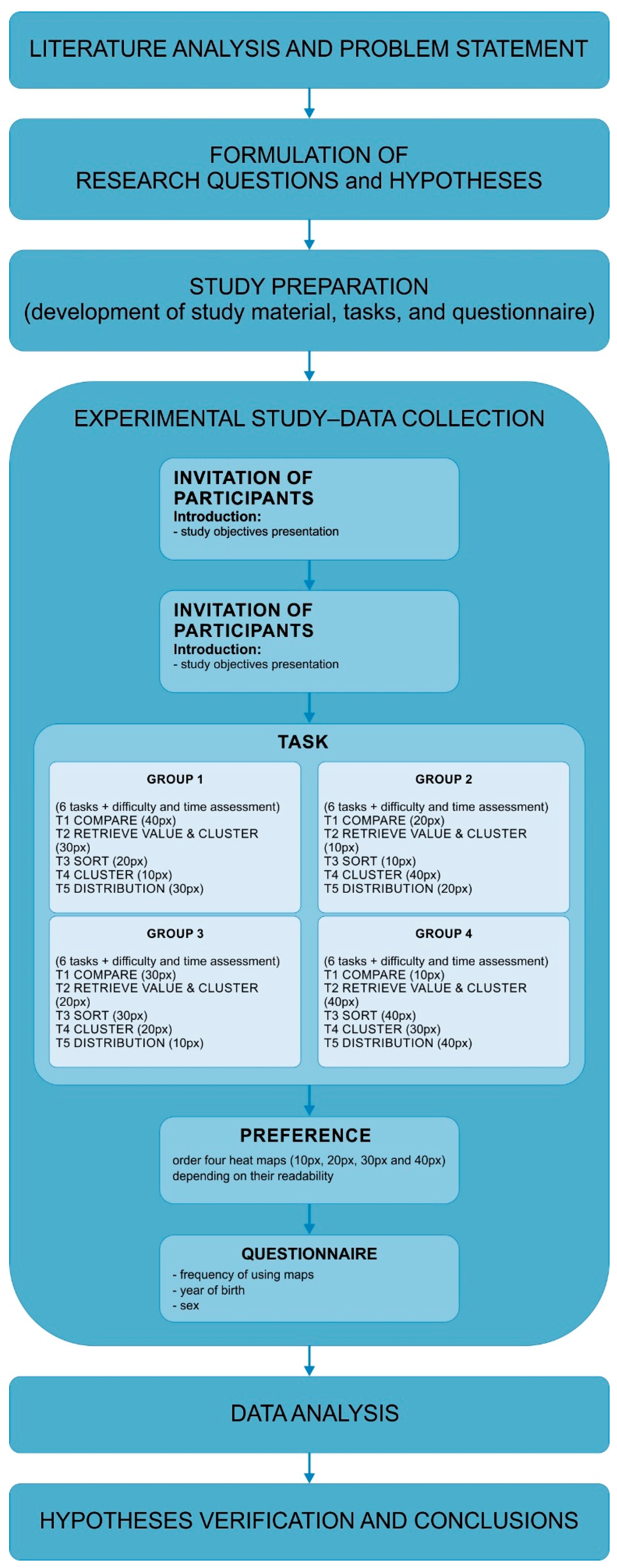
3.3. Tasks and Procedures
To define the tasks for heat maps analysis (maps for quick reading), we used a compilation of objective-based taxonomies by Roth [
52]. We had six tasks asking users to compare, sort, cluster, analyze distribution, and retrieve value and cluster (twice) (
Table 2). In three tasks (T1, T5, T6) respondents had to indicate a correct answer from the options: A, B, C, and D. In T1, a particular district was expected to be indicated; in T5, proportions of two areas were divided by a line; and in T6, an estimation of the number of wind turbines was made. Two further tasks (T2, T3) were open questions, and the users were asked to estimate the number of wind turbines (T2) and sort districts in descending order based on the number of wind turbines (T3). The last type of task (T4) involved indicating (marking) a particular district on the map, based on a comparison with another district.
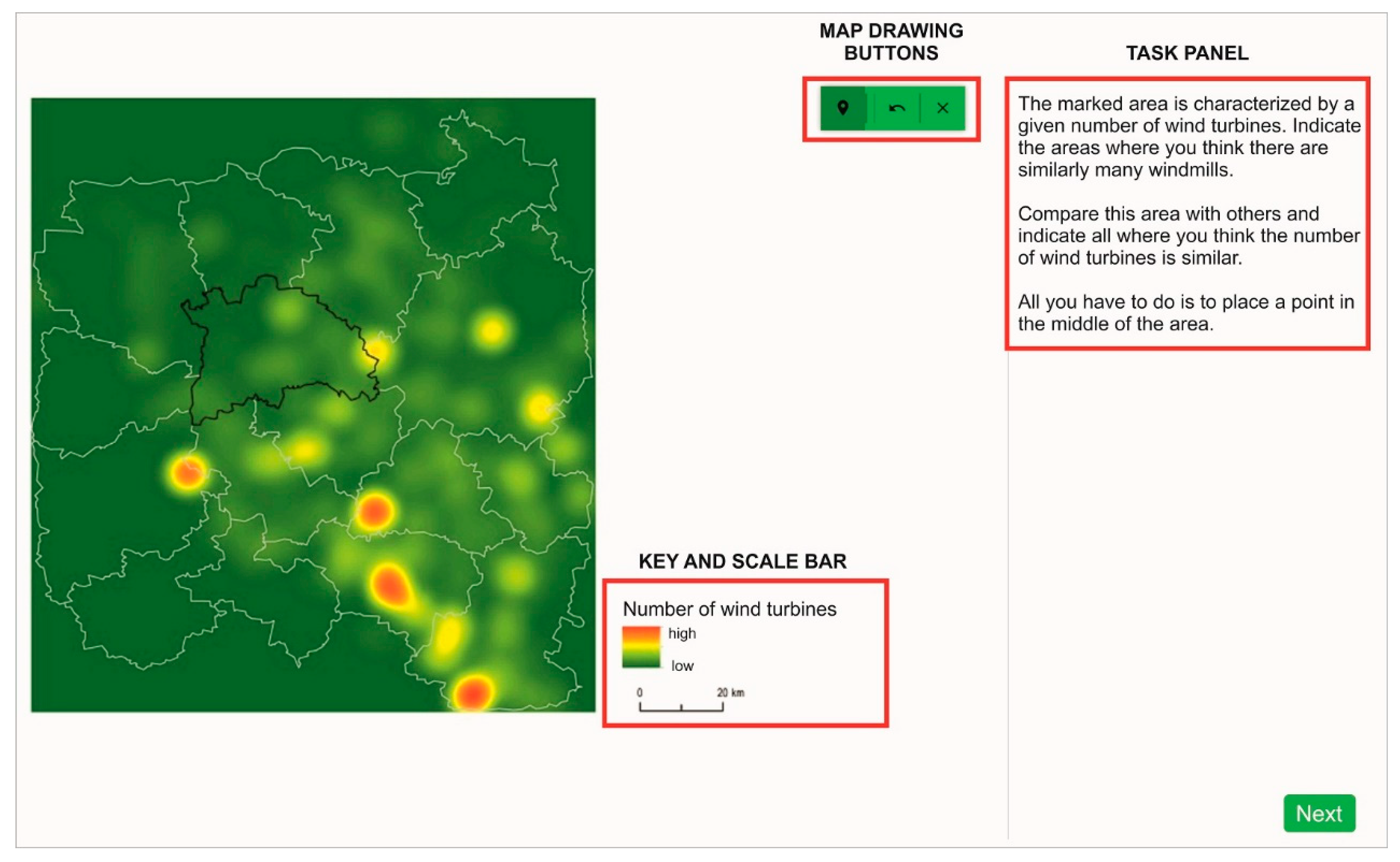
The study was conveyed in Poland using a web application during high school geography or IT lessons (
Figure 2, link to the application with the study:
https://emprek-ca39f.firebaseapp.com/badania/heat-map-v3, accessed on 6 July 2021). The participants were divided into four, almost parallel, groups with approximately 100 people in each. Each participant solved one of the four possible tests, which were randomly selected when the application started. The tests differed in generalization levels (4) and area variants (2) of the heat maps in order to avoid a learning effect. These areas, although different, were of a similar degree of difficulty, so the results are comparable.
The study began with an introduction to the research, during which its purpose, aims, and goals were explained. When starting the study, the application randomized the test. In the test, users had to answer every question before moving on. After each task, the participant answered questions on the difficulty assessment and time assessment, both on a 5-point Likert scale, from (1) very easy/fast to (5) very difficult/slow. The time was controlled during the test, so it could be possible to compare the time assessment and the real time spent on solving the tasks. At the end of the test, participants were asked about their preferences, and had to order four heat maps (10 px, 20 px, 30 px and 40 px) based on their readability. Finally, they filled in the personal questionnaire with questions about the year of birth, sex, and frequency of using maps (
Figure 3).
3.4. Data Analysis
Data were statistically analyzed in SPSS Statistics software. The chi-square test, which allows the dependence between variables to be verified, was applied for correctness of the response. Additionally, Cramér’s V was used to indicate the degree of association between the two variables. It is an extension of the chi-square test for tables larger than 2 × 2 [
53]. Concerning the time metrics, the data did not follow the normal distribution according to the Kolmogorov–Smirnov test; therefore, the Kruskal–Wallis test was applied. The Kruskal–Wallis test is a non-parametric test that can be performed on ranked data. The Kruskal–Wallis test allows for the verification of a significant difference between at least two groups in terms of the medians in the set of all analyzed medians [
53]. For the last two variables—time assessment and task difficulty—data were collected on the ordinal Likert scale; thus, the Kruskal–Wallis test was used.
4. Results
4.1. Answer Correctness
The participants answered 20% of all tasks correctly. The highest rate of correct answers was measured while using HM20 (25%) and HM10 (24%). While using more generalized maps, participants achieved a lower score (HM30 16%; HM40 15%). The accuracy of answers was dependent on the level of heat map generalization: X2 (3, N = 2454) = 29.145, p < 0.001, Cramér’s V = 0.109, p < 0.001. Moreover, pairwise comparisons showed that the relation between variables occurred in four cases when comparing less generalized maps (HM10, HM20) with more generalized (HM30, HM40):
HM10-HM20 X2 ns (the abbreviation ‘ns’ stands for ‘not statistically significant’);
HM10-HM30 X2 (1, N = 1238) = 11.483, p < 0.001, Cramér’s V = 0.096, p < 0.001 (with better results for participants working with HM10);
HM10-HM40 X2 (1, N = 1217) = 13.859, p < 0.001, Cramér’s V = 0.107, p < 0.001 (with better results for participants working with HM10);
HM20-HM30 X2 (1, N = 1237) = 17.962, p < 0.001, Cramér’s V = 0.110, p < 0.001 (with better results for participants working with HM20);
HM20-HM40 X2 (1, N = 1216) = 17.600, p < 0.001, Cramér’s V = 0.120, p < 0.001 (with better results for participants working with HM20);
HM30-HM40 ns.
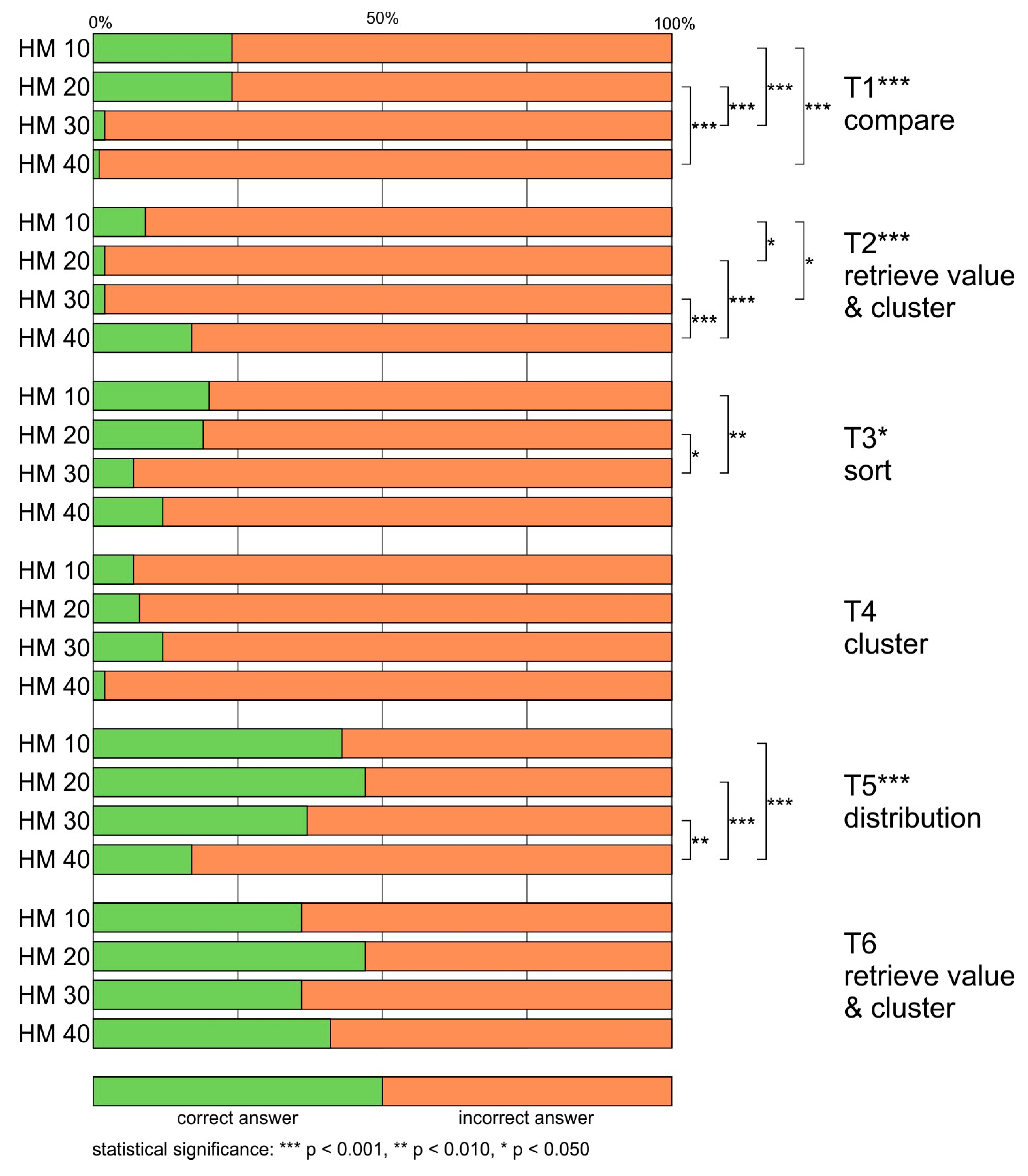
The highest rate of correct answers was obtained for T6 retrieve value and cluster (40%). Slightly fewer respondents answered correctly for T5 distribution (37%). In both cases, the highest percentage of correct answers was achieved in the HM20 group (47%). The lowest rate of correct answers was obtained for two tasks—T2 retrieve value and cluster, and T4 cluster (7%). In the case of these questions, in some groups, only 1 or 2% of the respondents chose the right answer (e.g., HM30, HM40,
Figure 4).
When it comes to inferential analysis, the statistical significance of the association between the mapping type and the correctness of the answers was found for four out of the six tasks: T1 compare, T2 retrieve value and cluster, T3 sort, and T5 distribution (
Table 3). In one case, the association was moderate (T1), and in the remaining three cases, the dependence was weak (T2, T3, T5).
In T1 compare, the best result (24%) was achieved for HM10 and HM20, and the outcome of the statistical tests was significant when the results were compared to the results recorded with HM30 and HM40, which performed very poorly (HM30 2%, HM40 1%) (HM10-HM30 p < 0.001; HM10-HM40 p < 0.001; HM20-HM30 p < 0.001; HM20-HM40 p < 0.001). A similar situation was found for T3. In that case, the pairwise comparisons showed that the dependence of the correctness of the answer on the level of generalization was significant only when comparing the results of HM10 (20%) and HM20 (19%) with the results of HM30 (7%), but not with those of HM40 (12%) (HM10-HM30 p < 0.010; HM20-HM30 p < 0.050).
In the T5 distribution, the best results were obtained for HM20 (47%), with slightly worse results for HM10 (43%) and HM30 (37%). The dependence of the correctness of the answer on the level of map generalization was significant when comparing each of these maps to HM40, for which respondents obtained the worst rate of correct answers—17% (HM10-HM40 p < 0.001; HM20-HM40 p < 0.001; HM30-HM40 p < 0.010). A different situation was discovered in the case of T2 retrieve value and cluster, in which HM40 provided the most correct answers (17%), HM10 provided fewer (9%), and the least was provided by HM20 and HM30 (2% each). Statistically significant results were found when comparing two better maps to two worse maps (HM10-HM20 p < 0.050; HM10-HM30 p < 0.050; HM20-HM40 p < 0.001; HM30-HM40 p < 0.001).
4.2. Response Time
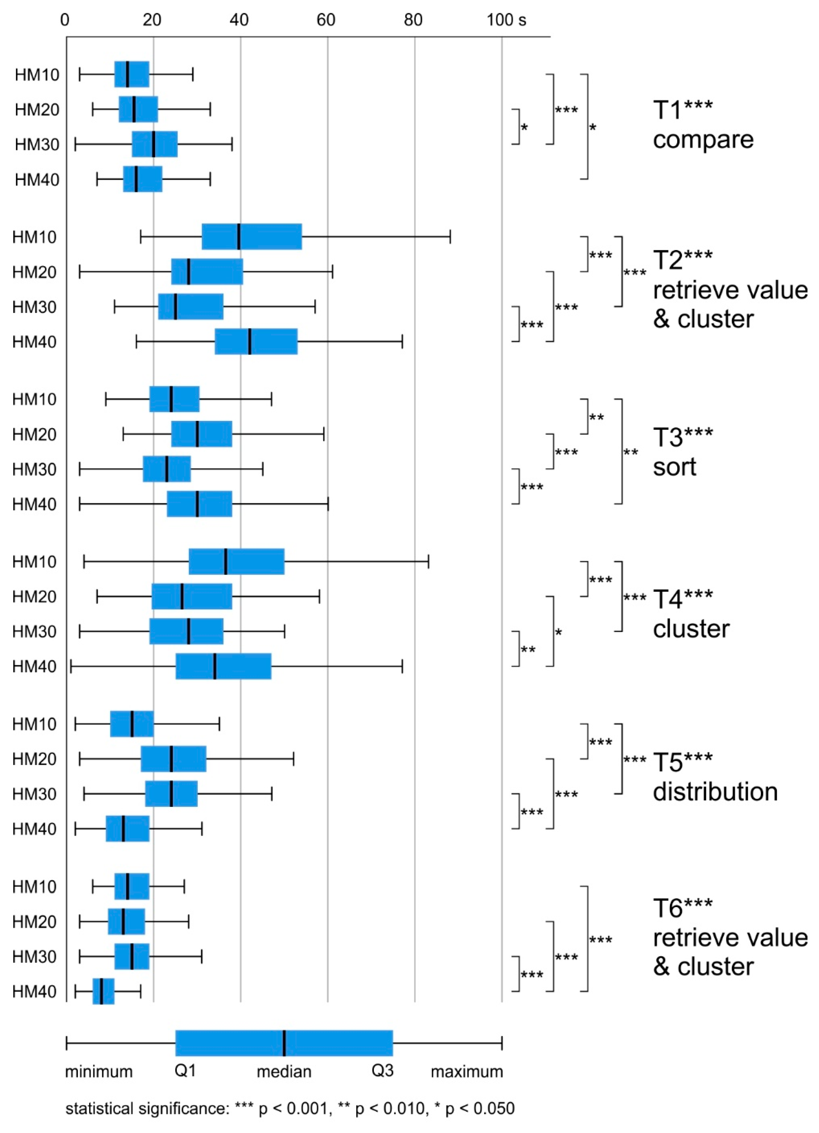
The mean response time for all maps was similar (HM10 M = 26.5 s, SD = 0.767; HM20 M = 25.3 s, SD = 0.558; HM30 M = 24.6, SD = 0.543; HM40 M = 26.4, SD = 0.782). The differences in response time while using heat maps with different levels of generalization were not significant: H (3) = 1.898, ns.
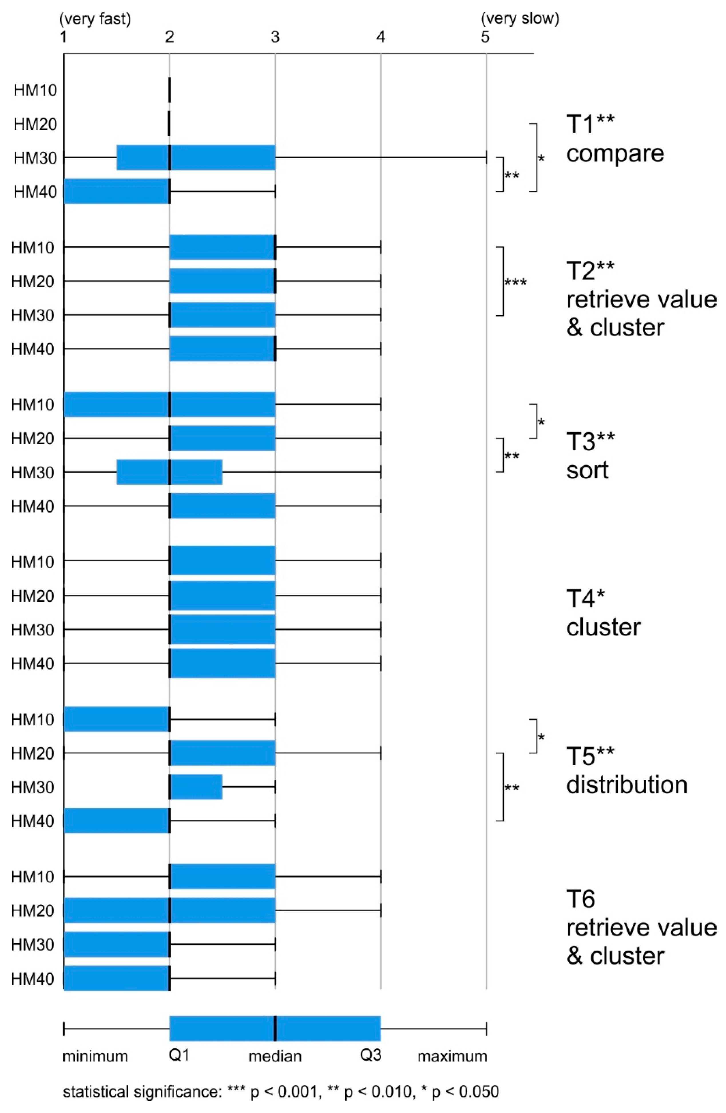
The average task-solving time varied by up to 24 s. The task, which on average was answered the slowest, was the T2 retrieve value and cluster (M = 38.6 s, SD = 0.958). The lowest mean response time was achieved for the T6 retrieve value and cluster (M = 14.0 s, SD = 0.385). For T1 compare and T5 distribution, the difference was less than two seconds (T1 M = 18.6 s, SD = 0.509; T5 M = 20.5 s, SD = 0.584). For T3 sort and T4 cluster, the average response time was around 30 s (T3 M = 28.8 s, SD = 0.637; T3 M = 33.5 s, SD = 0.940) (
Figure 5).
The differences in response time between the maps were statistically significant for all tasks, and post hoc (Bonferroni) tests were conducted in order to identify significant intergroup differences (
Table 4).
In T1 compare, respondents using HM10 answered significantly faster than those using HM30 or HM40 (HM10-HM30 p < 0.001, HM10-HM40 p < 0.050). What is more, participants who solved this task using HM20 answered faster than those using HM30 (HM20-HM30 p < 0.050).
In T2 retrieve value, T3 sort, and T4 cluster, respondents using HM30 responded the fastest. In T3 sort, respondents using HM10 answered slightly slower than those using HM30. Statistically significant differences occurred between HM10-HM20 (p < 0.010), HM10-HM40 (p < 0.010), HM20-HM30 (p < 0.001) and HM30-HM40 (p < 0.001). In T2 retrieve value and cluster, and T4 cluster, respondents using HM20 and HM30 answered questions significantly faster than those using HM10 and HM40 (T2 HM10-HM20 p < 0.001, HM10-HM30 p < 0.001, HM20-HM40 p < 0.001, HM30-HM40 p < 0.00; T4 HM10-HM20 p < 0.001, HM10-HM30 p < 0.001, HM20-HM40 p < 0.050, HM30-HM40 p < 0.010).
The last two tasks (T5 distribution, T6 retrieve value and cluster) were solved most quickly by respondents using HM40 (T5 M = 14.3 s, SD = 0.671; T6 M = 8.7 s, SD = 0.364). In T5 distribution, respondents using HM10 responded slightly slower than those using HM40. Statistically significant differences occurred between maps with extreme generalization values (HM10, HM40—fastest) and those with average generalization values (HM20, HM30—slowest): HM10-HM20 p < 0.001; HM10-HM30 p < 0.001; HM20-HM40 p < 0.001; HM30-HM40 p < 0.001. In the case of T6 retrieve value and cluster, significant differences occurred between HM40 and the other maps that took, on average, almost twice as long to solve the task (HM10-HM40 p < 0.001; HM20-HM40 p < 0.001; HM30-HM40 p < 0.001).
4.3. Response Time Assessment
Most of the tasks were assessed as being resolved very quickly (20%), or quickly (48%). The answer “hard to say” was indicated in 25% of all tasks. Negative assessments of difficulties appeared less frequently (“slow” 6%, “very slow” 1%).
For each of the analyzed maps, the median was 2 (“fast”). However, while using more generalized maps (HM30, HM40), respondents assessed their completion of tasks as slightly faster (over 70% of responses were from categories “very fast” or “fast”). When using less generalized maps (HM10, HM20), these assessments accounted for 65% of the responses. The differences in response time assessment while using heat maps with different levels of generalization were significant: H (3) = 13.434, p < 0.010. Post hoc comparisons indicated that the maps that differed significantly from one another (in favor of more generalized maps) were HM20 and HM40 (p < 0.050) (
Figure 6).
The differences in the assessment of time between the maps and post hoc (Bonferroni) tests were statistically significant for four of the six tasks: T1 compare, T2 retrieve value and cluster, T3 sort, and T5 distribution (
Table 5). For eight cases of intergroup differences, six were in favor of more generalized maps.
In T1 compare, the participants using HM40 assessed the response time as faster than respondents using HM20 (p < 0.050) or HM30 (p < 0.010). In turn, in T2 HM30 was assessed as significantly faster than HM10 (p < 0.001). Interestingly, in both T3 sort and T5 distribution, two significant intergroup differences were detected—one in favor of a less generalized map (T3 HM10-HM20 p < 0.050; T5 HM10-HM20 p < 0.050), and the other in favor of a more generalized map (T3 HM20-HM30 p < 0.010; T5 HM20-HM40 p < 0.010).
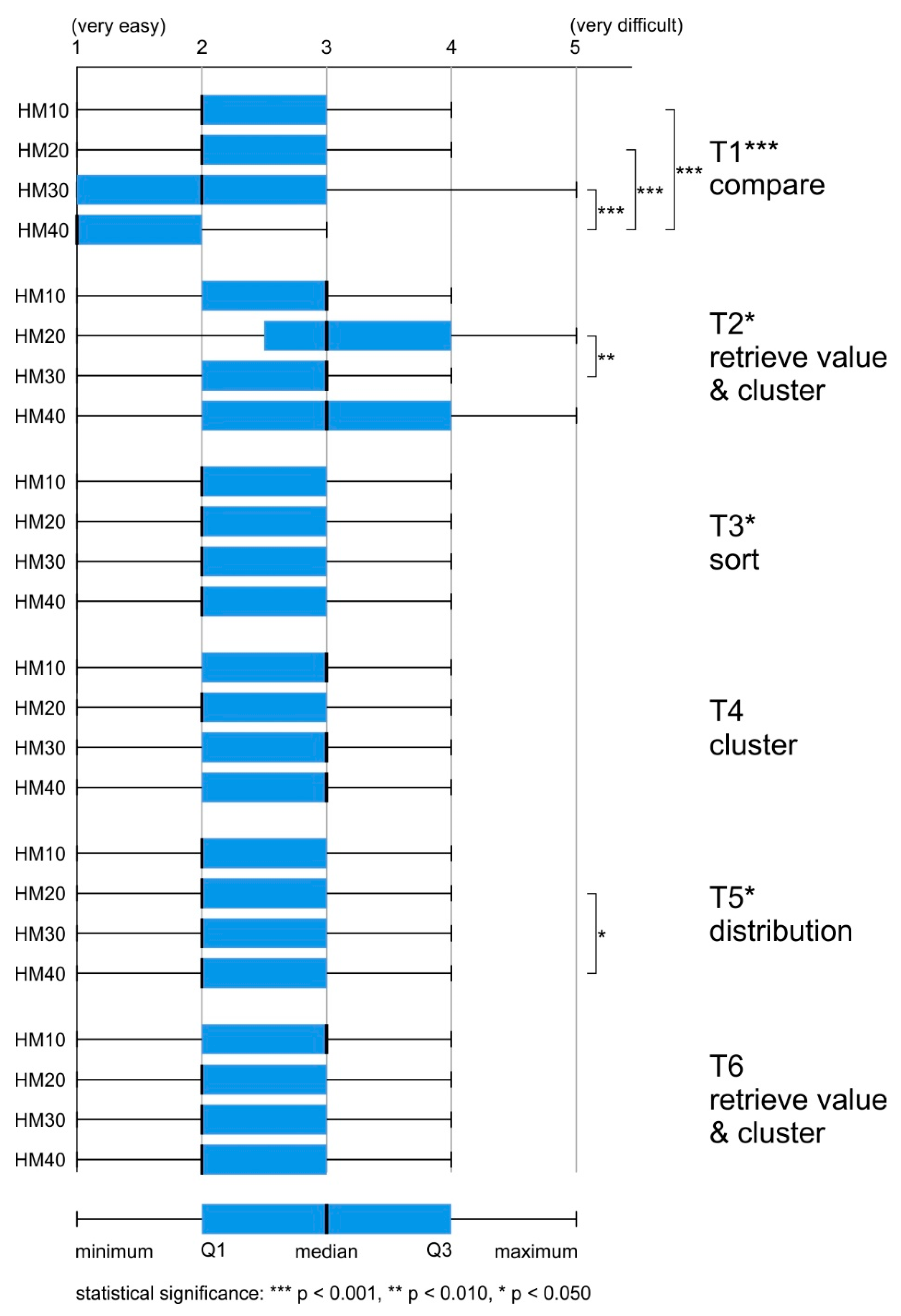
4.4. Difficulty of the Task
Most of the tasks were assessed positively (“easy” 37%, “very easy” 27%). The answer “hard to say” was indicated in as many as 33% of all tasks. Negative assessments of difficulties appeared less frequently (“difficult” 10%, “very difficult” 3%).
For each of the analyzed maps, the median was 2 (“easy”). However, while using more generalized maps (HM30, HM40), respondents assessed the tasks as slightly easier (around 55% of responses were from categories “very easy” or “easy”), whereas, when using less generalized maps (HM10, HM20), these assessments accounted for 50% of the responses. The differences in difficulty assessment between heat maps with different levels of generalization were significant: H (3) = 28.242, p < 0.001. Post hoc comparisons indicated that the maps which differed significantly from one another were HM10-HM40 (p < 0.001) and HM20-HM40 (p < 0.001) (
Figure 7).
The differences in task difficulty between the groups were statistically significant for three of the six tasks: T1 compare, T2 retrieve value and cluster, T3 sort, and T5 distribution (
Table 6). Post hoc (Bonferroni) tests showed that in each of the three cases, the more generalized maps were rated as easier, and in the case of T3 sort, no differences at the intergroup level were found.
The highest number of intergroup differences was found for T1 compare. Statistically significant differences in the assessment of the difficulty of tasks occurred between HM40 and the other maps (HM10-HM40 p < 0.001, HM20-HM40 p < 0.001, HM30-HM40 p < 0.001). In the remaining two tasks, there was only one significant difference between the maps. For T2 retrieve value and cluster, it concerned HM30-HM20 (p < 0.010); in T5 distribution, it concerned HM40-HM20 (p < 0.050). In each case, the difference was in favor of the most generalized map.
4.5. Preferences
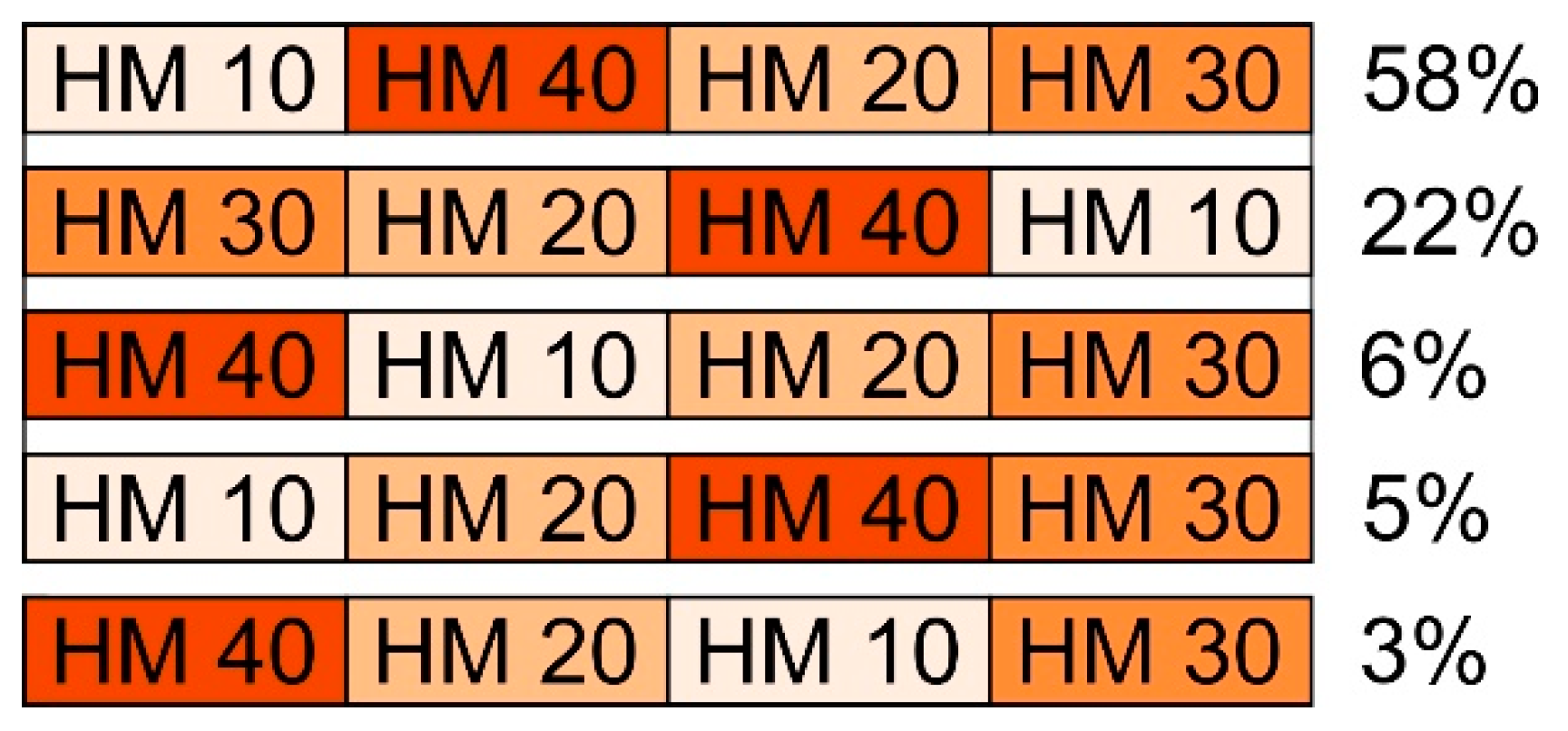
The participants were asked to rank maps according to those that best represented the spatial diversity of the phenomenon. The responses of 22 participants were considered invalid (e.g., they repeatedly indicated the same map) and were not taken into account during the analysis. In over half of the answers (57%), HM10 was chosen as the most suitable. HM30 was indicated more than two times less frequently (26%). The lowest percentage concerning the most adequate solution was recorded for HM40 (11%) and HM20 (5%).
The sequence analyses took responses that occurred ten times or more into account. The most frequently indicated sequence was HM10, HM40, HM20, HM30 (48%) (
Figure 8). Interestingly, as many as 22% selected the reverse order. However, in the next most frequently repeated sequences, HM30 was indicated as the map that least favorably represented the spatial diversity of the phenomenon (
Figure 8).
5. Discussion
The aim of the study was to compare heat maps in terms of four levels of generalization (radius of 10 px, 20 px, 30 px, and 40 px) with respect to objective and subjective usability metrics. In terms of objective metrics, we took into account the time and accuracy of the response; in relation to subjective metrics, we took into account the assessment of response time, assessment of difficulty, and users’ preferences. On this basis, we wanted to compare the effectiveness and difficulty of using heat maps with different levels of generalization, as well as confront their efficiency with their perceived efficiency.
RQ1. How does the heat map’s generalization, defined by the size of the kernel radius, influence its effectiveness?
H1. Lower levels of generalization result in higher correctness of answers by heat map users.
The average correctness score was low. Tasks used in the reported study included data retrieval or number estimation. Thus, the very low overall correctness rate obtained in the study (20%) confirmed the observations of Netek et al. [
4] and Nelson and MacEachren [
38] about heat maps not being suitable for reading accurate values from maps. Yet, while locating the “hot spots” in T1 compare, or T3 sort, participants did not obtain better results, although heat maps are recommended for such visual analyses [
4].
When it comes to the general results, the best metrics on the correctness of the answers were obtained by the participants working with more detailed heat maps (HM10 and HM20) than those with more generalized ones (HM30 and HM40). Pairwise comparisons determined that the relation between variables occurred when comparing two more detailed maps with two more generalized ones.
While analyzing the results of each task carefully, statistically significant results were obtained for four out of the six tasks. In two cases (T1 compare, T3 sort), the best and simultaneously similar results were obtained by participants using HM10 and HM20. In T5 distribution, participants using HM20 had the best results, while those using HM10 and HM30 were slightly worse; however, in each case of pairwise comparison with HM40, they were statistically significant. The dependence of variables was especially evident in T1 compare, and slightly less visible for T3 sort and T5 distribution, which involved analysis of spatial distribution. Interestingly, in the case of T2 retrieve value and cluster, the best results were obtained by people using heat maps with extreme radius values (HM40 or HM10) for this task. Thus, the maps which presented already grouped or most detailed data were more effective than those with a mean radius (HM20, HM30).
To sum up, the obtained results confirm the observations made by Netek et al. [
4] that lower radii present data more clearly. This indicates better readability of heat maps with a low level of generalization. We thus accept Hypothesis 1, which states that lower levels of generalization result in higher correctness of answers by heat map users. However, unlike the research by Roth et al. [
41,
42], we noted a much lower accuracy of response while participants were using heat maps. The preliminary results of Roth et al. [
41,
42] reported the percentage of correct answers at around 90%, which probably results from the use of interactivity in their study. To sum up, a comparison of the results obtained in both studies suggests that heat maps should be used in interactive environments and not as static maps. The availability of interactive tools that have zoom or data retrieval functions could result in map users being able to gain a more detailed view of the phenomena and use heat maps more effectively.
RQ2. What are the discrepancies between differently generalized heat maps in the context of efficiency and perceived efficiency?
H2. Higher levels of generalization result in faster responses and a higher perceived efficiency by heat map users.
Given the general results of the time of response, there were no significant differences between using heat maps with different levels of generalization. Nevertheless, while looking at the more detailed results—in five cases (T2 retrieve value & cluster, T3 sort, T4 cluster, T5 distribution, T6 retrieve value & cluster)—usage of the more generalized heat maps (HM30, HM40) resulted in the fastest response, and only in one task (T1 compare) was HM10 the most efficient map.
Yet another insight was provided by post hoc tests. Statistically significant results were obtained for all of the six tasks. The most frequent (occurring in half of the cases—T2 retrieve value and cluster, T3 sort, T4 cluster) was the difference between HM30 and HM40, with the results being in favor of HM30. In two cases (T2 retrieve value and cluster, and T4 cluster), participants using HM30 were also significantly faster than participants using HM10. With regard to the other outcomes, it would be quite impossible to indicate any consistency in the results, as, for instance, there are two cases where the results for HM10 are better than HM20, and for when HM20 are better than HM10. For example, when the participants’ task was to retrieve, value and cluster the data, in T2, the results were in favor of mean radii values (HM20, HM30), and in T6, they were in favor of the map with the highest radius (HM40). While conducting the task of comparison (T1), participants had better results while using HM10 or HM20 than maps with higher radii values, a result that is similar to the case of answer correctness.
When it comes to the perceived response time, more consistent results were obtained. Participants assessed that they conducted tasks faster when using more generalized maps. In terms of particular tasks, statistically significant results occurred in four out of six cases. In the case of T1 compare, participants indicated that they responded faster using HM40 than HM10 or HM20, which is the opposite of the real-time response results. The actual and perceived efficiency scores were also inconsistent for T4 cluster. In terms of objective metrics, the participants using HM20 and HM30 had better results than those working with HM10 and HM40. Yet, in terms of subjective metrics, the difference occurred between participants using HM40 and HM20, being in favor of the higher radius value. Two cases of consistency of statistically significant differences occurred in T3 sort, where users achieved better objective and subjective results using HM10 and HM30 than HM20. In T2 retrieve value and cluster, there was only one case of the difference being the same, which was the only significant post hoc difference of the time assessment for this task—with HM30 participants solving tasks faster and also perceiving that they performed faster than those using HM10.
In conclusion, for subjective metrics, unlike objective metric, the overall result was significant in favor of one level of heat map generalization—HM40. Moreover, there were many more specific differences in the response time than in the perceived response time. Therefore, we can only partially accept Hypothesis 2 stating that higher levels of generalization result in faster responses and a higher perceived efficiency by heat map users. In terms of time metrics, the obtained results confirm the findings on the inconsistency between objective and subjective metrics [
48,
49]. However, in some cases, regarding the compliance of the results with the metrics, some authors reported the consistency of the data in relation to the correctness of the answers and subjective metrics [
41,
42,
47]. Yet, in the study reported in this paper, participants obtained the lowest error rate using maps with a high degree of detail, and positively assessed the response time and difficulty of tasks in relation to the most generalized maps in the reported study. Thus, we obtained consistent results only for subjective metrics.
In general, participants of the reported study found the heat map tasks easy. However, Roth et al. [
41,
42] reported better results on heat map difficulty. Presumably, the reason was that the participants of their study could benefit from interactive functions, as in the case of the correctness of answers.
In terms of the overall difficulty of the test, participants assessed more generalized maps as the easiest. Statistically significant differences occurred between heat maps with different levels of generalization in three out of six tasks (T1 compare, T2 retrieve value and cluster, T5 distribution). Additionally, in each of these cases, participants using heat maps with a larger radius (HM 30 or HM40) rated the tasks as being easier than those using heat maps with a smaller radius (HM10 and HM20). In T1 compare, a significant difference appeared, even when comparing HM40 and HM30, in favor of a more generalized map. The obtained results are not consistent with the subjective metrics from the study by Netek et al. [
4], in which participants assessed heat maps with radius values of 10 and 20 pixels as preferred and more legible. However, these results were obtained on the basis of survey questions that were not preceded by the performance of tasks as in the study reported in this paper.
In conclusion, participants found heat maps with higher levels of generalization to be less difficult. Thus, we cannot accept Hypothesis 3, stating that heat map users perceive less generalized maps as easier. Perhaps participants from the reported study recognized less generalized heat maps as “visually noisy”, similar to those who took part in the study by Nelson and MacEachren [
38]. It might also be possible that the results would have been different had the study material been interactive, as in the studies by Roth et al. [
41,
42] and Nelson and MacEachren [
38].
We decided not to make any hypotheses about the preferences of the study participants, as we did not analyze this variable for statistical significance. Yet, we would like to point out the difference between the results among participants’ preferences obtained in the study reported in this paper and those in the study by Netek et al. [
4] conducted among both cartographers and the general public. In our study, conducted among high school students, the most preferred solutions were the most extreme ones, namely, HM10 and HM40. However, the older age group (age mean 26 years) from the study by Netek et al. [
4] preferred heat maps with low radii settings of 10 px and 20 px. Such differences in the results may encourage map research on different levels of generalization to be conducted in relation to the age of users, as research with reference to age groups is an important part of cartographic empirical research [
54,
55,
56].
6. Conclusions
Based on the presented user study, we can state that, in the given circumstances, heat maps can be considered a useful method for spatial data presentation. Three statements could be made to justify this. Firstly, although the average answer correctness score was quite low, lower levels of generalization resulted in higher correctness of the answers, especially in T1 compare, T4 cluster, and T5 distribution. Secondly, higher levels of generalization did not result in faster response times: there were no notable differences between heat maps with different levels of generalization. However, the users perceived more generalized heat maps as being more efficient and less time-consuming for solving tasks. Thirdly, the participants perceived more generalized maps as being easier to use, although this was not reflected in the answer correctness.
The authors of this study are fully aware of its limitations. It was focused on the usability of heat maps with respect to the generalization level only and included certain types of participants and tasks. As heat maps are becoming more and more popular, especially in the web environment, the next step is to assess them more thoroughly and incorporate other visual variables into consideration, such as, for example, color schemes and transparency, as well as variables, such as different base maps (e.g., satellite imagery or topographic maps), and the level of interactivity. The latter is substantially important, as heat maps are mostly used in interactive environments and not as static maps. The availability of interactive tools, including zoom or data retrieval functions, could result in map users’ possibility to gain a more detailed view of the phenomenon in order to use heat maps more effectively. Therefore, it is worth analyzing which interactive functions are most useful while using heat maps. Other—already grounded—map types, such as choropleth, isoline maps or dot maps, should also be compared with heat maps in terms of efficiency. It would be interesting to compare flow maps and heat maps in relation to linear phenomena. Quantitative analysis of the generalization process could also be interesting for future research of heat maps, as it proved to be in terms of tactile maps [
57] or topological information [
58]. To sum up, considering the possibilities of analyses in the field of the use of heat maps in cartography, we are presented with a very wide field of research possibilities. We hope that our study will contribute to further interest in this type of map and further empirical research.


