
Architectural Beauty: Developing a Measurable and Objective Scale


1
Eurac Research, Institute for Biomedicine, Affiliated Institute of the University of Lübeck, Via Galvani 31, 39100 Bolzano, Italy
2
The Human Architecture & Planning Institute, Inc., 43 Bradford St., Concord, MA 01742, USA
3
Departments of Mathematics and Architecture, The University of Texas, San Antonio, TX 78249, USA
*
Author to whom correspondence should be addressed.
Challenges 2022, 13(2), 56; https://doi.org/10.3390/challe13020056
Submission received: 30 August 2022
/
Revised: 27 October 2022
/
Accepted: 28 October 2022
/
Published: 29 October 2022
Abstract
:After decades of being ignored, the concept of beauty, as understood by the non-architect, has recently been making a comeback in architecture, not so much in the practice itself, as in appeals for design solutions that are more human-centered and not dictated by abstract principles. Architectural beauty needs to be evaluated from its effects on human health. This study discusses two diagnostic tools for measuring the degree of architectural “beauty” and presents the results of the pilot application of one of them. The goal is to use diagnostic imaging for evaluations. Analytical elements are introduced from disciplines with which practitioners are normally not familiar, such as artificial intelligence, medicine, neuroscience, visual attention and image-processing software, etc. In addition to the diagnostic tools, this paper ties related ideas on objective beauty into a novel synthesis. These results support the idea of a feasible, “objective” way to evaluate what the users will consider as beautiful, and set the stage for an upcoming larger study that will quantitatively correlate the two methods.
1. Introduction
The idea of beauty in architecture triggers endless and inconclusive debates and polemics. Even so, it is beginning to occupy center stage in appeals for better—that is, more humanly adaptive and sustainable—design solutions [1,2,3,4,5]. This article introduces one way of approaching the topic (certainly not the only way) in a model that might prove useful in achieving clarity among widely accepted yet competing notions of “beauty”. Architectural beauty is far too important to leave to theoretical discussions, because it affects cities and the global economy.
Architectural beauty has become a question that already touches the highest levels of government policy in several nations. It is therefore important that it be addressed with scientific tools rather than the usual historical and political arguments, which have only led to controversies and polarization. This topic has occupied the national debate in three recent and separate instances.
1. China. One of the present authors (NAS) wrote an open letter to President Xi Jinping supporting his call to end “weird buildings” linked to corruption and cultural meltdown [6,7], which was published in Chinese.
2. United Kingdom. The Building Better, Building Beautiful Commission produced the report Living With Beauty containing guidelines for future building developments [8]. Co-author NAS provided input on a previous publication, Of Streets and Squares [9], which served as material for the subsequent government report.
3. United States. Co-author NAS was a member of the President’s Council on Improving Federal Civic Architecture, established by President Donald Trump and disbanded by President Joe Biden; and is now a member of the non-partisan American Committee on Federal Architecture that is preparing recommendations to the United States General Services Administration for the design of Federal Buildings. He did not participate in drafting the controversial Executive Order on Promoting Beautiful Federal Civic Architecture [10], which stirred up a very ugly political controversy. That original effort was flawed since it promoted a limited variety of architectural beauty using historical, top-down arguments instead of scientific, bottom-up ones [11,12].
Lost among the heated and partisan media debate, a confluence of events occurred that signals a paradigm shift. An independent Harris Poll revealed overwhelming public preference for traditional versus modernist US federal buildings [13]. The pollsters were able to show that this preference in no way depends upon political party affiliation. Two separate groups of researchers verified the results of the Harris Poll with either direct eye-tracking experiments, or eye-tracking simulation software [14,15]. Brandon Ro used visual attention software by 3M Corporation, while Ann Sussman measured eye movements on webcams while subjects viewed the images on a computer screen. Evaluating the same set of comparison image pairs from the Harris Poll, both research groups found complete agreement with the survey results.
Several architectural organizations are trying to convince politicians to support biologically based objective beauty, and to block the wanton destruction of historical urban fabric that exemplifies those desirable qualities. One of these is Le Table Ronde de l’Architecture in Belgium [16]. Co-author NAS is a signatory of their declaration. The umbrella non-governmental organization The Architectural Uprising is active in the Baltic and Scandinavian countries as well as in the United Kingdom [17], and its branches survey the most beautiful versus ugliest new buildings in each country.
Worldwide, ever more intelligent production methods profiting from the latest digital technology are moving the architecture, engineering, and construction industry forward. Nevertheless, it seems antiquated to continue to rely upon reproducing standard design typologies that are taken for granted. There exists a disconnect between those two facets that is glossed over, in part because of the industry’s inertia: “if it’s not broken, don’t fix it”. Hopefully, the present discussion will uncover significant opportunities for improved end-results in shaping buildings and cities.
Psychologists have used numerical scales to measure beauty, starting with Gustav Fechner in the 19th century [18]. We have hypothesized a method that could prove to be useful if other researchers rigorously tested the methodology, and provide documentation for the underlying assumptions and theories that drive the research hypothesis, design, and execution, using established research protocols.
The goal of this article is to establish a scale for objective beauty, and a means of rank-ordering buildings on that scale. Because of a historical flip, the direction of increasing objective beauty is very important. Our diagnostic imaging method does not give an absolute ranking on the beauty scale; that comes from an intuitive assessment, yet those separate evaluations point in the same direction. Starting from the 1920s, however, dominant architectural culture accepts only buildings rating very low on the objective beauty scale.
Here, we attempt two things: (1) propose a way to guide the viewer into an unselfconscious state so as to better sense objective correlates of beauty; (2) define a parallel and supportive measure to objectively identify images manifesting such correlates using only software. These two techniques reinforce each other, and they also help to distinguish situations in which different types of subjective beauty play a role.
Diagnostic tools measure the relative degree of architectural “beauty” in the objective sense described above, and this study presents the results of the pilot application of one of them. These results set the stage for a larger study that will quantitatively correlate the two methods, to be undertaken separately. We will focus on developing a practical model for direct perception, and not investigate the origins of the effect. The present work is relevant because it can lead to better designed environments for human use. Its perspective prioritizes the health and wellbeing of the user, rather than advantages for systems of construction and design that are the commercial drivers for the building trade worldwide. The findings have a direct and immediate relevance for creating healing environments, in the sense that those are better for human health in general precisely because the design approach relies upon human neurophysiological responses.
We relate previous work by Christopher Alexander and Nir Buras to the diagnostic technique of eye-tracking simulation through Visual Attention Software (VAS). The first approach to evaluating architectural beauty here is the “beauty scale” estimate of a number from 0 to 10, introduced by Buras as an intuitive measure of visceral attraction (see The Art of Classic Planning, page 161) [19]. Despite being intuitive, the Buras beauty scale is inspired by experiments by Kawabata and Zeki on ranking visual artworks on a scale from 0 to 10: scores of 0–4 are “ugly”, scores of 5–6 are “neutral”, and 7–10 are “beautiful” [20,21].
Buras first mentioned the test applied to architecture in his book; otherwise, it is not well-known. This tool has proven to work well for a range of individuals not trained as architects, but it can lead to contradictory results when architects apply it (we discuss this important point towards the end of this essay). An accurate and easy means of quantifying beauty, it is nevertheless influenced by implicit biases. This vulnerability is often misinterpreted to cast doubt on the premise of assigning numbers to architectural beauty. What might at first appear to be a game is in fact deeply rooted in the body’s unconscious response mechanisms. Buras has used this tool for estimating architectural beauty, and has found roughly an 85% correlation among subjects (in numerous though undocumented examples).
Concordance among different subjects in evaluating the specific type of architectural beauty outlined here, and among different methods for estimating or measuring it mirrors the hypothesis of measurable objective features of perceived beauty (which constitute what we will call, from now on, “objective beauty”. In a statistically significant study using many images and subjects, the values for the beauty scale of a particular image estimated by different subjects will need to be combined, and the deviation computed. The robustness of the data will depend upon the inter-rater reliability. At the moment, the Buras test is an intuitive measure that some researchers use to estimate objective beauty, but it has not been statistically verified. A study is now underway to validate it under controlled conditions.
We will later discuss the Buras “beauty scale” together with Christopher Alexander’s “Quality Without A Name”—the QWAN [22,23], which has been applied extensively by software engineers to measure coherence in complex computer code. This relationship lends further insight and makes the “beauty scale” appear as far more than a personal whim. It also helps us to explore and better understand the QWAN in the context of measuring architectural beauty.
A software-based measurement of some components of objective beauty relies upon techniques such as eye-tracking and the very recent development of visual attention simulations. VAS simulates first-glance vision, which is informed by pre-attentive processing. VAS does not need to be trained for architectural images for our findings to be valid. In fact, for our purpose, it is beneficial that it has not been trained in this way. If there is any hope for probing into universal, culture-neutral reactions to visual stimuli, then investigating correlates of pre-attentive processing regardless of the image content is one of the best candidates.
Diagnostic imaging promises to improve the adaptability of global building to human health and sensitivities. Using VAS to rank-order architectural beauty correlates both with the Buras beauty scale, and with Alexander’s QWAN. Photos with high visual coherency depict buildings with beauty, or that at least contain some of the necessary components of objective beauty. The software ranking roughly (but not unequivocally) identifies the same images that we intuitively rate as beautiful, indicating promise in its use as a valid diagnostic tool.
To summarize: First, an intuition-based spontaneous estimate for architectural “beauty” ranges from 0 to 10. Second, a software-based technical analysis rank-orders images using two separate software packages. The human element in this latter method of analysis comes from the preliminary eye-tracking experiments that the 3M Corporation utilized in writing the code for its proprietary Visual Attention Software (VAS). No subjects are needed for this second evaluation.
2. Biologically Based Objective Beauty
The present investigation is interested in integrating new ideas and knowledge about public health rather than theoretical aesthetics. Architectural beauty links to health, because buildings low on the beauty scale deliver emotionally negative signals that activate the “behavioral immune system” through stress on the body [24,25,26,27,28,29,30]. The type of health impacted is initially mental, which over longer exposure influences the body, and so it eventually becomes physical. Medicine has to confront entrenched opinion about architectural beauty. While the Visual Coherence Index R computed later does not prioritize the impact of beauty on user health, salutogenic environments contain all the components of the biophilic healing index that will be mentioned in this context.
Medical practitioners are belatedly realizing that architectural culture’s dominant, ingrained aesthetic is not compatible with laboratory measurements indicating salutogenic environments [31,32,33,34,35,36,37,38]. The established approach to design undermines recent trends in using the environment to significantly aid in healing. This effort includes, but is not limited to, biophilic effects of human health. The healthcare profession does not know how the curriculum for training architects omits any discussion of the opposing valence sets of sensory qualities linked to beauty. Students are conditioned to disengage from neurological responses occurring in their own bodies, which is the reason why they—as practicing architects—later have such a psychological resistance to diagnosing objective beauty in the designed environment [39].
The potential health implications of exposure to different visual environments have been demonstrated in numerous studies focusing on exposure to natural versus artificial environments, and there are strong indications that it is the presence or absence of specific types of geometrical organization in the natural environment that mediates the observed beneficial effects. There is also evidence that the presence or absence of these same types of geometrical organization in artificial environments can have similar effects.
Going beyond generic design minimalism that lacks biophilic healing properties, the architecture profession imitates pathological conditions. Trauma survivors can lose their ability to process complex visual detail: yet a visually empty and featureless building deliberately banishes ordered architectural detail. Depressingly grey minimalistic design styles mimic pathologies of the eye-brain system such as cataract, Carbon Monoxide poisoning, cerebral achromatopsia, cortical lesions, macular degeneration, retinal detachment, and visual agnosia [40] (Chapter 4). This medically inexplicable choice generates anxiety in users; however, it advocates a preferred and subjective architectural aesthetic.
Newly developed commercial products thoroughly debunk the opinion that beauty cannot be measured (a debate that invariably turns unpleasant when it veers into ideology and politics). AI-based programs couple with sensors to detect people’s unconscious reactions to objective beauty, which is unbiased compared to self-reporting.
Substantial evidence exists for the effect that stress, and stressful urban environments, have on facial beauty [41]. A combination of stressors, mainly visual, affect the entire body, altering facial features so that they are perceived as being “uglier” than normal (a relative, not absolute measure), summarized as “stress induces ugliness”. However, also the other way around: ugliness induces stress. Experiments to establish the dual effect use medical evidence to measure stress, but the tools for measuring “ugliness” need an objective method of measuring architectural beauty.
It turns out that ugliness in the visual environment induces facial stress in the observer, which manifests in measurable though non-obvious facial features. AI-based programs discover the effect that environmental stress has by generating ugliness in a person’s face, which reciprocates with ugliness in the built environment generating stress in the human body.
Current technology makes possible computer-based facial expression recognition. Among several companies offering diagnostic products for facial expression analysis, iMotions and Noldus companies have established commercial platforms [42,43]. These similar tools sense how detailed facial features respond to an image and use AI to infer the unconscious emotional responses. The method “reads” facial muscle activity, which evolution has specialized for expression. Affectiva company (owned by Smart Eye, which also owns iMotions) is pioneering emotion AI software that measures human emotions and complex cognitive states by supplementing facial movements with other biometric sensors [44].
The capability of measuring environmental ugliness indirectly through physiological sensors represents a paradigm shift for design. Physiological stress induced by specific types of environmental information—which are identified as “ugly”—generates pathologies. This normally unnoticed mechanism of interacting visually with the environment goes beyond aesthetics, to influence human health. We expect forthcoming experiments to unambiguously support quantitative methods of ranking architectural beauty. The existing applications are to fine art, however, and not architecture.
The “Stendhal Index” is a recent commercial application developed by AI company Emotiva for evaluating artworks objectively [45,46]. Reasoned Art Gallery exhibits and sells digital artworks (Crypto Art, a new digital artistic platform consisting of Non-Fungible Tokens) to the public, selected according to their beauty rating on the Stendhal Index. Using webcams to measure facial muscle movements, this AI-based algorithm extrapolates the underlying emotions and their intensity. It measures how a work impacts the viewer emotionally from unconscious responses.
3. Analytical Methods
3.1. Using the Buras Beauty Scale to Rank-Order Images of Buildings
We first apply an intuition-based approach to evaluating architectural beauty, for purely practical purposes. It does not belong to the analytical methods that lead to our results in the present paper. Although this test is not analytical, we mention it here because of its utility. Using it enabled us to start the analysis by ordering the images we chose to use. The Buras scale is explained more fully towards the end of this paper.
The instructions for estimating the beauty scale—introduced into architecture from neuroscience by Nir Buras—are natural and straightforward. We simply allow the neurological apparatus of the human body to decide on ranking the observed “beauty”. Subjects are asked to use their senses instead of any preconceived opinions to rate something:
“Please rate this based on its visual appeal on a scale of 0 to 10—the first number that comes to your mind—with 10 being the most appealing.”
Ordinarily, this prompt should be enough to trigger an unconscious reaction that can be very roughly estimated by assigning a number from 0 (low or negligible beauty) up to 10 (high beauty). This is not an intellectual judgment; the effect of the aesthetic experience of beauty is emotional nourishment felt by the body. It is strongly recommended that the subject have cellphone, computer, or paper and pen at hand to record the result instantly, without thinking about it. This precaution is necessary to prevent changing the number in one’s mind according to perceived peer pressure and social norms. Reflection allows for confirmation bias, where the urge to switch numbers so as to match what is expected forces one to lie to oneself about the result.
In practice, the present authors use the Buras scale almost exclusively to evaluate the beauty of buildings, interiors, and urban settings. This is much easier than to have to rely on VAS or any other software, although VAS provides detailed and invaluable information about where the eyes are attracted to.
The Buras scale is not the same as a Likert scale, in which a subject fills in a questionnaire having a range of responses, with plenty of time to reflect. What the two have in common is that a rating notes the intensity of feeling when exposed to a given stimulus. Unlike the Likert scale, which is about intellectualized responses submitted post-attentively, this research focuses on pre-attentive sensibility. Therefore, there is no relation to that useful tool. Another difference is that many Likert scales range from positive to negative values, which psychologically privileges the neutral mark, whereas Buras uses a range of zero to maximum. The pre-attentive time scale links the Buras test to the VAS software.
3.2. Introduction to Visual Attention Simulation Software VAS
The method presented utilizes standard image-processing techniques used in other fields, including cell biology, applied here to evaluate the user’s engagement with images of buildings. To the best of the authors’ knowledge, a combined analysis using ImageJ (by the US National Institutes of Health) with VAS software is novel (as is its application to evaluate architecture). Eye tracking is being applied to document how a person perceives an environmental setting or object during the pre-attentive stage, which guides the first 3 s of gaze [47,48,49,50,51,52,53,54,55,56].
The software employed here does not seek specific geometrical features that the authors or anyone else expect beautiful images to contain. The VAS program mimics actual eye-scanning experiments. It is an AI application trained on real eye-tracking data from visuals, and not on architectural scenes (trained by 3M, not by us; it comes ready-to-use). The software helps us to document unconscious activity, where the eye first looks in processing salient environmental information. VAS was written using artificial intelligence to give us a picture of what the eye-brain system has evolved to do.
The VAS heat maps are further processed here using a different analytical software (ImageJ) to establish three measures of coherence: (1) the percentage coverage of the color heat map; (2) the number of “hot spots” in the heat map; and (3) the number of distinct non-contiguous regions of the heat map. These three numbers, taken from two versions of each image (see Figure 1, below), are then combined into a single index that will be used for studying the coherence of each image, using a very simple formula that is suggested by our previous investigations of VAS scans.
For practical use, we combine the three numbers measured from the VAS heat map for each image into a visual coherence index “R” (given later) to obtain a single number ranging from 0 to 100. The original image results in what is labeled here Rfar. A second “Rnear” is calculated for a second set of images, “zoomed in” by a constant factor, and the proportion of Rnear over Rfar is calculated. This number is taken as a computed numerical measure for one aspect of architectural beauty.
3.3. Visual Attention Scans and Engagement
3M Company developed VAS for applications in advertising, to determine how well a visual advertisement will be noticed. The software is based on actual eye-tracking data and uses results on the main factors that affect pre-attentive human visual interest that guides the first 3 s of gaze. This method of analysis applies equally to billboards, store displays, and webpages.
VAS simulates “first glance vision”, making possible diagnostic imaging. The visual system is able to select relevant or salient information so as to guide appropriate responses with survival value. These visual features are computed pre-attentively in a parallel manner, creating an early “saliency map” [57]. Information from the initial, pre-attentive processing of visual input, which lasts approximately 200–250 ms, is then used to guide the early deployment of selective attention [58]. It is known that many key decisions are made unconsciously based on this information. With VAS, it is possible to simulate actual eye-tracking to an accuracy of 92%. We use this software to get heat maps indicating the points of eye fixations on an image of an environment. This tool has been successfully employed in our previous work on the perception of architecture [59,60,61] and also on elements of landscape analysis, to which we refer the reader for more details.
Here, we will use the “heat map”, a color-coded visual showing where the eye spends most of its time during that first gaze period. Of the nine available settings for processing images in VAS, we chose “other” as the most neutral choice appropriate for building façades and details. The summation of the probability of fixation spots over the initial brief time frame is color coded as follows: black (none), violet (very low), blue (low), green (medium), red (considerable), dark red (maximum). Different colors indicate the degree of engagement, thus alerting the observer to further investigate whether the points of maximal interest could be beneficial or harmful to them. The software cannot make this distinction.
We review the structure of VAS heat maps. (1) Higher visual attention corresponds to a higher percentage of coverage of the image, as seen in the VAS heat map. High geometrical coherence correlates with a higher percentage of coverage, but note that coherence does not mean homogeneity in the original image. In fact, it’s the opposite. From our previous VAS studies, high coherence is achieved by having a high degree of organized complexity. (2) Points of focus show as red spots where our gaze spends relatively more time. In a harmonious composition, the gaze tends to be more uniformly distributed, hence there are not many of these singular points of attraction, whereas those present should reinforce geometrical coherence. If too many isolated red spots are present in the heat map, then the viewer’s unconscious attention is fragmented; and there are indications that this situation leads to stress that can even induce headaches [62,63,64]. (3) A harmonious composition attracts visual attention to every component throughout, whereas a fragmented visual presents competing regions of attention. For this reason, the number of non-contiguous regions of the VAS heat map is another useful measure of the degree of fragmentation, or lack of coherence.
A VAS scan showing mostly uniform distribution of gaze, with very few hot spots (red points), and largely contiguous span of the image can be thought of as corresponding to a state of psychological comfort. It is interesting to note that fractal patterns show a homogeneous VAS coverage and that such patterns have been demonstrated to recruit the Default Mode Network in fMRI experiments [65,66], which is associated with reduced cognitive processing load. We posit that this situation offers a major though unconscious reason for identifying something as “beautiful”. Departure from these features, such as incomplete coverage, too many hot spots, or a fragmented scan, are all indicators of stress that registers unconsciously. Based upon our previous VAS analysis of artifacts and buildings, an object or setting with those opposite qualities is unlikely to be perceived as “beautiful”.
VAS diagnostic imaging makes it possible to confirm whether a proposed design will indeed be perceived the way the designer imagines. This tool anticipates and predicts user engagement; specifically, these two related factors:
- Do the points where the eye is drawn to coincide with meaningful spots in the design?
- Does a carefully delineated part of the composition receive the expected visual attention?
It could be that VAS predicts the user to experience the structure very differently from what is anticipated on the basis of abstract aesthetics. Most importantly, the diagnostic images offer clues on how to fix a discovered problem before building. Note: at the time of writing, 3M company is making available several free VAS scans for visitors to its website (vas.3m.com accessed 5 October 2022). This provides an excellent opportunity for people to experiment with this technology and realize its diagnostic potential.
3.4. Comparison and Interaction of Images: Two Complementary Ways of Using Paired VAS Heat Maps for Diagnostics
Pairwise comparisons among buildings are performed using their VAS heat maps. The software gives useful information on how the eye notices visual details of the entire composition in pairs, documenting their relative interest. There are two distinct and complementary ways of carrying out such comparisons, and both are employed here to extract interesting results.
One method is to process two images separately, then compare them visually by looking at the two heat maps next to each other. Such a juxtaposition reveals unexpected features that contribute to relative user engagement with each structure. As most people are not used to seeing VAS heat maps, a side-by-side comparison could reveal surprising information; this comparison is akin to A/B testing.
The other comparative method combines two images of interest into one, and then processes that double image. In this case, the VAS software investigates visual competition and interaction between two buildings or structures, treating them as one scene. Patterns of visual attraction are radically altered as the software (imitating the eye) seeks points of maximal engagement. This interaction reveals the relative qualities of engagement of each of the two initial images. It is akin to A/B testing using the VAS software itself to evaluate preference.
The VAS software is designed to map the regions where the eye is attracted inside an image. Neural processing seeks and compares features in the environment to an internal reference; not an image stored in long-term memory, but general structural features such as facial geometry, fractals, symmetries, etc. that create some deep resonance with our perceptive system. An automatic analysis draws our attention to what could be threatening, and what could be beneficial.
In the context of judging architectural beauty, Christopher Alexander already discovered that absolute methods of evaluating a single design or image are not ideal, and that the quicker solution is to perform pairwise comparisons. This relative approach gives far more robust results, and is the basis of Alexander’s “Mirror-of-the-Self” test [67]. We have previously analyzed this tool and introduced VAS software both to aid and to validate the “Mirror-of-the-Self” test [68]. Here, we apply the same idea by having the VAS software compare the images with each other.
The present analysis offers a powerful and simple tool for judging designs variants in practice. The proposed method works as follows:
“Generate a pair of alternative designs for a particular portion of the project, then join those neatly into one image. The combined double VAS scan will reveal automatically which one of the alternatives is to be preferred, using objective criteria.”
This is a simple “spell-check” for designers who need to choose among alternatives. Just as in medical imaging, there are various complementary imaging methods, each one with its specific relevance. Obviously, the above result applies to specific images with fixed angle of view and chosen magnification, and does not extend to the entire building. Our recommendation is for several such tests to be performed at different magnifications, and focusing on distinct portions of the whole.
A key application of the diagnostic method, therefore, is to use pairwise comparisons of combined VAS scans. This practical measure corresponds to the “tech” version of Christopher Alexander’s “Mirror-of-the-Self” test, which does not require any software to implement. The ultimate goal is to use these double scans to select the design alternative with the highest degree of beauty.
3.5. The Formula for Estimating Visual Coherence from a VAS Heat Map
It is useful to extract a single numerical estimate of visual coherence “R”, as one component of objective beauty, from the heat map of each VAS scan. There are many possible ways to combine the following three quantities: (1) percentage of coverage of the image; (2) number of red spots in the VAS heat map; and (3) the number of non-contiguous regions of the VAS heat map. We propose the following simple formula as a ratio:
R = % coverage/(red spots + non-contiguous regions)
Since the best idealized situation would correspond to 100% image coverage, no red spots, and a single contiguous region, the maximum possible value for this measure is 100. Accomplished architects, however, do focus their composition in several spots; for example details of an entrance, or the key points of a building’s façade, etc. This could be a positive design feature that draws attention to a building’s selected components. In addition, anthropomorphic and ornamental elements naturally draw the viewer’s attention. In practice, therefore, there will be some hot spots (red spots in a VAS scan distributed coherently), but not so many as to splinter the user’s gaze. Additionally, in a successful composition, the hot spots should focus on functionality and not appear at irrelevant points.
In the context of this study, the “image” is the image of the building. If the building did not fill the frame, then a Region of Interest (ROI) was defined manually in ImageJ, so that the software would execute calculations within the ROI only. This way, we avoided variations that could be introduced by different proportions of the sky or of other buildings in the same frame. The image analysis included thresholding, to calculate the proportion of the heat map; and object counting, for the number of non-contiguous regions and red spots. A specific hue of red that would be considered positive was pre-determined and applied to all counts. Then, in a second run, all images were upscaled by a constant factor (x2.35) and then cropped to the same dimensions as the original ones, effectively “zooming in”. These images were all processed in the same manner, and a new R, the Rnear was calculated as above.
Finally, the proportion of Rnear to the originally measured R (now referred to as Rfar) was calculated as % Rnear/Rfar. This measure reveals how the coherence of the design transforms as the viewer approaches, and taps into the fractal processing of the eye-brain system. As we have shown before, many buildings may present a homogeneous VAS coverage that disintegrates upon approach. A high number for this ratio is the best VAS correlate of organized complexity-based coherence. Organized complexity requires nested symmetries within a scaling hierarchy: the above number ratio measures whether such a hierarchy is likely to exist (but not its hierarchical depth, which will involve further magnifications). Coherence is only one component of objective beauty, and does not cover all the contributing factors. VAS measures engagement and coherence only. This paper is a call for further research, and it presents useful preliminary results clarifying this contentious topic.
It is not straightforward to see how the beauty scale and the index R work together in estimating the objective beauty of a building. R helps in detecting attention fragmentation, and coherence under scaling (fractal properties), while the intuitive beauty test responds to all the qualities of objective beauty together.
3.6. Background on Choosing the 12 Images for Analysis
Twelve plain and rather unassuming photographs were selected illustrating a wide range of buildings. Many people love buildings in “Eclectic”, “Historicist”, and “Indo-Saracenic” styles—despite these disparaging labels invented by dominant architectural culture—included here among some iconic ones. We will argue that the future of sustainable global construction and housing lies in new buildings that have some of these traditional characteristics.
We did not consider any particular geometrical features in selecting the 12 buildings: only that they illustrate a spectrum of organized complexity. Some buildings may be “plain”—not as in a high-fashion minimalist style (which turns out to be terribly expensive and unsustainable)—but instead as in historical and vernacular architectures, where the human scale and local climate and materials shape the geometry, and nothing can afford to be deliberately flashy. Made attractive through the means of color and ornament, yes, but not to conform to some dictated “style”.
Our examples purposely mix continents, epochs, and styles. All evolved architectural traditions are equally humanizing, and do indeed measure high on the beauty scale. The basis for objective beauty is neurological, hence shared across cultures. Human beings all over the world, and throughout history, instinctively created buildings and everyday environments that correspond to a high degree of beauty, while using very different local materials and design traditions. Things change only when we come to industrial modernism, whose design canon forbids buildings with any of the visual characteristics of our selections 4 to 12. Previous studies reveal the ubiquitous curtain-wall and mirror-clad skyscrapers to be the worst of all building types as far as engagement is concerned, so none of those were picked [56,59,60].
An architect reader might ask why buildings by Frank Lloyd Wright were not used. Wright hated classical architecture and was a Modernist architect, but he also hated the Bauhaus group and its sterile style. Would subjects have preferred Wright’s buildings over the examples shown? Then, would subjects have preferred a Postmodern building by Michael Graves over the buildings shown? Do Postmodern buildings have higher scores in the beauty scale that Modernist ones? Additionally, why did we exclude movements such as postmodernism or deconstruction, with a few Frank Gehry buildings, for example?
As far as Wright is concerned, that ought to be an interesting future study. His building exteriors have color, detail, intrinsic order, scaling, and nested symmetries (except for the Guggenheim Museum). He deserves a separate treatment on his own.
The reason for excluding postmodernist and deconstructivist buildings is that previous VAS studies of visuals that willfully break coherence show that the eye is repelled to the edges of the façade [59,60]. No attention is drawn to the interior of a façade, because there is no mathematical coherence there; after all, those styles aim to break coherence. We refer the interested reader to separately published studies, but did not feel the need to reproduce the results here. Finally, what we present here is a very small, proof-of-principle study that aims to spearhead future work in this direction, not an exhaustive approach.
3.7. Ranking the Images According to the Buras Beauty Scale
The authors chose from among the archival photos of the Classic Planning Institute, courtesy of Dr. Nir H. Buras. We selected 12 photos of scenes representing a spectrum of buildings and situations of different degree of intuitive beauty, then edited the photos before processing. Any photo showing obvious persons and cars was a priori excluded, since we know from previous VAS scans that the eye is preferentially drawn to those rather than to the building elements. The images were further processed to cut out distracting details around the edges.
Both authors independently estimated the ranking of each image on the beauty scale, and the results were averaged arithmetically and used for grouping the images in this presentation. The beauty scale ordering upon which the presentation sequence labeling images 1 to 12 is determined contains no duplication. The scores are as follows: {I1 = 0.5, I2 = 1.25, I3 = 2, I4 = 4.25, I5 = 6, I6 = 6.75, I7 = 7.5, I8 = 7.75, I9 = 8.25, I10 = 8.75, I11 = 9.5, I12 = 10}. These only come from two people and cannot be used for statistical analysis.
We needed to order the images all together as one big image. The Buras test gave us the increasing sequence 1 to 12 as a convenient way in which to present the images as grouped in Figure 1, below.
These results regard relative, not absolute beauty ratings. The Buras beauty scale estimations enabled us to rank-order the 12 images so that we could present them in order of increasing objective beauty. We will later validate this sequence using the diagnostic software. The software will be used for comparative diagnostics, not to compute a number for the beauty scale ranking of each image or check the numbers obtained from the Buras beauty scale. The strangely high rank for the parking garage (Image 4 in Figure 1) reflects the fact that there is indeed a degree of complexity and coherence in that space, but it does not imply that this garage is more coherent or beautiful than most of the other structures included in the test.
The beauty of a building cannot be precisely determined by a single photograph taken at precise conditions of weather and luminosity. Additionally, there is a difference between the impact of a new versus a weathered building; yet beauty as a result of geometry does survive, as witnessed by the touristic attraction of historic towns and ruins. Architects wishing to use our proposed method must analyze a large set of photographs, at different distances, and taken from different angles and under different weather conditions. The same analysis has to be undertaken for photos of interior spaces and walls.
Considering the variety of appearance of a façade at different times ties directly into the scaling analysis undertaken later. The visual experience of a building’s exterior changes with evolving light and weather conditions. Compositions and surfaces that have geometrical reliefs change most dramatically with the variation in incident light. The richness of the visual experience depends on the play of light on the geometrical details. For this reason, objective beauty relies immeasurably on the fractal nature of a composition (which we will address in part by zooming in).
Only three of our building images are interiors. It is true that the health and stress impact of a building occurs predominantly through its interior spaces, as a user spends time inside. However, we had to limit our study to manageable parameters, and so chose to investigate mostly the façades. Interiors require us to evaluate the additional sensory dimensions of affordance and proprioception, which cannot be done only with VAS.
3.8. Thermodynamic Processes in the Image Sequence
Although the present analysis proposes image diagnostics, it is worthwhile describing the cognitive effect that the above sequence has on observers. For this, we refer to the model of “architectural life” proposed by one of the authors [69] (see Chapter 5). A simplistic geometry of Platonic solids with little or no fractal scaling (e.g., a half-sphere or cube) does not engage the visual system. As increasing information is included in the form of detailed substructure, the human perceptive system engages more, processing this information to determine how to react to it. We see that increasing informational content—images 5, 6, 7, and 8 in Figure 1— also presents an appearance of “clutter”, although not nearly as much as would random compositions. This impression of visual clutter eventually disappears as the highest-rated buildings achieve coherence, not by eliminating the “clutter”, but by organizing it.
The reason that our images 4 to 12 look odd and old-fashioned to present-day architects is precisely because they contain complex information that is organized to various degrees. As is discussed later, subjective architectural aesthetics have focused for decades on eliminating organized complexity, which leads design in two different directions: (1) minimalism, and (2) randomness. When design innovation is defined by moving away from organized complexity, then minimalism and randomness are the only options that the “official canon” allows.
3.9. Validating the Beauty Scale Sequence Mathematically from Pairwise Image Comparisons
The following mathematical discussion (one may easily skip over the details but not the conclusion!) shows how pairwise comparisons help to establish a ranking order for beauty. We hope to convince the reader that relative evaluations of the beauty scale obtained from a process involving a minimum of two VAS scans do indeed correspond to the beauty scale evaluations from unconscious assessments. Even though not rigorous at this early proof-of-principle stage, this coincidence helps to integrate the method. Comparing images involves approximations and uncontrollable factors. Despite these limitations, the method of comparing the VAS scans pairwise helps explain how the intuitive sequence of images is far from arbitrary.
We judge each ordered pair of images (Im, In) according to visual interest, where Im < In denotes that In is more beautiful than Im. The combined heatmap of pairs shows preferential engagement of one side or the other, which is only one component of beauty; nevertheless, we are uncovering important relationships and a distinct way of approaching the problem. (If we see that the relationship goes the other way, then we simply switch the images).
VAS analysis presented later establishes comparative ratings of buildings that are scanned together pairwise. Those heat maps imply the following relationships: I1 < I2, I3 < I5, I5 < I6, and I7 < I9. According to the present method, therefore, comparative architectural beauty defines a measure that obeys a transitive mathematical relation where Im < In and In < Ir implies that Im < Ir. This is the reason why we can order different buildings into a sequence according to their perceived beauty.
Take a set of N objects that can be compared to each other. Ordered pairs that obey a relationship Im < In when m < n, for all such pairs, define an ordered sequence of consecutive neighbors {I1 < I2 < … < IN} (for simplicity, assume there are no equal values). To establish an ordered sequence of N terms through pairwise comparisons, we need to compare one pair at a time to check that it obeys the correct ordering. This process necessitates N(N–1)/2 (in the present case 66) pairwise comparisons. At a higher level of mathematical sophistication, the Merge Sort algorithm requires only N lnN steps (here 30 steps). We did not undertake all of these for the present study, but only did a few for the purposes of illustration. Our goal is to “spot-check” pairs to show consistency with the original sequence of images in Figure 1.
The above procedure serves to create an ordered sequence given a randomly distributed set; in what is known as the “sorting problem”. However, if all we need to do is to verify an already-established sequence (ordered using any other means), the task is far easier. It suffices to compare nearest-neighbor pairs to check that Im–1 < Im, which involves only N–1 comparisons (in this case 11).
3.10. External Validation of the Model Using Portable Sensors
As VAS was designed to measure attention, and not beauty, more support is needed for the present model. We have discussed the convergence between the instinctive neural-based beauty scale and the results of the VAS analysis. Later in this paper, the very different though highly relevant approach of Christopher Alexander will be brought into the discussion. However, the ultimate verification, in our opinion, will come eventually from a new generation of experiments beginning today.
It is frustrating trying to judge beauty solely from VAS scans, since the theoretical problem is multi-dimensional (as known from emotion theory). Getting a proper grasp of the attraction mechanism requires at least two dimensions: engagement, and emotional response that distinguishes between opposite valences. VAS maps the engagement, which could identify either alarming or attractive information. An independent assessment of the emotional state of the subject is necessary to plot the valence of that response on an axis going from “alarming” to “attractive”. This is easy to do with the latest technology (although we did not undertake those measurements for this paper). Objective beauty then corresponds to the high-engagement plus high-attraction region of responses. “Ugliness”, on the other hand, encompasses an entire axis of responses, starting from the region of low-engagement, and ending at the region of high-engagement plus high-alarm.
Today, portable eye-tracking apparatus can diagnose whether a building façade is welcoming or not, and if a user can easily identify the entrance (which causes stress when it is not obvious). Separately, the emotional experience of connecting visually to a building façade or physical place can be measured using portable, wearable indicators of body indices. Those sensors give readings for activation, mood, and stress levels [69,70,71,72,73,74]. This type of measurement, available only now through instrumental miniaturization and AI software for processing the signals, will go far in confirming the model of this paper.
3.11. From the Visual Coherence Index to the Beauty Scale
It would have been nice to be able to compute a number derived from the index R (Equation (1)) measured at various magnifications, and correlate that to a rating on the beauty scale for that image. However, as everyone who has seriously attacked the problem of architectural beauty already knows, there are more factors that contribute [75,76]. The present quantitative method is merely a beginning pilot study that focuses on what can be done with the VAS and ImageJ software.
Previous investigations point out that objective evaluations of architectural beauty must also measure cooperating factors such as the various biophilic healing indices, the fractal characteristics, organized complexity, and multiple nested symmetries, including bilateral face-like symmetries. This, indeed, is the aim of a research program underway. We now have sophisticated AI-based research tools developed for computer vision and digital image processing, especially medical imaging, that can be applied to help us.
Perhaps the key result of this exercise is to alert the designer—through these comparative measurements—to the body’s neural information-processing mechanisms. While those details remain unknown, survival depends upon methods of extracting meaningful patterns from the environment. However, minimalist or random forms frustrate or impede any type of informational analysis.
A potential correlation between the coherence and the beauty-scale rating would indeed be significant, but this is to be investigated in a subsequent study with many participants and samples. We need to stress again here, that as a comparison tool, the score is useful only when comparing views that are comparable to begin with: ideally, two buildings or two interiors photographed at the same distance with the same focal length lens and under the same lighting conditions, etc.
4. Results
4.1. Visual Attention Scan Heat Maps
The twelve images shown in Figure 1 were processed individually using VAS software to obtain their heat maps. As this is a standard procedure, we refer to our previous studies using VAS scans for details, including hints for obtaining more accurate results and avoiding artifacts [59,60].
Luminance affects the VAS scan; therefore, all images were adjusted before the scan so that their luminance extends to the upper limit of the 0–255 dynamic range of the 24-bit color format, without clipping.
These VAS heat maps will be used in our subsequent analysis. They reveal a mode of information retrieval that is not obvious from the original image; yet this is what influences unconscious decision making.
Either concentrated hot spots or blank regions need to be further investigated. For example, Image 1 in Figure 2 above is worrisome because of the intense hotspots on the ramps. The hotspot in Image 8 turns out to be an artifact, however, because it is due to vegetation behind the building itself. We did not get uniform visual coverage across the built structure since the foliage drew all the attention. It is well-known from previous VAS studies that cars, people, and vegetation engage the eye much more than architectural elements. The hotspot in Image 10 remains a mystery, but it is probably due to the shadows.
Images 2, 7, and 9 show a fairly uniform coverage as an overall “blue glow”. This would indicate visual coherence, where no design element calls undue attention to itself. However, such a desirable VAS image could be due to two opposite types of composition: a dull and uniform structure, or one that shows organized complexity. For this reason, further imaging diagnostics are necessary to distinguish between these two classes. Zooming into an image and then getting its VAS heat map will distinguish between uniformity and organized complexity; and this test is performed in the subsequent sections.
4.2. Absolute Versus Relative Visual Attention: Useful Information from Comparative Scans
When the present selected images are joined together in pairs and then scanned, interesting features are observed in the extended VAS scans. The more engaging of the two images will draw the most attention in two distinct ways: the more “relaxing” of the two shows a more uniform VAS coverage, while the more disturbing of the pair reveals more red hot spots. Figure 3 below shows a sample of these pairwise scans. Attention is drawn more to either one or the other of the combined images (here, the one on the right).
The buildings in the twelve images illustrated in Figure 1 can be compared pairwise using heatmaps from double VAS scans. We chose the above pairs of views (Figure 3) from roughly the same distance, and adjusted the sky to be the same shade. So, in this case, the zoom factor may be different, as what we aimed for is to have a constant apparent distance from the building. When photographs or renderings are created for the purpose of such a study, they should be prepared with this in mind.
An immediate result from Figure 3 is to help verify the original rank-ordering of the twelve images of buildings in Figure 1. Looking at the VAS heat maps reveals that the eye’s attention is drawn more to the building on the right in each of the cases illustrated above in Figure 3. These pairwise relationships imply the rankings: I1 < I2, I3 < I5, I5 < I6, and I7 < I9. According to this “spot check”, the present diagnostic imaging method is therefore consistent with the intuitive ranking obtained from the Buras beauty scale.
Looking at a set of alternatives together, one usually picks those that stand out from the rest: a multivariate preference test. Yet, experience shows that the best way to do this accurately is by choosing from among one pair only, then repeating the process to cover all of the permutations. Of course, this method of pairwise A/B preference testing is laborious.
4.3. How Zooming in Changes Engagement
A second set of “zoomed-in” images was generated from the original twelve images in Figure 1. The images were upscaled by a constant factor (x2.35) and then cropped to the same dimensions as the original ones, effectively “zooming in”. Images were cropped selecting a region where there was some degree of complexity to zoom into, and processed using VAS in the same manner. The results are shown in Figure 4, below.
We support the notion that geometry linked to objective beauty is recursive in its nature, and that the richness of information of a built structure can be maintained as we examine its parts closer up. The purpose of this process of “zooming in” is precisely to examine the consistency of this visual richness. We attempt here the crudest possible approach: analyzing only two views, far and near, instead of the larger number that would be required for a more thorough calculation (by zooming in several higher magnifications, and into different parts). Nevertheless, even having views at two distances emphasizes this critical aspect of perception, which is vital for engaging with the environment.
A single image scanned with VAS is adequate for detecting buildings and street views that attract our gaze, as already demonstrated in previous publications, but often is not enough for comparisons between buildings. Ideally, multiple “zoom” levels should be used to demonstrate the robustness of the structure’s coherence. Using two levels of magnification represents a proof of principle. Architects, being visually oriented professionals, can profit from this analysis to evaluate designs by discovering some of their hidden features. Zooming in on an image and then performing a VAS heat map will reveal an increase, invariance, or decrease in visual coherence.
One building having more coherence in its zoomed-in detail always means that it profits from fractal/scaling symmetries as compared to a minimalist, non-detailed building. Of course, this depends upon where one chooses to zoom in: most usefully where there is some organized detail. In a minimalist, non-detailed building, there is no detail to zoom into. The greatest “plain” buildings, most loved by the ordinary public responding with their senses, in fact turn out to have subtle organized detail (complexity, not mere precision of edges) at lower scales. Not all over, but in key regions that do not attract attention to themselves when the building is viewed as a whole. In contradistinction, beautiful detail cannot be extrapolated out to the whole building, since that depends on anchoring the larger scale by means of larger symmetries to achieve overall coherence. Design mistakes could ruin the large scale despite having successful local regions.
We selected the heat maps of three examples (images 1, 2, and 3 in Figure 1) whose low rating on the beauty scale is in part explained by comparing their original heatmaps in Figure 2 with heatmaps of a magnified detail in Figure 4. For convenience, these three pairs are reproduced below in Figure 5.
For example, the heat maps of image 1 (top of Figure 5) suffer from salient hot spots that draw the eye away from taking in the building in its entirety. This anomaly only increases by zooming in, because the hot spots become intensified. The two dominant hot spots are in fact decorative sculptural elements that totally overwhelm the building’s design and tectonics (see top of Figure 3).
The heat map of image 2 (middle of Figure 5), which seems fairly homogeneous from afar, breaks up upon approach as shown in the heat map of the zoomed-in image 2near. The main body of the building no longer engages the user, implying that it ceases to be of unconscious interest as one moves towards it. The façade might as well not be there.
A different, but equally undesirable, effect occurs with image 3 (bottom of Figure 5), which breaks up into separated hotspots on a grid as we zoom in, shown in image 3near. Unconscious engagement is maintained, but it’s the wrong type of interest as far as its consequences on human health. Monotonous repetition of hotspots was mentioned earlier as it possibly correlates with headaches. Image 3 therefore also poses problems for the user.
Our most dramatic result using the relative attention scans comes from scanning zoomed-in images 1 and 12 together (Figure 6, below, zoomed in to a comparable “distance”—not by a constant factor, as was the case in Figure 4). See how the visual attention jumps dramatically from the details of image 1 compared to details of image 12 (an ordering of opposites that was determined by informal estimations of the Beauty Scale).
Image 12 in Figure 1 has the best fractal scaling because it shows organized structure at every magnification (here only one magnification step was performed, and this in only one selected region), while each scale is made coherent through an extremely high density of nested symmetries. Some architects will object to our juxtaposing a modernist iconic building with a detailed neo-classical column capital, yet organized detail is what draws human attention: this biological fact cannot be denied.
We are attempting to demonstrate, as a proof of principle, that coherence combines different levels of scale, from a whole building down to its specific details. To investigate coherence on any such image, we use two “zoom levels”, regardless of whether one starts with the whole building or with only part of it. These we regard as the bare minimum. The presence of different image distances of the initial (not zoomed-in) images can be confusing, but a researcher aware of this problem can make suitable adjustments.
Design is a complex and intricate process whose success is contingent upon many forces. The present diagnostic tool does not resolve all problems related to the adaptiveness of design, but it reveals key forces in the visual field for the first time, as part of a helpful method towards humanizing architecture. Those forces were always there, influencing how users interact with a building; however, we were never able to visualize them.
4.4. Computing the Three Indices of Visual Coherence from VAS Image Heat Maps
Both the twelve original VAS heat-map images (Figure 2), and their zoomed-in pieces (Figure 4), were processed using the ImageJ software to measure the 3 indices that are used in our subsequent analysis. The corresponding values obtained are listed in the table in Appendix A. The computed values were then combined according to formula (1) to give the measures of visual coherence Rfar, Rnear, and % Rnear/Rfar. Those values are listed in Table 1 and plotted in Figure 7, below, for easy comparison.
The above data reveal a large amount of useful information relevant to how people experience a building unconsciously. None of these factors, so critical in guiding adaptive design, are obvious from looking solely at a building’s image. While we do not expect for architects to go through the exacting evaluation using the two software packages every time, this was necessary in order to illustrate how the quantitative method works in practice. All sorts of diagnostic possibilities open up for the interested designer, inconceivable even a few years ago without such software.
Readers should pay attention to how the VAS scans unveil the recursive nature of beauty: when we focus on the parts, they are themselves beautiful. This is a consequence of biophilia and fractal scaling. So much of what is built during the past few decades fails to engage with the user when measured on the range of scales corresponding to the human body: well-defined structures from 1 cm up to 2 m. It is worth noting that image 12 shows small architectural detail even in the original (unmagnified) image, which explains the fragmented heatmap; however, it is so rich in detail that further “zooming in” reveals more details to the simulated observer, leading to this increased result for coherence.
Revisiting Images 2 and 3 in Figure 1 is instructive. Those were analyzed previously by comparing their zoomed-in heat maps in Figure 5, concluding that the buildings’ unconscious interest drastically diminishes as the user moves towards either one. Their poor performance under scaling is verified by the low numbers for the relative visual coherence index Rnear/Rfar, both around 5%, the lowest among all the images studied here (Table 1).
Other images conserve and even increase their interest when zooming in, mimicking the fractal scaling in our ancestral natural environments. Images 4 and 10 in Figure 1 have approximately the same computed value for the relative visual coherence index Rnear/Rfar, around 200% (Table 1). An ordinary parking garage (Image 4) and an iconic historical building (Image 10) both show successful scaling (whilst other factors of emotional appeal differ markedly). In the case of the garage, the scaling seems to emerge as a direct result of its structural components and functional markings; although it is a modern structure, its morphology is not guided by modernist design principles and is thus more “organic” and, inadvertently, closer to the geometry of natural forms and pre-modern structures. The same holds true for images 5 and 8, for which Rnear/Rfar is around 100%. An apartment building (Image 5) compares with the historical icon (Image 8) in their use of scaling; although not as well as the previous pair of examples that double this ratio rather than merely maintaining it.
While contrasts are indeed important for VAS, having a stark contrast between two large areas because of different illumination would not dramatically change the score. Instead, it is the presence or absence of multiple contrasts distributed on the building, and persisting when zooming in, that results in high scores. However, it is important to point out that for reliable comparisons between buildings (or renderings), the illumination, framing, etc. should all be the same, so photographs or renderings should be produced from the beginning with this in mind, which was not the case with the archival images used in this proof-of-principle first study.
5. Discussion: Applying Objective Beauty to Design and Renovate Buildings
5.1. Objective Architectural Beauty
Diagnostic tools such as the ones introduced here facilitate evidence-based architecture, which has the potential of improving the users’ quality of life. An imaging toolkit reveals crucial information about user engagement not visible to the naked eye. Beauty-scale evaluations provide critical insights at every stage of design for the successful management of environmental conditions that result directly from the built geometry. This information takes out most of the guesswork and saves time without sacrificing creativity. Diagnostic evaluations are by far the least expensive component of design and construction, yet they can overwhelmingly influence the outcome’s success.
“Beauty… really lies at the heart of life” [76]. Any attempt to delve into the origins of beauty risks falling into a philosophical trap that the present study strenuously wishes to avoid. The greatest minds throughout recorded history have struggled with the problem of what beauty is, and whether the phenomenon is objective or subjective. Our method supports an objective measure of perceived beauty, since the Visual Coherence Index R can be measured by using computer processing of VAS scans, themselves the products of a computer program.
A number of alternative definitions of architectural beauty—all of them subjective and based on different criteria—are equally possible. An enormous though unresolved problem confronting the world of building today is that academia and the profession pick out one of those alternatives, but then present it as objective beauty. It is not.
Christopher Alexander developed a body of work that supports the notion of objective beauty, linking it to biology, physics, and metaphysics [77,78,79,80,81,82]. His goal was to build more attractive and healing human environments, hence those ideas and results directly influence our own work. Alexander’s astonishing hypothesis is that what we call objective beauty goes back to before humans, before animals; indeed, before life on earth, to actual physical processes. His conception of beauty is a mathematical structure obeyed by matter in the universe. The preferred configurations that bring matter to coalesce into observable states are ultimately responsible for generating the complexity giving rise—under very special conditions—to living forms.
In The Nature of Order, Alexander presents his results as “Fifteen Fundamental Properties” that coherent matter is discovered to obey [79]. Those can be applied to create coherent structures such as artifacts and buildings. Doing that follows a geometrical path to creating “living structure”. A number of architects and buildings have been applying this method to achieve wonderfully adaptive and human results. Closer examination reveals that this approach to architecture underlies owner-built settlements in much of the world, especially in places where official architects have little influence. Nevertheless, this activity is totally incompatible with today’s dominant building industry.
The Buras beauty scale, when correctly applied, is a strictly objective measure, in the sense that it reflects correspondences to forms that have been hard-wired into our nervous system in the process of our evolution. The brain “is a superb measuring device… that… continually executes measurements, be they measurements of light intensity or the degree of hate or desire.” [83] Estimating the beauty scale is actually derailed when conscious reasoning enters, and learned preferences compete with instantaneous unconscious responses.
Therefore, the Buras beauty scale turns out to be a highly sophisticated use of the human brain, in evaluating what originally was essential to survival. It is ironic that the brain’s huge reasoning capacity when compared to other animals leads into a cognitive trap, since people can and do turn off their apparatus for perceiving beauty. Neural circuits become short-circuited by acquired idea memes, as is discussed later.
Architects who wish to inject beauty into their project, and decision-makers who need to choose among alternative proposals, will find these tools valuable. They might get the impression that the intuition-based approach to evaluating objective beauty is useful for setting up the problem, while preparing for a more rigorous software-based method. Intuition is hard to pin down, whereas software is more accurate. Yet, the opposite is true. The human mind is by far the most powerful and sophisticated tool for evaluating architectural beauty. What the software does is to apply a form of artificial intelligence that mimics what the mind does pre-attentively. Therefore, the limited software-based approach can never be as accurate as an unbiased, pre-attentive assessment.
5.2. Building Homeostatic Balance for a Healthier Future: Enlightened Historic Preservation
Healing effects coming entirely from environmental information require buildings with a high threshold on the beauty scale, and traditional architecture sought this. Our diagnostic model reveals how industrial modernism actually reversed the beauty axis in pursuing design minimalism. The VAS heat maps show the stated intention of much of industrial-modernist architecture, which is to avoid a fractal scaling hierarchy. Mainstream architects willingly limit themselves to only a narrow range of low values for architectural beauty. As a result, the built fabric around the world has come, on the average, to rank steadily lower on the beauty scale. People accept this radical transformation of the built environment as the “look-and-feel” of modernity, even though this reordering undermines salutogenic living spaces.
An easily-implemented test for whether a building will be perceived as beautiful—at each stage of its design before and even during construction, copying “Agile testing” and “Test-driven development” in software engineering—will save enormous amounts of money. Buildings perceived as ugly by common people are going to be neither used, nor maintained to the expected degree, despite the optimistic public relations promises that initially sell those projects to a client. A further complication is that in the most egregious instances, the client is not the end-user.
The present analysis might help to re-orient global building practice. Attempting to accommodate all-embracing styles and innovative ideas of beauty cannot succeed when the directions of preference are not only different, but opposite. Because, then, a compromise will juxtapose design components that point up in the beauty scale together with elements that point down. The paradoxical amalgam cannot possibly be perceived as harmonious, as irreconcilable forces pull its value lower on the beauty scale. Beauty-elevating parts are overwhelmed by comparable beauty-lowering parts (see below). This “contamination effect” is easily verified using diagnostic imaging.
Assigning numerical estimates of objective beauty to individual buildings makes it possible to discuss the following useful points:
- To achieve homeostatic balance from environmental information requires a 6:1 ratio of beautiful to ugly components; anything less creates anxiety and stress.
- We can compute how adjustments in beauty of a single building, or portion thereof, influence the beauty of an urban ensemble.
We inadvertently open up a can of worms because current legislation governing historic preservation demands that any new additions have to be visually distinct from the original buildings; specifically, that they “must bear a contemporary stamp” [84,85]. Our computations in the next section show how this type of intervention inevitably lowers the beauty-scale ranking of the overall result.
Donald Ruggles introduced into architectural discourse the 6:1 ratio weighting the unconscious response of threatening as compared to attractive information (see Beauty, Neuroscience, and Architecture, page 101) [86]. Beauty in the built environment impacts people according to this disproportionate fraction. “Ugly” buildings cause six times the anxiety than the healing effect a “beautiful” building of comparable size has on the public. Therefore, achieving homeostatic balance in the user’s autonomic nervous system requires roughly a 6:1 ratio of “beautiful” to “ugly” information sources in everyday surroundings. That is just to achieve a neutral result. Society’s priority ought to be to fix aversive and ugly environments, by raising them to at least a moderate level of beauty. Creating a few truly beautiful buildings will be tremendously helpful for spreading the concept, but can only have a secondary global impact.
Resolving this contradiction demands a coordinated global effort to rebuild and upgrade beauty-deficient regions of the world’s cities (which includes the wealthy parts). Boosting the overall beauty of the built environment follows a neurological motivation and has potential health implications. Upgrading the vast number of buildings at the bottom end of the beauty scale is more immediately beneficial than adding new buildings at the top end of the beauty scale. This task will require massive interventions, and could amount to the largest construction project in history.
5.3. Beauty and the Cortex
Pioneering experimental work by Zeki and collaborators using fMRI has demonstrated that the experience of beauty from paintings [20], faces [87], and also across different modalities [88] correlates with the strength of activity in a specific cortical region, the medial orbito-frontal cortex (mOFC). Increased activation in this area has also been correlated with non-sensory experience of beauty, such as coming from mathematics [89], and the experience of sorrow [90].
On the other hand, the experience of ugliness was associated with increased activity in the motor cortex and the amygdala. The finding of a positive motor cortical response to ugly, but not beautiful, stimuli is referred to as puzzling by Kawabata and Zeki [20]. We interpret it as fitting with the 6:1 weighting of threatening versus attractive information: survival depends on prioritization of motor responses to threats over other stimuli. The increased activity in the amygdala, a subcortical structure associated with processing of fearful and threatening stimuli, is also consistent with the notion of ugliness perceived as threatening.
While individual brain responses to certain stimuli can be defined as subjective, the correlation of such responses with the experience of beauty, and the correlation of this experience with certain structural features of the stimuli, fits well with the idea of a direct objective causal sequence between brain reaction, stimulus structure, and subjective experience. These links are demonstrated in the above publications that support what we and others have shown.
5.4. We Can Compute How Changes Affect the Beauty of an Ensemble
A few sample computations that any middle schooler can do illustrate the power of the quantitative method. In simple numbers, an emotionally nourishing built environment has to exceed the neutral threshold of one ugly building situated among six beautiful ones (judged on the objective beauty scale, not by architectural culture). The average value of the ensemble on the beauty scale thus has to be greater than around 8 ½. Only selected historical districts measure such high values today, whereas new construction falls significantly below this threshold.
In order to make such quantitative calculations with data that are necessarily semi-quantitative (the beauty scale estimates 0 to10), we use some hypothetical numbers here. These computations illustrate the mechanism by which beauty-scale measurements are combined, and contribute towards establishing a computational basis for explaining and predicting unconscious user appeal.
First, see how lowering the beauty-scale value of two out of ten buildings in an ensemble destroys its overall salutogenic effect. Assume the following values: five buildings ranked 8 together with five buildings ranked 10, giving the high ensemble average of 9 on the beauty scale. Now replace two of the highest-ranked buildings with new ones of value 0. The ensemble average drops to 7, which is below the homeostatic balance threshold.
Second, try the opposite exercise of raising the ensemble average of ten nondescript but not ugly buildings all ranked at 6 on the beauty scale. Renovating or replacing two of those to achieve a value of 10 only raises the ensemble average to around 7, which is still below the threshold. You will actually need to upgrade six of these ten buildings to a 10 to even reach the homeostatic balance threshold of 8 ½ on the beauty scale.
These examples introduce a computational analysis of quantitative objective beauty into architectural design. The mathematics is trivial and can be performed by anybody. Despite the very approximate nature of the method, a concerned professional gains useful insights into how the built environment will be perceived unconsciously by users.
5.5. Reshaping the Global Distribution of Built Beauty
As humankind instinctively sought to implant living qualities into its environment, traditional built urban fabric had and continues to have a high beauty index. This is seen everywhere regardless of native building style, era, geographical region, materials, or socioeconomic class. Buoyed up by the threshold of objective beauty rank 8 ½ necessary for emotional nourishment (as estimated above), the average rank was for millennia consistently much higher than an arithmetic mean of 5 would be among constructions randomly distributed on the beauty scale.
Industrial modernism’s preference for buildings rated 3 and below—the “canonical” architecture taught in all of our schools—reversed this evolutionary tendency, drastically lowering the average rank on the beauty stale to a value far below the threshold of 8 ½. While a systematic analysis is beyond the scope of the present study, we raise the alarm that the environment’s overall beauty rank is steadily decreasing through normal replacement and repair of older buildings. Consequently, the beauty distribution of the world’s stock of buildings has become skewed in a pronounced manner.
6. Enhancing the Buras Beauty Scale Using Christopher Alexander’s “Quality without a Name”
6.1. The Buras Beauty Test in Practice
The Buras beauty scale is extremely easy to use to rank-order a set of buildings or images in a sequence. Anyone can verify such a sequence by generating double heat maps using VAS software to perform pairwise comparisons. Interested researchers wishing to replicate our results could choose their own set of building photos; evaluate them on the intuitive beauty scale; rank-order them according to that score; process double VAS scans; and finally rank the original photos in a sequence according to the results from the pairwise comparison scans. The two ranking sequences should coincide. The results become more accurate when using average rankings from the beauty-scale test after several people perform them.
As mentioned previously, we use this spontaneous estimate of objective beauty in all practical situations. The beauty scale plays an important role in the measurements beyond helping in choosing the images of buildings. After repeated usage, it becomes easier to keep extraneous factors and opinions from influencing the result. When coupled to single VAS scans, it results in a very powerful diagnostic tool. To this, we may add double pairwise VAS scans, and Alexander’s “mirror of the self” test.
6.2. Alexander’s QWAN—The Quality without a Name
Methods of “priming” that help obtain results are accepted practice in psychological experiments as long as they do not obviously bias them. Please keep in mind that we do not wish to influence the spontaneity of the viewer response. Towards this end of aiding and preparing the viewer in better making an unconscious decision on beauty, we propose word descriptors that one can read beforehand (not used by Buras). These are there to set a frame within which the viewer can decide when grading the images.
We offer two sets of cues to look for in the object or setting. Numbers for beauty up to 10 are triggered by the following eight sensory qualities:
HIGH—“alive, whole, comfortable, free, exact, egoless, eternal, engaging”.
At the low end of the beauty scale, numbers going down to 0 correspond to these eight sensory qualities:
LOW—“lifeless, grating, monolithic, brutal, drab, disharmonious, stark, unfriendly”.
These words do not specify descriptions of intrinsic and preferred geometrical features (which would certainly bias the observations), but instead identify the emotional reaction or mood that the subject should pay attention to. The two word sets define roughly opposite reactions as they trigger a spontaneous emotion (valence) in the viewer.
An alternative way of approaching this topic is to begin with the Buras beauty scale, then use results obtained from an intuitive evaluation to explain Alexander’s QWAN—“The Quality Without A Name” (which is valued in computer science but neglected by the architecture profession). We are looking for ways to clear the mind so as not to be sidetracked by rationalizations, and to be able to perform the beauty test spontaneously. This is best done by triggering the senses of real experience, not with more intellectualizing. The QWAN is a useful way of elucidating the results of the beauty scale and the ranking it establishes on a set of buildings or images, by describing the type of experiences people encounter.
Christopher Alexander introduced what he called “The Quality Without A Name” (QWAN) in his book The Timeless Way of Building [22]. Whenever a particular object, building, or urban environment succeeds in connecting emotionally and positively to the user, people sense the QWAN. Perceiving the QWAN allows one to judge the structure’s adaptation towards a deeply connective state. Alexander describes seven qualities that combine to define the QWAN. He later renamed the same concept as “degree of life” and also as “the field of centers”, a state characterizing healing environments. Computer scientists picked up the term QWAN, and applied it to describe elegance in computer design and the complex structure of software.
Here, we adopt the original seven descriptors of Alexander’s “Quality Without A Name”, but add the new term “engagement” to the above list of sensory attributes leading to HIGH numbers on the beauty scale. This follows from our recent work that reveals which images engage the user, as shown using Visual Attention Software. Eye-tracking experiments and their software simulation are investigative methods predicated upon determining engagement through visual attention.
Taking a cue separately from Christopher Alexander and Juhani Pallasmaa [67,91], we expect that objective beauty is intimately linked to love, sexual attraction, and the neglected haptic sense of contemporary humans. The beauty scale is exclusively visual, yet attraction as the effect of beauty also invokes the other senses. A subject needs to actually feel the urge for an intimate connection with a physical building or place, or when shown an image of them. The intensity of the pull that this visual information exerts on the subject —in the sense of being “seductive”—corresponds with an urge to approach and caress or touch some part of the object of this attraction.
It is useful in practice to explain the “Quality Without A Name” by appealing to its opposite. Anthropogenic environmental stress is known to trigger anxiety, leading to autoimmune responses and a general feeling of malaise [92]. Nathan Robinson proposes descriptors for any architecture that provokes such negative responses in the viewer [93]. He and many other observers individuate sensory qualities that cause distress in architectural and urban settings. We chose eight out of his fifteen suggested terms to include in the above list for LOW numbers on the beauty scale. One of the authors previously noted the historical use of sets of opposite and mutually exclusive design rules (see A Theory of Architecture) [40].
The utility of these opposite-valence sets is to help train one’s self to optimally frame what are built-in neural responses, while minimizing anxiety and self-doubt during beauty evaluations. One way to implement them is to perform mental exercises on selected images, saying each word out loud (to take advantage of the “production effect” in psychology) while relaxing the mind to better sense the quality’s presence. However, only as a preparation to the actual beauty scale test, which should be spontaneous. The above qualities should not consciously enter the decision-making process when deciding a number from 0 to 10; let the mind make that decision by itself.
A built structure experienced in person as a healing design, or positive bodily reactions coming from a full-scale mock-up, triggers our neurophysiology to respond. During millennia of traditional architectural practice, forces of life and movement adapted complex forms to create a comfortable and healthy built environment embodying the QWAN, thus scoring high on the beauty scale. Successful configurations were selected by builders and users over many generations on the basis of human health and wellbeing. Traditional typologies and construction arrangements that were felt viscerally to be pleasant and life-affirming were copied by other builders, whereas the opposite, configurations that felt hostile and induced anxiety, were abandoned.
We underline that built objective beauty in the sense defined in this paper was kept consistently high over generations during a process of architectural selection. This was an unconscious goal of society, aimed at increasing the salutogenic effects of beauty coming from the forms and surfaces embedded in the built environment. Which makes the contrast with the deliberate 20th-Century reversal of the beauty axis all the more dramatic and troubling.
6.3. Why the Beauty Scale Generates Cognitive Dissonance in Architects
Beauty does lie in the eye of the beholder, but this does not mean that it is arbitrarily defined on a subjective basis [94]. Architects have trouble with the beauty scale as a consequence of their training, and voice an opposite opinion from their built-in biological instincts. Asking the beauty-scale question sparks cognitive dissonance since modernist tradition teaches a predisposition that reverses unconscious responses. Architects are taught a subjective set of aesthetics, and at the same time, they have to suppress their innate sensory experience in favor of a learned preference. Fear—influenced by aesthetic opinions based on group preference—sabotages the sensory basis for judging something on the beauty scale.
Conditioned architects keep their neurological responses in check when identifying dehumanizing grey concrete surfaces as “beautiful” [95]. They automatically rate a rough Brutalist wall at 10, even though their own body tells them it’s depressing and repulsive, hence rating a 0. This tension produces cognitive dissonance [96]. At the high end of the beauty scale, color, organized complexity, and ornament cause anxiety for PTSD (Post-Traumatic Stress Disorder) and autistic subjects, who seek psychological relief in minimalist environments. Ann Sussman suggests that signs of Autism Spectrum Disorder (ASD) and PTSD after WWI in the pioneers of modernist architecture could help explain diminished ability to process complex visual stimuli — including an aversion to face-like symmetries [55,97,98]. Neurotypical architecture students are imbued with those preferences, compelling them to score a building at 0 that actually ranks a 10 in biological terms [39,40,96].
Architectural education uses operant conditioning to achieve the unnatural goal of devaluing biological beauty. Confronted with “approved” styles with minimal values of objective beauty, students are rewarded for propagating them, and become afraid of their own innate ability to feel pleasure from sources of coherent complex information. As Brielmann and Pelli [18] showed, an experience of beauty occurs when pleasure is high and is unlikely to occur when little pleasure is felt. Therefore, suppressing pleasure is a necessary prerequisite to suppressing biologically based beauty. The inability to experience pleasure is called anhedonia. Architects are taught emotional cutoff: to be unreceptive to visceral pleasure coming from the environment.
The neurological pathways that encode valences (i.e., bad versus good emotional associations) are known. It is possible to reverse valences established through memory: conditioning achieves a valence switch [99]. In Brave New World, Aldous Huxley describes babies being conditioned to hate flowers and pretty images of animals, so as “to abolish the love of nature” [100]. For the past century, architectural education has focused on training exercises that achieve emotional numbing with respect to the environment, as a means to switch valences [39]. Prior conditioning explains why design professionals show insensitivity to the feelings of users inhabiting their work.
Distressingly, architects who learn about analytical software based on Artificial Intelligence, biophilia, and neuroscience make no attempt to adapt their work to human physiology; instead, they co-opt those new technologies to perpetuate their own preexisting stylistic positions while ignoring medical evidence against them [101,102]. Architectural training that sensitizes students to Alexander’s QWAN would have prevented all of these problems. However, for decades, the goal of architectural education has been in many ways the opposite, seeking to discourage a visceral connection to an object or surface [39,40]. Perhaps we can hope for a belated market-driven reform that privileges human qualities in design once more.
7. Conclusions
Architecture, engineering, and construction provide a major economic engine for all the world’s economies. Practical and commercial forces drive the industry, yet how buildings and the built urban fabric affect the everyday lives of users also plays a significant role. Buildings and urban settings that people find “beautiful” will be favored in use, and be given priority for maintenance and repair. The other side of the coin is even more important: “beautiful” architecture has a healing effect on the human body. This effect is established through accumulating biomedical research data in recent years. Architectural beauty is therefore linked, and strongly so, to public health.
This paper presented two practical tools for estimating architectural beauty and discussed them in their broader context. One estimate uses the body’s unconscious reactions. What at first seems a game—the “beauty scale”—actually recruits highly sophisticated neural mechanisms, which are prepared by evolution for precisely such evaluations. Another ordering estimate for architectural beauty uses visual attention simulation software combined with image-processing techniques widely used in other scientific fields. Ignoring, for the moment, the underpinnings for objective beauty, there exist impartial diagnostic methods to perceive it.
- The Buras beauty scale represents an independent, intuitive tool. Make an instant, visceral judgment of how beautiful something ranks on a scale of 0 to 10, and immediately write down the score. Emphasizing the rapidity of this sensory response will help to sidestep implicit bias. To better understand the unconscious evaluation of biologically based objective beauty, review the eight HIGH sensory qualities of emotional nourishment proposed by Christopher Alexander plus the eight LOW sensory qualities of emotional nourishment proposed by Nathan Robinson.
- Use the Visual Attention Software, where the heatmap of an image scan reveals hidden traits such as coherent versus fragmented interest, and the distribution of hot spots (not too many of them, while those present should reinforce design coherence). Comparatively evaluate two similar images side-by-side. The more beautiful one is the more engaging one (with the above proviso of coherence). Since beauty is recursive under scaling, focus on zoomed-in parts of an image, and check that the parts themselves are beautiful. Compute the visual coherence index using the VAS and ImageJ software, and especially the ratio of near to far indices.
A synthesis was created of many disparate topics that include our own previous discoveries together with those of other researchers. Practitioners can feel confident in applying the tools presented here to their projects in estimating objective architectural beauty, even partially. This seems an urgent step to take towards improving public health. Some resistance from the architectural establishment is to be expected, since the profession has become comfortable with using the same rather limited styles and typologies over decades of practice. If people who are the actual users of buildings and urban spaces judge them to be ugly, however, then a massive realignment is called for.
Twelve images chosen for analysis illustrated objective beauty ranging from very low to very high. The dominant architectural culture’s peculiar concept of beauty in the built environment makes all except those with the lowest value seem odd today. Architectural education, the media, and the profession promote this limited aesthetic objective. We live in an age when we have to constantly struggle to prove what was, until recently, obvious to all. Demonstrating the neurological underpinnings of human reactions, and tracing them millions of years into our evolutionary history, strips the apologists of this 100-year-old digression of the last vestiges of scientific credibility: it is they who are out of touch with our current scientific understanding of human nature.
Our approach to the topic is a practical one: to provide a simple model that can be applied to adaptive design. After looking at all the experiments and theoretical background, we wish for readers to have something new in hand to use in their design toolkit. We would like for this and related diagnostic methods to be taken seriously when an architect has the opportunity to propose a USD 300 million building. The present-day technocratic system is geared to apply other criteria for approving such projects.
Instead of repeating the same approaches that have become standard practice since the end of World War I, the design profession might consider acquiring a different skillset. The diagnostic imaging toolkit outlined here will enhance design creativity while using it to sensitively serve the eventual users. This will make it possible to design a built environment that is emotionally connected, healthy, and sustainable. It will also remove the mistrust that many people have in the current building system, ever since it became more abstract, distant, and unapproachable.
Author Contributions
Conceptualization, A.A.L. and N.A.S.; methodology, A.A.L. and N.A.S.; software, A.A.L.; validation, A.A.L. and N.A.S.; formal analysis, A.A.L. and N.A.S.; investigation, A.A.L. and N.A.S.; data curation, A.A.L.; writing—original draft preparation, N.A.S.; writing—review and editing, A.A.L. and N.A.S. All authors have read and agreed to the published version of the manuscript.
Funding
This research received no external funding.
Institutional Review Board Statement
Not applicable.
Informed Consent Statement
Not applicable.
Data Availability Statement
Not applicable.
Acknowledgments
The authors are greatly indebted to Nir H. Buras, Director of the Classic Planning Institute, for permission to use the Institute’s archival photos. We thank Kelly Canavan of the 3M Corporation for providing access to VAS Visual Attention Software. ImageJ software by the US National Institutes of Health is in the public domain. We also thank Aenne Brielmann, Nir H. Buras, Eduardo Duéñez, Alperen A. Ergür, Donald H. Ruggles, and Professor Richard P. Taylor for stimulating discussions on the topic of this paper.
Conflicts of Interest
The authors declare no conflict of interest.
Appendix A

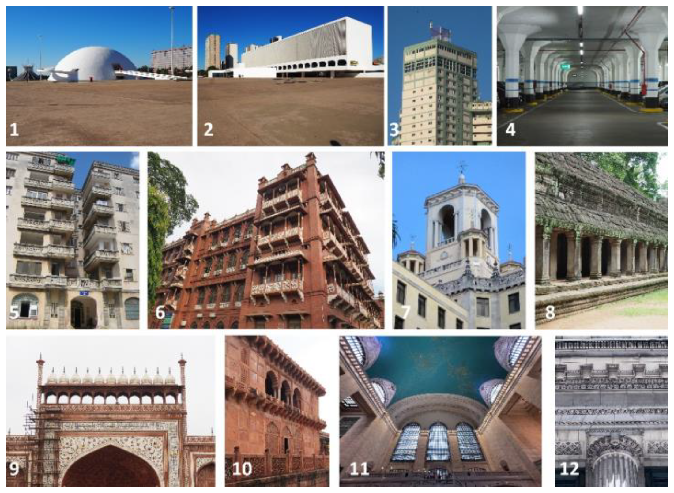
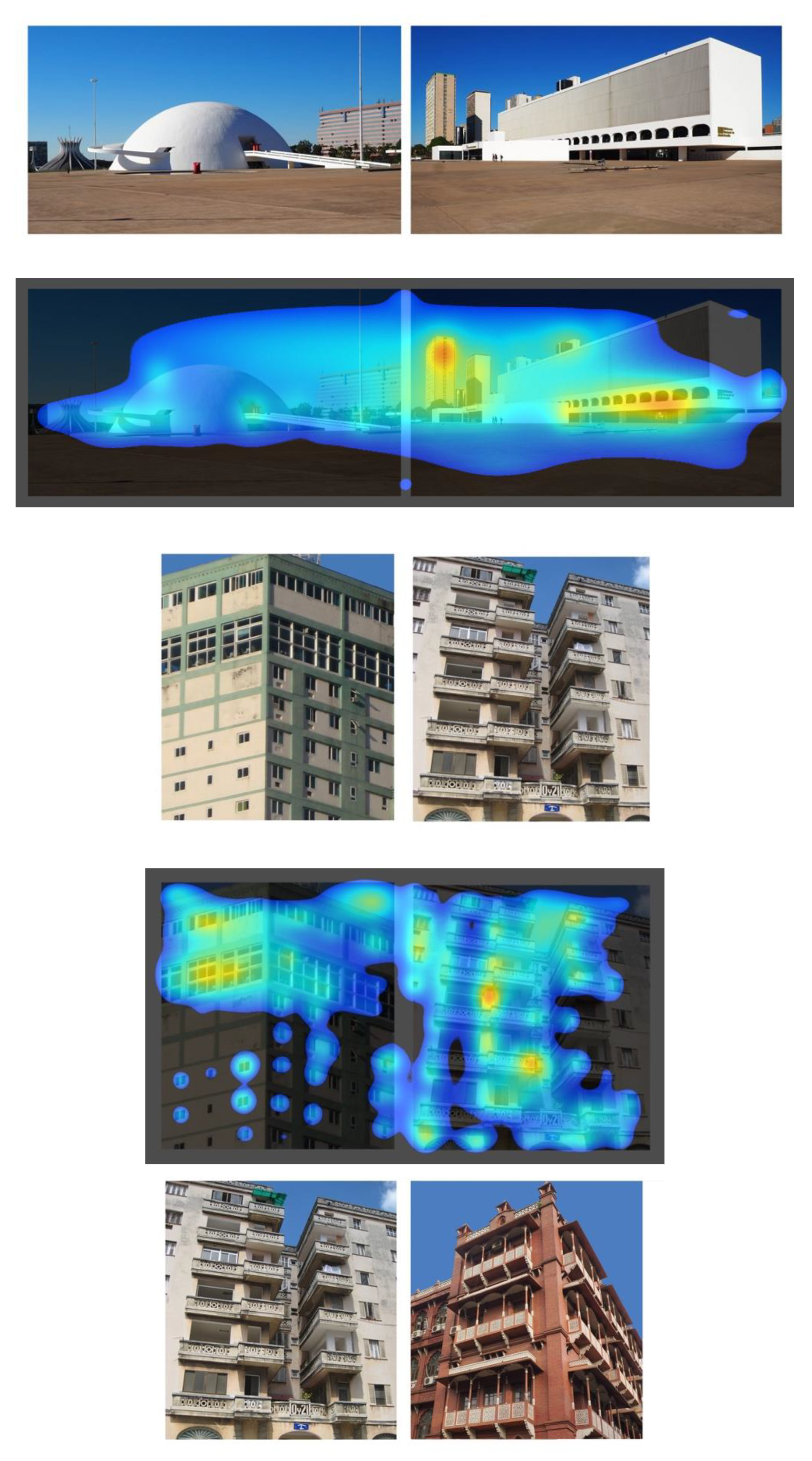
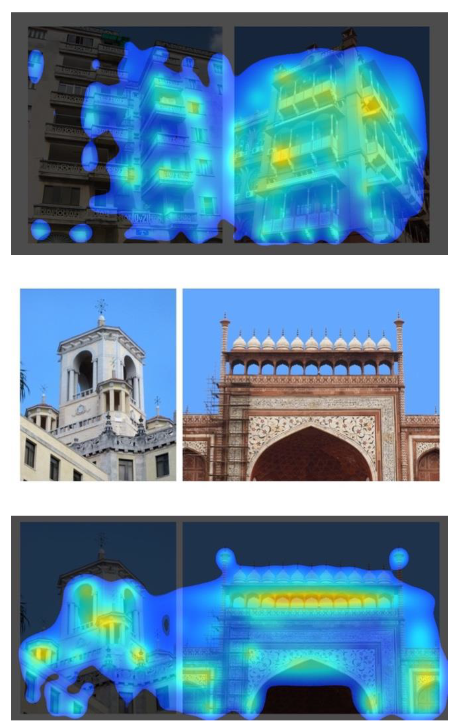
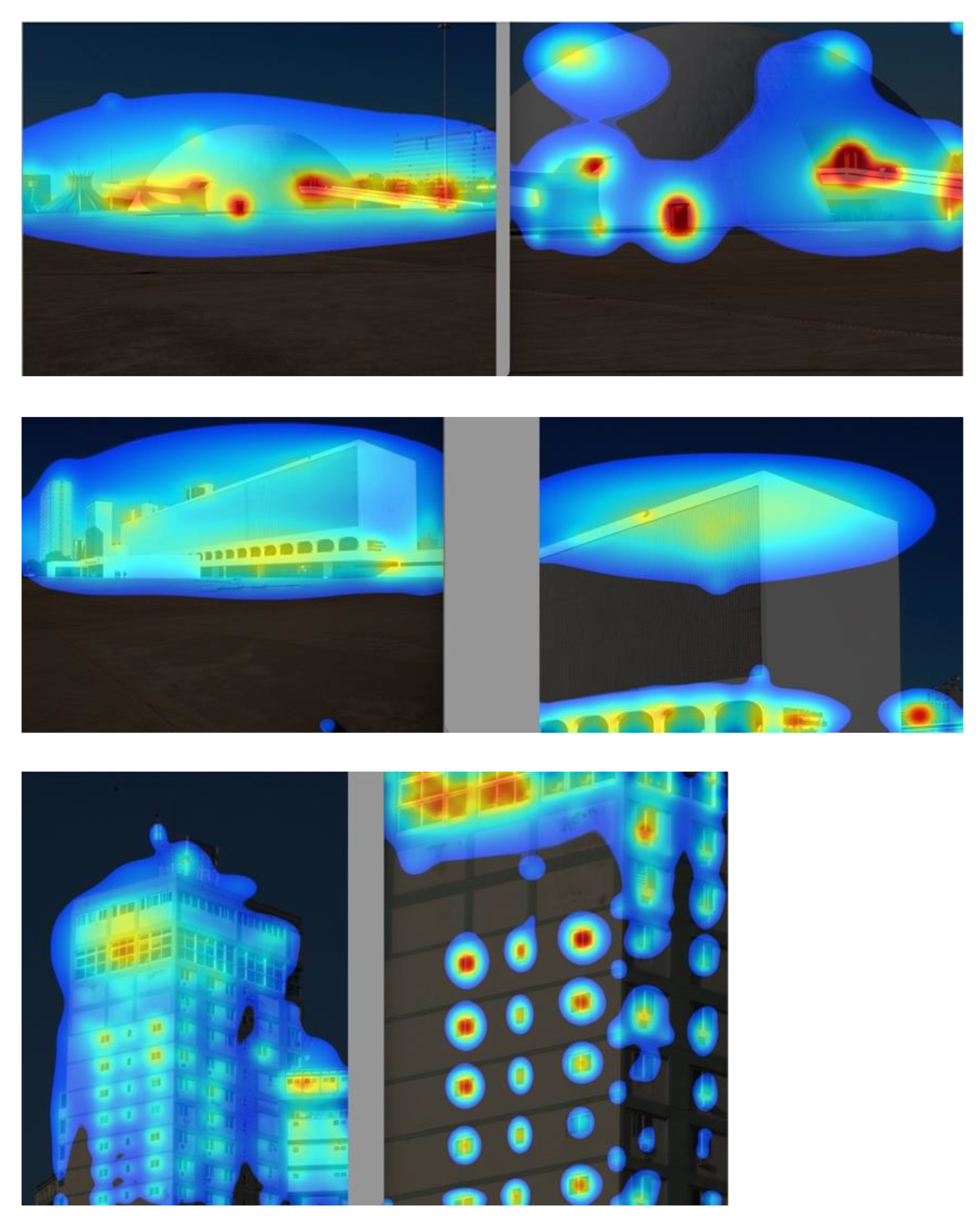
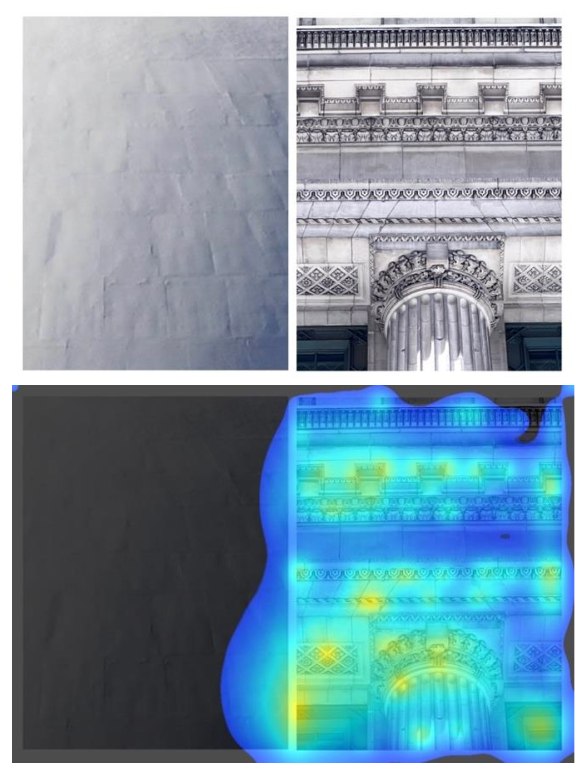
Table A1.
Data from processing the VAS heat maps using ImageJ software.
| Image No. | % Coverage | Number of Hot Spots | Number of Non-Contiguous Regions |
|---|---|---|---|
| 1 | 100 | 4 | 1 |
| 1near | 75 | 6 | 1 |
| 2 | 100 | 0 | 1 |
| 2near | 46 | 5 | 3 |
| 3 | 96 | 2 | 1 |
| 3near | 43 | 13 | 22 |
| 4 | 40 | 8 | 8 |
| 4near | 40 | 4 | 4 |
| 5 | 51 | 9 | 47 |
| 5near | 43 | 7 | 6 |
| 6 | 60 | 2 | 8 |
| 6near | 56 | 2 | 11 |
| 7 | 82 | 2 | 4 |
| 7near | 86 | 7 | 2 |
| 8 | 37 | 3 | 15 |
| 8near | 45 | 8 | 11 |
| 9 | 77 | 1 | 5 |
| 9near | 80 | 2 | 6 |
| 10 | 42 | 2 | 12 |
| 10near | 66 | 2 | 8 |
| 11 | 58 | 1 | 1 |
| 11near | 50 | 2 | 2 |
| 12 | 50 | 3 | 12 |
| 12near | 56 | 0 | 4 |
References
- Zeki, S. Beauty in Architecture: Not a Luxury—Only a Necessity. Special Issue: Beauty Matters: Human Judgement and the Pursuit of New Beauties in Post-Digital Architecture. Archit. Des. 2019, 89, 14–19. [Google Scholar] [CrossRef]
- Hewitt, M.A. The “B” Word: How a More Universal Concept of Beauty Can Reshape Architecture. Common Edge, 11 February 2019. Available online: https://commonedge.org/the-b-word-how-a-more-universal-concept-of-beauty-can-reshape-architecture/ (accessed on 26 June 2022).
- Brankin, A.J. The Cult of Ugliness in America. The American Society for the Defense of Tradition, Family and Property. 14 July 2009. Available online: https://www.tfp.org/the-cult-of-ugliness-in-america/ (accessed on 11 September 2022).
- Scruton, R. The need for beauty. In Building Beautiful: A Collection of Essays on the Design, Style and Economics of the Built Environment; Airey, J., Ed.; Policy Exchange: London, UK, 2019; pp. 30–35. Available online: https://policyexchange.org.uk/wp-content/uploads/2019/01/Building-Beautiful.pdf (accessed on 11 September 2022).
- Scott, J. Where Is the Beauty in Buildings? The Imaginative Conservative, 11 January 2019. Available online: https://theimaginativeconservative.org/2019/01/where-beauty-buildings-jake-scott.html (accessed on 26 June 2022).
- Stott, R. Why China’s President Says “No More Weird Buildings”. Arch Daily, 21 October 2014. Available online: https://www.archdaily.com/559456/why-china-s-president-says-no-more-weird-buildings (accessed on 22 August 2022).
- Salingaros, N.A. Open Letter to China’s President Xi Jinping Supporting His Call to End “Weird Buildings”. China Architecture and Building Press, 22 May 2015. Available online: https://applied.math.utsa.edu/~yxk833/PresidentXiJinping.pdf (accessed on 22 August 2022).
- Scruton, R.; Boys Smith, N. Living with Beauty, Promoting Health, Well-Being and Sustainable Growth; Ministry of Housing, Communities & Local Government, UK Government: London, UK, 2020. Available online: https://assets.publishing.service.gov.uk/government/uploads/system/uploads/attachment_data/file/861832/Living_with_beauty_BBBBC_report.pdf (accessed on 22 August 2022).
- Iovene, M.; Boys Smith, N.; Seresinhe, C.I. Of Streets and Squares; Cadogan and Create Streets: London, UK, 2019; Available online: https://issuu.com/cadoganlondon/docs/of_streets_and_squares_26_march_wit?e=32457850/68741701 (accessed on 22 August 2022).
- Trump, D.J. Executive Order on Promoting Beautiful Federal Civic Architecture; The White House, US Government: Washington, DC, USA, 2020. Available online: https://trumpwhitehouse.archives.gov/presidential-actions/executive-order-promoting-beautiful-federal-civic-architecture/ (accessed on 22 August 2022).
- Mehaffy, M.; Salingaros, N.A.; Sussman, A. “Making Federal Buildings Beautiful Again”: Three Comments on the Executive Order. Arch Daily, 20 January 2020. Available online: https://www.archdaily.com/934164/three-comments-on-the-executive-order-making-federal-buildings-beautiful-again (accessed on 22 August 2022).
- Salingaros, N.A. If Science Truly Won, The Era of Modernist Architecture Would Be Over. The Federalist, 27 February 2020. Available online: https://thefederalist.com/2020/02/27/if-science-truly-won-the-era-of-modernist-architecture-would-be-over/ (accessed on 22 August 2022).
- National Civic Art Society. Americans’ Preferred Architecture for Federal Buildings: A Survey Conducted by the Harris Poll. National Civic Art Society, 5 October 2020. Available online: https://www.civicart.org/americans-preferred-architecture-for-federal-buildings (accessed on 1 October 2022).
- Huffman, H.; Ro, B.R. Modern vs Traditional: A Visual Attention Study on Federal Architectural Preferences. In Proceedings of the 2022 Intermountain Engineering, Technology and Computing Conference, IEEE, Orem, UT, USA, 13–14 May 2022; Available online: https://www.academia.edu/83795649/Modern_vs_Traditional_A_Visual_Attention_Study_on_Federal_Architectural_Preferences (accessed on 1 October 2022).
- Sussman, A.; Rosas, H. Study #1 Results: Eye Tracking Public Architecture. Genetics of Design, 2 October 2022. Available online: https://geneticsofdesign.com/2022/10/02/what-riveting-results-from-buildingstudy1-reveal-about-architecture-ourselves/ (accessed on 2 October 2022).
- Everard, N.N.; Morin, N. The world is becoming ugly. What can we do? In Proceedings of the La Table Ronde de l’Architecture, Brussels, Belgium, 25 February 2021; Available online: https://www.latablerondearchitecture.com/la-tribune (accessed on 23 August 2022).
- Arkitekturupprororet. Kristianstad, Sweden. 2022. Available online: https://www.arkitekturupproret.se/om-au/about-english/ (accessed on 23 August 2022).
- Brielmann, A.A.; Pelli, D.G. Intense beauty requires intense pleasure. Front. Psychol. 2019, 10, 2420. [Google Scholar] [CrossRef] [PubMed] [Green Version]
- Buras, N.H. The Art of Classic Planning: Building Beautiful and Enduring Communities; Harvard University Press: Cambridge, MA, USA, 2020. [Google Scholar]
- Kawabata, H.; Zeki, S. Neural Correlates of Beauty. J. Neurophysiol. 2004, 91, 1699–1705. [Google Scholar] [CrossRef] [PubMed] [Green Version]
- Démuthová, S.; Démuth, A. Evolutionary and Cognitive Aspects of Beauty (Attractiveness). Kaygı 2017, 28, 145–158. [Google Scholar] [CrossRef] [Green Version]
- Alexander, C. The Timeless Way of Building; Oxford University Press: New York, NY, USA, 1979. [Google Scholar]
- Salingaros, N.A. Why Christopher Alexander failed to humanize architecture. Side View J. 19 November 2021. Available online: https://thesideview.co/journal/why-christopher-alexander-failed-to-humanize-architecture/ (accessed on 26 June 2022).
- Ellard, C. The Generic City. Slate 27 November 2015. Available online: https://slate.com/technology/2015/11/psychology-of-boring-architecture-the-damaging-impact-of-big-ugly-buildings-on-mental-health.html (accessed on 9 July 2022).
- Rennix, A.; Robinson, N.J. Why You Hate Contemporary Architecture. Curr. Aff. 31 October 2017. Available online: https://www.currentaffairs.org/2017/10/why-you-hate-contemporary-architecture (accessed on 9 July 2022).
- Bond, M. The Hidden Ways That Architecture Affects How You Feel. BBC Future, 5 June 2017. Available online: https://www.bbc.com/future/article/20170605-the-psychology-behind-your-citys-design (accessed on 9 July 2022).
- Reynolds, E. Could Bad Buildings Damage Your Mental Health? The Guardian, 16 September 2016. Available online: https://www.theguardian.com/cities/2016/sep/16/bad-buildings-damage-mental-health-research-anxiety-depression (accessed on 9 July 2022).
- Conroy, J.O. A Torture Experiment: Plan for Almost Windowless Student Megadorm Raises Alarm. The Guardian, 4 November 2021. Available online: https://www.theguardian.com/artanddesign/2021/nov/04/torture-experiment-architects-appalled-windowless-student-megadorm (accessed on 9 July 2022).
- Klebl, C.; Greenaway, K.H.; Rhee, J.; Bastian, B. Ugliness Judgments Alert us to Cues of Pathogen Presence. Soc. Psychol. Personal. Sci. 2021, 12, 617–628. [Google Scholar] [CrossRef]
- Klebl, C.; Luo, Y.; Bastian, B. Beyond Aesthetic Judgment: Beauty Increases Moral Standing Through Perceptions of Purity. Personal. Soc. Psychol. Bull. 2021, 48, 954–967. [Google Scholar] [CrossRef] [PubMed]
- Golembiewski, J.A. Start Making Sense: Applying a salutogenic model to architectural design for psychiatric care. Facilities 2010, 28, 100–117. [Google Scholar] [CrossRef]
- Golembiewski, J.A. The Designed Environment and How it Affects Brain Morphology and Mental Health. HERD Health Environ. Res. Des. J. 2015, 9, 161–171. [Google Scholar] [CrossRef] [Green Version]
- Golembiewski, J.A. Salutogenic Architecture in Healthcare Settings. In The Handbook of Salutogenesis; Mittelmark, M.B., Sagy, S., Eriksson, M., Eds.; Springer: Cham, Switzerland, 2016; Chapter 26. Available online: https://www.ncbi.nlm.nih.gov/books/NBK435851/ (accessed on 9 July 2022).
- Mazzi, A. Healthcare Design Doesn’t Have to be Ugly. Shield, 23 June 2014. Available online: https://www.shieldcasework.com/healthcare-design-doesnt-have-to-be-ugly/ (accessed on 9 July 2022).
- Bates, V. Humanizing healthcare environments: Architecture, art and design in modern hospitals. Des. Health 2018, 2, 5–19. [Google Scholar] [CrossRef] [Green Version]
- Seresinhe, C.I.; Preis, T.; Moat, H.S. Quantifying the Impact of Scenic Environments on Health. Sci. Rep. 2015, 5, 16899. [Google Scholar] [CrossRef] [PubMed]
- Seresinhe, C.I.; Preis, T.; Moat, H.S. Using deep learning to quantify the beauty of outdoor places. R. Soc. Open Sci. 2017, 4, 170170. [Google Scholar] [CrossRef] [PubMed] [Green Version]
- Wood, C. New School Designs Have Abandoned Beauty. The Cincinnati Enquirer, 30 January 2022. Available online: https://www.cincinnati.com/story/opinion/2022/01/30/opinion-new-school-designs-have-abandoned-beauty/6613243001 (accessed on 9 July 2022).
- Salingaros, N.A. What Architectural Education Does to Would-Be Architects, Common Edge, 8 June 2017. Available online: https://commonedge.org/what-architectural-education-does-to-would-be-architects/ (accessed on 26 June 2022).
- Salingaros, N.A. A Theory of Architecture, 2nd ed.; Sustasis Press: Portland, OR, USA, 2014. [Google Scholar]
- Moore, F.R.; Cornwell, R.E.; Law-Smith, M.J.; Al Dujaili, E.; Sharp, M.; Perrett, D. Evidence for the stress-linked immunocompetence handicap hypothesis in human male faces. Proc. R. Soc. B Biol. Sci. 2011, 278, 774–780. [Google Scholar] [CrossRef] [PubMed] [Green Version]
- Krosschell, K. Facial Expression Analysis: The Complete Pocket Guide; iMotions: Copenhagen, Denmark, 2022; Available online: https://imotions.com/blog/facial-expression-analysis/ (accessed on 24 July 2022).
- Noldus. FaceReader; Noldus: Wageningen, Holland, 2022; Available online: https://www.noldus.com/facereader (accessed on 24 July 2022).
- Affectiva. In Lab Biometric Solution; Affectiva: Boston, MA, USA, 2022; Available online: https://www.affectiva.com/product/individual-product-page-imotions/ (accessed on 24 July 2022).
- Berra, T. Reasoned Art, the New Era of Crypto Art. Collater.al, 18 July 2022. Available online: https://www.collater.al/en/reasoned-art-exhibition-rome/ (accessed on 24 July 2022).
- Emotiva. Stendhal Index: Measuring the Emotional Engagement of an Artistic Work; Emotiva Company: Milan, Italy, 2022; Available online: https://emotiva.it/en/stendhal-index-measuring-the-emotional-engagement-of-an-artistic-work/ (accessed on 24 July 2022).
- Brielmann, A.; Buras, N.; Salingaros, N.; Taylor, R. What happens in your brain when you walk down the street? Implications of architectural proportions, biophilia, and fractal geometry for urban science. Urban Sci. 2022, 6, 3. [Google Scholar] [CrossRef]
- Hollander, J.B.; Sussman, A.; Purdy Levering, A.; Foster-Karim, C. Using eye-tracking to understand human responses to traditional neighborhood designs. Plan. Pract. Res. 2020, 35, 485–509. [Google Scholar] [CrossRef]
- Hollander, J.B.; Levering, A.P.; Lynch, L.; Foster, V.; Perlo, S.; Jacob, R.J.; Taylor, H.A.; Brunyé, T.T. Cognitive responses to urban environments: Behavioral responses in lab and field conditions. Urban Des. Int. 2020, 8, 256–271. [Google Scholar] [CrossRef]
- Hollander, J.B.; Anderson, E.C. The impact of urban façade quality on affective feelings. Archnet-IJAR Int. J. Archit. Res. 2020, 14, 219–232. [Google Scholar] [CrossRef]
- Krupina, A.A.; Bespalov, V.V.; Kovaleva, E.Y.; Bondarenko, E.A. Eye tracking in urban visual environment. Constr. Unique Build. Struct. 2017, 1, 47–56. [Google Scholar] [CrossRef]
- Hollander, J.B.; Purdy, A.; Wiley, A.; Foster, V.; Jacob, R.J.; Taylor, H.A.; Brunyé, T.T. Seeing the city: Using eye-tracking technology to explore cognitive responses to the built environment. J. Urban. Int. Res. Placemaking Urban Sustain. 2018, 12, 156–171. [Google Scholar] [CrossRef]
- Hollander, J.B.; Sussman, A. (Eds.) Urban Experience and Design: Contemporary Perspectives on Improving the Public Realm; Routledge: London, UK, 2020. [Google Scholar]
- Sussman, A.; Ward, J.M. How Biometric Software is Changing How We Understand Architecture—And Ourselves. Common Edge. 8 June 2021. Available online: https://commonedge.org/how-biometric-software-is-changing-how-we-understand-architecture-and-ourselves (accessed on 5 January 2022).
- Sussman, A.; Hollander, J.B. Cognitive Architecture: Designing for How We Respond to the Built Environment, 2nd ed.; Routledge: New York, NY, USA, 2021. [Google Scholar]
- Sussman, A.; Ward, J.M. Eye-Tracking Boston City Hall to Better Understand Human Perception and the Architectural Experience. New Des. Ideas 2019, 3, 53–59. Available online: http://jomardpublishing.com/UploadFiles/Files/journals/NDI/V3N1/SussmanA%20WardJ.pdf (accessed on 3 July 2021).
- Tollner, T.; Zehetleitner, M.; Gramann, K.; Muller, H.J. Stimulus Saliency Modulates Pre-Attentive Processing Speed in Human Visual Cortex. PLoS ONE 2011, 6, e16276. [Google Scholar] [CrossRef] [Green Version]
- Wolfe, J.M. Guided Search 6.0: An updated model of visual search. Psychon. Bull. Rev. 2021, 28, 1060–1092. [Google Scholar] [CrossRef] [PubMed]
- Lavdas, A.; Salingaros, N.; Sussman, A. Visual Attention Software: A new tool for understanding the ‘subliminal’ experience of the built environment. Appl. Sci. 2021, 11, 6197. [Google Scholar] [CrossRef]
- Salingaros, N.; Sussman, A. Biometric pilot-studies reveal the arrangement and shape of windows on a traditional façade to be implicitly ‘engaging’, whereas contemporary façades are not. Urban Sci. 2020, 4, 26. [Google Scholar] [CrossRef]
- Schirpke, U.; Tasser, E.; Lavdas, A.A. Potential of eye-tracking simulation software for analyzing landscape preferences. PLoS ONE 2022, 17(10), e0273519. [Google Scholar] [CrossRef] [PubMed]
- Wilkins, A.J.; Penacchio, O.; Leonards, U. The Built Environment and Its Patterns: A View From the Vision Sciences. J. Sustain. Des. Appl. Res. Innov. Eng. Built Environ. 2018, 6, 42–48. [Google Scholar] [CrossRef]
- Penacchio, O.; Wilkins, A.J. Visual discomfort and the spatial distribution of Fourier energy. Vis. Res. 2015, 108, 1–7. [Google Scholar] [CrossRef] [PubMed] [Green Version]
- Wilkins, A.J. Looking at buildings can actually give people headaches. Conversation 2018, 5. Available online: https://www.cnn.com/style/article/why-looking-at-buildings-can-give-people-headaches/index.html (accessed on 30 December 2021).
- Martins, M.J.; Fischmeister, F.P.; Puig-Waldmüller, E.; Oh, J.; Geissler, A.; Robinson, S.; Fitch, W.T.; Beisteiner, R. Fractal image perception provides novel insights into hierarchical cognition. Neuroimage 2014, 96, 300–308. [Google Scholar] [CrossRef]
- Fischmeister, F.P.; Martins, M.J.D.; Beisteiner, R.; Fitch, W.T. Self-similarity and Recursion as Default Modes in Human Cognition. Cortex 2016, 97, 183–201. [Google Scholar] [CrossRef]
- Hora, D. Nature of Order #4: The Discovery of the Self in Architecture. Architexturez. 5 July 2021. Available online: https://patterns.architexturez.net/doc/az-cf-218796 (accessed on 6 July 2022).
- Salingaros, N.A. Connecting to the World: Christopher Alexander’s Tool for Human-Centered Design. She Ji J. Des. Econ. Innov. 2020, 6, 455–481. [Google Scholar] [CrossRef]
- Parlak, O. Portable and wearable real-time stress monitoring: A critical review. Sens. Actuators Rep. 2021, 3, 100036. [Google Scholar] [CrossRef]
- Chen, J.; Abbod, M.; Shieh, J.S. Pain and Stress Detection Using Wearable Sensors and Devices-A Review. Sensors 2021, 21, 1030. [Google Scholar] [CrossRef] [PubMed]
- Wang, B.; Zhao, C.; Wang, Z.; Yang, K.-A.; Cheng, X.; Liu, W.; Yu, W.; Lin, S.; Zhao, Y.; Cheung, K.M.; et al. Wearable aptamer-field-effect transistor sensing system for noninvasive cortisol monitoring. Sci. Adv. 2022, 8, eabk0967. [Google Scholar] [CrossRef]
- Gloor, P. Happymeter; Center for Collective Intelligence, MIT: Cambridge, MA, USA, 2022; Available online: https://www.happimeter.org (accessed on 20 October 2022).
- Long, N.; Lei, Y.; Peng, L.; Xu, P.; Mao, P. A scoping review on monitoring mental health using smart wearable devices. Math. Biosci. Eng. 2022, 19, 7899–7919. [Google Scholar] [CrossRef] [PubMed]
- Olszewska, N. Why Has Beauty Disappeared? #1. Venetian Letter, 14 November 2020. Available online: https://www.venetianletter.com/2020/11/14/why-has-beauty-disappeared-1/ (accessed on 9 July 2022).
- Olszewska, N. Why Has Beauty Disappeared? #2. Venetian Letter, 18 December 2020. Available online: https://www.venetianletter.com/2020/12/18/why-has-beauty-disappeared-2/ (accessed on 9 July 2022).
- Salingaros, N.A.; Dalrymple, T.; McGilchrist, I.; Mehaffy, M.; Perenha da Silva, B. Nos Olhos de Quem Vê: O Fim da Beleza, Episódio 1; Brasil Paralelo Produções Audiovisuais: Porto Alegre, Brazil, 2022; Film directed by Marco Aslan; Available online: https://www.youtube.com/watch?v=BIvpg-QKJ_o (accessed on 9 July 2022).
- Robinson, N.J. The Patterns of Florida. Current Affairs, 4 August 2020. Available online: https://www.currentaffairs.org/2020/08/the-patterns-of-florida (accessed on 11 September 2022).
- Ohrenstein, D.; Robinson, N.J. How To Build Beautiful Places. Current Affairs, 16 May 2022. Available online: https://www.currentaffairs.org/2022/05/how-to-build-beautiful-places (accessed on 11 September 2022).
- Alexander, C. The Nature of Order. Volume 1: The Phenomenon of Life; Center for Environmental Structure: Berkeley, CA, USA, 2002. [Google Scholar]
- Alexander, C. The Nature of Order. Volume 2: The Process of Creating Life; Center for Environmental Structure: Berkeley, CA, USA, 2002. [Google Scholar]
- Galle, P. Christopher Alexander’s Battle for Beauty in a World Turning Ugly: The Inception of a Science of Architecture? She Ji J. Des. Econ. Innov. 2020, 6, 345–375. [Google Scholar] [CrossRef]
- Salingaros, N.A. Beauty and the Nature of Matter: The legacy of Christopher Alexander. Architexturez, 22 July 2020. Available online: https://patterns.architexturez.net/doc/az-cf-198826 (accessed on 27 June 2022).
- Zeki, S. In praise of subjective tr uths. J. Physiol. 2009, 587, 2825–2835. [Google Scholar] [CrossRef] [PubMed] [Green Version]
- Mehaffy, M.W.; Salingaros, N.A. Building Tomorrow’s Heritage. I. What Historic Structures Can Teach Us about Making a Better Future. Preservation Leadership Forum, National Trust for Historic Preservation, 26 February 2019. Available online: https://forum.savingplaces.org/blogs/special-contributor/2019/02/26/what-historic-structures-teach-better-future (accessed on 9 July 2022).
- Mehaffy, M.W.; Salingaros, N.A. Building Tomorrow’s Heritage IV. Making Places for All, by All. Preservation Leadership Forum, National Trust for Historic Preservation, 20 May 2020. Available online: https://forum.savingplaces.org/blogs/special-contributor/2020/05/20/building-tomorrows-heritage-making-places-for-all (accessed on 9 July 2022).
- Ruggles, D.H. Beauty, Neuroscience, and Architecture: Timeless Patterns and Their Impact on Our Well-Being; Fibonacci Press: Denver, CO, USA, 2018. [Google Scholar]
- Yang, T.; Formuli, A.; Paolini, M.; Zeki, S. The neural determinants of beauty. Eur. J. of Neurosci. 2022, 1, 91–106. [Google Scholar] [CrossRef]
- Ishizu, T.; Zeki, S. Toward A Brain-Based Theory of Beauty. PLoS ONE 2011, 6, e21852. [Google Scholar] [CrossRef] [PubMed] [Green Version]
- Zeki, S.; Romaya, J.; Benincasa, D.; Atiyah, M. The experience of mathematical beauty and its neural correlates. Front. Hum. Neurosci. 2014, 8, 68. [Google Scholar] [CrossRef] [Green Version]
- Ishizu, T.; Zeki, S. The experience of beauty derived from sorrow. Hum. Brain Mapp. 2017, 38, 4185–4200. [Google Scholar] [CrossRef] [Green Version]
- Pallasmaa, J. The Eyes of the Skin; John Wiley: New York, NY, USA, 1996. [Google Scholar]
- Stojanovich, L.; Marisavljevich, D. Stress as a trigger of autoimmune disease. Autoimmun. Rev. 2008, 7, 209–213. [Google Scholar] [CrossRef] [PubMed]
- Robinson, N. When Is the Revolution in Architecture Coming? Current Affairs. 15 April 2021. Available online: https://www.currentaffairs.org/2021/04/when-is-the-revolution-in-architecture-coming (accessed on 26 June 2022).
- Norman, D.A. Introduction to This Special Section Beauty, Goodness, and Usability. Hum.–Comput. Interact. 2004, 19, 311–318. [Google Scholar] [CrossRef]
- Curl, J.S.; Calder, B. The Duel: Has Modern Architecture Ruined Britain? Prospect Magazine. 31 January 2019. Available online: https://www.prospectmagazine.co.uk/magazine/the-duel-has-modern-architecture-ruined-britain (accessed on 9 July 2022).
- Salingaros, N.A. Cognitive Dissonance and Non-adaptive Architecture: Seven Tactics for Denying the Truth. Doxa 2014, 11, 100–117. Available online: https://patterns.architexturez.net/doc/az-cf-172607 (accessed on 9 July 2022).
- Sussman, A.; Chen, K. What Neuroscience Says About Modern Architecture Approach. Arch Daily, 18 September 2020. Available online: https://www.archdaily.com/947890/what-neuroscience-says-about-modern-architecture-approach (accessed on 9 July 2022).
- Sussman, A.; Hollander, J.B. Understanding ourselves better reframes architecture and planning. In Urban Experience and Design: Contemporary Perspectives on Improving the Public Realm; Hollander, J., Sussman, A., Eds.; Routledge: New York, NY, USA; London, UK, 2020; pp. 210–220. [Google Scholar]
- Redondo, R.L.; Kim, J.; Arons, A.L.; Ramirez, S.; Liu, X.; Tonegawa, S. Bidirectional switch of the valence associated with a hippocampal contextual memory engram. Nature 2014, 513, 426–430. [Google Scholar] [CrossRef] [PubMed] [Green Version]
- Huxley, A. Brave New World; Harper Perennial: New York, NY, USA, 2006; (originally published in 1932); Chapter 2. [Google Scholar]
- Aresta, M.; Salingaros, N.A. The importance of domestic space in the times of COVID-19. Challenges 2021, 12, 27. [Google Scholar] [CrossRef]
- Lavdas, A.A.; Salingaros, N.A. Can suboptimal visual environments negatively affect children’s cognitive development? Challenges 2021, 12, 28. [Google Scholar] [CrossRef]
Figure 1.
The images used for the study: 1,2 Brasília, Brazil; 3 Vedado, Havana, Cuba; 4 Buenos Aires, Argentina; 5 Havana, Cuba; 6 Dhaka, Bangladesh; 7 Vedado, Havana, Cuba; 8 Angkor, Cambodia; 9,10 Agra, India; 11,12 New York, USA. Original photos by Nir H. Buras, used here with permission. Photo editing by A.A. Lavdas.

Figure 2.
Heat maps produced individually by 3M-VAS from the images of Figure 1.
Figure 2.
Heat maps produced individually by 3M-VAS from the images of Figure 1.

Figure 3.
Pairwise comparisons of images using double VAS heatmaps processed together.


Figure 4.
Heat maps of the “near” versions of the images of Figure 1, produced by VAS.
Figure 4.
Heat maps of the “near” versions of the images of Figure 1, produced by VAS.

Figure 5.
VAS heatmaps of original images next to zoomed-in images, processed separately.

Figure 6.
Comparative VAS heatmaps of zoomed-in images 1 and 12 processed together.

Figure 7.
Histogram plot of the Rn = Rnear, R = Rfar, and % Rnear/Rfar values computed from the images. The horizontal axis is presented in a logarithmic scale for clarity, as there is wide variation among the values.
Figure 7.
Histogram plot of the Rn = Rnear, R = Rfar, and % Rnear/Rfar values computed from the images. The horizontal axis is presented in a logarithmic scale for clarity, as there is wide variation among the values.

Table 1.
Values of “R” measuring the visual coherence of the 12 buildings illustrated in Figure 1.
Table 1.
Values of “R” measuring the visual coherence of the 12 buildings illustrated in Figure 1.
| Image Number | Coherence Rfar from 0–100 | Coherence Rnear from 0–100 | % Rnear/Rfar |
|---|---|---|---|
| 1 | 20 | 10.7 | 53 |
| 2 | 100 | 5.7 | 6 |
| 3 | 31.9 | 1.2 | 4 |
| 4 | 2.5 | 4.9 | 198 |
| 5 | 3.2 | 3.3 | 103 |
| 6 | 6.0 | 4.3 | 72 |
| 7 | 13.6 | 9.5 | 70 |
| 8 | 2.1 | 2.3 | 115 |
| 9 | 12.9 | 10.1 | 78 |
| 10 | 3.0 | 6.6 | 220 |
| 11 | 29.2 | 12.5 | 43 |
| 12 | 3.4 | 14.1 | 420 |
Publisher’s Note: MDPI stays neutral with regard to jurisdictional claims in published maps and institutional affiliations. |
© 2022 by the authors. Licensee MDPI, Basel, Switzerland. This article is an open access article distributed under the terms and conditions of the Creative Commons Attribution (CC BY) license (https://creativecommons.org/licenses/by/4.0/).
Share and Cite
MDPI and ACS Style
Lavdas, A.A.; Salingaros, N.A. Architectural Beauty: Developing a Measurable and Objective Scale. Challenges 2022, 13, 56. https://doi.org/10.3390/challe13020056
AMA Style
Lavdas AA, Salingaros NA. Architectural Beauty: Developing a Measurable and Objective Scale. Challenges. 2022; 13(2):56. https://doi.org/10.3390/challe13020056
Chicago/Turabian StyleLavdas, Alexandros A., and Nikos A. Salingaros. 2022. "Architectural Beauty: Developing a Measurable and Objective Scale" Challenges 13, no. 2: 56. https://doi.org/10.3390/challe13020056
Note that from the first issue of 2016, this journal uses article numbers instead of page numbers. See further details here.