Article

The New York City COVID-19 Spread in the 2020 Spring: A Study on the Potential Role of Particulate Using Time Series Analysis and Machine Learning

Department of Computer Science and Engineering, University of Bologna, 40127 Bologna, Italy
*
Author to whom correspondence should be addressed.
Appl. Sci. 2021, 11(3), 1177; https://doi.org/10.3390/app11031177
Submission received: 15 December 2020 / Revised: 22 January 2021 / Accepted: 25 January 2021 / Published: 27 January 2021
(This article belongs to the Special Issue Medical Artificial Intelligence)

Abstract

:
This study investigates the potential association between the daily distribution of the PM2,5 air pollutant and the initial spreading of COVID-19 in New York City. We study the period from 4 March to 22 March 2020, and apply our analysis to all five counties, including the city, plus seven neighboring counties, including both urban and peripheral districts. Using the Granger causality methodology, and considering the maximum lag period (14 days) between infection and the correspondent diagnosis, we found that the time series of the new daily infections registered in those 12 counties appear to correlate to the time series of the concentrations of the PM2.5 particulate circulating in the air, with 33 over 36 statistical tests with a p-value less than 0.005, thus confirming such a hypothesis. Moreover, looking for further confirmation of this association, we train four different machine learning algorithms on a portion of those time series. These are able to predict that the number of the new daily infections would have surpassed a given infections threshold for the remaining portion of the series, with an average accuracy ranging from 84% to 95%, depending on the algorithm and/or on the specific county under observation. This is similar to other results obtained from several polluted urban areas, e.g., Wuhan, Xiaogan, and Huanggang in China, and Northern Italy. Our study provides further evidence that ambient air pollutants can be associated with a daily COVID-19 infection incidence.

1. Introduction

On 1 March 2020, the first case of COVID-19 was recorded in New York City (NYC). A woman traveling back from Iran tested positive. This was only the first of a long series of infections: The pandemic swept through the whole State of New York, infecting 25,665 people and causing more than 200 deaths in just one month [1]. We were just at the beginning of a sad story, since in the following three months, NYC experienced widespread diffusion of this contagion, recording over 200,000 infections, and more than 21,000 confirmed deaths.
After the words of the Governor, Andrew Cuomo: “The apex is higher than we thought and the apex is sooner than we thought”, many measures were implemented to contain the spread of this virus, including public school closures on 15 March, and stay-at-home orders (for non-essential workers) on 22 March [2]. While newly diagnosed infections, hospitalizations, and deaths peaked in April, this lockdown regime led to a substantial drop in cases in May, and to a subsequent re-opening phase for industries, and other business activities, starting on 7 June 2020 [3]. Since then, NYC has experienced a relatively long period where the number of the new daily COVID-19 cases have continued to fall, while they climb in the rest of the United States. However, at the moment of writing, as winter nears, cases in city are ticking upward again, with a weekly average of some 4000 new infections and 40 deaths, as registered in the week of 17–24 November [4].
Ten months after the beginning of the pandemic, many studies have been developed by scholars to investigate how COVID-19 spreads and decays [5,6]. While scientific investigations that look for the most effective non-pharmaceutical containment countermeasures are of great interest, as they could help to keep a lid on the epidemic (including contact tracing and testing) [7,8,9,10,11,12,13,14], much attention has also been paid to the factors that can favor the contagion [15,16]. In this broad spectrum of research, studies are emerging that try to understand if a possible association exists between exposure to air pollution and COVID-19 infection and deaths.
This is a rapidly expanding research area that has attracted much interest, especially from China and various European countries. The rationale behind these studies is that fine particles (especially PM2.5; particles with diameter, ≤2.5 μm) have been linked to various adverse health events. Long-term exposure to this kind of particulate may negatively affect the respiratory and cardiovascular systems, and increase the mortality risk—thus, exacerbating the severity of COVID-19 symptoms, and worsening the prognosis of this disease [8,9,17].
Besides our present study, the relationship between COVID-19 and pollution has been researched intensively from various angles, yielding many published papers thus far [18].
We consider these kinds of studies as extremely relevant, since they have opened this new research area that is still flourishing through the collaboration of many different types of scientists, including virologists, biologists, chemists, physicists, and data scientists.
In this regard, the first work we would like to mention is the one by Wu et al. that investigates the association between exposure to air pollution and the death rate due to COVID-19, through a nationwide study of more than 3000 counties in the United States [19]. Fed with the values of PM2.5, they developed a mathematical model able to predict the extent to the county-level long-term exposure to that particulate can be associated with an increase of the COVID-19 mortality rate. This model was also reinforced with some twenty potential confounders of various socioeconomic and demographic nature, including, for example, the percentage of the population older than sixty-five years, the percentage of African Americans, and the percentage of persons affected by obesity. The authors fitted a binomial mixed model, where the COVID-19 deaths values were the outcome. Results have shown that even a small increase in the long-term exposure to PM2.5 is associated with a relevant increase of the COVID-19 death rate, in the county of interest. While that paper focused on U.S. COVID-19 data in general, at the moment of writing this paper, there appears to be no published work that concentrates exclusively on NYC, and its neighboring counties. However, there have been a number of relevant publications that address a similar topic within the context of other nations, especially in Italy and in China.
For example, Becchetti et al. studied the long-term exposure to air pollution and COVID-19 infections and mortality in Italy during the first wave of the pandemic [20]. The assumption at the base of their work is that air pollution, and in particular, the particulates, like PM2.5, may be a carrier for the virus, and that a person who lives in a very polluted area has a limited capacity of reacting to the virus. They considered the annual values of both the PM10 and PM2.5 particulates, plus other factors that could have played a role, such as population density, average income, public transport usage, and number of lung ventilators, yielding a cross-sectional regression statistical model that, again, has provided a clue about the correlation between COVID-19 infections/mortality incidence and air pollution.
Along the same line of reasoning is the paper by Setti et al. [21]. Their initial statement is that an epidemic model, based only on close contacts and respiratory droplets, cannot explain the excessive number of people infected with COVID-19 in Northern Italy. Hence, with univariate analysis, they have verified the correlation between the number of exceedances of the daily limit value of the PM10 particulate, finding that 39 of the 41 Northern Italian provinces most impacted by COVID-19 also reported the highest PM10 levels. Their conclusion is that air particulates may favor an airborne transmission of this virus, up to a distance of eight meters in an outdoor environment.
In the same vein of Reference [21], but with a different statistical model based on a time series analysis, the work described in References [22,23] has provided further proof of the causal correlation between abnormal values of various types of particulate (including PM2.5, PM10, and NO2) and COVID-19 infection incidence in the Italian region of Emilia-Romagna. This region is one of the most polluted areas in Italy, and the district that has had the highest death toll in Italy so far, after Lombardy. Moreover, one of these two papers, using a machine learning-based methodology (plus pollution data from previous years), also predicted (with excellent accuracy) the occurrence of the second wave of the contagion that is currently raging in that Italian region, as of November 2020.
Finally, the study by Jiang et al. [24] used a retrospective cohort, from 25 January to 29 February 2020, from the Chinese cities of Wuhan, Xiaogan, and Huanggang. The authors found that a daily COVID-19 infection incidence was positively associated with high values of both PM2.5 and humidity, in all the examined cities.
After this long introduction that was needed to frame the scenario, we can finally come to the intent behind this study: To investigate the association between particulate matter and the surge of COVID-19 infections suffered in NYC, during the 2020 spring. The main motivation is that, to the best of our knowledge, there does not exist similar studies for this iconic city.
To this aim, some premises are in order. First, we took the decision to study only one of the particulates, precisely PM2.5—because it is well known that PM2.5 is one of the air pollutants with a more positive correlation with the virus spread, as witnessed by many recent studies [24]. With regard to this important point, we can anticipate that the average values of that pollutant, measured in micrograms/m3 in NYC during the first epidemic outbreak (February–March 2020), were from 20% to 25% higher than the average values computed for a longer period that extends from February to July 2020.
Second, we decided to analyze the pollution/infections data relative to two different types of counties, belonging to the state of New York. Obviously, we were particularly interested in studying the situation of the metropolitan area of NYC, with its five counties which coincide with the renowned boroughs, namely: New York (Manhattan), Kings (Brooklyn), Bronx (The Bronx), Richmond (Staten Island), and Queens (Queens). Nonetheless, in addition to these, we also studied some other neighboring counties, including: Nassau, Suffolk, Rockland, and Westchester. Moreover, to evaluate whether the association we were trying to validate was only valid for urban, densely populated areas, very close to the city, such as those we have just mentioned, we decided to extend our analysis also to other, more peripheral counties, including: Onondaga, Oneida, and Monroe. This way, we have been able to test two different situations: Both densely populated and less-populated areas, with their different relative values, in terms of COVID-19 infections and amount of pollution.
Third, and finally, we examined two different time series in the period of interest (February–March 2020): The number of daily infections vs. the registered values of PM2.5 circulating in the air, daily. The daily COVID-19 infections data was provided by the New York State Department of Health, while the registered values of PM2.5 come from the United States Environmental Protection Agency. To check whether an association could be established between these two series of data, we adopted two different methodologies: Granger causality and machine learning.
We first subjected those temporal series of data to a Granger causality statistical hypothesis test. Testing for Granger causality means verifying the statistical hypothesis that a time series X Granger-causes another time series Y: In other words, X values would better predict the future values of Y, beyond the information contained in past values of Y alone. To do that, two different regression models are, typically, tested on the Y values. The first one uses only previous values of Y, while the second exploits both previous Y values, plus lagged values of X. If those tests are successful, it can be concluded that X values provide statistically significant predictive information about future values of Y. In simple words, X Granger-causes Y.
Unfortunately, many believe that the use of Granger causality tests can be questionable, if one aims at demonstrating a clear cause–effect correlation. Nonetheless, we argue that, with two different types of counties of the state of New York under investigation (that is, densely populated and less-populated areas), the results of this study have shown that an association between the two time series can be confirmed, well beyond the limit of a weak interpretation of causality, as 33 over 36 statistical tests have confirmed the hypothesis, with a p-value less than 0.05.
Then, to provide further evidence in favor of this correlation, we conducted a second, additional series of experiments, using machine learning (ML) algorithms. Specifically, four different ML algorithms were used in the following (non-traditional) way. At each step of this procedure, they were trained with the data (COVID-19 infections vs. pollution) relative to all the studied counties, except for the one for which we asked the algorithms to predict the number of the daily infections, given the concentrations of the pollutant occurred in the previous days. This procedure was repeated for all the counties of interest, resembling a kind of county cross validation methodology. With this procedure, we were able to develop 48 different experiments, aimed at predicting if the number of infected persons had exceeded a certain given value. Those experiments returned an excellent average prediction accuracy, ranging from 84% to 95%.
In conclusion, these two different types of experiments (i.e., Granger and ML predictions) should be considered a further confirmation that pollutants, like PM2.5, have played a non-secondary role in the spreading of the virus, at least in this specific case of NYC, during the 2020 spring.
The remainder of the paper is structured as follows. The next section describes both the dataset and the methodologies on the basis of our scientific investigations. In Section 3, we illustrate the results we have obtained. Finally, Section 4 concludes the paper, with some final and important considerations on both the potential and limitations of our approach.

2. Materials and Methods

This section provides a description of the dataset used in this study, and then presents some relevant information about the employed methodologies.

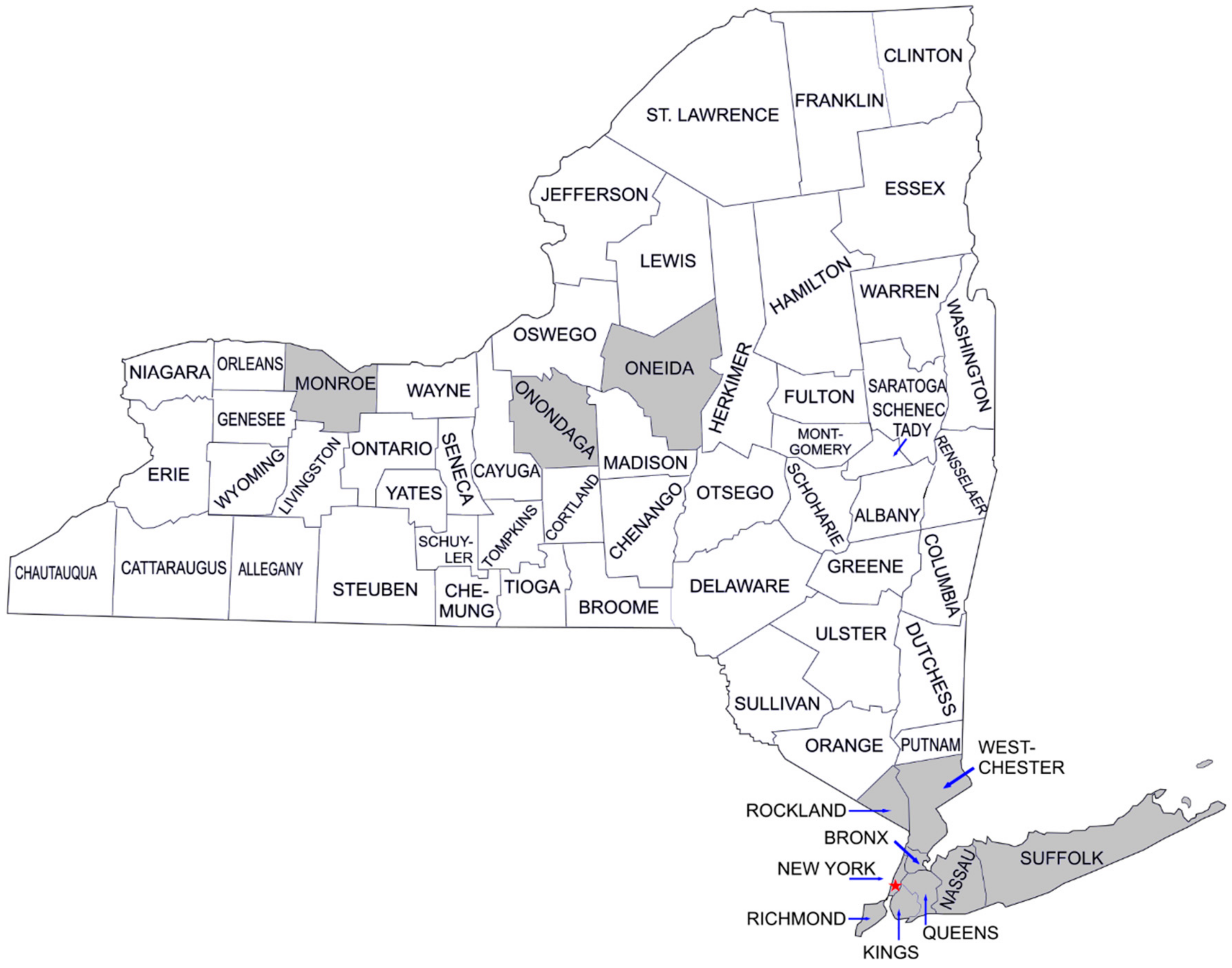
2.1. Dataset Description

The data at the base of our study was essentially corresponding to two types of time series.
The former was relative to the new daily COVID-19 infections registered in all the counties of interest in the period 4–22 March 2020, while the latter was concerned with the air pollution, in particular, the particulate matter PM2.5 registered on a daily basis, in the period 19 February–8 March 2020, in all the counties of interest.
The information relative to the daily COVID-19 infections was retrieved from the website of the New York State Department of Health—COVID-19 Tracker [25], while the daily pollution PM2.5 levels were collected from the website of the United States Environmental Protection Agency, under the Outdoor Air Quality Data section [26]. Since, in each county, there were different sensor stations returning pollution values, at various times during the same day, the correspondent data was aggregated using an average daily value for each county.
The first issue to explain regarding these two time series of data is concerned with the different periods that were analyzed, that is, 19 February–8 March (PM2.5) vs. 4–22 March (COVID-19 infections).
In regard of this, it is well known that a delay can occur between the day a person comes in contact with the virus (with pollution circulating in the air that might favor an airborne virus transmission) and the day when this person manifests the first symptoms of COVID-19 (being consequently recorded as infected). Unfortunately, such a delay can be influenced by two different factors. First of all, there is an incubation period of this virus that, according to the medical literature, may range from a couple of days to almost fourteen. More precisely, as reported in Reference [27], the mean incubation period for COVID-19 is estimated to be 5.2 days, while 12.5 days are needed to reach the 95th percentile of the distribution of all the infections. Moreover, other studies have highlighted how an additional delay can be suffered from the time when a person is tested for positivity and the moment in time when this infection is registered by the authorities [28].
For these reasons, the two time series of data we took into consideration, say X (the daily average PM2.5 level) and Y (the number of the new daily infections), were staggered by 14 days, yielding: X ranging from 19 February–8 March, and Y ranging from 4–22 March 2020.
It is also important to note that our investigation period ends on 22 March, in correspondence with the announcement of the Governor of New York State, Andrew Cuomo, who placed the statewide stay-at-home order, starting from 8 p.m. on 22 March [29]. Hence, the reason to limit our study to the pre-lockdown period is that the lockdown measures might have significantly altered the general situation, with a slowdown of human activities and a consequent change of the pollution levels.
The two corresponding curves of our interest (pollutant and infections), staggered by 14 days, are shown in the plots of Figure 1, where those curves are reported for all the counties we have examined (precisely: New York, Kings, Bronx, Richmond, Queens, Nassau, Suffolk, Rockland, Westchester, Onondaga, Oneida, and Monroe).
In Figure 1, blue lines are the PM2.5 pollutant values and the corresponding time period, while red lines are the new daily infections and the relative time period of interest. For each plot, one can see (leftmost) the measurement unit of the PM2.5 pollutant (measured in micrograms/m3) and (rightmost) the number of the new daily infected people.
The motivations behind our choice of investigating those precise 12 counties in the New York state, represented in grey in the map of Figure 2, was to evaluate whether the (potential) relationship between the PM2.5 pollutant and COVID-19 diffusion remained valid through very different scenarios. However, scenarios that were all geographically relative to NYC.
This was translated into the following two conditions. First, we have wanted to investigate both on densely populated districts, like those comprised in the city of New York, and also in less populated areas. Second, we have also wanted to extend our analysis both to those counties that are comprised in NYC (or are very close to NYC), and to those counties that are further away from NYC. We decided to choose 12 different counties, that can be considered as clustered in three different groups. First, the counties/boroughs of NYC—New York (Manhattan), Kings (Brooklyn), Bronx (The Bronx), Richmond (Staten Island), and Queens (Queens). Second, the counties that are very/quite close to NYC—Nassau, Suffolk, Rockland, and Westchester. Third, a group of suburban, less populated counties that are far away from NYC—Onondaga, Oneida, and Monroe.
The corresponding population density for each of the 12 counties is shown in the following Table 1, where the number of inhabitants is provided per square mile (1 square mile is equal to 2.58999 square kilometers), along with a total number of registered inhabitants, as per 2018 [30].
Before concluding this section, we need to return to the issue relative to the value of the PM2.5 pollutant in the period under investigation (i.e., 19 February–8 March 2020).
The first point to be considered is that the highest tolerable level of the PM2.5 pollutant, indicated in the guidelines by the World Health Organization, is equal to 10 micrograms/m3 [31]. In this regard, we should notice that in our period of interest (which is as long as 19 days), the number of times, when the PM2.5 levels were above that threshold, were as many as 41, considering all the 12 counties.
If we make a similar count for a longer time period, which extends from 19 February to the end of July (that is, a 168 days-long period), we yield a total number of PM2.5 exceedances equal to 115. Even though we have already mentioned that the lockdown measures, adopted starting on 22 March, have probably altered the entire scenario (including the levels of pollution circulating in the air), it should be noted that our shorter period of interest had totaled the 35% of the total amount of PM2.5 exceedances recorded in the longer period that extends from the beginning of the pandemic to its decay at the end of July 2020. Moreover, if we compare the average values of PM2.5, measured in all the 12 counties in the two following different periods: 4–22 March vs. 19 February–end of July, we can notice an increase of the amount of PM2.5 in the 4–22 March period, ranging from a minimum of almost +13% (New York) to a maximum of almost +50% (Oneida), with an average value of circa +24%, as calculated all over the 12 different counties.
All these considerations are summarized in Table 2, where the values of the PM2.5 particulate are given, as usual, in micrograms/m3. In the second and third column, we show, respectively, the average values of PM2.5, registered over the two different periods, while the aforementioned increase is given in the fourth and in the fifth column. The sixth and the seventh column account, instead, for the number of the PM2.5 exceedances in the two periods. This was examined for all 12 counties.

2.2. Methodologies

As anticipated, we have employed two different techniques to evaluate if a potential relationship exists between the PM2.5 particulate matter and the spread of COVID-19 infections in New York City in the period 4–22 March 2020: Granger causality and machine learning. In the following sections, we will discuss the two different methodologies.

2.2.1. Granger Causality

The first technique we have used was the Granger causality testing methodology, which is recognized as a kind of statistical hypothesis testing that determines if an association can be established between two time-series. It is based on the idea that a time series X Granger-causes another time series Y, if past values of X predicts the future values of Y better than using only past values of Y. This particular concept of causality is based on some epistemological assumptions. The reader interested in those issues can refer to References [32,33]. Instead, from a mathematical viewpoint, this Granger causality testing method requires that the time series under investigation are stationary. This is a condition to be checked prior to developing any experiment. Hence, before proceeding with the Granger causality methodology, we have verified that our time series (infections and pollution in NYC) met this stationary condition, using the augmented Dickey-Fuller method [34].
Finally, from a statistical viewpoint, a Granger causality test requires to define both a null hypothesis and an alternative hypothesis. The null hypothesis corresponds to the fact that the time series X does not Granger-causes the time series Y. The alternative hypothesis is that the time series X Granger-causes the time series Y. Coming to our specific case, the null hypothesis is that the series of the PM2.5 values does not Granger-cause the time series of the new daily infections in NYC. Consequently, we could decide that the time series of that particulate Granger-causes the time series of the infections, only if the aforementioned null hypothesis should be rejected.
To better understand, now, how a Granger causality hypothesis testing procedure works, we can start from our time series X and Y (i.e., PM2.5 and COVID-19 infections) that can be modeled with the following Granger causality Equation (1) below:
Y t =   i = 1 l a i   Y t i +   i = 1 l b i   X t 14 + i +   c t .
Yt and Xt are the single values of the two series Y and X, in our case corresponding to the values of the PM2.5 and of the infections, recorded daily, yet staggered by 14 days, due to the maximum delay it may take for COVID-19 to manifest symptoms. This said, the above formula computes the current values of Y, based on previous values of both X and Y. How far back one can go with past values of X and Y, to get the current values of Y, is given by the value of l, the so lag. In our case, we have chosen this lag value equal to 5, as 5.2 is the mean incubation period for COVID-19, as estimated in Reference [27]. c t , instead, is a white-noise-random vector.
The above formula, works based on the role played by the b coefficients. Essentially, X Granger-causes Y, only if the b coefficients are different from zero. In fact, if the b coefficients are equal to zero, only the previous values of Y have an influence on the future values of Y. It is now clear that modeling a causal relationship with the Granger formula above is equivalent to performing a statistical hypothesis test, where the null hypothesis is that all the b coefficients are zero, based on the following Formula (2):
H 0 :   b 1 =   b 2 =   =   b l = 0
Instead, the alternative hypothesis is that at least one of the b coefficients is not zero.
At this point, assigned all the real values to Y and Y, a vector autoregressive procedure must be run to get the b coefficients. Once that b coefficients are computed, a final F test procedure is to be performed to verify if those values fit with the all zero distribution of the null hypothesis. This statistical test will return a p-value. The higher is this p-value, the more certain is the null hypothesis. With a lower p-value, instead, the alternative hypothesis comes confirmed (that is, X Granger-causes Y). In all the Granger experiments we have conducted, a level of significance equal to 5% was used. Said simply, in each experiment, we have rejected the null hypothesis only if the returned p-value was less than 0.05.
More important is, now, to explain why and how we used this specific Granger procedure.
To respond to the first question (why?), suppose that one wants to decide if a relationship exists between the number of infections registered in a given day (e.g., 15 March) and the amount of PM2.5 circulating in the air in the previous days. To do that, with other alternative approaches, one would have considered only the measurement of the values of interest, taken on just two days: The day of the registered infections (15 March) and the day when the pollutant circulating in the air might have favored an airborne transmission of this virus, with the result of the consequent infections. Assume that this specific day could be the one set 14 days before 15 March, that is 1 March.
It is easy to understand that this would be an extremely reductive analysis, based on the role played by the amount of particulate circulating in the air on just one day (1 March), without the possibility of taking into account all the remaining days between 1 March to 15 March.
With the approach based on the Granger formula, instead, we can take into simultaneous consideration multiple days, each with its amount of measured particulate. This is by virtue of the lag factor (i.e., the l index in the sum of the Granger formula) that allows one to go back as many days as one wants in the computation. And this, in turn, brings us to the answer to the second of the two questions we have posed before (how?).
In particular, for each of the 12 counties of interest, we took into account three different pairs of time series. As to the (three) time series relative to the COVID-19 infections, all of them started in coincidence with the day of the beginning of the pandemic in NYC, that is 4 March; while the first, the second, and the third of those series ended, respectively, on the following days—20 March, 21 March, and 22 March. The idea was that using three different series, in our Granger analysis, would have corroborated our study, yielding more experiments/results for each of the 12 counties of interest.
Finally, given the time lag of 14 days between a COVID-19 infection and its registered symptoms, the (three) time series relative to the PM2.5 particulate all started on 19 February (14 days prior to 4 March) and ended, respectively, on the following days—6 March, 7 March, and 8 March. This is due to the fact that, to carry out a Granger analysis, the length of the compared series must be equal. In the end, all this yielded a total amount of 36 Granger experiments (three pairs of time series and 12 counties), whose final results are reported in the next section.

2.2.2. Machine Learning

We now come to the second methodology of our study. As already anticipated in Section 1, the rationale was to conduct an additional series of experiments that could confirm (or reject) our hypothesis, using a very different approach. Specifically, using machine learning (ML) algorithms, with which we have a strong experience [35,36,37].
Essentially, we devised a non-traditional procedure, resembling a kind of a ML (county) cross validation methodology, which went as follows: During the training activity, we let some ML algorithms be instructed with the daily values of the PM2.5 (input) and the COVID-19 infections (output). The periods of these two series of daily data were those mentioned before: PM2.5 (19 February–8 March) and COVID-19 infections (4 March–22 March). More precisely, the number of the COVID-19 infections for each given precise day, say X, were put in relation with the amount of the values of the PM2.5, registered in all those days included in the following time interval: [X−7, X−14]. The choice of these eight days, prior to X, was taken depending on two different factors: (i) The need to be as close as possible to the correspondent lag value used in the Granger analysis (which was equal to 5), and (ii) as a result of the ML hyperparameters optimization process. After this learning phase, this procedure went through a kind of testing validation where the instructed algorithms had to predict if, in a given day, in a specific county, the number of infections either exceeded a predefined infections threshold or they did not.
To summarize, the entire process worked as follows. With each round of our procedure, our ML algorithms were trained with the data (PM2.5 vs. COVID-19 infections) relative to all the 12 studied counties, except for the one for which we asked our algorithms to predict the number of daily infections, given the concentrations of the PM2.5 particulate occurred in previous days. This procedure was repeated, in turn, for all the counties under investigation. We developed 48 different experiments (4 ML algorithms and 12 counties), to predict if the number of infected persons has exceeded the infections threshold value. Obviously, the more accurate were the predictions on the infection threshold exceedances, for the counties subjected to our investigation, the more was confirmed the hypothesis of a correlation between PM2.5 and the COVID-19 spread in those areas.
As to the choice of the infection threshold, we had two different alternatives: Either computing an infection threshold for each different county or computing a unique threshold to be used for all the counties of interest. Even if the first choice could seem, at a first impression, as more accurate, nonetheless managing twelve different thresholds, with four different learning algorithms, would have resulted, with a high probability, in a kind of an overfitting problem with our ML-based procedure. Hence, the choice of a unique threshold. Moreover, to further simplify the problem, we resorted to a procedure to compute that threshold, which was very simple and effective. The idea was that of counting the number of daily infections registered per each county, in all the twelve counties of interest, during the four days that preceded the lockdown decision. Once we obtained those daily infection counts, we computed an average for all four days on a per-county basis. We then got 12 numbers that were definitely aggregated under the form of a final average count, thus yielding an infections threshold equal to 122.8. All the values used to compute our average are reported in Table 3.
The rationale behind this procedure was the following. When the Governor of the State of New York opted for a lockdown decision on 20 March, the average state number of daily infections, on a per-county basis, had just reached that threshold of 122.8 infections. Consequently, we can use that number as a key to design the predictions scheme of our ML model. One should also not forget the fact that New York was, at that time, along with its surrounding boroughs, the city with the largest number of COVID-19 infections in the U.S. Hence, the average number of infections that happened in all that region had an important weight.
We now come to the employed ML algorithms. We used the following ones:
  • K-Nearest Neighbors [38],
  • Support Vector Machine [39],
  • Multi-Layer Perceptron [40],
  • Extra Tree [41].
The motivation behind the choice of those specific ML algorithms goes back to a previous study [23], where we tried to train a dozen of different ML algorithms by using the same kind of relation (particulate vs. COVID-19 infections). These four algorithms resulted among those with the best performances, in terms of accuracy of the predictions.
Before we can conclude this section, some final comments are in order, regarding the metrics we have used to evaluate the results of these 48 experiments. To be precise, we measured the accuracy of the predictions with the F1-score (whose value can range from 0 to 1). An F1-score is the harmonic average between the precision and the recall, computed based on the following Formula (3):
F 1 s c o r e = 2 P r e c i s i o n R e c a l l P r e c i s i o n + R e c a l l .
With precision, it is intended the number of true positives divided by the sum of the true positives and the false positives, while with recall, it is computed the number of the true positives divided by the sum of the true positives and the false negatives.
As to the meaning of true/false positives and negatives in our experiments, we went for the following protocol: True positives were those predictions of having a number of daily infections above the threshold, and were confirmed as right, while true negatives were those predictions of having a number of daily infections below the threshold, and were confirmed as right. Instead, all the wrong predictions returnded by our algorithm are to be considered as false. An example of this protocol is given in Figure 3, where we report the case of the results given by the KNN algorithm and the data from the Bronx. As shown in the figure, we count as many as 11 true negatives, and as many as 6 true positives. Instead, KNN yielded wrong predictions just in two cases (2 false positives). Consequently, in this specific case, KNN returns a precision of 0.75 and recall equal to 1, with a resulting F1-score equal to 0.85. In the next Section 3, we finally provide all the results we have obtained with our datasets and the two different methodologies we have explained.

3. Results

We are going to present the results in two separate sections, respectively. First, Section 3.1 presents the results we have obtained by applying the Granger causality testing methodology, and then second, Section 3.2 presents the results we got with the use of ML-based methodology.

3.1. Granger Analysis: Results

Let us start with the results returned by the Granger procedure. They are reported in Table 4. As previously mentioned, we have subjected to our Granger tests the data relative to the following counties of New York State: New York, Kings, Bronx, Queens, Richmond, Nassau, Westchester, Rockland, Suffolk, Monroe, Onondaga, and Oneida. For each county, we have evaluated if the time series of the average daily values of the PM2.5 particulate (X) Granger-causes the time series of the new daily COVID-19 infections (Y). As already mentioned, the two time series were staggered by 14 days. This means that, for each Yi, the following temporal relation held Yi − 14 = Xi. The time series of the new daily infections started on 4 March. The air pollution time series started consequently fourteen days before, precisely on 19 February. With regard to the end of the infections time series, we considered different alternatives, using 20–22 March as the final days. Consequently, the end of the PM2.5 time series was set, respectively, on 6–8 March. Therefore, for each county, we subjected three different time series to our Granger procedure. Since we are considering 12 counties, the total number of tests we carried out was 36. For each of these 36 tests, Table 3 shows the corresponding p-values.
As previously explained, the null hypothesis can only be rejected if the corresponding p-value, returned by the statistical test, is lower than 0.05. Only in that case, can we maintain that the PM2.5 time series Granger-causes the time series of the COVID-19 infections.
As shown in Table 4, out of 36 tests, the null hypothesis was rejected in as many as 33 cases, yielding 92% of experiments in favor of a hypothesis of an association between the PM2.5 particulate and the spread of the COVID-19, in the various geographical areas relative to NYC. The few cases when the null hypothesis was not rejected are highlighted in red in Table 4.

3.2. Machine Learning: Results

We come now to the results we got by exploiting the ML-based procedure we have adopted. As described in the previous section, we used four different ML algorithms, namely: K-Nearest Neighbor (KNN), Support Vector Classifier (SVC), Multi-Layer Perceptron (MLP), and Extra Tree (ET).
Each algorithm worked with the data of the 12 counties, trying to return, for each county, a prediction that the COVID-19 daily infections would have exceeded a given threshold, in a certain day, given the values of the corresponding PM2.5.
Those predictions were obtained after a training phase conducted, in turn, with the data coming from all the 12 counties, except for that county subjected to the prediction, yielding a total amount of 48 different predictions (12 counties and 4 algorithms).
Before we can come to the results, we think it can be informative for the reader to look at the two procedures used in our designed process with the aim, respectively: (i) To prepare the data for the learning process, and (ii) to conduct the training and (county) cross validation activities.
The first procedure is shown in Algorithm 1, with its corresponding pseudocode. To better understand it, the following explanations are in order. We have a double nested iteration on both the various NY counties (line 6) and the period of interest (line 8). Within this iteration, the in_data array is prepared (lines 10–12), built on the values of the pollutant registered in all those eight days that run from 14 to 8 days before that specific day X when we take into consideration the infections.
Algorithm 1 Dataset preparation algorithm.
1: Input: raw data with number of infections and pollution values per county
2:  Output: time series with pollution levels and infection threshold exceedances per county
3:  begin
4:  in_data = []
5:  out_data = []
6:  for each county in counties do
7:  i = 0
8:  for each day from 03/04 to 03/22 do
9:  out_data[county][i] = infections[county][day] > threshold
10: in_data[county][i] = []
11: for each lag from 0 to 7 do
12: in_data[county][i].append(pollution[county][day-14+lag])
13: end for
14: i++
15: end for
16: end for
17: end
To this aim, line 9 is the out_data array. Specifically, here, the program returns a boolean value. That boolean value is equal to 1 if the amount of the registered COVID-19 infections in that day X is above the infections threshold, 0 otherwise. In essence, a function is built with these infections threshold exceedances (line 9).
Now, it is the turn to illustrate the second procedure, reported in Algorithm 2, with its pseudocode. Here, we have another iteration (lines 5–13). Within this iteration, our algorithms are trained (after the data preparation of lines 6–9) with the pollutant values (in_data) and the infections threshold exceedances (out_data). This happens for each of the twelve counties of interest, except for one (line 10).
Algorithm 2 Training and (county) cross validation algorithm.
1: Input: time series with pollution levels and infection threshold exceedances per county
2:  Output: predictions accuracy on the COVID-19 infections per each county
3:  begin
4:  results = []
5:  for each county in counties do
6:  input_train = in_data[!county]
7:  output_train = out_data[!county]
8:  input_validation = in_data[county]
9:  output_validation = out_data[county]
10: model.train(input_train, output_train)
11: output_pred = model.test(input_validation)
12: results.append(f1_score(output_result, output_validation)
13: end for
14: end
Upon completion of this training activity, the series of the pollutant values, relative to that county that was left out from the previous training activity, are shown to our trained algorithms.
At that point, our algorithms are asked to make their prediction on the number of expected COVID-19 infections threshold exceedances, for that given county (line 11).
The process ends with a comparison between that prediction and the real data, along with the consequent computation of the correspondent accuracy (line 12).
Obviously, this process is iterated over the whole set of the twelve countries of interest (line 5).
To conclude this discussion about using our ML-based procedure, it is time to communicate which hyperparameters were chosen and/or what kind of optimization techniques were used to tune our ML algorithms.
We report all this information in Table 5, being it crucial for the reproducibility of the results, for their interpretation, and for understanding the relationships learned and exploited by our algorithms.
The reader could note that the only parameter which is not present in the Table is the one regarding the lag value, because it has been discussed at length, before.
Table 6 shows all the 48 values of the accuracy of the predictions returned by our algorithms are reported, given in terms of the F1-score metric. Except for just one case (Nassau/SVC, highlighted in red), we have obtained 47 excellent F1-score values, all exceeding the value of 0.7. This both for those counties comprised in (or closer to) NYC, and also for those counties that are further away from the city. In Table 6, we have also reported the mean F1-score, respectively computed, averaging both on the 12 counties and on the 4 algorithms. If we look at the average F1-scores for the counties comprised in (or near to) New York City, they range from 0.84 to 0.89, while average values from 0.87 to 0.95 were returned for those counties that are further away from NYC (i.e., Onondaga, Oneida, and Monroe).
Obviously, the rationale here is that the more precise the predictions, the more confidently we can consider our correlation hypothesis as confirmed.

4. Discussion and Conclusions

The potential role played by the exposure to particulate matter in the spread of the COVID-19 pandemic has attracted a lot of interest in the scientific community. Different techniques have been employed to analyze this potential relationship from several perspectives.
This paper has provided a further contribution to this discussion, analyzing this association in the context of the first COVID-19 outbreak that hit New York City in March 2020.
The analyzed data consisted of both the PM2.5 daily levels and the daily number of infections, treated as time series. Two different methodologies (Granger causality and machine learning predictions) were used and extended to 12 different counties in the State of New York, thus including both densely populated and less populated districts.
Both the employed methodologies returned results in favor of a possible association between the PM2.5 particulate and the spread of this contagion in NYC, in the period of interest.
However, it is important to conclude by discussing the potential limitations of this study. The first relevant issue is that a Granger causality approach, like any other statistical method in this context, cannot establish if a true causal link does exist between two phenomena under observation. Instead, it checks if a predictive causality holds, which is a stronger evidence than mere correlation. Nonetheless, this is still very far from the very complex concept of true causality.
Much of this problem technically derives from the fact that the Granger methodology is designed to manage pairs of time series. For this reason, it can produce erroneous results when this relationship engages more than two variables. In fact, if both X and Y were influenced by a third common phenomenon, say W, a Granger causality test on X and Y might lead to accepting the alternative hypothesis (i.e., X Granger causes Y), even though the mutual correlation between X and Y were simply caused by W [33].
In our specific case, the role of W could be played by humans. In fact, one could argue that our observed phenomena (PM2.5 particulate and COVID-19 infections) might be both due to the common daily human activities that have led to an increase both in the level of pollution and in the risk of being infected.
However, this is exactly why we have structured our Granger-based experiments to include two different types of counties. In fact, those counties comprised in NYC (or very close to NYC) could be, in theory, more subjected to the influence of the W factor (i.e., the humans). Instead, those counties that are less populated, and far away from the city, should not suffer from that influence.
Another limitation is that we have extended our study to a limited number of counties (12) in the State of New York. Nonetheless, we judge this number of counties as not being a real limitation, based on the following reasoning. The State of New York comprises 62 different counties. New York City has a population of about 8,522,698, which is nearly half of the population of the entire state (at 19,453,561) [30]. The majority of the counties that are far from NYC have a population density and present socio-economical and demographical characteristics that are very similar to those possessed by the three counties we have chosen to represent this kind of situation, i.e., Monroe, Onondaga, and Oneida. Adding some other counties of this same type would just have increased the number of experiments, without changing the value of the results we got with our analysis.
An additional remark is relative to COVID-19 infection predictions using machine learning algorithms. One could criticize the non–conventional use we have made of these techniques. Essentially, rather than predicting the future, we tried to have a confirmation of our hypothesis of an association between the PM2.5 particulate and COVID-19 infections, by verifying if the predictions returned by a machine learning algorithm, trained with data relative to that hypothesis, were either right or wrong. Nonetheless, this is the same exact mechanism commonly used to perform a classical cross validation procedure.
Moreover, we do not consider that we have used only four different ML algorithms in our analysis as a limitation of this study. In fact, as we have explained, this choice is due to a previous study [23] where we tried to train several different ML algorithms using the same kind of relation (particulates vs. COVID-19 infections). The four algorithms we have selected were those with the best performances, in terms of accuracy of the predictions.
Lastly, to conclude the paper, we want to recognize the public sources from where we got the data employed in our experiments [25,26], and add that all the experiments we have conducted are fully reproducible, using the techniques we have illustrated.

Author Contributions

Conceptualization, M.R. and S.M.; methodology, M.R. and G.D.; software, G.D.; investigation, S.M. and M.R.; writing—original draft preparation, M.R. and G.D.; writing—review and editing, S.M. and M.R.; supervision, M.R.; funding acquisition, G.D. All authors have read and agreed to the published version of the manuscript.

Funding

This research received no external funding.

Institutional Review Board Statement

Not applicable.

Informed Consent Statement

Not applicable.

Data Availability Statement

Data available in a publicly accessible repository that does not issue DOIs.

Conflicts of Interest

The authors declare no conflict of interest.

References

  1. Goldstein, J.; McKinley, J. Coronavirus in N.Y.: Manhattan Woman Is First Confirmed Case in State. The New York Times. 1 March 2020. Available online: https://www.nytimes.com/2020/03/01/nyregion/new-york-coronvirus-confirmed.html (accessed on 24 November 2020).
  2. Zurcher, A. Coronavirus spreading in New York like ‘a bullet train’. BBC News. 24 March 2020. Available online: https://www.bbc.com/news/world-us-canada-52012048 (accessed on 24 November 2020).
  3. Yang, W.; Shaff, J.; Shaman, J. COVID-19 Transmission Dynamics and Effectiveness of Public Health Interventions in New York City during the 2020 Spring Pandemic Wave. medRxiv 2020. [Google Scholar] [CrossRef]
  4. COVID-19 Dashboard by the Center for Systems Science and Engineering (CSSE) at Johns Hopkins University (JHU). 2020. Available online: https://gisanddata.maps.arcgis.com/apps/opsdashboard/index.html#/bda7594740fd40299423467b48e9ecf6 (accessed on 24 November 2020).
  5. Wynants, L.; Van Calster, B.; Collins, G.S.; Riley, R.D.; Heinze, G.; Schuit, E.; Bonten, M.M.; Dahly, D.L.; Damen, J.A.; Debray, T.P.; et al. Prediction models for diagnosis and prognosis of covid-19: Systematic review and critical appraisal. BMJ 2020, 369. [Google Scholar] [CrossRef] [Green Version]
  6. Roda, W.C.; Varughese, M.B.; Han, D.; Li, M.Y. Why is it difficult to accurately predict the COVID-19 epidemic? Infect. Dis. Model. 2020, 5, 271–281. [Google Scholar] [CrossRef] [PubMed]
  7. Dinnon, K.H.; Leist, S.R.; Schäfer, A.; Edwards, C.E.; Martinez, D.R.; Montgomery, S.A.; West, A.; Yount, B.L.; Hou, Y.J.; Adams, L.E.; et al. A mouse-adapted model of SARS-CoV-2 to test COVID-19 countermeasures. Nature 2020, 586, 1–7. [Google Scholar] [CrossRef] [PubMed]
  8. Rocklöv, J.; Sjödin, H.; Wilder-Smith, A. COVID-19 outbreak on the Diamond Princess cruise ship: Estimating the epidemic potential and effectiveness of public health countermeasures. J. Travel Med. 2020, 27. [Google Scholar] [CrossRef] [Green Version]
  9. Rezaei, M.; Azarmi, M. DeepSOCIAL: Social Distancing Monitoring and Infection Risk Assessment in COVID-19 Pandemic. Appl. Sci. 2020, 10, 7514. [Google Scholar] [CrossRef]
  10. Lauritano, D.; Moreo, G.; Limongelli, L.; Nardone, M.; Carinci, F. Environmental Disinfection Strategies to Prevent Indirect Transmission of SARS-CoV2 in Healthcare Settings. Appl. Sci. 2020, 10, 6291. [Google Scholar] [CrossRef]
  11. Ahmed, N.; Michelin, R.A.; Xue, W.; Ruj, S.; Malaney, R.; Kanhere, S.S.; Seneviratne, A.; Hu, W.; Janicke, H.; Jha, S.K. A survey of covid-19 contact tracing apps. IEEE Access 2020, 8, 134577–134601. [Google Scholar] [CrossRef]
  12. Hellewell, J.; Abbott, S.; Gimma, A.; Bosse, N.I.; Jarvis, C.I.; Russell, T.W.; Munday, J.D.; Kucharski, A.J.; Edmunds, W.J.; Sun, F.; et al. Feasibility of controlling COVID-19 outbreaks by isolation of cases and contacts. Lancet Glob. Health 2020, 8, e488–e4996. [Google Scholar] [CrossRef] [Green Version]
  13. Kretzschmar, M.E.; Rozhnova, G.; Bootsma, M.C.; van Boven, M.; van de Wijgert, J.H.; Bonten, M.J. Impact of delays on effectiveness of contact tracing strategies for COVID-19: A modelling study. Lancet Public Health 2020, 5, e452–e459. [Google Scholar] [CrossRef]
  14. Hernández-Orallo, E.; Calafate, C.T.; Cano, J.-C.; Manzoni, P. Evaluating the Effectiveness of COVID-19 Bluetooth-Based Smartphone Contact Tracing Applications. Appl. Sci. 2020, 10, 7113. [Google Scholar] [CrossRef]
  15. Di Crosta, A.; Palumbo, R.; Marchetti, D.; Ceccato, I.; La Malva, P.; Maiella, R.; Cipi, M.; Roma, P.; Mammarella, N.; Verrocchio, M.C. Individual differences, economic stability, and fear of contagion as risk factors for PTSD symptoms in the COVID-19 emergency. Front. Psychol. 2020, 11, 2329. [Google Scholar] [CrossRef] [PubMed]
  16. Staszkiewicz, P.; Chomiak-Orsa, I. Dynamics of the COVID-19 Contagion and Mortality: Country Factors, Social Media, and Market Response Evidence from a Global Panel Analysis. IEEE Access 2020, 8, 106009–106022. [Google Scholar] [CrossRef]
  17. Marini, J.J.; Gattinoni, L. Management of COVID-19 Respiratory Distress. JAMA 2020, 323, 2329. [Google Scholar] [CrossRef] [PubMed]
  18. Shakil, M.H.; Munim, Z.H.; Tasnia, M.; Sarowar, S. COVID-19 and the environment: A critical review and research agenda. Sci. Total. Environ. 2020, 745, 141022. [Google Scholar] [CrossRef]
  19. Wu, X.; Nethery, R.C.; Sabath, M.B.; Braun, D.; Dominici, F. Air pollution and COVID-19 mortality in the United States: Strengths and limitations of an ecological regression analysis. Sci. Adv. 2020, 6, eabd4049. [Google Scholar] [CrossRef]
  20. Becchetti, L.; Conzo, G.; Conzo, P.; Salustri, F. Understanding the Heterogeneity of Adverse COVID-19 Outcomes: The Role of Poor Quality of Air and Lockdown Decisions. SSRN Electron. J. 2020. [Google Scholar] [CrossRef]
  21. Setti, L.; Passarini, F.; De Gennaro, G.; Barbieri, P.; Licen, S.; Perrone, M.G.; Piazzalunga, A.; Borelli, M.; Palmisani, J.; Di Gilio, A.; et al. Potential role of particulate matter in the spreading of COVID-19 in Northern Italy: First observational study based on initial epidemic diffusion. BMJ Open 2020, 10, e039338. [Google Scholar] [CrossRef]
  22. Delnevo, G.; Mirri, S.; Roccetti, M. Particulate Matter and COVID-19 Disease Diffusion in Emilia-Romagna (Italy). Already a Cold Case? Computation 2020, 8, 59. [Google Scholar] [CrossRef]
  23. Mirri, S.; Delnevo, G.; Roccetti, M. Is a COVID-19 Second Wave Possible in Emilia-Romagna (Italy)? Forecasting a Future Outbreak with Particulate Pollution and Machine Learning. Computation 2020, 8, 74. [Google Scholar] [CrossRef]
  24. Jiang, Y.; Wu, X.-J.; Guan, Y.-J. Effect of ambient air pollutants and meteorological variables on COVID-19 incidence. Infect. Control. Hosp. Epidemiol. 2020, 41, 1011–1015. [Google Scholar] [CrossRef] [PubMed]
  25. New York State Department of Health COVID-19 Tracker. Available online: https://covid19tracker.health.ny.gov/views/NYS-COVID19-Tracker/NYSDOHCOVID-19Tracker-DailyTracker (accessed on 24 November 2020).
  26. United States Environmental Protection Agency. Outdoor Air Quality Data. Available online: https://www.epa.gov/outdoor-air-quality-data/download-daily-data (accessed on 24 November 2020).
  27. Li, Q.; Guan, X.; Wu, P.; Wang, X.; Zhou, L.; Tong, Y.; Ren, R.; Leung, K.S.; Lau, E.H.; Wong, J.Y.; et al. Early transmission dynamics in Wuhan, China, of novel coronavirus–infected pneumonia. N. Engl. J. Med. 2020. [Google Scholar] [CrossRef] [PubMed]
  28. Cereda, D.; Tirani, M.; Rovida, F.; Demicheli, V.; Ajelli, M.; Poletti, P.; Trentini, F.; Guzzetta, G.; Marziano, V.; Barone, A.; et al. The early phase of the COVID-19 outbreak in Lombardy, Italy. arXiv 2020, arXiv:2003.09320. [Google Scholar]
  29. New York State on PAUSE. Available online: https://coronavirus.health.ny.gov/new-york-state-pause (accessed on 24 November 2020).
  30. TownCharts. Top 25 New-York Counties Ranked by Population Density. Available online: https://www.towncharts.com/New-York/Top-25-Counties-in-New-York-ranked-by-Population-Density.html (accessed on 24 November 2020).
  31. WHO. Air Quality Guidelines for Particulate Matter, Ozone, Nitrogen Dioxide and Sulfur Dioxide. Available online: https://apps.who.int/iris/bitstream/handle/10665/69477/WHO_SDE_PHE_OEH_06.02_eng.pdf?sequence=1 (accessed on 24 November 2020).
  32. Granger, C. Investigating Causal Relations by Econometric Models and Cross-spectral Methods. Econometrica 1969, 37, 424–438. [Google Scholar] [CrossRef]
  33. Granger, C.W. Testing for causality: A personal viewpoint. J. Econ. Dyn. Control 1980, 2, 329–352. [Google Scholar] [CrossRef]
  34. Dickey, D.; Fuller, W. Distribution of the estimators for autoregressive time series with a unit root. J. Am. Stat. Assoc. 1979, 74, 427–431. [Google Scholar] [CrossRef]
  35. Roccetti, M.; Delnevo, G.; Casini, L.; Cappiello, G. Is bigger always better? A controversial journey to the center of machine learning design, with uses and misuses of big data for predicting water meter failures. J. Big Data 2019, 6, 70. [Google Scholar] [CrossRef] [Green Version]
  36. Carbonaro, A.; Piccinini, F.; Reda, R. Integrating Heterogeneous Data of Healthcare Devices to enable Domain Data Management. J. e-Learn. Knowl. Soc. 2018, 14. [Google Scholar] [CrossRef]
  37. Salomoni, P.; Mirri, S.; Ferretti, S.; Roccetti, M. Profiling learners with special needs for custom e-Learning experiences, a closed case? In Proceedings of the International Cross-Disciplinary Conference on Web Accessibility (W4A 2007), Banff, AB, Canada, 7–8 May 2007; pp. 84–92. [Google Scholar]
  38. Keller, J.M.; Gray, M.R.; Givens, J.A. A fuzzy k-nearest neighbor algorithm. IEEE Trans. Syst. Man Cybern. 1985, 4, 580–585. [Google Scholar] [CrossRef]
  39. Cortes, C.; Vapnik, V. Support-vector networks. Mach. Learn. 1995, 20, 273–297. [Google Scholar] [CrossRef]
  40. Hastie, T.; Tibshirani, R.; Friedman, J.; Franklin, J. The elements of statistical learning: Data mining, inference and prediction. Math. Intell. 2005, 27, 83–85. [Google Scholar]
  41. Geurts, P.; Ernst, D.; Wehenkel, L. Extremely randomized trees. Mach. Learn. 2006, 63, 3–42. [Google Scholar] [CrossRef] [Green Version]
Figure 1. PM22.5 and relative period (blue) vs. COVID-19 infections and relative period (red).
Applsci 11 01177 g001
Figure 2. New York State map (studied counties: in grey).
Applsci 11 01177 g002
Figure 3. KNN algorithm at work with data from the Bronx (confusion matrix).
Applsci 11 01177 g003
Table 1. Population density of the twelve investigated counties.
CountyDensityPopulation
New York72,0561,632,480
Kings37,2522,600,750
Bronx21,1321,437,870
Queens34,1942,298,510
Richmond8149474,101
Nassau47631,356,560
Westchester2250968,815
Rockland1866323,686
Suffolk16321,487,900
Monroe1132744,248
Onondaga596464,242
Oneida190230,782
Table 2. The PM2.5 (short and extended periods) per county, increase, number of days with exceedances (short and extended periods).
CountyPM2.5# of Days with PM2.5 > 10
19/02–08/0319/02–31/07IncreasePercentage19/02–08/0319/02–31/07
New York7.486.63+0.85+12.8%410
Kings6.275.28+0.99+18.8%28
Bronx7.626.47+1.15+17.8%515
Queens6.875.79+1.08+18.7%414
Richmond6.865.63+1.23+21.8%512
Nassau6.525.18+1.34+25.9%37
Westchester6.084.77+1.31+27.5%24
Rockland6.144.82+1.32+27.4%36
Suffolk6.355.4+0.95+17.6%29
Monroe7.116,15+0.96+15.6%313
Onondaga8.516.38+2.13+33.4%511
Oneida6.634.38+2.25+51.4%36
Average24.04%
Table 3. The number of COVID-19 infections over four different days per each county.
CountyNumber of Infections (Four Days)
17/0318/0319/0320/03
New York69161335437
Kings39264273674
Bronx29123154191
Queens38123336519
Richmond112633116
Nassau2452186385
Westchester157158261292
Rockland982348
Suffolk223162193
Monroe14135
Onondaga1033
Oneida0020
Overall Average122.8
Table 4. Results of the Granger causality tests.
Start Date (Infections)04/03
End Date (Infections)20/321/0322/03
New York<10−40.05180.0902
Kings<10−40.0003<10−4
Bronx<10−40.00110.0003
Queens<10−40.00020.1283
Richmond<10−4<10−4<10−4
Nassau<10−4<10−40.0018
Westchester<10−4<10−4<10−4
Rockland0.00710.0<10−4
Suffolk<10−4<10−4<10−4
Monroe<10−40.00580.001
Onondaga<10−4<10−4<10−4
Oneida<10−4<10−4<10−4
Table 5. Machine learning (ML) algorithms: Hyperparameters optimization.
AlgorithmHyper-ParametersValue
KNNN Neighbors5
WeightsUniform
SVCC1
KernelRBF
Degree3
Gamma1/8
MLPHidden Layer1
Hidden Layer size100
Max Epochs500
Activation FunctionReLU
Optimization AlgorithmAdam
Batch Size16
Learning Rate0.001
ETN Estimators50
CriterionGini
Min Samples Split2
Min Samples Leaf1
Max Features 8
BootstrapFalse
Table 6. ML results: F1-score obtained with data from each county as a validation set.
CountyKNNSVCMLPETAvg. per County
New York110.950.820.94
Kings0.950.810.790.89
Bronx0.8510.950.820.91
Queens0.90.890.890.890.89
Richmond0.870.870.870.910.88
Nassau0.80.70.950.890.84
Rockland0.770.820.820.820.81
Westchester0.950.830.760.760.83
Suffolk0.90.850.850.90.88
Rockland0.770.820.820.820.81
Avg per algorithm0.890.860.890.84
Monroe0.850.850.880.910.87
Onondaga0.850.880.9110.91
Oneida0.910.9410.940.95
Avg per algorithm0.870.890.930.95
Publisher’s Note: MDPI stays neutral with regard to jurisdictional claims in published maps and institutional affiliations.

