

Abstract
Climate change induced extreme weather events will increase in intensity and frequency, leading to longer and widespread electricity outages. As an example, Winter Storm Uri in Texas left over 4.5 million customers without power between 14 and 18 February 2021. The social justice consequences of these events remain an outstanding question, as outage data are, typically, only available at the county level, obscuring detailed experiences. We produce a first-of-its-kind unique spatially resolved dataset of interruptions using satellite data on nighttime lights to track blackouts at the census block group (CBG) level. Correlating this dataset with demographic data reveals that minority CBGs were 1.5–3 times more likely to suffer from interruptions compared to predominantly white CBGs, whereas income status was positively correlated with the likelihood of interruption. The presence of critical facilities—including police and fire stations, hospitals, and water treatment facilities—in a CBG reduced the chances of interruptions by around  , a small difference that does not otherwise explain the disparity among communities. We suggest explanations, test a subset of them, and propose further work needed to explain what drives these disparities.
Export citation and abstract BibTeX RIS

Original content from this work may be used under the terms of the Creative Commons Attribution 4.0 license. Any further distribution of this work must maintain attribution to the author(s) and the title of the work, journal citation and DOI.
1. Introduction
Just after midnight on 15 February 2021, record-cold temperatures triggered a series of electrical infrastructure failures that interrupted electric service to millions of residents in Texas and neighboring states [1–4]. Ultimately, these interruptions would stretch for days, leaving many in cold, dark, and dangerous conditions—particularly for those who depend on electricity for heat. Electric service interruptions were largely driven by load shedding contingency measures taken by distribution and transmission providers to prevent a whole-system blackout [3, 5]. The energy justice consequences of these decisions for the entire state remain a critical unanswered question with deep political, social, and economic implications. This paper develops an empirical analysis to diagnose the inequality of interruptions in the state of Texas by quantifying the correlation of interruptions with indicators of race and income, among other variables. The method developed in this paper can easily be used to identify the fairness of interruption distribution for other long-duration widespread events.
Recent literature has examined the distributional impacts of electric service interruptions [6–14]. Methodologically, studies generally utilize either (i) localized surveys [6–8] or (ii) utility outage management system (OMS) data [9–11] to identify affected customers and associated demographic characteristics as well as other observed variables. These methods have an unavoidable trade-off. Surveys can rigorously characterize the affected customer, but are limited to a single event and specific location, and are costly to perform. Utility data, in contrast, can cover a wider geographic region, but interruptions are generally reported for entire feeders, circuits, zip codes, or counties, all of which offer limited association and relatively low resolutions as compared to demographic variables that are typically resolved at much higher resolutions, enabling the ability to quantify disparities. In addition, utility data is not publicly available and remains proprietary even when used in academic literature. Examining the equity considerations of interruptions available from these studies has limited application given that they are heavily localized, proprietary, or represent highly mixed populations. More importantly, these results cannot be generalized to sufficiently large areas that are consistent with decision-making power, such as states or countries.
This paper proposes a method that vastly outperforms existing approaches to measure the distributional impacts of interruptions using satellite data on nighttime lights (NTL) illumination. The proposed method uses NTL illumination before, during, and after the storm to track changes in illumination that indicate likely electricity interruptions. The method identifies NTL pixels (≈450 m resolution) that experienced a drastic drop in their storm-time radiance relative to their baseline levels, and pairs the pixel-level data with WorldPop [15] to estimate the approximate number of people impacted in each pixel. The method then aggregates the processed satellite data into census block groups (CBGs), a unit of analysis part of the U.S. Census. We then pair this spatially-resolved interruption dataset with several publicly available datasets on race, income, and other co-variates. In this paper, we use the publicly available demographic data from the EPA's Environmental Justice Screening and Mapping tool (EJSCREEN) [16], the U.S. Census Bureau's American Community Survey (ACS) [17, 18], and data on various critical facilities [19–22] to estimate the correlation between income, race, and infrastructure, among others, and customer interruptions at the CBG level. Counties have been a typical unit of analysis to examine distributional impacts of interruptions across large spatial scales, but this comes from data limitations and not choice. Texas counties have thousands to millions of residents spread over thousands of square miles, while CBGs in Texas are much smaller, typically with fewer than 2000 people each. The high spatial resolution afforded by our method and the fact that we have access to all CBGs in Texas provides a unique window to assessing the equity of interruptions in the state that had not been available until now.
The regression analysis developed to measure the correlation sheds light on the distribution of interruptions across income, race, and other indicators in the state. Satellite imagery has been utilized before to track recovery from major events [23–28], but this is the first application for analyzing the racial and socioeconomic disparities of a widespread electrical outage event in the mainland U.S. Our findings show that areas with higher minority population are more likely to have been affected by interruptions, whereas income is positively correlated with interruptions—higher income leads to higher likelihood of interruption. These results are consistent with anecdotal evidence and peer-reviewed publications on the inequity of the allocation of these interruptions in Texas [6, 7, 14, 29–32]. More generally, our results are consistent with findings in the energy justice literature that show that non-white areas are more likely to be affected by interruptions [8, 9, 13]. Our results contrast with previous works that identify income as negatively correlated with interruption experiences [10, 23, 25] and with existing literature that suggests presence of insignificant or no correlation between interruption experiences, demographics and socioeconomic status [11, 33].
This paper's primary purpose is to diagnose the equity of interruptions during a widespread, long-duration event with a spatial resolution that has not been available until now. The paper quantifies these findings using regression analysis, but intentionally stops short of attempting to causally explain the findings. As described in the results section, causal explanations go well beyond the quantitative modeling and inference work presented here and should include extensive historical analysis of infrastructure development that created the conditions for the outcomes we report.
2. Data and methods
The most apparent impact of large-scale, wide-area and long duration power interruptions is the dimming or complete loss of lighting in a region. Previous works have shown that with careful data cleaning steps, using satellites to track changes in lighting levels can help with detecting areas experiencing interruptions [24, 34, 35]. Historically, satellite-recorded NTL imagery has been the most popular choice for tracking illumination over space in time for three reasons: (i) globally consistent and regular measurements, (ii) high spatio-temporal resolution, and (iii) low/no cost. In this work, we leveraged the NTL images captured by the Suomi NPP Visible Infrared Imaging Radiometer Suite (VIIRS) [36] to develop and test a technique to conduct empirical statewide analysis for diagnosing the inequality of interruptions caused by Winter Storm Uri in Texas at a much finer spatial granularity than has been previously possible. The end-to-end workflow for this work is shown in figure 1, and it comprises of five main stages: (i) data acquisition, (ii) data filtering, (iii) data correction, (iv) z-score computation, and (v) z-score calibration. Each step of the pipeline is discussed in more detail in the subsequent sections.

Figure 1. End-to-end data processing pipeline for generating customer-outage maps using nighttime satellite data of a region in conjunction with other publicly available datasets. Diagram illustrates all the stages involved in estimating the share of customers in outage during the February 2021 winter storm in Texas. The pipeline comprises of five main stages—data acquisition, data filtering, data correction, z-score computation and z-score calibration (see Methods). Zoomed versions of the z-score map, binary outage map and customer-outages map (CBG- and county-level) for Texas are provided in SI appendix figures 3, 5, 6, and 7 respectively.
Download figure:
Standard image High-resolution image2.1. Acquiring NTL data
The VIIRS NTL data is publicly available, recorded once per night, and it provides global nighttime luminosity readings at 15 arc-seconds spatial resolution (≈450 m at the equator) [36] (SI appendix for more details on the dataset). In particular, for this work, we acquired the daily NTL data for Texas using the publicly available Nightly DNB Mosaic and Cloud product developed by the Earth Observation Group (EOG) at Colorado School of Mines [37]. Texas' NTL grid is 3647 pixels × 3119 pixels in size (SI figure 1). We acquired daily NTL images for the state of Texas for the period of 1 January 2020–28 February 2021 and divided it into two stacks—(1) a baseline stack comprising of 12 months of pre-storm NTL images from 1 January 2020 to 31 January 2021 (397 NTL images), and (2) a storm stack comprising of NTL images captured during the storm period, i.e. 15–18 February 2021 (4 NTL images). The two separate stacks were created to compare the pre-storm NTL baseline of Texas with NTL observations recorded during the storm to identify areas that experienced significant changes in the radiance relative to their usual levels.
2.2. Filtering NTL data
Before comparing the two stacks, it is important to note that the raw daily NTL readings are noisy as they are often polluted by external factors like lunar illumination, and cloud cover, which can lead to misleading observations [38]. For example, clouds tend to dampen the radiance of a pixel making it appear darker than it actually is, whereas high lunar illumination can increase the surface reflectance of a low-lit pixel making it appear brighter than it actually is [38]. Therefore, in order to avoid any such ambiguous observations, NTL images in both the stacks were filtered and cleaned.
2.2.1. Filtering NTL data for clouds
Every daily NTL image acquired using EOG's DNB Mosaic and Cloud product is accompanied by a corresponding daily cloud cover image at the same resolution (15 arc-seconds) [37]. Each pixel in the cloud cover image provides an integer value ranging between 0–5, where 0 denotes clear sky and 5 denotes presence of high cloud cover [37]. We used this information to filter out cloudy pixels from all the NTL images in the first stage of our pipeline. For a given NTL image, a pixel was filtered out if its corresponding cloud cover value was 4 or 5. This introduced spatial gaps in each NTL image, for example, during the peak of Winter Storm Uri,  ,
,  ,
,  and
and  pixels were cloudy on the nights of 15–18 February 2021, respectively. As a result, temporal gaps were created in a pixel's time series—between 15–18 February 2021,
  ,
,  ,
,  ,
,  ,
,  of the total pixels had unpolluted data for 0, 1, 2, 3, and 4 nights respectively. Therefore, at the end of the filtering stage, the filtered NTL images are aggregated to form baseline and storm composites, to ensure the spatio-temporal completeness of NTL data.
2.2.2. Filtering NTL data for lunar illumination
We integrated a Python script [39] into our pipeline to calculate the moon phase for each night present in our analysis timeline (1 January 2020–28 February 2021) (see SI table 2). High lunar illumination has been shown to have a significant impact on low-lit pixels particularly in rural settings [34, 38]—on a full moon night, radiance of low-lit pixels can increase by 5–10 times their normal values [38], resulting in misleading observations. So, we eliminated all the NTL images that were captured on nights with high illumination moon phases—Waning Gibbous, Full Moon, and Waxing Gibbous, which resulted in removal of 42 lunar polluted NTL images from the baseline stack of 397 images and 0 images from the storm stack.
2.2.3. Filtering NTL data for population
Note that Texas is sparsely populated and so we filtered out all the un-populated pixels to reduce the compute time and resources. Our pipeline acquired the publicly available WorldPop constrained top-down UN-adjusted 2020 population raster [15], and downsampled it from 3 arc-seconds to 15 arc-seconds spatial resolution for this purpose. We observed that only  of the total WorldPop pixels in Texas had non-zero population. Coupling the downsampled WorldPop raster with NTL images, we filtered out all the NTL pixels whose WorldPop counterpart was either 0 or null.
2.2.4. Removing noise from the baseline stack
Even after filtering the baseline stack images for lunar, clouds, and population, we observed atypical spikes in radiance of some pixels (10–20 times their median radiance) on certain nights. Researchers have identified multiple causes for existence of such outliers/noise in filtered NTL data, more details about which are presented in the SI appendix. A single high radiance outlier can increase a pixel's baseline variance by a considerable margin, which can be misleading. Therefore, we implemented a noise detection and removal algorithm to eliminate these outliers.
The algorithm computes a modified z-score value (a more robust version of standard z-scores) for each pixel-date pair using the formula proposed in [40]:

where,  is the modified z-score of pixel x on night i,
  is radiance of pixel x on night i,
  is the median radiance of pixel x over all the baseline nights (1 January 2020–31 January 2021 for Texas), and
  is the median absolute deviation of pixel x's radiance, which is simply the median of difference between
  and
and  . As prescribed in [40], all the pixel-date pairs with
  were treated as outliers and set to null. Please note that we did not perform outlier removal on the storm stack to avoid losing some potential outage pixels as outliers.
2.2.5. Aggregating filtered data
Following the data filtering process, we aggregated the baseline stack to form two baseline statistics images—a baseline mean composite and a baseline standard deviation composite—by computing mean and standard deviation of radiance of each pixel across time. Baseline statistics represented the normal lighting levels and their usual fluctuations in Texas. Similarly, the storm stack was aggregated into a mean storm composite, which signified the impact of the winter storm on Texas' lighting levels. Note that a storm composite was preferred over individual storm stack images to overcome the issue of spatial data gaps introduced by cloud filtering, and to ensure spatial completeness of the storm dataset.
2.3. Correcting NTL data for snow
Despite the presence of widespread outages, the storm composite appeared twice as bright as the baseline due to high snow albedo [38] (SI appendix, figure 2). Therefore, in order to reliably detect the underlying outage patterns, snow correction was performed on the storm composite. For this purpose, we obtained the publicly available historical daily snow depth observations from Global Historical Climatology Network (GHCN) stations [41]. Since the only spatial information provided by the GHCN data were county names, we computed average snow depth values across all stations and all the four dates in a given county, and performed snow correction only on the counties with non-zero average snow depth (≈70% counties). For each snow-covered county, we employed a linear regression model to compute the amount of change observed in the radiance of normally bright pixels during the snow storm relative to their baseline values. The slope and intercept obtained from the county-specific linear regression were used to correct all the pixels in that county (see SI appendix for more details). Post-snow correction, the storm radiance distribution across Texas appeared more comparable to the baseline distribution than the storm radiance distribution before snow correction (SI appendix, figure 2).
2.4. Z-score of radiance
In this stage of the pipeline, the snow-corrected lighting levels of the storm composite get compared with the baseline values using z-score of radiance per pixel as a metric. Z-score per pixel is calculated as follows:

where, Zx
is z-score of pixel x,  is radiance of pixel x in the storm composite,
  is baseline mean of pixel x and
  is baseline standard deviation of the pixel's radiance. A pixel's z-score indicates the number of standard deviations by which a pixel's storm radiance was away from its baseline mean. A positive z-score indicates that the pixel got brighter and a negative z-score indicates the pixel got darker during the storm compared to its usual lighting levels. This results in a Texas-wide z-score map with 15 arc-seconds spatial resolution. A high resolution outage map can then be aggregated to compute customers and/or population in outage at any spatial level like CBG or county.
2.5. Estimating total customers in outage
Dimming of a pixel's radiance (negative z-score) can be indicative of presence of an outage in that pixel [24, 35]; however, not all the pixels with negative z-scores can be considered as outage pixels [35]. So, in the final stage of the pipeline, we translate the z-score map into an outages map by calibrating an optimum Texas-wide z-score threshold value such that all the pixels with z-score less than the threshold are classified as outage pixels and the rest as normal. Threshold computation was carried out by comparing NTL-based observations against a low-resolution (county-level) dataset on interruptions from a service called PowerOutage.US (POUS) [42]. The POUS dataset, created by aggregating utility outage reports, provides the total number of customers in outage in every county at ≈10 min frequency. Z-score threshold calibration involved four steps:
- First, for every county, we extracted and averaged the POUS-recorded number of customer-outages that intersected with the satellite's flyover (SI appendix, table 1) during the storm period (15–18 February 2021). In parallel, we estimated the total number of customers present in each NTL pixel (see SI appendix).
- In the second step, 16 discrete
 values ranging from −3 to 0 with steps of 0.2, were defined as the search space for the optimum threshold. Using each threshold value (), we estimated the total number of customers present in the outage pixels (), in every county of Texas. As a consequence, we obtain one set of predictions (county-level customer-outage estimates) for every value.
 - Next, we compared the estimated (obtained from the step above) and true (POUS-reported) number of customer-outages for a randomly selected subsets of counties. We ran nine such experiments and in each experiment we selected a different subset size for results evaluation (see SI appendix and figure 4 for more details). Results from one such experiment are shown in figure 2. exhibited the lowest error in every experiment and also reported the narrowest range of errors in a majority of them.
- In the final step, we translated the z-score map into a binary outage map by labelling all the pixels with z-scores less than −1.6 as outage pixels and the rest as normal pixels (SI appendix, figure 5). Note that the generated binary outage map has the same spatial resolution as the NTL images, i.e, ≈450 m, which is much higher than the county-level resolution offered by POUS. In this work, we assumed that all the customers/people present inside an outage pixel were uniformly affected by the outage.


Figure 2. The box plot represents results of one of the 9 z-score threshold calibration experiments in the form of mean absolute error (MAE, Y-axis) between the POUS-reported number of customer-outages and the NTL-based estimates predicted using each of the 16 unique z-score thresholds (X-axis). In this particular experiment,  of the counties were selected at random, we repeated the entire experiment 100 times, selecting a new set of
  counties in every iteration. Each box represents the distribution of MAE (Y-axis) across 100 iterations for each threshold (Y-axis). We select a threshold of −1.6 as it exhibits the minimum median error across 100 iterations. Results of other experiments are presented in SI appendix, figure 4.
Download figure:
Standard image High-resolution image3. Results and discussion
3.1. Evaluating NTL-detected customer-outages
In this section, we assess the fidelity of our NTL-based outage estimates by evaluating them against several quantitative and qualitative data sources.
3.1.1. Evaluating false positives and systematic biases
First, we ensured that our technique did not have a high false positive rate of detecting outages by comparing the NTL-detected share of population in outage in every CBG of Texas during the pre-storm (3–9 February 2022), storm (15–18 February 2022) and post-storm (21–28 February 2022) periods (SI appendix, figure 8). Our method detected a very low share of population in outage during the pre-storm period which increased significantly during the storm, and then dropped back close to the pre-storm levels signaling recovery and restoration of electricity services following the storm. Furthermore, only  of El Paso's customers were detected in outage during the storm, which was qualitatively validated by multiple news reports—El Paso experienced the winter storm Uri but did not experience as many outages as other counties in Texas [43, 44]. Both the sanity checks confirmed that our model did not have high a false positive rate. Next, we made certain that our customer-outages predictions were unbiased by analyzing the distribution of prediction errors by county demography (SI appendix). Prediction error exhibited no correlation with the two key demographic variables used in this study—share of low income population (
 ) and minority population (
 )—and was evenly distributed across both the demographic variables (SI appendix, figure 9) which indicated that, at the county level, our method did not exhibit any systematic biases.
3.1.2. Comparison with POUS-reported customer-outages
After confirming the absence of systematic bias in NTL-based predictions, we measured its performance against the POUS-reported customer-outages. As shown in figure 3(a), the distributions of NTL-detected proportion of customer-outages matched closely with the POUS-reported numbers. Furthermore, we observed a similarly strong agreement (Pearson's correlation coefficient = 0.84) between the absolute number of customer-outages detected by NTL and reported by POUS figure 3(b). Importantly, the NTL-based approach performed reasonably well in population-dense counties ( 8 persons per square mile) but its performance degraded in counties with low population density (
 persons per square mile) majority of which were rural areas with sparse settlements. Degradation of NTL-based prediction performance in low-lit, rural areas is a well-known limitation [45, 46]. In Texas, our technique detected 2.76 million customer-outages in the storm composite while POUS reported an average of 2.04 million customer-outages over the four storm nights. This mismatch can be attributed to some fundamental limitations of NTL and POUS data (see Methods). Since POUS data was used for tuning the z-score threshold, we further evaluated our predictions against two completely independent ground truth datasets from Texas—(i) customer-outages dataset released by Austin Energy, a major utility serving customers in the city of Austin and surrounding regions [47], and (ii) a geospatial dataset on outages recorded using sensors deployed across the Greater Houston Area by a company called GridMetrics [48].

Figure 3. Comparison of NTL-detected outages with POUS-reported customer-outages. (a) Density plots for proportion of NTL-detected and POUS-reported customer-outages at county-level. The density plot was generated using NTL and POUS data from 246 counties. The plot shows strong similarity between the two distributions. (b) Scatter plot of log number of customer-outages detected using NTL versus reported by POUS. Each scatter point represents a county in Texas and the plot contains data for 246 counties in total. We do not show the remaining 8 counties as they were not covered by POUS. NTL-based outage detection system performs poorly in counties with population density  8 persons per square mile represented by black triangles in the plot.
Download figure:
Standard image High-resolution image3.1.3. Comparison with Austin Energy-reported customer-outages
Austin Energy publicly released the total number of customer in outage and total customers tracked in each zip-code of its service territory on the morning of 16 February 2021 [47]. For the purpose of consistent comparison, we generated a z-score map of Austin just for the night of 16 February 2021, and calculated the proportion of customers in outage in each zip-code using  . The total number of customer-outages in each zip-code was obtained by multiplying the NTL-detected proportion with total customers tracked by Austin Energy in that zip-code. As shown in figure 4, the NTL-based customer-outages showed a strong directional agreement with Austin Energy reported numbers (r = 0.94) and our model was able to explain
  of the variation (
 ) in the Austin Energy-reported ground truth. Slight under-prediction can be attributed to the temporal mismatch between time when satellite captured Austin's NTL data and the timestamp for which Austin Energy reported the customer-outages. Overall, on 16 February 2021, our technique detected
  of customers in outage in Austin, which is fairly close to the
  reported in City of Austin's after-action report [49]. Furthermore, the same report stated that
  of customers in outage had their power restored by 19 February 2021, i.e. only
  of the total customers were still in outage on 19 February [49]. We detected
  customers in outage on the night of 19 February 2021, confirming power restoration for majority of the customers in Austin.

Figure 4. Scatter plot showing a comparison of total number of customer-outages detected using NTL and the actual numbers reported by Austin Energy in 51 zip-codes of Austin city. Each dot in the plot represents a unique zip-code. A high correlation (r = 0.94) is observed between the predicted and actual numbers.
Download figure:
Standard image High-resolution image3.1.4. Comparison with GridMetrics-reported customer-outages
Finally, we evaluated our results against a high resolution outages dataset from the Houston metro area which was recorded using a deployment of  voltage sensors by an independent organization called GridMetrics [48]. GridMetrics shared their Houston dataset such that the sensor-recorded outage data was aggregated to 1 km2 US National Grid (USNG) cells [50]. Their Houston metro area coverage spanned more than 4000 USNG cells across 8 counties (see SI appendix, table 3 for more information on GridMetrics' county-level coverage). For every recorded outage, the dataset provided an outage timeline and a list of impacted USNG cells. Although GridMetrics-recorded ground truth data was available for all the storm nights, the region was predominantly cloud-free only on the night of 16 February 2021. As a consequence, we generated the binary outage map of Houston metro for the night of 16 February 2021, and extracted the GridMetrics data that intersected with the satellite's flyover on that night. In order to quantify the (dis)similarities between the two datasets, we assigned true and predicted labels to all the USNG cells covered by GridMetrics. The true label of a USNG cell was set to 'outage' if GridMetrics detected an outage inside the cell and 'no outage' otherwise. The predicted label of a USNG cell was set to 'outage' if it intersected with at least one NTL outage pixel, and 'no outage' otherwise. As shown in figure 5, the outage (red) and no outage (blue) regions detected by NTL (right map) closely matched with the ground truth reported by GridMetrics (left map). Our NTL-based technique also exhibited high precision (
 ) and recall (
 ) in detecting areas experiencing an outage (figure 5), and achieved a Jaccard index (intersection-over-union) value of 0.67 indicating high similarity between NTL- and GridMetrics-reported outage regions. However, a
  false negative rate indicates that our method failed to correctly detect some areas that were experiencing outages within GridMetrics' coverage area. Despite the high false negative rate, we observe a strong directional agreement between the actual and predicted number of people in outage across each of the 8 counties in Houston metro (
 and MAPE= 0.147) (SI appendix, figure 10).
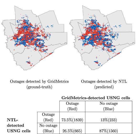
Figure 5. Maps show distribution of outages (at USNG cell level) recorded by GridMetrics (left) and estimated by our NTL-based method (right) in the Houston Metro Area on 16 February 2021. Since GridMetrics' coverage is limited to 4297 USNG cells spread over 8 counties in the Houston Metro Area, we display the NTL-detected results (right map) only for those 4297 USNG cells to facilitate consistent comparison between true (left map) and predicted (right map) values. Red color denotes USNG cells with outage, blue denotes USNG cells without outage, and gray color represents areas that were not covered by GridMetrics. Table at the bottom shows a confusion matrix that provides the percentage of USNG cells (in)correctly predicted as experiencing an outage (or not) by our NTL-based approach in comparison to the ground truth recorded by GridMetrics. Numbers provided in brackets provide the absolute number of USNG cells. A Jaccard index (intersection-over-union) of 0.67 and F1-score of 0.8 indicate strong agreement between the GridMetrics-reported and the NTL-based outage estimates.
Download figure:
Standard image High-resolution imageStrong agreement between our outage estimates and the two independent ground truth datasets recorded over two entirely different geographical areas (Austin city and Houston metro) is convincing evidence that the proposed NTL-based technique performs well at finer spatial scales. Moreover, it is important to note that the proposed NTL-based method is applicable to detect outages in any disaster-stricken region without any need for expensive ground-based sensing (see Shortcomings for exceptions).
3.1.5. Shortcomings
Since NTL data are captured only once every night, the total number of outages observed by VIIRS is strictly limited by the satellite's flyover window. The number and spatial extent of observed outages is further limited by factors like cloud cover and lunar illumination. If during a storm event, a region is covered by clouds or has high lunar illumination, outage detection using our technique would not be possible. Texas during Winter Storm Uri was a unique case because—(i) all the four storm nights had low lunar illumination, and (ii) more than  of the pixels were cloud-free for at least 2 nights, with ≈63% cloud-free pixels on the night of 16 February 2021. Furthermore, due to the instrument's high light detection threshold, illumination from sparsely populated rural regions often goes unregistered which makes it challenging to detect outages in low-lit areas.
Due to the scale and magnitude of power outages observed in Texas, our work assumes that all the dips observed in NTL were mainly caused by power outages. But it is important to note that in addition to power outages, various other factors can cause dimming of NTL—(a) weather conditions like rain and cloud cover can reduce the overall perceived brightness of a region [38], (b) decrease in ground activity in the area can also reduce the amount of NTL [51], (c) changes in land use and built environment [52, 53], for example, converting industrial zones to residential areas can have a drastic impact on brightness of the region and (d) transitioning to energy efficient outdoor lighting like LEDs can reduce the amount of NTL emitted by a region as well [53, 54]. Lighting variations introduced by weather were addressed by the NTL filtering and correction stages in our workflow. The changes in NTL associated with changes in lighting technology, land use and built environment occur gradually over time and since our work only analyzes 4 storm nights, we assumed that these factors would have an insignificant impact on our observations. Although we do not consider the impact of human mobility on NTL in this work, we do acknowledge that the changes in ground activity, for example people moving from highly impacted areas to less impacted ones, would have impacted the NTL intensity of certain areas resulting in some faulty observations.
Besides NTL, the POUS dataset has four fundamental limitations—(i) incomplete coverage—it does not cover all the customers across all the counties, (ii) some customers are just smart meters connected to public infrastructure like street lights, (iii) customer-outages are aggregated and reported at county-level which obfuscates granular information related to racial and socioeconomic groups, and (iv) POUS data is highly susceptible to potential misreporting by utilities, especially during major events like winter storm Uri. Despite these limitations, comparing NTL detected estimates with POUS reported numbers is the only realistic way to calibrate and evaluate our model for detecting customer-outages using NTL data for the entire state. Finally, it is important to note that the z-score threshold computed for Texas might not be optimum for other regions in which case a new threshold will have to be computed for every region.
3.2. Evaluating the impact of outages
We leveraged the high spatial resolution of NTL-detected interruption data to diagnose the correlation between the spatial distribution of interruptions and the demographics characteristics of affected populations across the state of Texas. The EJSCREEN data reported share of minority population for each CBG [16], and the ACS dataset provided median household income for each CBG [17, 18]. We matched this dataset with our estimate of share of population whose electric service interrupted at the CBG level and calculated the mean share of population interrupted by income and minority population-weighted quintiles. The use of quintiles created differentiated groups that are more easily compared against each other than each individual CBG in order to identify general trends in the relationship between the variables.
Figure 6 shows the share of population interrupted for all the five minority quintiles (figure 6(a)) as well as the income quintiles (figure 6(b)). The data reflects that low-minority CBGs appear to be affected less by interruptions compared to high-minority CBGs. On average, about 18%–19% of the population in predominantly white areas suffered an interruption compared to  in the high-minority share areas. The data closely matches with the observations presented in the University of Houston's report on impacts of Winter Storm Uri—
 of the survey respondents disagreed that power cuts in their areas were equitable [6, 55] and
  of the respondents belonging to minority groups (Latino/African American) experienced outage versus
  of Anglos [7]. On the other hand, the relationship between interruptions and income was seemingly unclear—the average share of population interrupted stayed consistent between 22%–24% across all the income quintiles. This observation closely matched with the findings published by GridMetrics that interruption experiences were consistent across all income levels [56]. Overall, these descriptive statistics suggest that CBGs with a higher share of minority population were more likely to have suffered an interruption and that the correlation between income levels and the incidence of interruptions is unclear.
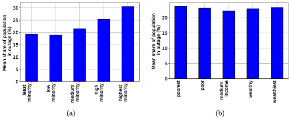
Figure 6. Average percentage of population experiencing blackouts among the (a) minority quintiles and (b) income quintiles, across Texas during the winter storms of 15–18 February 2021. These descriptive statistics show that the share of population in outage in Texas increased with share of minority in a CBG whereas it remained consistent across all income levels.
Download figure:
Standard image High-resolution imageThe spatial distribution of interruptions may shed light on whether the income and race relationships described before are due to spatial demographics in Texas. We found that, indeed, there was a moderate overlap between traditionally poor and non-white areas in Texas and the location of interruptions (see figure 7). Interruptions were concentrated in the southern and eastern counties in Texas (SI appendix, figure 11), which also correspond to the location of relatively large shares of minority and low-income populations. However, the spatial distribution of interruptions within counties did not exhibit a clear pattern. We focused on the most populous county in Texas, Harris County, and used a two-dimensional color scheme to identify CBGs by their percent minority population and percent population interrupted (see figure 8). The hotspots of highly interrupted CBGs appear interspersed with areas with similar shares of minorities that were minimally affected. These interruption patterns may reflect outages in portions of the electricity distribution system that were vulnerable to the storm, as well as intentional load shedding or customer disconnection decisions performed to balance supply and demand given large generation and transmission line outages. In some cases, these decisions and resulting spatial interruption patterns may reflect the existence of critical facilities—hospitals, police and fire stations, water and wastewater treatment plants—in a CBG. Texas law dictates that areas with these critical facilities should be prioritized to not experience or to minimize interruptions [57].
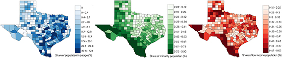
Figure 7. County-level maps to visualize the spatial distribution of population in outage against distribution of minority and low income population. The left map shows share of population in outage in each CBG. The center and right maps show the distribution of minorities and low income population in each CBG of Texas, respectively. Each map is accompanied by a colorbar—lighter shades denote lower percentages and darker shades denote higher percentages. Although the overlap was moderate, a higher concentration of interruptions were found in southern and eastern regions of Texas where the share of minority and low-income population is relatively higher.
Download figure:
Standard image High-resolution image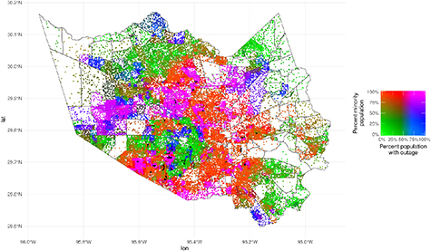
Figure 8. Spatial distribution of interruptions within Harris County, Texas. Each dot represents 100 people. The two-dimensional color scheme quantifies the share of population in outage by percentage of minority population in each CBG. The spatial distribution of interruptions within the county did not exhibit a clear pattern.
Download figure:
Standard image High-resolution imageThe descriptive statistics reported earlier reflected a complex relationship between income, race, and interruptions, especially when including the spatial distribution of these variables. One may conclude a high dependency of interruptions with minority population. However, if these populations were located in areas naturally prone to be affected by interruptions, the potential causal interpretation would be different. For a more rigorous assessment, we develop a multivariate binomial regression approach to estimate the impact of income, race, location, and other variables on the share of population interrupted. In our model, the dependent variable was the share of population interrupted (expressed in Wilkinson-Rogers format) and the main explanatory variables were the share of minority population and the median household income for each CBG (SI appendix, tables 4 and 5). Four out of five of our models (models 1–3, 5) included an interaction term between low-income and minority to capture and isolate potential correlation between poverty and race. We include a dummy variable that indicates the existence of a critical facility to capture the effect of this variable in a CBG's likelihood of suffering an interruption (used in models 2, 4–5). Furthermore, we include five spatially related controls. Two of them reflect (i) the total number of pixels in a given CBG and (ii) the subset of those pixels that were observed as settlement-containing cloud-free pixels. These variables control for the fact that larger CBGs with more cloud-free pixels have a better chance of being identified. A third control is a snow dummy variable that reflects whether the CBG had snow accumulation during the analysis period. Presence of snow may correlate with higher likelihood of interruptions due to infrastructure damage, but it also may affect our NTL detection due to its albedo effect. The pixels and snow controls are used across all five models. A fourth control used on one model is a dummy variable that identifies whether a CBG was part of electric reliability council of texas (ERCOT) (used in models 3–5). This variable may capture the effect that ERCOT mandated load shedding might have affected the likelihood of interruptions, in contrast to CBGs that were not part of ERCOT. For the final spatial control, we introduce county fixed effects in two models (models 4–5) to control for county-level unobservables. The regression coefficients and their significance for the five models constructed are reported in SI appendix, table 4. Furthermore, the odds ratios and corresponding standard errors resulting from the logistic regression are reported in SI appendix, table 5.
Regression results across the models consistently show that the odds of suffering an interruption increases with the share of minority population and with median household income. The odds ratios of the share of minority population variable changes substantially when county fixed effects are introduced, which suggests a high correlation between the location of minority populations in Texas and the counties affected by interruptions as revealed by the mapping described earlier. When including county fixed effects but not an interaction term between income and race (model 4), we find that the odds of suffering an interruption increase approximately  for each
  of increase in minority population. In turn, the odds of suffering an interruption increase about
  for every $10 000 increase in median household income. On including the interaction term (model 5), these odds ratios changed to
  and
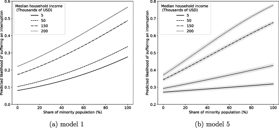
and  , respectively, but their interpretation becomes less intuitive as they depend on the odds ratio of the interaction term (which is significant and relatively large). The marginal effects plots (for models 1 and 5) in figure 9 provide an easier interpretation of the interaction, showing that the predicted likelihood of suffering an interruption is more sensitive to income for higher minority population levels compared to lower minority population levels. This means, the odds of suffering an interruption for predominantly white populations did not change substantially with income, while in high minority populations the odds increased at a much higher rate. Predicted likelihood of interruption did not change substantially with race for low income CBGs, but it doubled or even tripled for wealthier CBGs. The wealthiest predominantly white CBGs exhibited a predicted likelihood of
  –
– of suffering an interruption, compared to
  –
– for high minority CBGs. These results show that, contrary to intuition, wealthier high minority areas were the most affected population group. Quite similar observations were made by researchers who studied the racial and socioeconomic impacts of interruptions caused by hurricane Isaac in Louisiana [9].
Figure 9. Marginal effects plot for the regression models 1 and 5. (a) Model 1, is the simplest binomial regression model that did not contain county fixed effects, critical facility dummy variable, and the ERCOT control variable (refer tables S4 and S5 for more information about the model). The plot shows predicted likelihood of experiencing an interruption (Y-axis) with changes in the share of minority population (X-axis) and median household income (legend). The plot shows that the predicted odds of experiencing an outage increase with increasing share of minority population and with increasing median household income. (b) Model 5, is the most complex model used for this study, utilizing county fixed effects and all the other control and dummy variables (refer tables S4 and S5 for more information about the model). The plot provides predicted likelihood of experiencing an interruption (Y-axis) with changes in the share of minority population (X-axis) and median household income (legend). The odds of experiencing an outage increase with increasing share of minority population and with increasing median household income. Additionally, both the plots show that the predicted likelihood of suffering an interruption was more sensitive to income for higher minority population levels compared to lower minority population levels. In other words, the odds of suffering an interruption for predominantly white populations did not change substantially with income, while in high minority populations the odds increased at a much higher rate.
Download figure:
Standard image High-resolution image
The logistic regression shows robust results for the impact of critical facilities on a CBG: the three models (models 2, 4–5) that include this variable show a  reduction in the odds of suffering an interruption for CBGs that include at least one critical facility. Across all the models, the pixel variables show that the size of the CBG—total pixels available—does not affect results with an odds ratio of 0 and that the number of observed pixels had a very small effect on the odds of suffering an interruption. In a model with no county fixed effects (model 3), the ERCOT dummy variable appears to substantially increase the odds of suffering an interruption, as much as three times. However, the fixed effects models (models 4–5) reveal that the odds ratios of suffering an interruption actually decrease by about
  for CBGs that belong to ERCOT. A similar phenomenon occurs with the snow dummy, in which its odds ratios of suffering an interruption decrease from about
  in models with no fixed effect to almost
  in models with the county fixed effects, demonstrating that local snow accumulation did not correlate with CBG-level interruptions. The changes in most variables' odds ratios between models with and without county fixed effects demonstrate that there were important unobservable variables that explain a large portion of the ultimate likelihood of suffering an interruption.
We hypothesize on what these unobserved variables might be and how they could inform our results. One variable that we do not observe are the spatial patterns of transmission- and generation-level outages that may be captured by county-level fixed effects. The difficulty of capturing these patterns lies in the interconnected nature of transmission systems, in which an outage on a generation unit on one given county may not correlate with power supplied to that location. A simulation approach with power flow modeling may be needed to produce the right controls for this variable. Even with these spatial patterns, we would need to identify why certain generation and transmission assets failed and others did not. Analysis from the interruption point at technology-level issues—frozen gas pipelines and wind turbines [5]—but there may be a historical deficit in infrastructure investment in certain areas of the transmission system that are captured by the county fixed effects models as well. In many cases, infrastructure failure may not only have occurred at the generation-transmission level, but at the local distribution level. Similar systematic biases in maintenance of distribution systems across counties could explain their failure and be part of the unobservables in the county fixed effects. Compiling a comprehensive dataset of failures in distribution system infrastructure for the entire state would be a considerable undertaking given the atomized nature of the data. Finally, it is known that in many cases interruptions were caused by disconnection decisions made by a local utility at the request of ERCOT [5]. It is possible that county fixed effects are capturing biases on how these decisions were made or on the level of load shedding required by ERCOT across counties. Our hypothesizing for county fixed effects shows that the causal explanations for the odds ratios that we report across income and race are complex and out of the scope of this study but should definitely be pursued to identify the underlying causes of the disparity in the reliability experience of Texas customers. The method and interruption dataset produced for this paper using NTL data is a fundamental first step in this endeavor.
4. Conclusion
Our research analyzed the impact of Winter Storm Uri on the electricity systems in Texas, which was an unparalleled event causing an estimated 250 deaths and between $80–$200 billion in costs. In this work, we propose and demonstrate a method to measure the distributional impacts of interruptions using NTL satellite data and utilize it to quantify and analyze the inequality of interruptions across Texas at an unprecedented spatial resolution (the CBG level, which enables detailed socioeconomic analysis). Our results show that minority communities were more likely to experience interruptions compared to predominantly white communities, while higher income was associated with a higher likelihood of interruption. The presence of critical facilities reduced the chances of interruption, but the disparities still persisted. Our findings raise questions about the social justice implications of extreme weather events and emphasize the need for further research to uncover the underlying factors contributing to these disparities.
Acknowledgments
We thank The Rockefeller Foundation for their generous support of this work under Grant  POW 004.
Data availability statement
The data that support the findings of this study are openly available. The final output—a high-resolution (≈450 m) binary outage map of Texas and the dataset on proportion of population in outage in each CBG—have been made publicly available [58]. Metadata used in this study can be found in the article and/or SI appendix. The PowerOutage.us and GridMetrics datasets are proprietary and cannot be shared. All the other geospatial datasets used in this study are publicly available, and we have provided details on how to obtain them in SI appendix.
The data that support the findings of this study are openly available at the following URL/DOI: https://doi.org/10.7910/DVN/ZYJTWJ.
Supplementary data (5.1 MB PDF)