

Abstract
Identifying air pollutant emissions has played a key role in improving air quality and hence the health of billions of people around the world. Central to this effort are the development of emission inventories and the mapping of air pollution using satellite remote sensing. The TROPOspheric Monitoring Instrument (TROPOMI) has been providing high resolution vertical column densities of nitrogen dioxide since late October 2018. Using the flux divergence method and a Gaussian Mixture Model, we identify peak emission hotspots over four cities in South Asia: Dhaka, Kolkata, Delhi and Lahore. We analyze data from November 2018 to March 2021 and focus on the three dry seasons (November to March) for which retrievals are available. The retrievals are shown to have sufficient spatial resolution to identify individual point and area sources. We further analyze the length scale and eccentricities of the hotspots to better characterize the emission sources. The TROPOMI emission estimates are compared with the EDGAR global emission inventory and the REAS regional inventory. This reveals areas of agreement but also significant discrepancies that should enable improvements and refinements of the inventories in the future. For example, urban emissions are underestimated while power generation emissions are overestimated. Some areas of light manufacturing cause significant signatures in TROPOMI retrievals but are mostly missing from the inventories. The spatial resolution of the TROPOMI instrument is now sufficient to provide detailed feedback to developers of emission inventories as well as to inform policy decisions at the urban to regional scale.
Export citation and abstract BibTeX RIS

Original content from this work may be used under the terms of the Creative Commons Attribution 4.0 license. Any further distribution of this work must maintain attribution to the author(s) and the title of the work, journal citation and DOI.
1. Introduction
Air pollution is a significant cause of mortality globally [1]. Satellite remote sensing has enabled great progress in mapping air pollution around the globe [2] and is being used to improve exposure estimates for health effect studies [3]. Many health studies rely on numerical models to evaluate the costs of air pollution and the benefits of policies [4]. Because these models rely on emission inventories, it is imperative to strive for their continuous improvement and development [5, 6].
Nitrogen dioxide (NO ) is an air pollutant that can be readily detected by satellites using sensors in the ultraviolet. NO
 analyses have benefited from the long operating life of the Ozone Monitoring Instrument [7] and, since 2018, of the higher resolution TROPOspheric Monitoring Instrument (TROPOMI) [8]. OMI enabled the detection of individual point sources and urban areas and the evaluation of their temporal variation [9, 10]. Downward trends were shown over the United States of America [11], over China [12] and, more recently, around the globe [13].
With a nadir resolution of 3.5 by 5.6 km2, the finest TROPOMI column is 16 times smaller than the OMI resolution of 13 by 24 km2. This has made it possible to estimate urban emissions more accurately, for example over the Canadian Oil Sands [14], in Paris [15], in North America [16], and in South Korea [17]. By taking the divergence of the NO fluxes, even higher resolution identification of point sources was made possible [18, 19]. Emissions estimates in Germany were found to be in good agreement with the European Pollutant Release and Transfer Register [18] and worldwide hotspots were in agreement with the Global Power Plant Database [19].
The higher resolution of TROPOMI has also enabled a more detailed evaluation of the temporal variation in the NO columns in the United States of America [20] as well as over urban areas worldwide [21]. These capabilities were naturally extended to evaluate the impact of the COVID-19 lockdowns on NO
 columns worldwide [22, 23]. Significant reductions in NO
 were found for most cities in India [24] with some notable exceptions attributed to biomass burning. The reductions in NO
 columns were particularly striking over the urban cores of the largest cities [25], and these were consistent with surface air quality measurements [26]. A study of the reductions over Dhaka, Bangladesh, found significant reductions as well as showing that the NO
 columns over Dhaka have significant spatial heterogeneity [27].
In this study we consider four large megacities in South Asia: Dhaka, Bangladesh; Kolkata and Delhi, India; and Lahore, Pakistan (figure 2). In a previous study we found that Dhaka and Kolkata experienced extreme air pollution events because of a combination of local and regional sources together with particularly unfavorable meteorology [28]. Nevertheless, decades of policy work on air quality have managed to stabilize the air pollution in Dhaka [29]. Likewise, there are gradual improvements in India even though pollutant concentrations remain far in excess of the national standards [30]. Detailed analyses of emission inventories and alternative scenarios for Kolkata show that further policy developments will be required [31]. High resolution aerosol optical depth retrievals were used to evaluate both spatial and temporal variations of pollution over Delhi [32]. In contrast with NO which is primarily urban and industrial, PM
 was found to be primarily due to agricultural emissions and secondary aerosol formation. Micro-satellite imagery was used to estimate the importance of very localized hotspots of pollution within the city [33]. TROPOMI retrievals over North India were able to estimate the emissions of NO
 from individual power plants, including the Dadri power plant on the edge of Delhi [33]. Lahore, Pakistan, also has high air pollutant loadings especially in the winter [34]. Comparison of two sites in Lahore showed that both experienced high concentrations, but the more central, commercial site had lower concentrations than the residential/industrial site to the south. Finally, a study of OMI columns during the COVID-19 lockdowns for the four cities in our study plus Kathmandu found significant reductions in all five, but the plots also show that the urban signatures are more diffuse in the OMI retrievals than in the TROPOMI retrievals [35].
In this study, we analyze TROPOMI retrievals of NO vertical column densities (VCDs) over the four megacities (figure 1(a)) and refine the flux divergence method [18] to characterize the spatial heterogeneity of NO
 emissions in each area (figure 1(b)). A Gaussian mixture model (GMM) is used to estimate individual emissions from point sources and urban area sources simultaneously (figure 1(c)). We then compare these estimates with established emission inventories to identify areas of uncertainty and avenues for improvement (figure 1(d)).
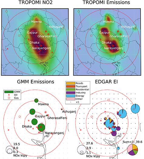
Figure 1. Oversampled NO columns over Dhaka ((a), top left) and flux divergence emission estimates ((b), top right) reveal the high spatial resolution of the TROPOMI retrievals. Estimates of individual sources ((c), bottom left) can be compared with emission inventories, for example the EDGAR inventory ((d), bottom right).
Download figure:
Standard image High-resolution image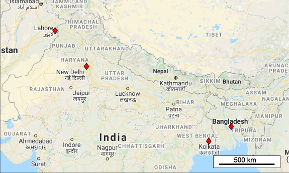
Figure 2. Map showing the four cities analyzed: Dhaka, Bangladesh; Kolkata and Delhi, India; and Lahore, Pakistan.
Download figure:
Standard image High-resolution image2. Methods
2.1. Satellite retrievals and study area
VCDs of NO were obtained from the TROPOMI [8] on the Sentinel-5 Precursor mission of the European Space Agency. Level 2 retrievals were obtained from www.tropomi.eu/data-products/ and https://scihub.copernicus.eu/. These are at the original swath resolution of the instrument. The original finest resolution of 3.5 by 7 km2 was further reduced to 3.5 by 5.6 km2 on 6 August 2019.
We analyze TROPOMI retrievals and emission inventories for four cities in South Asia: Dhaka, Bangladesh; Kolkata and Delhi, India; and Lahore, Pakistan (figure 2). Dhaka and Kolkata have similar geographical conditions and meteorology, as do Delhi and Lahore making them more easily comparable. The columns were oversampled to a lambert conformal grid with 1 km resolution and a coverage of 150 by 150 km2 around the city centers [36].
Scenes were obtained from 1 November 2018 to 31 March 2021. The satellite overpass is in the early afternoon given that it follows a Sun-synchronous low-Earth orbit with an equatorial overpass time of around 13:30 local time.
Emission estimates were obtained by selecting swath data from different time periods, for example by year, by season, or by days of the week. The main emission estimates presented in this paper were obtained by averaging over the three dry seasons (November to March, for 2018/19, 2019/20 and 2020/21) which provided the clearest signal with the largest signal-to-noise ratio. Cloudiness from April to October reduces the quality of the retrievals as shown in figure B1.
2.2. Flux divergence method
Emissions were estimated using the flux divergence method [18] (1):
Fluxes of NO were obtained by multiplying NO
 VCDs with wind speeds (u) in orthogonal directions (along and across the swath tracks). The divergence of the fluxes yields an emission estimate in units of µg m−2 s−1.
Sinks of NO are included in the equation by adding VCD divided by the atmospheric lifetime of NO
 , τ, which was taken to be 9 h (see section 2.5).
Estimates of NO emissions, ENOx
, are obtained by multiplying the estimates by fNOx
, the ratio of NO
emissions, ENOx
, are obtained by multiplying the estimates by fNOx
, the ratio of NO to NO
to NO . We used the same uniform value of 1.32 for fNOx
as in the original method [18] since all four cities are at similar latitudes and have similar meteorological conditions, especially during the dry season.
. We used the same uniform value of 1.32 for fNOx
as in the original method [18] since all four cities are at similar latitudes and have similar meteorological conditions, especially during the dry season.
A few differences are worth noting with the original method. Rather than interpolating the columns to a latitude/longitude grid and then performing the divergence, we calculate the flux divergence on the original swath axes (along-track and cross-track) and then oversample the results to the 1 km grid for temporal averaging. This makes it easier to handle missing values and edge values when calculating the divergences.
We use all columns with a QA value greater than or equal to 0.7, as this includes many points that would be rejected with a threshold of 0.75, as shown in figure B1. We note however that while this makes a large difference to the number of points in the analysis, it does not change the results.
We tested both second order and fourth order estimates of the divergence, and found that this made no difference. We therefore kept the fourth order estimates of the initial method.
The fluxes were calculated using the ERA5 wind product [37]. We obtained hourly ERA5 winds at 100 m height and 1∘ resolution [ERA5: Fifth Generation of ECMWF Atmospheric Reanalyses of the Global Climate; Copernicus Climate Change Service (C3S), European Centre for Medium-Range Weather Forecasts (ECMWF), 2017], and interpolated them linearly to the swath grid. During testing, we also tried using a single value for wind speed and direction at the grid center and found that this did not affect the results.
2.3. Gaussian mixture model
In the original method [18, 19], two-dimensional Gaussian functions were mapped onto the largest hotspots in sequence, removing the Gaussian from the divergence map each time a new source was estimated. In this study, a GMM was used to estimate emissions from multiple hotspots in the flux divergence fields simultaneously. We specified the number of two-dimensional Gaussians and their location as initial conditions to the 'fitgmdist' function in Matlab. Emissions of NO were obtained for each hotspot by scaling the 'mixing proportion' of each Gaussian identified in the algorithm based on flux estimates in µg m−2 s−1 to obtain spatial sums in kilotonnes per year.
All values below a certain threshold were treated as background values. They were not included in the GMM model because the background field was noisy and led to unstable estimates in the estimates. By setting the threshold value at the level of 80% of the data, we found that the algorithm provided stable estimates of the largest hotspots. The emission estimates are larger with smaller values of the threshold because less of the flux divergence is assumed to be part of the background. However, the relative source strengths remain very similar. As the threshold is lowered, the Gaussian fits are less focused on the hotspots and more influenced by small fluctuations. Results from sensitivity tests using 50%, 70%, 80% and 90% are shown in figure C1 and table C1.
Eigenvalues and eigenvectors were calculated for the individual two-dimensional Gaussians to obtain an estimate of the diameter of the hotspots as well as an estimate of their eccentricities. In geometric terms, the contour plots of the Gaussians look like ellipses, and the average length scale was taken to be the geometric mean of the semi-major and semi-minor axes of those ellipses. The eccentricity was calculated as the ratio of the axes.
2.4. Emission inventories
The World Resources Institute (WRI) has created a Global Power Plant Database that merges official government data, independent sources and crowdsourced satellite imagery analysis [38]. We use version 1.3.0 to compare the locations of the TROPOMI hotspots with the locations of known power plants.
The EDGAR version 5.0 Global Air Pollutants emission inventory provides global emissions of nitrogen oxides (NO ) on a grid with 0.1∘ resolution [5, 39]. NO
 emissions for multiple source sectors were obtained for 2015. In the figures, we display the EDGAR category of 'TRO_noRES' as 'Roads' and 'TNR_Other' as 'Transport'.
The REAS version 3.2 emission inventory provides emissions by source sectors over Asia at a resolution of 0.25∘ [6]. Sectoral emissions were used for the year 2015. Point sources are defined individually in REAS and were mapped to the gridded emission fields for analysis in this study. They are labeled as 'Energy Pt' in the figures. The REAS category of 'TRO_Other' contains all non-road transport and is labeled as 'Transport'.
2.5. Uncertainty analysis
The NO retrievals used algorithm version 1.0.0 from November 2018 to 20 March 2019, version 1.3.0 from 21 March 2019 to 28 November 2020 and version 1.4.0 from 29 November 2020 to March 2021 [40]. The cloud product used for the retrievals was updated with version 1.4.0, which led to larger NO
 vertical columns. This adds to the uncertainty of the emission estimates, although at this stage we use all available times to create smooth averages of the NO
 fields since using smaller time periods leads to a weaker signal to noise ratio in the estimates.
Uncertainty analyses were performed by varying the key parameters in the method. In a revised catalog of NO point sources [19], removed the sink term when estimating the emissions. This is effectively like setting the lifetime to infinity. We tested lifetimes of 4 and 9 h and no sink term. The source strengths are larger with the longer lifetimes, but the relative source strengths are very similar between them. The Gaussian approximations were found to be more robust with the 9 h lifetime than with zero sinks, because the sink term served to smooth out some of the noise in the flux divergence term. We therefore decided to use 9 h for this study.
For the chosen lifetime and background threshold, we analyze the variation in the source strengths for 27 different time sectors: days of the week for the entire year (seven estimates) and for the dry season (7), seasons (2), years (3), dry seasons for 3 years (3), wet seasons for 2 years (2), calm and non-calm winds (2) and the complete record (1). The uncertainty in the source strengths was estimated to be around 30%, and the uncertainty in the relative emissions between the hotspots was estimated to be around 20%, as shown in figure E1 for Kolkata.
3. Results and discussion
3.1. VCDs and flux divergence emission estimates
NO2 VCDs from TROPOMI were able to identify considerable spatial variations over Dhaka, Kolkata, Delhi and Lahore (figure D1). The emission estimates from the flux divergence method further brought into focus the spatial variations in emissions in the megacities (figure 3). Detailed maps of each city with some of the power plant names are shown in figures A1–A4.
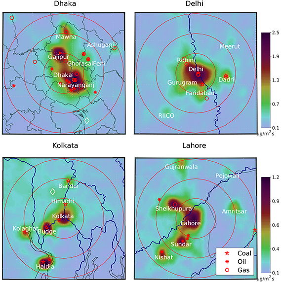
Figure 3. Emissions from the flux divergence of TROPOMI NO VCDs oversampled to 1 km grids over Dhaka, Kolkata, Delhi and Lahore for the three dry seasons (November to March) in the dataset. Red circles show 25, 50 and 75 km radii from the urban centers. Red symbols show power plants in the WRI global inventory. White diamonds show point sources not in the WRI inventory.
Download figure:
Standard image High-resolution imageDhaka has the greatest NO columns of the four cities considered in this study. The largest hotspot of emissions is over Narayanganj, a city containing most of the heavy industry in Dhaka, located along the Shitalakshya river. The second largest hotspot is over the Summit Gajipur oil-fired power plant to the north of Dhaka. Urban emissions from Dhaka itself are sandwiched between these two sources and are of lower magnitude. To the north is a clearly defined area of emissions in the light industrial area of Mawna. Further afield we see clearly points associated with power plants, including a minor increase in emissions over the Chandrapur power plant that is missing in the WRI inventory but shown in figure 3 as a white diamond.
Over Kolkata, five very distinct source areas can be seen. Spatially, the largest hotspot is Kolkata city itself. However, the most polluted columns occur over the Budge Budge power plant and the industrial area in Haldia, to the south along the mouth of the Hooghly river. The largest power plant in the area is Kolaghat, but it shows up much less in the TROPOMI retrievals than Budge Budge and Haldia. To the north there is a minor hotspot at the Bandel power plant, and the method can just barely see the Himadri petrochemical facility (the white diamond on the map).
The situation in Delhi is more typical of other megacities: the main hotspot is clearly the urban area, with smaller point sources in surrounding areas and corridors of urban development clearly visible in the emissions estimates. The Dadri power plant is a distinct hotspot to the east, and the RIICO industrial area to the southeast. The other industrial areas extend from Delhi along corridors of continuous development.
Lahore has lower values of NO VCD and emissions than Dhaka and Delhi, but higher than Kolkata. The city itself is the main hotspot with development corridors going west toward Sheikhupura and southwest toward Sundar. What may be surprising is that the Atlas gas-fired power plant (225 MW), which is on the east side of Sheikhupura, is within a large hotspot, whereas the Saba oil-fired power plant (114 MW) does not show up in the TROPOMI fluxes. The Atlas plant is surrounded by other industrial sources which could be the cause of the emissions. To the south, Kohinoor Energy (131 MW) is in the middle of the hotspot but Southern Electric (135 MW) and Japan Power Company (120 MW) do not show up even though all three are oil-fired power plants of similar sizes. Nishat oil-fired power plant (200 MW) shows up very clearly further southwest. To the northeast one can clearly see the Hubco Narowal power plant in Pejowali that is missing in the WRI inventory, as well as two urban areas: Gujranwala to the north, and Amritsar in neighboring India.
3.2. GMM emission estimates and inventories
A GMM was used to estimate the source strengths of the emission hotspots by approximating these as the sum of two-dimensional Gaussians. Figure 4 shows the Gaussians as ellipses with the corresponding total emission field that approximates the original flux divergence emission estimates (figure 3). The inputs to the model are shown in figure D2: using a high threshold for the background was necessary to reduce the noise in the data field and to correctly identify the main hotspots. The number of hotspots and their location was specified by inspection of the data in order to constrain the model and obtain a better identification of the hotspots. The residual between the initial emission field (figure 3) and the GMM estimates (figure 4) shows that the method identified the main features in the spatial map (figure D3).
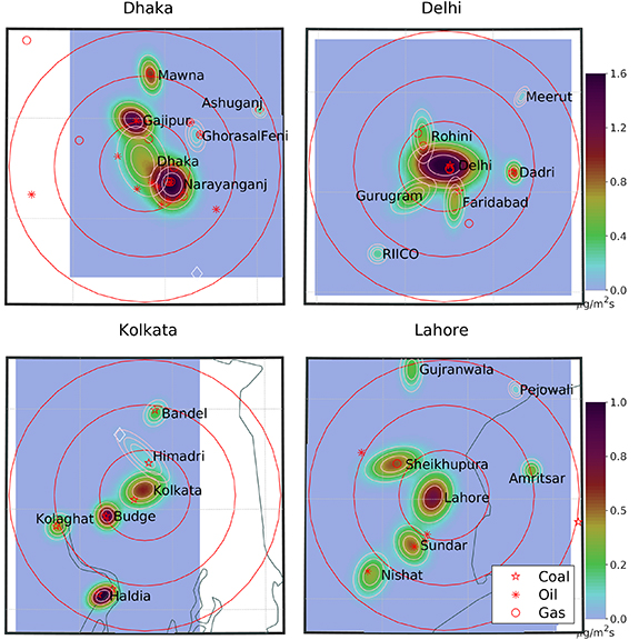
Figure 4. GMMs based on the flux divergence emission estimates over Dhaka, Kolkata, Delhi and Lahore. Red circles show 25, 50 and 75 km radii from the urban centers. Red symbols show power plants in the WRI global inventory. White diamonds show point sources not in the WRI inventory.
Download figure:
Standard image High-resolution imageTable 1 shows the emissions, length scale and eccentricity of the Gaussian estimates and compares them with the corresponding emissions from the REAS and EDGAR inventories, as well as with the total power of the plants in the WRI inventory and with the previous TROPOMI estimates [19]. The type of each hotspot was determined by inspection of the surroundings using Google maps. For the spatial extent of each two-dimensional Gaussian fit, we determined if the area in a hotspot was predominantly commercial or residential ('Urban'), if there was one dominant source ('Point', usually a power plant or a cement plant), if there were multiple point sources ('Multipoint') or if there was a mix of urban and industrial point sources ('Mixed').
Table 1. NO emissions from the TROPOMI NO
 GMMs for Dhaka, Kolkata, Delhi and Lahore megacities for the three dry seasons (November to March) in the dataset. Diameter represents the length scale of the Gaussian ellipses, and eccentricity is the ratio of the semi-major to the semi-minor axis. Emissions from REAS, EDGAR and the TROPOMI Catalog (GMM-SB, [19]) along with WRI power plant generation capacities are shown for comparison.
| Emiss | Diameter | Eccentricity | REAS | EDGAR | WRI Power | GMM-SB | |||
|---|---|---|---|---|---|---|---|---|---|
| Site | Abb. | ktNO yr−1 yr−1
| km | Non-Dim. | ktNO yr−1 yr−1
| ktNO yr−1 yr−1
| MW | ktNO yr−1 yr−1
| Type |
| Dhaka megacity sources | |||||||||
| Dhaka | DHA | 12.1 | 19.5 | 1.5 | 10.0 | 35.3 | 12 | — | Urban |
| Narayanganj | NAR | 19.5 | 15.6 | 1.1 | 12.0 | 23.8 | 2599 | — | Multipoint |
| Gajipur | GAJ | 11.1 | 12.6 | 1.3 | 11.0 | 0.5 | 149 | — | Point |
| Mawna | MAW | 5.0 | 10.3 | 1.7 | 1.2 | 0.2 | 33 | — | Urban |
| GhorasalFeni | GHO | 0.6 | 8.3 | 1.7 | 8.2 | 26.4 | 1025 | — | Multipoint |
| Ashuganj | ASH | 0.3 | 4.8 | 1.1 | 4.2 | 27.0 | 1649 | — | Point |
| Kolkata megacity sources | |||||||||
| Kolkata | KLT | 5.9 | 13.8 | 1.3 | 31.0 | 41.0 | 275 | 3.5 | Urban |
| Haldia | HAL | 4.3 | 8.9 | 1.4 | 17.0 | 9.6 | 900 | 3.2 | Multipoint |
| Kolaghat | KLG | 1.7 | 8.8 | 1.1 | 27.0 | 29.7 | 1260 | 2.7 | Point |
| Budge | BUD | 3.4 | 8.8 | 1.1 | 7.8 | 20.9 | 750 | 3.2 | Point |
| Bandel | BAN | 1.0 | 8.4 | 1.3 | 11.0 | 11.4 | 455 | — | Point |
| Himadri | HIM | 1.0 | 13.8 | 2.9 | — | — | — | — | Mixed |
| Delhi megacity sources | |||||||||
| Delhi | DEL | 30.3 | 19.0 | 1.6 | 87.7 | 49.6 | 735 | — | Urban |
| Faridabad | FAR | 3.7 | 10.9 | 2.5 | 11.4 | 31.0 | 705 | — | Mixed |
| Gurugram | GUR | 4.5 | 12.6 | 1.8 | 9.8 | 3.5 | — | — | Mixed |
| Rohini | ROH | 3.0 | 12.0 | 2.3 | 10.7 | 1.9 | 1466 | — | Mixed |
| Dadri | DAD | 2.0 | 6.9 | 1.3 | 38.2 | 43.7 | 2636 | — | Point |
| RIICO | RII | 0.6 | 6.5 | 1.0 | 10.3 | — | — | — | Point |
| Meerut | MEE | 0.2 | 5.4 | 1.8 | — | 1.1 | — | — | Urban |
| Lahore megacity sources | |||||||||
| Lahore | LAH | 8.4 | 15.2 | 1.3 | 10.8 | 39.0 | — | — | Urban |
| Sheikhupura | SHE | 6.1 | 15.0 | 1.9 | — | — | 225 | 4.0 | Mixed |
| Sundar | SUN | 4.0 | 12.5 | 1.3 | 6.6 | — | 386 | 1.9 | Multipoint |
| Nishat | NIS | 3.4 | 13.3 | 1.4 | — | 11.8 | 200 | 2.1 | Mixed |
| Gujranwala | GUJ | 1.7 | 10.8 | 1.9 | 3.3 | 6.1 | — | — | Urban |
| Amritsar | AMR | 1.0 | 7.4 | 1.1 | 10.1 | 2.4 | — | 1.2 | Urban |
| Pejowali | PEJ | 0.2 | 5.4 | 1.3 | — | — | — | — | Point |
There is a strong correlation between the GMM emission estimates and the size of the hotspot (figure 5). In theory, the emission estimates and the diameter are independent of each other: a narrow hotspot with large maximum values could have the same emission estimates as wide hotspot with low maximum values. Ideally, we would be able to determine the spatial extent of the emission source from the spatial extent of the hotspot. In practice, it seems that most of the hotspots have the same shape: a larger hotspot goes along with higher maximum values. The spatial extent of the hotspot is also determined by the meteorological dispersion; blurring due to temporal averaging; and the underlying resolution of the satellite retrievals (around 5 km). At this stage the method therefore can give a general indication of source types but cannot provide a precise estimate of the source length scale.
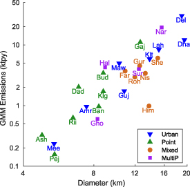
Figure 5. Scatter plot of GMM hotspot properties: average diameter versus emission estimates are shown by type of source on a log scale. See table 1 for full hotspot names.
Download figure:
Standard image High-resolution imageBy comparing the four cities, figure 5 shows that Delhi has more emissions per area than the others whereas Dhaka has a lower emission density. Narayanganj and Haldia are both centers of heavy industry and consequently have larger emission densities. Himadri and Ghorasal & Feni are both diffuse hotspots that cover different sources, and this is clearly reflected by their position below the other points on the graph. Of particular interest for the development of emission inventories, both Gajipur and Mawna have emissions above the line of best fit, suggesting that they have denser emissions than other areas. The Gajipur hotspot is a power plant, but the large emissions and diameter suggest that the neighboring urban areas are significant sources. Mawna only has a small gas-fired plant that would not account for the TROPOMI hotspot. However, it is an area of light manufacturing: aerial photography clearly shows mixed-use development with predominantly textile industries. The hotspots with mixed sources all have lower emissions and larger radii, as expected given that they represent development corridors or multiple types of sources that are more spread out. Both Amritsar and Meerut look like point sources on this graph—probably because the blurring of the point sources means that the satellite retrievals cannot distinguish a single point source from a small area source.
The eccentricity of the hotspots provides further information on the possible spatial patterns of the emissions (figure 6). Single sources are expected to have low eccentricities, and this is what is seen for all the point sources. As expected, the mixed hotspots have large eccentricities: Rohini, Gurugram and Faridabad are areas that extend away from Delhi. Urban areas are more varied, reflecting the different urban morphologies due to geography and historical patterns of development. They range from Amritsar which has a very circular footprint to Meerut and Gujranwala which are more elliptical and which both have preferential axes of development.
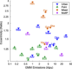
Figure 6. Scatter plot of GMM hotspot properties: emission estimates versus eccentricity are shown by type of source on a log scale. See table 1 for full hotspot names.
Download figure:
Standard image High-resolution imageOverall, the finer resolution of the TROPOMI retrievals compared with previous satellite sensors mean that the diameter and the eccentricity of the hotspots provide valuable information for distinguishing point sources from other types of sources, as well as for identifying different spatial patterns of emission sources.
3.2.1. Dhaka
Figure 7 compares the GMM emission estimates in Dhaka with the sources in the EDGAR and REAS inventories, using pie charts to distinguish the emissions from different sectors. In order to highlight the main sources, all grid cells with emissions below the threshold shown in the graph are combined into a single pie chart shown on the bottom left of the plot.
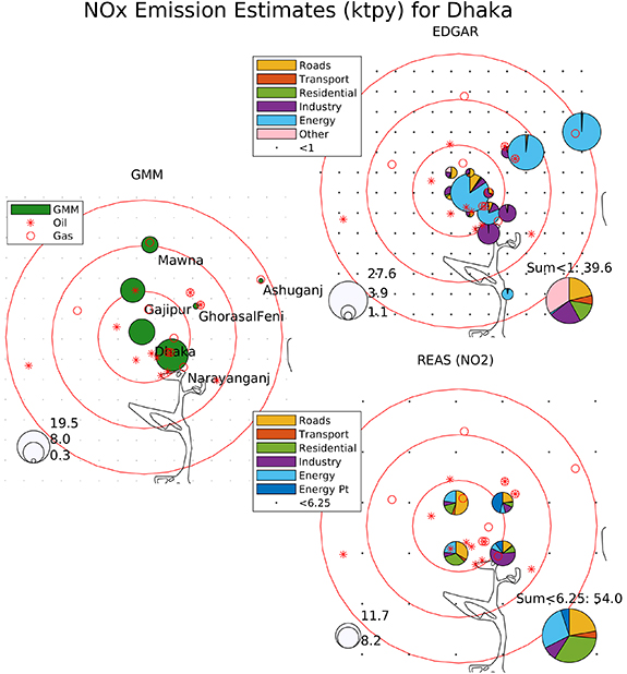
Figure 7. Comparison of NO emission estimates from the TROPOMI GMM, as well as the EDGAR and REAS emission inventories for Dhaka. 'Roads' include all road mobile sources, and 'Transport' contains all other transportation modes. REAS emissions are reported as kilotonnes of NO
 per year. Black dots show grid cells with emissions below the threshold, these are combined into a single pie chart in the lower left corner. Red circles show 25, 50 and 75 km radii from the urban centers. Red symbols show power plants from the WRI global inventory.
Download figure:
Standard image High-resolution imageOver Dhaka, the GMM method identified emissions from six hotspots. Comparisons with the EDGAR inventory show stark differences. Road transport and residential emissions in EDGAR are minimal for the entire area. Although there has been a concerted effort to reduce these through the use of natural gas, the Dhaka urban area nevertheless shows up as a significant source in the TROPOMI estimates. The power plants are the dominant sources in EDGAR, especially the Ashuganj power plant and the neighboring Ghorasal and Feni power plants. Ashuganj is a gas power plant with minimal emissions in the TROPOMI estimates. Ghorasal and Feni use a mix of oil and gas, and also barely show up above the background of urban emissions. In contrast, the Chandrapur power plant that was missing in the WRI inventory is in EDGAR, but the TROPOMI signal is too weak to be able to quantify its emissions. The Gajipur power plant is oil-fired, and is missing in EDGAR, like many of the other oil-fired power plants in the area. Furthermore, the light industrial area around Mawna is missing in the inventory.
The REAS inventory has a coarser resolution than EDGAR (0.25∘ vs. 0.1∘). In contrast with EDGAR, it does not overestimate the emissions from the power plants. The comparison between REAS and GMM seems adequate given the coarse resolution, and the only main discrepancy is that the area emissions in Mawna are missing. The Gajipur power plant shows up, and Narayanganj consists mostly of industrial emissions rather than power plants, which is consistent with the presence of heavy industry and cement factories in the area.
3.2.2. Kolkata
In Kolkata there are five well defined sources in the GMM estimates (figure F1). The magnitudes of the GMM emissions are lower than for the other cities and also lower than in the inventories, hence the different scale for the GMM emissions in the figure. As in Dhaka, EDGAR overestimates the emissions from the power plants, except for Budge Budge which is identified as a major source in both the EDGAR inventory and the TROPOMI signatures. Two of the power plants are shifted in location: Bandel one grid cell to the south, and Kolaghat 9 grid cells to the east. While Kolaghat is the largest power plant in the area, it does not have large emissions in the TROPOMI estimates—even though it is next to a cement plant which appears to be missing in the inventories. EDGAR underestimates the urban (road and residential) emissions in Kolkata as well as the industrial emissions in Haldia which has steel and cement industries.
The REAS inventory for Kolkata identifies urban emissions as the dominant regional source, which is in agreement with the TROPOMI estimates. The Haldia industrial area, to the south, is characterized as both energy and industrial plants, in contrast with EDGAR which neglected the industrial emissions. The emissions of the Kolaghat power plant are overestimated relative to TROPOMI, even though the emissions of the cement plant are missing in the inventory. The Budge Budge power plant seems to be underestimated by REAS relative to the TROPOMI estimates. Bandel power plant, to the north, is a minor contributor to the local regional emissions which are in the same proportion to Kolkata as the TROPOMI estimates.
3.2.3. Delhi
In Delhi, the main TROPOMI hotspot is the central urban area (figure F2). It is surrounded by three smaller areas that are related to built-up corridors extending from Delhi: Rohini, Gurugram and Faridabad. The method also identifies emissions from the Dadri power plant, the RIICO industrial area and Meerut, a city to the northeast.
As with Dhaka and Kolkata, EDGAR has too many emissions from power plants and not enough from urban areas. The Dadri power plant shows up as the grid cell with the largest emissions, even though it is a minor source in the TROPOMI signatures. The power plants in Faridabad also show up very strongly, whereas in the TROPOMI signal this area is similar to Gurugram which does not have power plants. Even in Delhi itself, EDGAR has very little transport and residential emissions but rather has mostly industrial emissions. Even though the TROPOMI method cannot identify source sectors specifically, the spatial patterns suggest that transport and residential emissions are more important than industrial and power generation sources. Meerut does show up in the inventory albeit also as an industrial rather than as an urban source.
Also in keeping with the pattern seen for Dhaka and Kolkata, REAS is a better match with the TROPOMI estimates because it includes more urban emissions than EDGAR. The REAS inventory does have large emissions over the Dadri power plant which are not present in the TROPOMI retrievals. RIICO shows up as an industrial hotspot, but Meerut does not show up above the regional background.
3.2.4. Lahore
Lahore has lower NO columns than the other cities and correspondingly smaller emission estimates (figure F3). As with the other cities, EDGAR appears to overestimate the power plant emissions relative to the urban emissions. The Nishat power plant shows up clearly in both EDGAR and TROPOMI. However there is little match in the others: the Sundar and Atlas power plants do not show up at all in EDGAR, and Saba shows up as the largest power generation source even though it is not detected by TROPOMI. Amritsar is characterized as a predominantly industrial source, and Gujranwala as mostly power generation, even though they look mostly like urban sources. In Gujranwala there are no power plants in the WRI inventory, although there appears to be the GEPCO Gujranwala power plant on the southeast side of the city and the Nandipur power plant to the north—neither of which cause a clear signal in the TROPOMI retrievals.
The REAS inventory in Lahore is more focused on urban emissions, as seen for the other cities in this study. It is missing the power plants in EDGAR, WRI and the TROPOMI signatures. Nevertheless, it does identify Gujranwala emissions and characterizes these as mostly power generation and industrial emissions. Amritsar shows up as a regional hotspot that is nearly as large as Lahore in REAS, even though it is a much smaller source in both TROPOMI and REAS. One striking feature is that the background emissions in REAS are larger in India than in Pakistan, with many Indian grid cells above the threshold used for displaying the sources in the figure.
4. Conclusions
Satellite remote sensing has enabled great progress in identifying pollution hotspots around the world and in assisting and evaluating the development of emission inventories. TROPOMI in particular has attained the spatial resolution required to identify individual point sources and smaller area sources surrounding large metropolitan areas. Using a GMM, it is possible to quantify the emissions as well as to develop metrics for the spatial extent and orientation of the sources.
By focusing on four megacities in South Asia, we show that each has distinct sources and characteristics. We further compare the TROPOMI results with established inventories (EDGAR and REAS) and with the WRI global power plant database. We find areas of agreement as well as discrepancies worthy of future analysis. EDGAR may be overestimating power plant emissions and underestimating urban emissions systematically. REAS appears to be in better agreement although it has a coarser resolution which make it more appropriate for regional, rather than local studies. Both inventories appear to miss emissions from light manufacturing. Both inventories also appear to have unsystematic discrepancies in emission estimates from power plants: the emissions can be very different between power plants of the same power output using the same fuel, in the same region. Detailed comparison of emissions over industrial areas should further enable a more consistent representation in the inventories.
New geostationary satellites for detecting air pollution are already in orbit in the case of South Korea's Geostationary Environment Monitoring Spectrometer [41] or are soon to be launched in the case of NASA's Tropospheric Emissions: Monitoring of Pollution [42] and ESA's Sentinel-4 mission [43]. These will have improved spatial and temporal resolutions. Given the experience with TROPOMI, ongoing development in satellite retrievals will enable further development of emission inventories and hence improved guidance for air quality policies and a reduced health burden of air pollution.
Acknowledgments
This project was partially supported by two grants from the United States Department of State (SMLAQM19CA2361 and SLMAQM20CA2398). The opinions, findings, and conclusions stated herein are those of the investigators and do not necessarily reflect those of the United States Department of State.
We are grateful to the European Space Agency, the European Centre for Medium Range Weather Forecasts, the World Resources Institute, the European Environment Agency and the National Institute for Environmental Studies of Japan for making their emission inventories freely accessible (please see references in the text).
We wish to thank the anonymous reviewers whose careful feedback improved the manuscript.
Data availability statement
The data that support the findings of this study are openly available at the following URL/DOI: https://scihub.copernicus.eu/.
Appendix A.: City maps and power plant locations
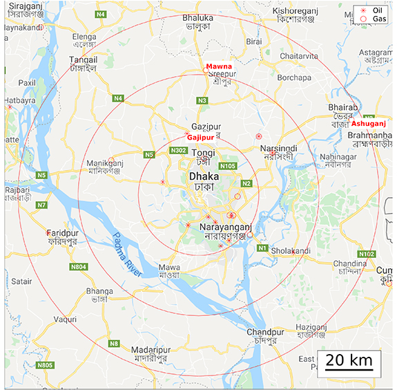
Figure A1. Map of Dhaka with selected power plant names from the WRI inventory. Red circles show 25, 50 and 75 km radii from the urban centers. Red symbols show power plants in the WRI global inventory.
Download figure:
Standard image High-resolution image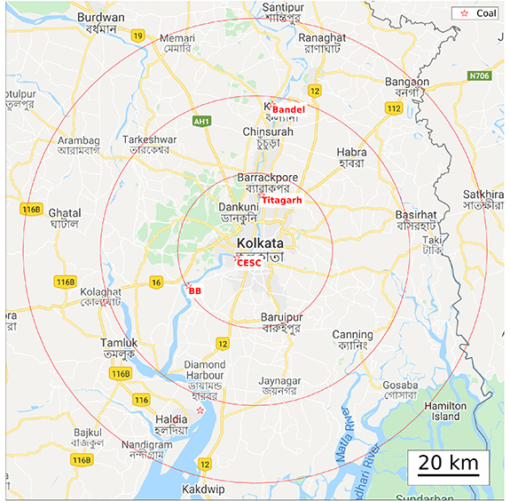
Figure A2. Map of Kolkata with selected power plant names from the WRI inventory. Red circles show 25, 50 and 75 km radii from the urban centers. Red symbols show power plants in the WRI global inventory.
Download figure:
Standard image High-resolution image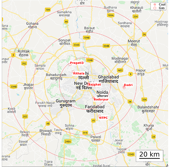
Figure A3. Map of Delhi with selected power plant names from the WRI inventory. Red circles show 25, 50 and 75 km radii from the urban centers. Red symbols show power plants in the WRI global inventory.
Download figure:
Standard image High-resolution image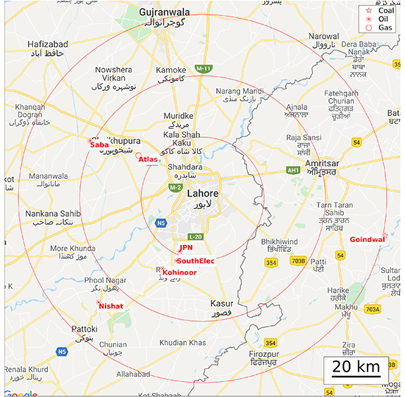
Figure A4. Map of Lahore with selected power plant names from the WRI inventory. Red circles show 25, 50 and 75 km radii from the urban centers. Red symbols show power plants in the WRI global inventory.
Download figure:
Standard image High-resolution imageAppendix B.: Histograms of TROPOMI quality assurance flag values
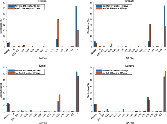
Figure B1. Histograms showing quality assurance flag values for oversampled grid pixels from November 2018 to March 2021. Unique individual values are shown except for values smaller than or equal to 0.3 which are lumped together. Missing correspond to pixels outside the swath view, 0 corresponds to missings within the swath.
Download figure:
Standard image High-resolution imageAppendix C.: Background threshold values for GMMs
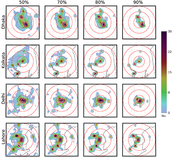
Figure C1. Contour plots of particles used as inputs to the GMM for Dhaka, Kolkata, Delhi and Lahore using four different values of threshold for the background (50%, 70%, 80% and 90%). This shows that at 50% threshold, the 2D Gaussians are too large and contaminated by small variations in the flux divergence field. At 90%, the sources are reduced and some are missing entirely. See figure D2 for the plots using the 80% value used in this study.
Download figure:
Standard image High-resolution imageTable C1. NO emissions from the TROPOMI NO
 GMMs for Dhaka, Kolkata, Delhi and Lahore megacities using background threshold values of 50%, 70%, 80% and 90%. The emission values correspond to figure C1.
| Emiss (50%) | Emiss (70%) | Emiss (80%) | Emiss (90%) | ||
|---|---|---|---|---|---|
| Site | Abb. | ktNO yr−1 yr−1
| ktNO yr−1 yr−1
| ktNO yr−1 yr−1
| ktNO yr−1 yr−1
|
| Dhaka megacity sources | |||||
| Dhaka | DHA | 17.9 | 18.0 | 12.1 | 4.0 |
| Narayanganj | NAR | 30.2 | 22.9 | 19.5 | 12.5 |
| Gajipur | GAJ | 16.3 | 13.3 | 11.1 | 7.0 |
| Mawna | MAW | 9.9 | 7.1 | 5.0 | 1.8 |
| GhorasalFeni | GHO | 4.1 | 1.9 | 0.6 | 0.0 |
| Ashuganj | ASH | 2.5 | 1.0 | 0.3 | 0.0 |
| Kolkata megacity sources | |||||
| Kolkata | KLT | 9.7 | 7.5 | 5.9 | 2.8 |
| Haldia | HAL | 6.0 | 4.7 | 4.3 | 3.2 |
| Kolaghat | KLG | 4.2 | 2.1 | 1.7 | 0.8 |
| Budge | BUD | 3.8 | 3.8 | 3.4 | 2.5 |
| Bandel | BAN | 2.8 | 1.1 | 1.0 | 0.3 |
| Himadri | HIM | 3.5 | 1.1 | 1.0 | 1.0 |
| Delhi megacity sources | |||||
| Delhi | DEL | 34.5 | 28.8 | 30.3 | 16.5 |
| Faridabad | FAR | 4.9 | 5.2 | 3.7 | 1.0 |
| Gurugram | GUR | 7.4 | 5.6 | 4.5 | 2.3 |
| Rohini | ROH | 8.1 | 7.3 | 3.0 | 6.3 |
| Dadri | DAD | 2.7 | 2.3 | 2.0 | 0.9 |
| RIICO | RII | 2.7 | 1.2 | 0.6 | 0.0 |
| Meerut | MEE | 2.4 | 0.6 | 0.2 | 0.0 |
| Lahore megacity sources | |||||
| Lahore | LAH | 9.7 | 9.5 | 8.4 | 5.4 |
| Sheikhupura | SHE | 8.9 | 7.4 | 6.1 | 3.3 |
| Sundar | SUN | 2.0 | 4.1 | 4.0 | 2.4 |
| Nishat | NIS | 9.7 | 5.1 | 3.4 | 1.5 |
| Gujranwala | GUJ | 3.8 | 2.7 | 1.7 | 0.5 |
| Amritsar | AMR | 2.3 | 1.4 | 1.0 | 0.3 |
| Pejowali | PEJ | 0.5 | 0.3 | 0.2 | 0.0 |
Appendix D.: GMM inputs and residuals
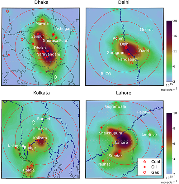
Figure D1. TROPOMI NO VCD oversampled to 1 km grids over Dhaka, Kolkata, Delhi and Lahore. Red circles show 25, 50 and 75 km radii from the urban centers. Red symbols show power plants in the WRI global inventory. White diamonds show point sources not in the WRI inventory.
Download figure:
Standard image High-resolution image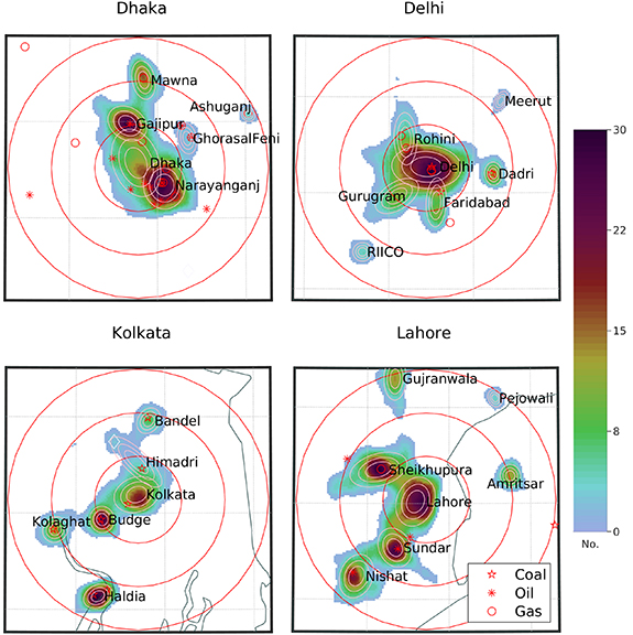
Figure D2. Contour plot of particles used as inputs to the GMM for Dhaka, Kolkata, Delhi and Lahore. Ellipses show the Gaussians calculated by the GMM model. Red circles show 25, 50 and 75 km radii from the urban centers. Red symbols show power plants in the WRI global inventory.
Download figure:
Standard image High-resolution image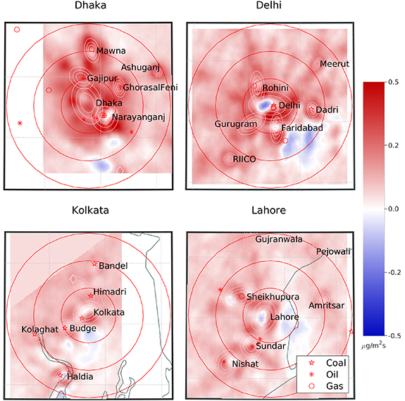
Figure D3. Residual flux divergence emissions after removing the two-dimensional Gaussians from the original flux divergence emissions. This is the difference between figures 3 and 4.
Download figure:
Standard image High-resolution imageAppendix E.: Uncertainty of emission estimates from the GMM
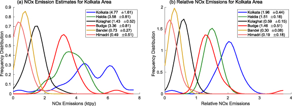
Figure E1. Frequency distribution of emission estimates from the GMM for Kolkata using different time periods. (a) Uncertainty of the emissions in ktpy. (b) Uncertainty of the emissions relative to the average of all the hotspots in the megacity. Legend shows mean and standard deviation for each GMM hotspot.
Download figure:
Standard image High-resolution imageAppendix F.: Comparisons of emission estimates for Kolkata, Delhi and Lahore
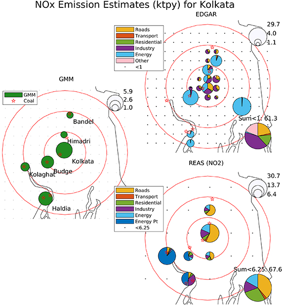
Figure F1. Comparison of NO emission estimates from the TROPOMI GMM, EDGAR and REAS for Kolkata. 'Roads' include all road mobile sources, and 'Transport' contains all other transportation modes. REAS emissions are reported as kilotonnes of NO
 per year. Red circles show 25, 50 and 75 km radii from the urban centers. Red symbols show power plants in the WRI global inventory.
Download figure:
Standard image High-resolution image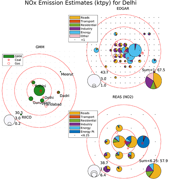
Figure F2. Comparison of NO emission estimates from the TROPOMI GMM, EDGAR and REAS for Delhi. 'Roads' include all road mobile sources, and 'Transport' contains all other transportation modes. REAS emissions are reported as kilotonnes of NO
 per year. Red circles show 25, 50 and 75 km radii from the urban centers. Red symbols show power plants in the WRI global inventory.
Download figure:
Standard image High-resolution image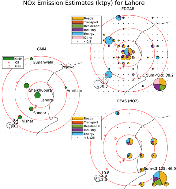
Figure F3. Comparison of NO emission estimates from the TROPOMI GMM, EDGAR and REAS for Lahore. 'Roads' include all road mobile sources, and 'Transport' contains all other transportation modes. REAS emissions are reported as kilotonnes of NO
 per year. Red circles show 25, 50 and 75 km radii from the urban centers. Red symbols show power plants in the WRI global inventory.
Download figure:
Standard image High-resolution image